Blog
All Blog Posts | Next Post | Previous Post

 Next Generation Data Grid for Delphi: Cell Controls
Tuesday, October 22, 2024

Intro
If you’re developing in Delphi and looking for a powerful, flexible, and highly customizable data grid solution, then TMS FNC Data Grid is the perfect choice. In this blog, we continue on our journey with the TMS FNC Data Grid. The TMS FNC Data Grid offers developers advanced tools for presenting and interacting with data. Adding controls such as buttons, checkboxes, progressbars and more to allow interaction and data visualization within the cell is key in providing your application with a unique user interface.
Built-in Controls
TTMSFNCDataGrid has a set of built-in controls ready to use and interact with.
- Buttons
- ProgressBars
- Checkboxes
- RadioButtons
To access these built-in controls, there are methods available at the grid level:
Grid.AddButton(AColumn, ARow: Integer; AText: string = '')

Grid.AddCheckBox(AColumn, ARow: Integer; AValue: Boolean = False)

Grid.AddRadioButton(AColumn, ARow: Integer; AValue: Boolean = False; AGroupIndex: Integer = 0)

Grid.AddProgressBar(AColumn, ARow: Integer; AValue: Integer = 0)

Grid.AddDataCheckBox(AColumn, ARow: Integer)

Grid.AddDataRadioButton(AColumn, ARow: Integer; AValue: Boolean = False; AGroupIndex: Integer = 0)

Grid.AddDataProgressBar(AColumn, ARow: Integer)

Grid.RemoveButton(AColumn, ARow: Integer)

Grid.RemoveCheckBox(AColumn, ARow: Integer)

Grid.RemoveProgressBar(AColumn, ARow: Integer)
Please note that the grid includes Data Checkbox, RadioButton, and ProgressBar controls. These elements are linked to the cell's value, determining whether the checkbox or radio button is selected, or displaying the progress value. To modify these control values, use `Grid.Booleans[]` for checkboxes and radio buttons, or `Grid.Ints[]` for progress bars. Below is a screenshot showing a grid configured with these cell controls.

You might notice the additional grid at the bottom. This is a sub-grid, which can be added using the following method:
g := Grid.AddGrid(AColumn, ARow);
The `AddGrid` method returns an instance of `TTMSFNCDataGridRenderer`, which provides the same features and functionality as the main grid.
Control Events
The grid provides events that can be triggered when controls are interacted with:
- OnCellButtonClick: Triggered when a button in a cell is clicked.
- OnCellCheckBoxChange: Triggered when the value of a checkbox in a cell changes.
- OnCellRadioButtonChange: Triggered when a radio button in a cell changes state.
Here is an example code snippet, handling events on cell controls
procedure TForm1.GridCellButtonClick(Sender: TObject; AColumn, ARow: Integer);
begin
  ShowMessage('Button in cell (' + IntToStr(AColumn) + ', ' + IntToStr(ARow) + ') clicked.');
end;

procedure TForm1.GridCellCheckBoxChange(Sender: TObject; AColumn, ARow: Integer);
begin
  if Grid.Booleans[AColumn, ARow] then
    ShowMessage('Checkbox in cell (' + IntToStr(AColumn) + ', ' + IntToStr(ARow) + ') is checked.')
  else
    ShowMessage('Checkbox in cell (' + IntToStr(AColumn) + ', ' + IntToStr(ARow) + ') is unchecked.');
end;
On top of built-in controls, it's possible to add custom controls to the grid cells. To set a custom control inside a set, use the Controls[] property. Additionally, it's possible to configure where the control needs to be aligned. The following properties are available.
- Controls[AColumn, ARow]: TTMSFNCDataGridCellControl: Sets the custom control as child of a cell.
- ControlWidths[AColumn, ARow]: Integer: Defines the width of the control inside the cell.
- ControlHeights[AColumn, ARow]: Integer: Defines the height of the control inside the cell.
- ControlAligns[AColumn, ARow]: TTMSFNCDataGridCellControlAlign: Sets the alignment of the control within the cell.
- ControlTexts[AColumn, ARow]: string: Defines the text displayed on the control (applies to buttons, checkboxes, etc.).
- ControlPositions[AColumn, ARow]: TTMSFNCDataGridCellControlPosition: Sets the position of the control inside the cell.
For example, this is a code snippet that adds and aligns buttons to the grid.
b := TButton.Create(Self);
b.Text := 'Top';
Grid.Controls[1, 1] := b;
Grid.ControlAligns[1, 1] := gcaTop;

b := TButton.Create(Self);
b.Text := 'Right';
Grid.Controls[2, 1] := b;
Grid.ControlAligns[2, 1] := gcaRight;

b := TButton.Create(Self);
b.Text := 'Bottom';
Grid.Controls[3, 1] := b;
Grid.ControlAligns[3, 1] := gcaBottom;

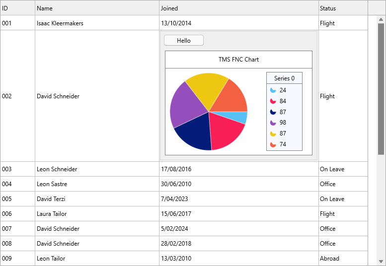
In the next sample, we design our own panel, a button and a TMS FNC Chart instance.
Grid.LoadSampleData;

Grid.Controls[2, 2] := Panel1;
Grid.ControlAligns[2, 2] := gcaClient;
Grid.RowHeights[2] := Panel1.Height;
Grid.ColumnWidths[2] := Panel1.Width;
Conclusion
Cell Controls in TTMSFNCDataGrid is a powerful feature that transforms the way data is visualized in a cell. It proves to be a very valuable feature
In the next blog we'll explore how you can set up a master-detail relationship with and without database binding, so stay tuned for more advanced tips and tutorials on leveraging this next-generation data grid for your Delphi projects! Happy coding!
Pieter Scheldeman
Related Blog Posts
-
Next Generation Data Grid for Delphi: Getting Started
-
Next Generation Data Grid for Delphi: Adding, Formatting & Converting Data
-
Next Generation Data Grid for Delphi: Filtering & Sorting
-
Next Generation Data Grid for Delphi: Grouping
-
Next Generation Data Grid for Delphi: Webinar Replay Available!
-
Next Generation Data Grid for Delphi: Cell Controls
-
Next Generation Data Grid for Delphi: Master-Detail
-
Next Generation Data Grid for Delphi: Calculations
-
Next Generation Data Grid for Delphi: Import & Export
-
Next Generation Data Grid for Delphi: Template
-
Next Generation Data Grid for Delphi: Filter Row
-
Next Generation Data Grid for C++: Getting Started
-
Freebie Friday: Next Generation Grid Quick Sample Data
-
Next Generation Data Grid for Delphi: Columns Editor
-
Next Generation Data Grid for Delphi: File Drag & Drop
-
Next Generation Data Grid for Delphi: Visual Grouping
-
Next Generation Data Grid for Delphi: FMX Linux Support
-
Next Generation Data Grid for Delphi: Header & Footer Buttons
-
Next Generation Data Grid for Delphi: Paging
-
Next Generation Data Grid for Delphi: Cell Classes
-
Next Generation Data Grid for Delphi: Excel Style Selection
-
Next Generation Data Grid for Delphi: AutoFill
-
Bridging FlexCel and Our Next-Gen Data Grid
-
Next Generation Data Grid for Delphi: Headless Data Layer

This blog post has received 4 comments.
 2. Sunday, March 15, 2026 at 7:43:04 PM
A bitmap is also a control type similar to a checkbox, so you can only choose between checkbox or bitmap, not both at the same time.
2. Sunday, March 15, 2026 at 7:43:04 PM
A bitmap is also a control type similar to a checkbox, so you can only choose between checkbox or bitmap, not both at the same time.
Pieter Scheldeman
3. Monday, March 16, 2026 at 6:24:25 AM
Thanks. However, I would like to insert the bitmap only in the first cell (row = 0) of the CheckBox column. In this cell, with the TypeRange:= gcirNormal option, no checkbox appears, so I would like to insert a bitmap header along with the text.
Blunda Nicol
4. Monday, March 16, 2026 at 8:29:55 AM
What you can do is use the following code:procedure TForm13.TMSFNCDataGrid1GetCellClass(Sender: TObject; AColumn,
ARow: Integer; var ACellClass: TTMSFNCDataGridCellClass);
begin
if (AColumn = 2) and (ARow = 0) then
ACellClass := TTMSFNCDataGridBitmapCell;
end;
which will override the default class used for rendering checkboxes
Pieter Scheldeman
All Blog Posts | Next Post | Previous Post
This is very simple (with AddBitmap method) in a gcitNormal first column''s cell. But, if column is of gcitCheckBox type, method don''t works...
Blunda Nicol