Blog
All Blog Posts | Next Post | Previous Post

 Next Generation Data Grid for Delphi: Header & Footer Buttons
Tuesday, July 22, 2025
Intro
The latest sample demonstrates how to add custom header and footer buttons to the powerful TTMSFNCDataGrid, enabling enhanced user interaction directly within the grid interface. From search capabilities to sorting control and data grouping toggles, these buttons make interacting with grid data easier than ever. And yes, they seamlessly adapt to light and dark mode. Let's dive into how you can implement and use them effectively!
What is TMS FNC Data Grid?
To have a better understanding on what TMS FNC Data Grid is and has to offer, please read through this blog first.
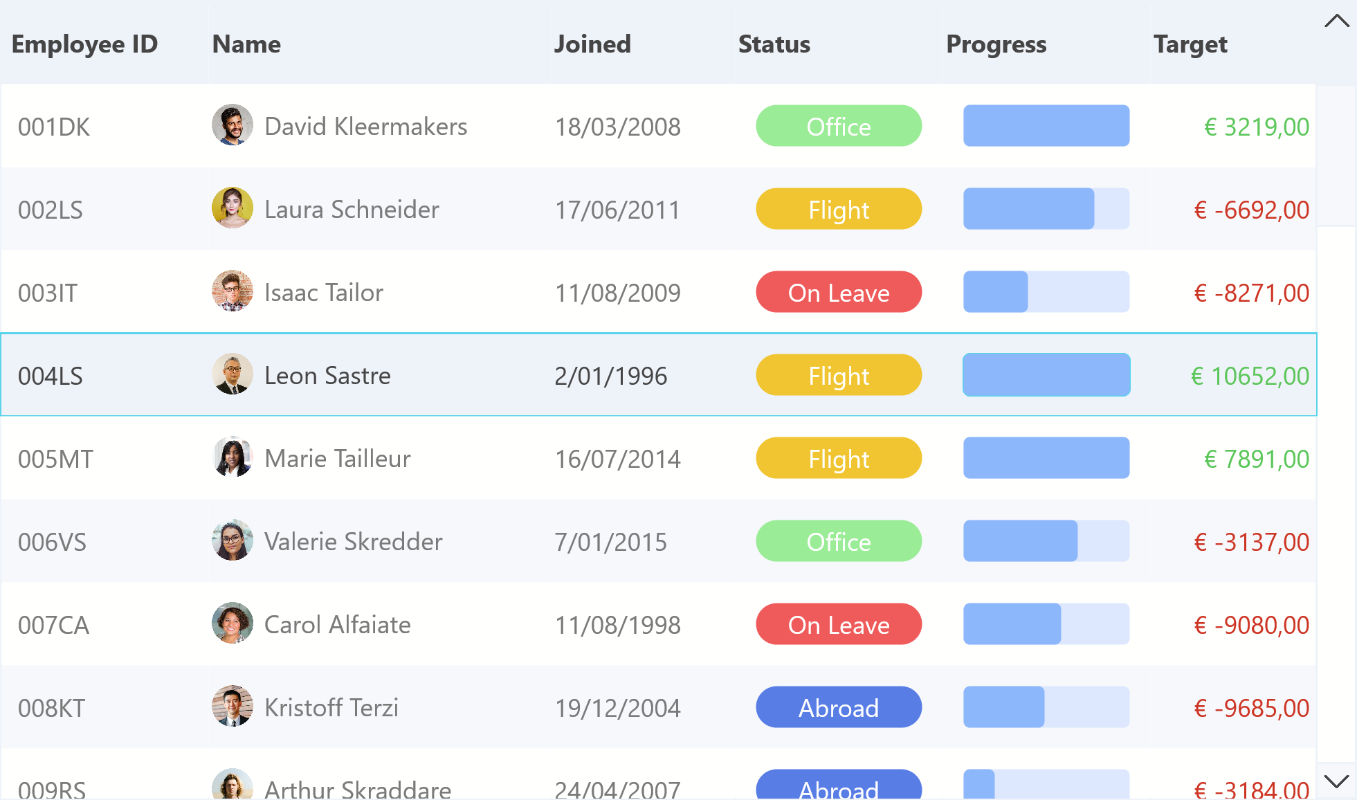
Interactive Buttons in Header and Footer
TTMSFNCDataGrid supports embedding buttons / custom controls in its header and footer, giving developers the power to create personalized UI experiences.
Header Buttons
To add header buttons we can use the following code:
var
  Btn: TTMSFNCDataGridButton;
begin
  Btn := TMSFNCDataGrid1.Header.Bar.Buttons.Add;
  Btn.Text := 'Calculations';
  Btn.OnClick := OnHeaderButtonClick;
These buttons will appear aligned at the top of the grid and automatically adjust their appearance based on the active theme.

Footer Buttons
At the bottom of the grid, we can add a search bar and search button using:
Edit := TEdit.Create(Self);
Edit.Parent := Self;
Edit.Prompt := 'Type in your search query';
TMSFNCDataGrid1.Footer.Bar.Buttons.Add.Control := Edit;

Btn := TButton.Create(Self);
Btn.Parent := Self;
Btn.Text := 'Search';
Btn.OnClick := OnSearchClick;
TMSFNCDataGrid1.Footer.Bar.Buttons.Add.Control := Btn;
This approach makes it easy to implement user-defined data querying directly within the grid.

Dark & Light themes
One of the major advantages of using TTMSFNCDataGrid is its built-in styling awareness. The buttons added to the header and footer automatically adapt to theme changes as well as the built-in icons for actions such as as sorting & filtering. Set the AdaptToStyle property to true to see the applied style coming through. Note that the improvements regarding dark & light themes are not yet available, but will be in the upcoming release.

Whether you're using the grid in light mode or switching to dark mode, all controls retain clarity and consistency without extra styling code. (Used theme: FMX Copper Style)
Conclusion
Header and footer buttons in TTMSFNCDataGrid offer a convenient and stylish way to interact with your data. Whether it’s filtering, sorting, expanding/collapsing groups, or providing a search interface, this functionality lets you bring control closer to the user.
Pieter Scheldeman
Related Blog Posts
-
Next Generation Data Grid for Delphi: Getting Started
-
Next Generation Data Grid for Delphi: Adding, Formatting & Converting Data
-
Next Generation Data Grid for Delphi: Filtering & Sorting
-
Next Generation Data Grid for Delphi: Grouping
-
Next Generation Data Grid for Delphi: Webinar Replay Available!
-
Next Generation Data Grid for Delphi: Cell Controls
-
Next Generation Data Grid for Delphi: Master-Detail
-
Next Generation Data Grid for Delphi: Calculations
-
Next Generation Data Grid for Delphi: Import & Export
-
Next Generation Data Grid for Delphi: Template
-
Next Generation Data Grid for Delphi: Filter Row
-
Next Generation Data Grid for C++: Getting Started
-
Freebie Friday: Next Generation Grid Quick Sample Data
-
Next Generation Data Grid for Delphi: Columns Editor
-
Next Generation Data Grid for Delphi: File Drag & Drop
-
Next Generation Data Grid for Delphi: Visual Grouping
-
Next Generation Data Grid for Delphi: FMX Linux Support
-
Next Generation Data Grid for Delphi: Header & Footer Buttons
-
Next Generation Data Grid for Delphi: Paging
-
Next Generation Data Grid for Delphi: Cell Classes
-
Next Generation Data Grid for Delphi: Excel Style Selection
-
Next Generation Data Grid for Delphi: AutoFill
-
Bridging FlexCel and Our Next-Gen Data Grid
-
Next Generation Data Grid for Delphi: Headless Data Layer

This blog post has received 5 comments.
 2. Monday, July 28, 2025 at 10:20:36 AM
Hi,
2. Monday, July 28, 2025 at 10:20:36 AM
Hi,We are working on other stuff, so it’s unclear. Most likely this week
Pieter Scheldeman
3. Thursday, March 5, 2026 at 11:54:09 AM
Poderia disponibilizar o fonte?
Cardoso Romilson Pereira
4. Thursday, March 5, 2026 at 11:55:16 AM
Correção disponibilizar os exemplos de cada videos.
Cardoso Romilson Pereira
5. Thursday, March 5, 2026 at 1:40:52 PM
Hi, I''ve provided a link to the source via a separate email directly to your address.
Pieter Scheldeman
All Blog Posts | Next Post | Previous Post
Rieger Maximilian