Blog
All Blog Posts | Next Post | Previous Post

 Next Generation Data Grid for Delphi: Visual Grouping
Thursday, May 15, 2025
TMS FNC UI Pack 6.6
Intro
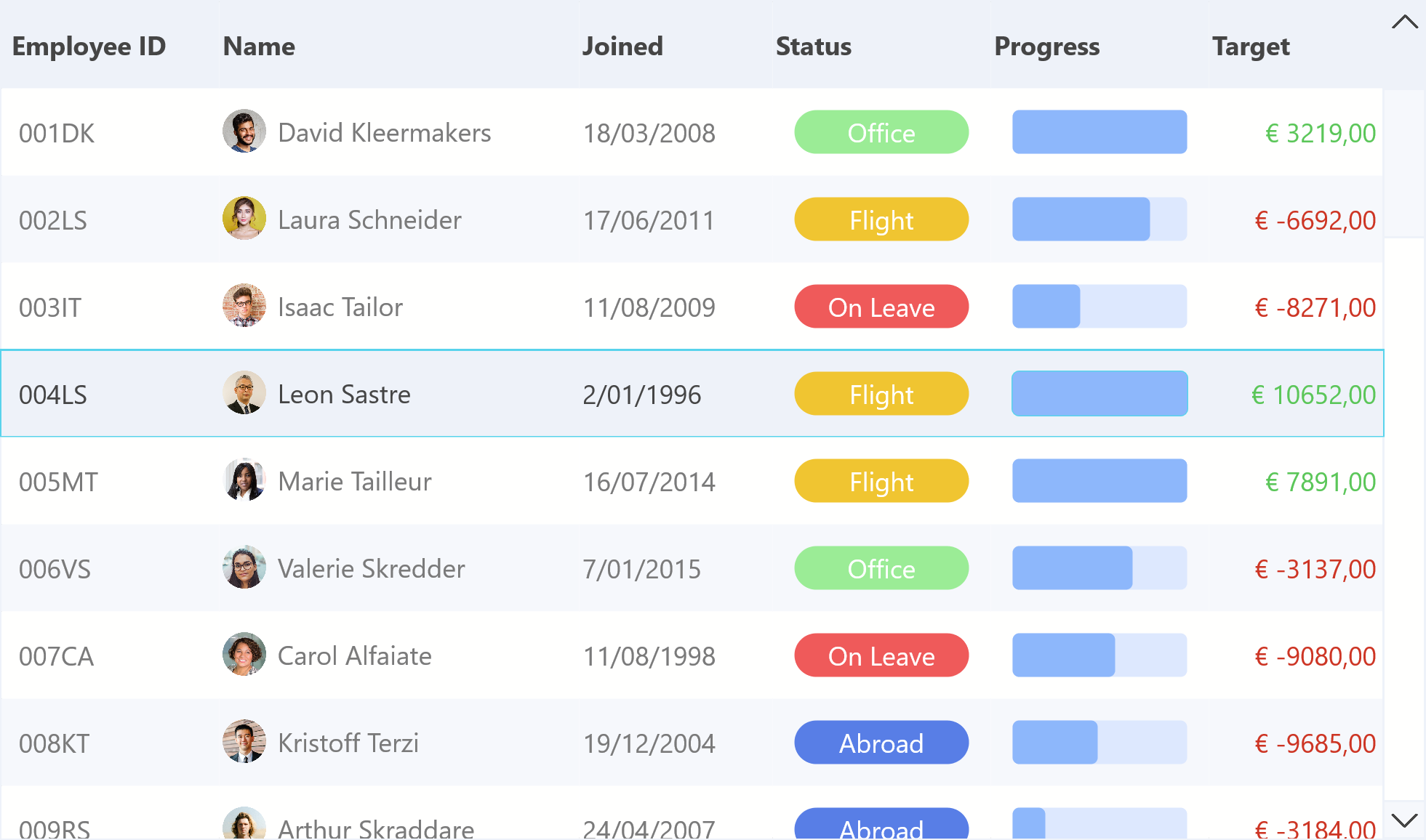
TMS FNC UI Pack 6.6 brings a series of significant improvements and fixes as well as some major new features for the TMS FNC Data Grid. If you’re developing in Delphi and looking for a powerful, flexible, and highly customizable data grid solution, then TMS FNC Data Grid is the perfect choice. In this blog, we'll demonstrate how to display column grouping in a visual way and expose functionality by adding buttons to the header bar.
What is TMS FNC Data Grid?
To have a better understanding on what TMS FNC Data Grid is and has to offer, please read through this blog first.
TMS FNC UI Pack 6.6
This update brings a couple of new features such as
- Visual Grouping in TTMSFNCDataGrid
- ShowFindDialog to programmatically open the find dialog in TTMSFNCMemo
- FilterMode property in TTMSFNCComboBox
- OnTimeLineClick, OnTimeLineDblClick events in TTMSFNCPlanner
Various improvements including
- Message selection events exposed in TTMSFNCChat
- Inplace editor handling improvements in TTMSFNCDataGrid
- SelectAllCells now has a parameter to optionally exclude hidden cells in TTMSFNCDataGrid.
Various fixes
- Designtime crash in combination with TTMSFNCTileList
- Copy & Paste issues in TTMSFNCEdit
- Slow navigation in TTMSFNCTileList
For a full list, navigate to the Version History
TMS FNC Data Grid 1.5
Understanding the Header
Version 1.5 exposes a new property "Header".
The header consists of two main parts:
- Header.VisualGrouping: Used for visual column grouping and interaction
- Header.Bar: Controls the appearance and behavior of the main column header row, including optional UI elements like custom buttons
To visualize the Header use
Grid.Header.Visible := True;
Visual Column Grouping
Visual Column Grouping in TTMSFNCDataGrid enhances header organization by grouping columns under visual levels. This improves clarity and supports drag-and-drop reordering with customizable visual feedback.
Enabling Visual Grouping
You can activate visual grouping and automatic height calculation by configuring the Header.VisualGrouping properties.
Grid.Header.VisualGrouping.Visible := True;
When activating visual grouping, all grouping related activity will be reflected as "header groups" inside the visual header grouping area.

You can freely move around header groups. Click on the optional close button to remove a group. Click on the header group to initiate a column sort. When
Grid.Options.Mouse.ColumnDragging := True;
Header Buttons
TTMSFNCDataGrid allows embedding custom buttons directly into the column headers via the Header.Bar.Buttons collection. These buttons can be used to trigger actions such as filtering, exporting, or toggling display modes.
To visualize the header bar, set
Grid.Header.Bar.Visibile := True;
To add a button to the header bar use the following code
var
  Btn: TTMSFNCDataGridButton;
begin
  Btn := Grid.Header.Bar.Buttons.Add;
  Btn.Name := 'FilterBtn';
  Btn.Text := 'Filter';
  Btn.Visible := True;
  Btn.Enabled := True;
end;
Each button supports:
- Text and/or icon display
- Click handling via OnClick
- Visibility and enable control
- Optional hint and width customization

Video
Sample
Download and start playing around with Visual Grouping in TMS FNC Data Grid
https://download.tmssoftware.com/download/TMSFNCDataGridVisualGrouping.zip
Conclusion
The TMS FNC Data Grid is a powerful and flexible component for Delphi developers, offering extensive features for displaying, managing, and interacting with data. Whether you're building a desktop, mobile or web application, this grid can handle a wide range of data scenarios while providing a sleek, modern user interface.
In this blog, we’ve demonstrated how you can enable the new visual grouping feature as well as displaying buttons in the header bar, but its capabilities go far beyond what we’ve shown here. We encourage you to explore its features to fully unlock its potential in your applications by downloading the new TMS FNC UI Pack 6.6.
To find out more about "Visual Grouping" or "Header Buttons", please read through the documentation: https://download.tmssoftware.com/doc/tmsfncuipack/components/ttmsfncdatagrid/
Pieter Scheldeman
Related Blog Posts
-
Next Generation Data Grid for Delphi: Getting Started
-
Next Generation Data Grid for Delphi: Adding, Formatting & Converting Data
-
Next Generation Data Grid for Delphi: Filtering & Sorting
-
Next Generation Data Grid for Delphi: Grouping
-
Next Generation Data Grid for Delphi: Webinar Replay Available!
-
Next Generation Data Grid for Delphi: Cell Controls
-
Next Generation Data Grid for Delphi: Master-Detail
-
Next Generation Data Grid for Delphi: Calculations
-
Next Generation Data Grid for Delphi: Import & Export
-
Next Generation Data Grid for Delphi: Template
-
Next Generation Data Grid for Delphi: Filter Row
-
Next Generation Data Grid for C++: Getting Started
-
Freebie Friday: Next Generation Grid Quick Sample Data
-
Next Generation Data Grid for Delphi: Columns Editor
-
Next Generation Data Grid for Delphi: File Drag & Drop
-
Next Generation Data Grid for Delphi: Visual Grouping
-
Next Generation Data Grid for Delphi: FMX Linux Support
-
Next Generation Data Grid for Delphi: Header & Footer Buttons
-
Next Generation Data Grid for Delphi: Paging
-
Next Generation Data Grid for Delphi: Cell Classes
-
Next Generation Data Grid for Delphi: Excel Style Selection
-
Next Generation Data Grid for Delphi: AutoFill
-
Bridging FlexCel and Our Next-Gen Data Grid
-
Next Generation Data Grid for Delphi: Headless Data Layer

This blog post has not received any comments yet.
All Blog Posts | Next Post | Previous Post