Frequently Asked Component Specific Questions
Options |
|
Display all FAQ items |
Displaying items 601 to 615 of 888, page 41 of 60
<< previous next >>

 THotSpotImage
Getting started with the HotSpot editor
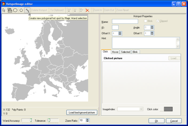
Drop a THotSpotImage on the form and load a background picture via the Picture property. Start the HotSpots editor by clicking the HotSpots property in the Object Inspector.
Select the magic wand tool to automatically select an area:
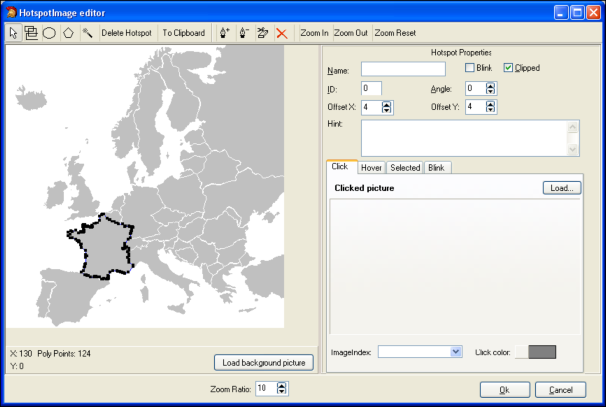
After clicking inside the area of France and going to selection mode again by clicking the first arrow button on the toolbar, this becomes:
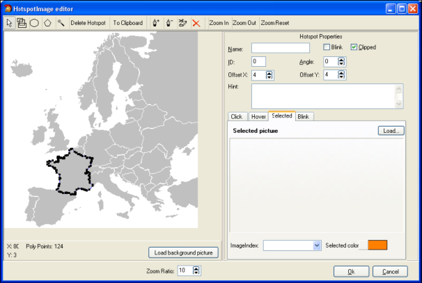
On the right pane, the properties for the hotspot can be edited. The name, ID, Hint, Angle and state of the hotspot can be set. In the different tabs, either image, color or imagelist image can be set for the different states of the hotspot. For example, moving to the Selected tab and setting the Selected color to orange results in:
After clicking the hotspot at runtime to select it, this appears as:
THotSpotImageSaving & loading HotSpots at runtime
Hotspots can be easily saved & loaded at runtime. The HotSpotImage.HotSpots collection has following methods:
THotSpotImage.HotSpots.SaveToStream(S: Stream);
THotSpotImage.HotSpots.LoadFromStream(S: Stream);
THotSpotImage.HotSpots.SaveToFile(FName: string);
THotSpotImage.HotSpots.LoadFromFile(FName: string);
THotSpotImageHow to programmatically add & delete hotspots
It is equally possible to programmatically add & delete hotspots.
This code snippet adds an ellips shaped hotspot to the THotSpotImage:
with HotSpotImage.HotSpots.Add do
begin
   X := 50;
   Y := 50;
   Width := 75;
   Height := 75;
   ShapeType := stEllipse;
   Clipped := true;
   SelectedColor := clLime;
   Hint := 'This is a programmatically added ellipse';
   Name := 'Circle close to Iceland';
   ID := 1;
end;
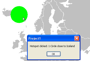
procedure TForm2.HotSpotImageHotSpotClick(Sender: TObject; HotSpot: THotSpot);
begin
  ShowMessage('Hotspot clicked: '+ IntToStr(HotSpot.ID) + ':'+ HotSpot.Name);
end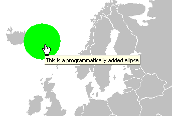
This results in:
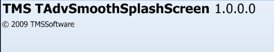
TAdvSmoothSplashScreenVisual organisation of TAdvSmoothSplashScreen
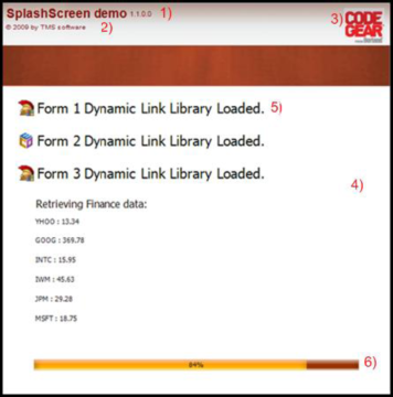
1 & 2) Basic Program Information: The Splash screen allows you to set the program name version number and copyright. With the property AutoLoad the splash automatically loads the project settings from the EXE version info resource.
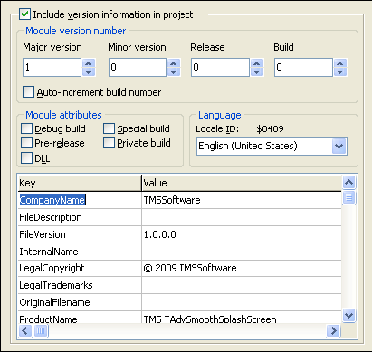
3, 4) The background fill of the splashscreen can contain texture, gradients opacities, etc…
AdvSplashScreen1.Fill.Picture.LoadFromFile('RAD2007.bmp');6) A ProgressBar to display the progress while the application is loading the different elements. Below is a sample on how to simulate a splash screen. The layout will be based on the Office 2007 Luna style. With the basic program information you can automatically display the program name and version that is embedded inside the EXE version info resource.
Code:
var
   I: integer;
begin
   AdvSmoothSplashScreen1.SetComponentStyle(tsOffice2007Luna);
   AdvSmoothSplashScreen1.Height := 150;
   AdvSmoothSplashScreen1.Width := 350;
   AdvSmoothSplashScreen1.CloseOnTimeout := true;
   AdvSmoothSplashScreen1.ListItemsSettings.Rect.Top := 30;
   AdvSmoothSplashScreen1.ListItemsSettings.Rect.Left := 5;
   AdvSmoothSplashScreen1.BasicProgramInfo.AutoLoad := true;
   AdvSmoothSplashScreen1.Show;
   I := 0;
   while I <= 4 do
   begin
      AdvSmoothSplashScreen1.ListItems.Add.HTMLText := 'Loading new Project '+inttostr(I)+' DLL';
      AdvSmoothSplashScreen1.Refresh;
      Sleep(1000);
      Inc(I);
   end;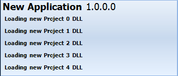
TPlannerAutomatically selecting PlannerItems on mouse hovering
Normally, a PlannerItem is set in the selected state when the mouse clicks the PlannerItem. By default, to start editing a PlannerItem, it is required to first select it and then click again to start editing. It is easy to avoid the first click to select the item by programmatically auto select it on mouse hovering. Following code snippet will perform this automatic selection:
procedure TForm2.Planner1PlannerMouseMove(Sender: TObject; Shift: TShiftState;
  X, Y: Integer);
var
  item: TPlannerItem;
begin
  item := planner1.XYToItem(x,y);
  if Assigned(item) then
    Planner1.Items.Select(item);
end;TPlannerUsing balloons on PlannerItems
To have a balloon showing when the mouse hovers over a Planner item, set Planner.Balloon.Enable = true. It is important that when you create the Planner programmatically or reparent the Planner control, that Planner.Balloon.Enable is only set to true AFTER the parent for the Planner control is set.
Also check if theming is enabled in the project options. Only when theming is enabled in the project options, the balloon will be visible.
TAdvStringGridPersisting grids with images to file
The functions grid.SaveToBinFile / grid.LoadFromBinFile persist grid cell data including cell properties. This can also include objects created in cells. If you want to persist an image set in a cell, make sure to use grid.CreatePicture() as this creates the object managed by the grid. All objects managed by the grid will also be saved when calling grid.SaveToBinFile().
Example:
begin
  AdvStringGrid1.CreatePicture(1,1,false,noStretch,4,haLeft,vaTop).Assign(image1.Picture);
  AdvStringGrid1.SaveToBinFile('.\advgrid.bin');
end;
TAdvSmoothDockUpdate smooth controls faster with BeginUpdate and EndUpdate
This short article describes the use of BeginUpdate and EndUpdate methods to allow faster updating and repainting.
When creating a smooth listbox or a smooth imagelistbox with 500+ items in code, it tends to be slow when starting the application.
For each item that is added / deleted or updated, the listbox is updated. It is just a matter of milliseconds to update the listbox for one item, but imagine the time that is needed to update 500 items. And these items are drawn with the default layout. With more advanced items the update process can be painfully slow.
Because we cannot predict when the user wants to update the listbox, we have implemented a BeginUpdate and EndUpdate which *blocks* the painting of the listbox until the EndUpdate is called. Then all the calculations and painting is executed once, with all the new information the user has inserted in the items.
Below is a code sample based on the TAdvSmoothListBox component to update all items between a BeginUpdate and EndUpdate.
var
  i: integer;
begin
  AdvSmoothListBox1.Items.BeginUpdate;
  for I := 0 to AdvSmoothListBox1.Items.Count - 1 do
  begin
    AdvSmoothListBox1.Items[i].Caption := 'Item Updated !';
  end;
  AdvSmoothListBox1.Items.EndUpdate;
Important note !: All BeginUpdate calls must end with an EndUpdate. In other words: The count of BeginUpdate and EndUpdate calls must be equal. When this condition is false, the listbox will not update, and the listbox will not respond to other update calls.
A List of components which currently implement the BeginUpdate and EndUpdate:
- AdvSmoothListBox (AdvSmoothListBox.Items.BeginUpdate / EndUpdate)
- AdvSmoothImageListBox (AdvSmoothImageListBox.Items.BeginUpdate / EndUpdate)
- AdvSmoothDock (AdvSmoothDock.BeginUpdate / EndUpdate)
- AdvSmoothExpanderGroup (AdvSmoothExpanderGroup.BeginUpdate / EndUpdate)
- AdvSmoothSplashScreen (AdvSmoothSplashScreen.BeginUpdate / EndUpdate)
- AdvSmoothTimeLine (AdvSmoothTimeLine.BeginUpdate / EndUpdate)
- AdvSmoothTouchKeyBoard (AdvSmoothTouchKeyBoard.Completion.BeginUpdate / EndUpdate)
TAdvSmoothMegaMenuAdding different items
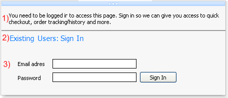
1) This is a section menu item with itemtype itNormal. The text property has been set with no extra functionality.
2) This is a section menu item with itemtype itHeader. The text property has been set with a different font and color. The difference between item number 1 and 2 is that an item with itemtype itHeader does not respond to hovering or selection. Between item 1 and 2 there is a thin line that separates item 1 and 2. This is a section menu item with itemtype itLineSeparator. The fill of this separator can be changed in the itemappearance of a section.
3) This is an item with no text, and only the control property has been set. The controls are bundled in a panel container and the panel is used in the control property of an item.
Below is the code to add those three items:
with Items.Add do
begin
  Text.Text := 'You need to be logged in to access this page. Sign in so we can give you access to quick checkout, order tracking/history and more.';
  ItemType := itNormal;
end;

Items.Add.ItemType := itLineSeparator;

with Items.Add do
begin
  Text.Text := 'Existing Users: Sign In

';
  ItemType := itHeader;
end;

with Items.Add do
begin
  ControlType := ctControl;
  Control := Panel1;
end;
TAdvMoneyEditUsing the Extrabuttons
You can define the caption of the extra buttons via AdvMoneyEdit.ExtraButtons.Extra1,AdvMoneyEdit.ExtraButtons.Extra2,.. properties.
The click on such button is handled from the OnExtraButtonClick event.
This passes the index of the button and the value in the edit control.
From there you can perform a function.
For example, if you set Extra1 := 'SQRT'; you could implement the function as:
procedure TForm2.AdvMoneyEdit1ExtraButtonClick(Sender: TObject; idx:
Integer;
  var value: Extended);
begin
  if (idx = 1) then
    value := sqrt(extended);
end;TAdvSmoothMegaMenuCreating and saving new themes
The AdvSmoothMegaMenu component look and feel can easily be changed with default appearance properties. There are default properties for a top layer item, a section item, and a section. When you change these default properties, the new item that is added will take over those settings.
This way you must not change the properties for each toplayer, section or section item in a menu. When setting default properties, these properties can be saved to theme‟s. By default there are a few sample theme‟s that are built-in. To save your theme use this code below:
var
  sd: TSaveDialog;
begin
  AdvSmoothMegaMenu1.ApplyMenuItemDefault(0, 0, 0);
  sd := TSaveDialog.Create(Application);
  sd.Filter := 'Mega Menu Theme files (*.MMProp)|*.MMProp';
  if sd.Execute then
begin
  AdvSmoothMegaMenu1.SaveToFile(sd.FileName);
end;
  sd.Free;
end;
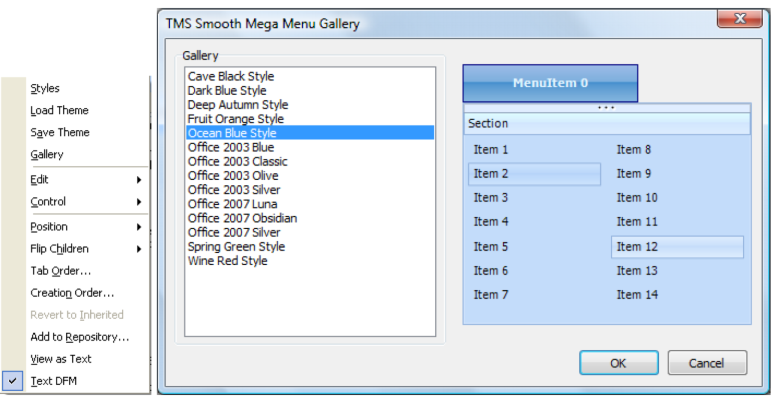
You can Load and Save theme‟s by right clicking on the AdvSmoothMegaMenu component. The sample theme‟s can also be chosen from the gallery.
TAdvSmoothMegaMenuAdding TWinControl descendent components to a menu item
There is an extra user definable type to insert your own TWinControl descendant controls to the item of the sub menu. Set ControlType to ctControl and Assign a TWinControl descendant to the Control property of an item.
TAdvSmoothMegaMenuAdding built-in controls to an item
Each item has a ControlType property. When you want to quickly customize a large amount of checkboxes, radiobuttons or edit controls you can choose the corresponding control type and the mega menu will automatically add the control of your choice.
When choosing ctCheckBox or ctRadioButton the event OnMenuSubItemCheckChanged can be used to determine which items are checked / unchecked.
For the ctRadioButton a GroupIndex property is added to the section item to allow the radiobutton to act as a radiogroup with other items of the same groupindex. The last built-in type you can choose is a ctEdit type and can only be indented with the ControlIndent property. To get the text of the ctEdit textbox use the OnMenuSubItemEditChanged event.
TAdvSmoothMegaMenuVisual organisation of TAdvSmoothMegaMenu
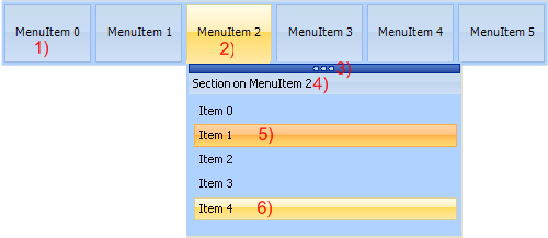
1) Root menu item. The root menu item can contain images, multiline text, HTML formatted text. The root menu items can be organized vertically or horizontally.
2) Selected root menu item with its menu dropdown: This menu dropdown can contain sections, top layer items, each root menu item has a separate fill for normal, hovered, selected and disabled state.
3) Tear-off strip: When the tear-off functionality is enabled you can “tear-off” the sub menu from the root menu item. After tear-off, the menu dropdown remains fully functional. To hide the sub menu click on the corresponding root menu. Multiple menus of a TAdvSmoothMegaMenu can be in “tear-off” state.
4) Section: The section caption has a separate fill and can be switched on/off. The section height and width can be set or can be automatically calculated. The menu dropdown can contain multiple sections and sections can be positioned vertical or horizontal.
5 - 6) Section items: Each section can be populated with feature-rich items. Items can contain HTML text, controls, images and have a normal, hovered, selected or disabled fill appearance. Items can have a different type depending on the needed functionality. These item types are: Normal, Header, Separator, LineSeparator, Break, LineBreak.
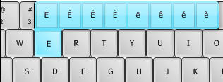
TAdvSmoothTouchKeyboardAdding SubKeys
This is an extra feature to allow certain Keys that are not included in the default keyboard layout to be shown. When adding characters to the SubKey collection of a single key, visually nothing will change by default. Only when holding the left mouse button a window pops up which shows the added subkeys.