Frequently Asked Component Specific Questions
Options |
|
Display all FAQ items |
Displaying items 1 to 1 of 1, page 1 of 1
<< previous next >>

 TAdvSmoothMegaMenu
Adding different items
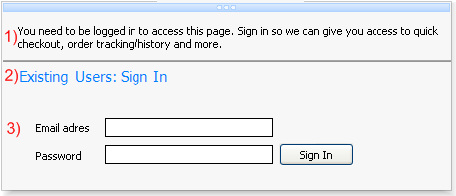
1) This is a section menu item with itemtype itNormal. The text property has been set with no extra functionality.
2) This is a section menu item with itemtype itHeader. The text property has been set with a different font and color. The difference between item number 1 and 2 is that an item with itemtype itHeader does not respond to hovering or selection. Between item 1 and 2 there is a thin line that separates item 1 and 2. This is a section menu item with itemtype itLineSeparator. The fill of this separator can be changed in the itemappearance of a section.
3) This is an item with no text, and only the control property has been set. The controls are bundled in a panel container and the panel is used in the control property of an item.
Below is the code to add those three items:
with Items.Add do
begin
  Text.Text := 'You need to be logged in to access this page. Sign in so we can give you access to quick checkout, order tracking/history and more.';
  ItemType := itNormal;
end;

Items.Add.ItemType := itLineSeparator;

with Items.Add do
begin
  Text.Text := 'Existing Users: Sign In

';
  ItemType := itHeader;
end;

with Items.Add do
begin
  ControlType := ctControl;
  Control := Panel1;
end;