Frequently Asked Component Specific Questions
Options |
|
Display all FAQ items |
Displaying items 91 to 105 of 508, page 7 of 34
<< previous next >>

 TMS VCL Chart
Adding single, multi points
Depending on the chosen chart type different methods are available to add series data point values to a series. This is done via a number of overload functions of AddSinglePoint and AddMultiPoint. For some chart types, a single value per series data point is sufficient. Other chart types such as a band chart or OHLC chart require 2 or 4 values per series data point. Additional settings per data point might be necessary such as a specific chart X-axis value for a data point or a color of a data point for a histogram.
The easiest way to add points is with the method AddSinglePoint or AddMultiPoint. Alternatively the methods SetSinglePoint or SetMultiPoint can also be used to change values of some data points in a serie. Note though that when no data points are added in the series, it is required to set the number of points first with the method SetArraySize() before using SetSinglePoint or SetMultiPoint. In this example we use the Add Methods:
Example: Adding some random points for different chart types.
procedure TForm1.AddRandomSinglePoints;
var
  i: integer;
begin
  with AdvChartView.Panes[0].Series[0] do
  begin
    //Applies to ctLine, ctDigitalLine, ctBar, ctArea, ctHistogram, ctLineBar,
    //ctLineHistogram, ctStackedBar, ctStackedArea, ctStackedPercBar,
    //ctStackedPercArea, ctMarkers
    for i := 0 to 10 do
      AddSinglePoint(Random(50));
    //Applies to ctArrow, ctError, ctScaledArrow, ctBubble,
    //ctScaledBubble (Random points with X an Y offset)
    for i := 0 to 10 do
      AddPoints(Random(50), XOffset, YOffset);
  end;
end;

procedure TForm1.AddRandomMultiPoints;
var
  i: integer;
begin
  with AdvChartView.Panes[0].Series[0] do
  begin
     //Randomly add some points ranging from 0 to 10
    //Applies to ctCandleStick, ctOHLC, ctLineCandleStick
    for i := 0 to 10 do
      AddMultiPoints(Random(50), Random(50), Random(50), Random(50));
  end;
end;Example: Adding points for every month of the year.
You can quickly add custom text to the X-axis by using one of the overloaded AddSinglePoint methods.
for I := 0 to 11 do
begin
  AdvChartView1.Panes[0].Series[0].AddSinglePoint(Random(100) + 10,
  ShortMonthNames[I + 1]);
end;
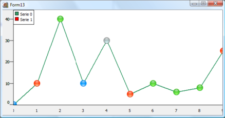
TMS VCL ChartCustomizing the drawing of the markers.
A marker can be selected. Set the SelectedColor and the SelectedSize property. Click on the marker at runtime, the marker will be shown in the selected color & size. To add code when a marker is clicked you can use the SerieMouseDown or SerieMouseUp event. This can be used for example to add an annotation at a specific point of the series.
It is possible to customize the drawing of the markers. Select mCustom as marker type and use the event OnMarkerDrawValue. Follow sample code snippet shows how this can be done:
type
  TForm1 = class(TForm)
  private
     { private declarations }
  public
     { public declarations }
    procedure DrawMarker(Sender: TObject; Serie: TChartSerie; Canvas: TCanvas; X, Y,Point: integer; value: TChartPoint);
end;AdvChartview.Panes[0].Series[0].OnMarkerDrawValue := DrawMarker;
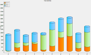
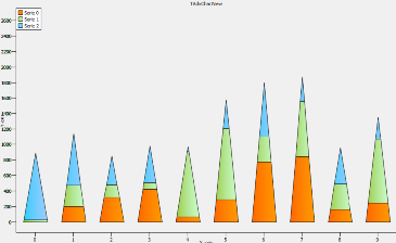
TMS VCL ChartChanging different bar chart types to cylinder shape or pyramid shape
When adding new bar type charts the shape of the bar is bsRectangle by default. When changing the BarShape property on Series level the shape of the bar can be a Rectangle, Cylinder or a Pyramid.
Below is a sample that demonstrates the different shapes with one line of code for each series.
AdvGDIPChartView1.Panes[0].Series[0].BarShape := bsRectangle;
AdvGDIPChartView1.Panes[0].Series[1].BarShape := bsRectangle;
AdvGDIPChartView1.Panes[0].Series[2].BarShape := bsRectangle;
AdvGDIPChartView1.Panes[0].Series[0].BarShape := bsCylinder;
AdvGDIPChartView1.Panes[0].Series[1].BarShape := bsCylinder;
AdvGDIPChartView1.Panes[0].Series[2].BarShape := bsCylinder;
AdvGDIPChartView1.Panes[0].Series[0].BarShape := bsPyramid;
AdvGDIPChartView1.Panes[0].Series[1].BarShape := bsPyramid;
AdvGDIPChartView1.Panes[0].Series[2].BarShape := bsPyramid;
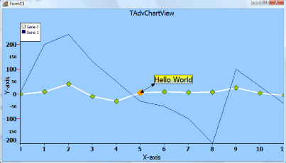
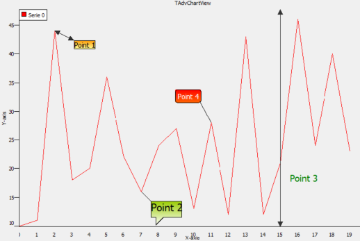
TMS VCL ChartAdding and removing annotations
Start the AnnotationEditorDialog and click on the- sign to remove or the + sign to add an annotation. You can add multiple annotations per series. Here is an example to remove an annotation and to add an annotation to the first series of the first pane.
procedure TForm1.AddNewAnnotation;
var
  ca: TChartAnnotation;
begin
  ca := AdvChartView.Panes[0].Series[0].Annotations.Add;
  // set properties of the chart annotation here
end;

procedure TForm1.RemoveAnnotation;
begin
  AdvChartView.Panes[0].Series[0].Annotations[0].Free;
end;
Example with annotations:
procedure TForm1.AddNewAnnotation;
begin
  with AdvChartView.Panes[0].Series[0].Annotations.Add do
  begin
    // ADD ALL CODE TO SET PROPERTIES HERE EXAMPLE:
    Shape := asBalloon;
  end;
end;Balloon, Circle, RoundRectangle, Rectangle : Shapes to wrap around the text.
Line: a line drawn from top to bottom on the X-position of the point.
Offset (X, Y): the text offset from the X, Y- position of the point.
Here is a screenshot with the different shapes.
TMS VCL ChartUsing the Zoom Control Window in TAdvGDIPChartView
TMS Advanced Charts also comes with a GDI+ version of TAdvChartView and adds extra features such as a special zoom control window.
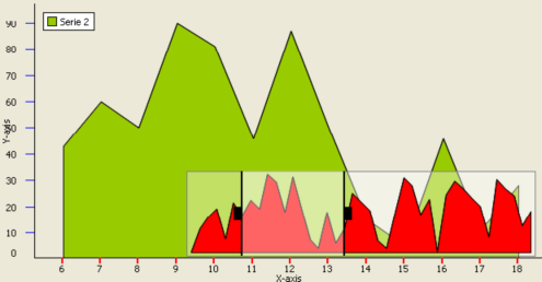
The zoom control window allows the user to navigate through the chart and always displays the complete chart range by default. There are 2 handles that can be dragged left or right representing the RangeFrom and RangeTo of the Chart. The zoom control appearance can be customized in the GDI+ Panes Editor Dialog.
When you start the application, the zoomcontrol window will be empty. Therefore it is important to link the series by setting the SerieType property of TAdcChartSerie. The SerieType property specifies how and what series from the series collection of the chart is used on the zoomcontrol.
stNormal: This is the default value, the series will not be visible in the zoom control window.
stZoomControl: The series will only be displayed in the zoom control window.
stBoth: The series will be displayed in the zoom control window and as a normal series.
By default the chart will be automatically updated when changing the range. The property AutoUpdate can be changed to update immediate, upon release of the mouse button, or no automatic update. When no automatic update is set, you can use the 3 events below:
OnZoomControlRangeChanged: Event triggered when Range is updated after mouse button release
OnZoomControlRangeChanging: Event triggered when Range is updated when mouse is moving
OnZoomControlSelection: Event triggered when Range is updated after dragging the Selection area between the range from and range to.
TMS VCL ChartLinking TMS Advanced Charts with databases
TMS Advanced Charts has the ability to link with databases and automatically add points from record fields. To do this, the DB-aware chart can be linked to a dataset via a datasource and the dataset field can be choosen for the values of a series and optionally a different dataset field can be chosen as X-axis values. The DB-aware chart will automatically load values of all rows in the dataset as series data points and it will also automatically update values when the dataset is being edited or when new rows are inserted in the dataset.
Connecting DataSource to the Chart
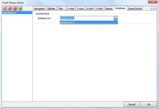
Drop a TDBAdvGDIPChartView on the form. When double-clicking the chart view, the panes editor dialog shows and a new tabsheet named Database.
Drop a TTable component on the form. Choose DBDemos as database and employees.db as tablename. Then link the TTable to the TDataSource by choosing Table1 as Dataset.
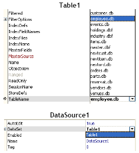
Double-click on the chart to start the panes editor dialog. Go to the TabSheet Database and select DataSource1 as DataSource property. Return to the form and set Active to true on Table1 dataset.
Connecting Fields to Series
After setting the DataSource on the chart the series are aware of the selected tablename and will display the fields of the table employees.db
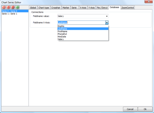
Remove the 2 other series and leave series 0. Select Salary as Fieldname value for Series 0 and LastName as Fieldname X-Axis for Series 0. After saving the changes, the chart will automatically be updated with every record that exists in the database. Choose a line type and change the AutoRange to arEnabled for automatic Y-Range.
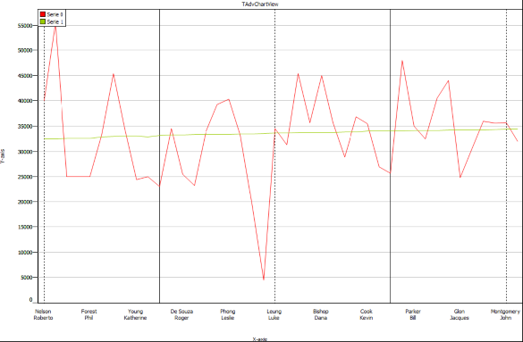
Result:
TMS VCL ChartProgrammatic use of DBAdvChartView & TDBAdvGDIPChartView
Below is a code sample to show values from a Microsoft Access Database, using an AdoDataSet, AdoConnection and a Datasource.
Drop a TDBAdvGDIPChartView, TAdoConnection, TAdoTable and a TDataSource on the form. Insert this code in the procedure FormCreate:
procedure TForm1.FormCreate(Sender: TObject);
var
I: integer;
begin
DBAdvGDIPChartView1.Panes[0].BorderColor := clBlack;
DBAdvGDIPChartView1.Panes[0].BorderWidth := 3;
with DBAdvGDIPChartView1.Panes[0] do
begin
Series.Clear;
//Set connection string to database
ADOConnection1.ConnectionString :=
'Provider=Microsoft.Jet.OLEDB.4.0;Data
Source=sales.mdb;Persist Security Info=False';
ADOConnection1.Connected := true;
//Set tablename
ADOTable1.Connection := ADOConnection1;
ADOTable1.TableName := 'Sales';
//link to Datasource and datasource to chart
DataSource1.DataSet := ADOTable1;
//Datasource property of Chart
DataSource := DataSource1;
XAxis.Position := xNone;
YAxis.Position := yNone;
Title.Color := RGB(255, 255, 210);
Title.ColorTo := RGB(255, 255, 210);
Title.BorderColor := clBlack;
Title.BorderWidth := 1;
Title.GradientDirection := cgdVertical;
Title.Size := 50;
Title.Text := 'Database Spider Chart';
Title.Font.Size := 14;
Title.Font.Style := [fsBold];
Background.GradientType := gtHatch;
Background.HatchStyle := HatchStyleWideDownwardDiagonal;
Background.Color := RGB(255, 255, 210);
BackGround.ColorTo := clWhite;
Legend.Visible := false;
Margin.LeftMargin := 0;
Margin.rightMargin := 0;
Margin.TopMargin := 0;
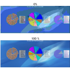
series.DonutMode := dmStacked;
YAxis.AutoUnits := false;
YGrid.MajorDistance := 50;
YGrid.MinorDistance := 10;
YGrid.MinorLineColor := clSilver;
YGrid.MajorLineColor := clDkGray;
YGrid.MinorLineStyle := psDash;
Series.Add;
with Series[0] do
begin
Pie.LegendOffsetTop := (Self.Height div 2) - 150;
Pie.LegendColor := clRed;
Color := clRed;
FieldNameValue := 'Product X';
FieldNameXAxis := 'Sales by Region';
LegendText := 'Product X';
Pie.LegendTitleColor := clRed;
Pie.ValueFont.Color := clRed;
end;
Series.Add;
with Series[1] do
begin
Pie.LegendOffsetTop := (Self.Height div 2);
Pie.LegendColor := clGreen;
Color := clGreen;
Pie.ShowGrid := false;
YAxis.Visible := false;
FieldNameValue := 'Product Y';
FieldNameXAxis := 'Sales by Region';
LegendText := 'Product Y';
Pie.LegendTitleColor := clGreen;
Pie.ValueFont.Color := clGreen;
End;
Series.Add;
with Series[2] do
begin
Pie.LegendOffsetTop := (Self.Height div 2) + 150;
Pie.LegendColor := clBlue;
Color := clBlue;
Pie.ShowGrid := false;
YAxis.Visible := false;
FieldNameValue := 'Combined';
FieldNameXAxis := 'Sales by Region';
LegendText := 'Combined';
Pie.LegendTitleColor := clBlue;
Pie.ValueFont.Color := clBlue;
end;
for I := 0 to Series.Count - 1 do
begin
with Series[I] do
begin
YAxis.MajorUnit := 50;
YAxis.MajorUnit := 25;
Pie.LegendTitleVisible := true;
Pie.LegendOpacity := 50;
Pie.LegendOpacityto := 0;
Pie.LegendTitleOpacity := 50;
Pie.LegendGradientType := gtForwardDiagonal;
Pie.LegendBorderColor := clBlack;
Pie.Position := spCustom;
Pie.Left := self.Width div 3;
Pie.Top := self.Height div 2;
Pie.LegendFont.Size := 10;
ValueFormat := '$%g,000';
Pie.ValueFont.Size := 10;
ChartType := ctSpider;
Opacity := 50;
LineColor := clBlack;
AutoRange := arCommonZeroBased;
Pie.Size := 400;
Pie.ShowValues := true;
Pie.ValuePosition := vpOutSideSlice;
Pie.LegendPosition := spCustom;
Pie.LegendOffsetLeft := Self.Width - 150;
end;
end;
// open connection
ADOTable1.Active := true;
end;
end;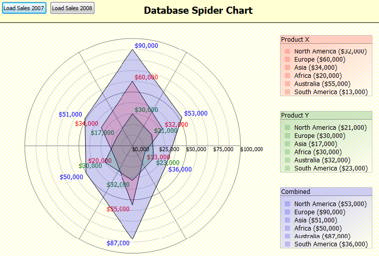
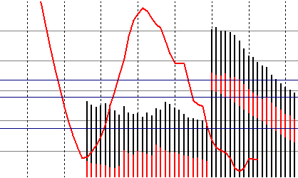
TMS VCL ChartAdding Special Series
TMS Advanced Charts allows you to add trend lines, moving averages, line series and band series. This series is not visible in the legend and will be used as an extra calculated data � series. These series are automatically calculated from specific values in a defined range from series available in the chart. As such, it is mandatory to first add the series values and when values are added, call the method to calculate the trend line series, moving averages series etc�
Trend Channel
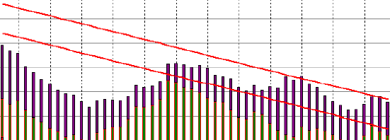
Moving Average
Below are the method definitions that can be used to add informational series to the chart.
procedure AddLineSerie(startx, endx: integer; startvalue, endvalue: Double; UseCommonYRange: Boolean = true; serielinecolor: TColor = clBlack; serielinewidth: integer = 1);

procedure AddBandSerie(startx, endx: integer; startvalue1, startvalue2, endvalue1,endvalue2: Double; UseCommonYRange: Boolean = true; serielinecolor: TColor = clBlack; serielinewidth: integer = 1;seriebandcolor: TColor = clGray);

procedure AddTrendLine(serieindex, startx, endx: integer; UseCommonYRange: Boolean = true; serielinecolor: TColor = clBlack; serielinewidth: integer = 1);

procedure AddTrendChannel(serieindex, startx, endx: integer; UseCommonYRange: Boolean = true; serielinecolor: TColor = clBlack; serielinewidth: integer = 1);

procedure AddTrendChannelBand(serieindex, startx, endx: integer; UseCommonYRange: Boolean = true; serielinecolor: TColor = clBlack; serielinewidth: integer = 1; seriebandcolor: TColor = clGray);

procedure AddMovingAverage(serieindex, startx, endx, window: integer; UseCommonYRange: Boolean = true; serielinecolor: TColor = clBlack; serielinewidth: integer = 1);

procedure AddParetoLine(serieindex, startx, endx: integer; UseCommonYRange: Boolean = true; serielinecolor: TColor = clBlack; serielinewidth: integer = 1);
TMS VCL ChartSaving and restoring TAdvChartView settings
All properties of the TAdvChartView can be saved to a .Chart file. If you close the application and load the .Chart file, all settings will be restored. Here is an example of saving / reloading settings in code.
Save settings:
procedure TForm1.SaveToFile1Click(Sender: TObject);
begin
  if SaveDialog1.Execute then
  begin
    AdvChartView1.SaveToFile(SaveDialog1.FileName);
    ShowMessage('Settings Saved');
  end;
end;procedure TForm1.LoadSettings1Click(Sender: TObject);
begin
if OpenDialog1.Execute then
begin
AdvChartView1.LoadFromFile(OpenDialog1.FileName);
ShowMessage('Settings Loaded');
end;
end;
TMS VCL ChartPrinting
The support for printing in TAdvChartView is on level of panes. The chart can print a single pane or can print all panes at once. As the print function just sends the chart to a destination Canvas, the print function can be used to send the chart to a printer device but it can be used to send the output also to a memory bitmap canvas:
Print on a printer
if PrinterSetupDialog1.Execute then
begin
  with printer do
  begin
    BeginDoc;

    //The rectangle to print the AdvChartView.
    r := Rect(0, 0, printer.PageWidth, printer.PageHeight);

    AdvChartView.PrintAllPanes(Printer.Canvas, r);
    //OR print a single pane.
    AdvChartView.PrintPane(0, Printer.Canvas, r);

    EndDoc;
  end;
end;if SavePictureDialog1.Execute then begin //for example the size of the picture has been set to a 1280 x 1024 //resolution. AdvChartView1.SaveAllPanesToBitmap(SavePictureDialog1.FileName ,1280, 1024); end;
TMS VCL ChartExporting to PNG, JPEG, TIFF, BMP or GIF files (GDI+)
Saving to a Windows bitmap file offers good quality but generates large files. You can save the AdvChartView to different image formats to improve / reduce the size and quality. The image formats currently supported are JPEG, PNG, BMP, GIF, TIFF. You can also save a single pane to a different image format. Using the method SaveToImage(), by default the image will be saved to Windows bitmap (BMP) format. If you set the extra format parameter (itJPEG, itBMP, itPNG, itGIF, itTIFF), you can choose in which encoded image type your result image will be saved.
Example:
Save to a jpeg with 50 % quality (quality only has effect on the jpeg format).
if SavePictureDialog1.Execute then
begin
  //for example the size of the picture has been set to a 1000 x 500
  //resolution.
  AdvChartView1.SaveToImage(SavePictureDialog1.FileName, 1000, 500, itJPEG, 50);
end;
if SavePictureDialog1.Execute then
begin
  //for example the size of the picture has been set to a 1000 x 500
  //resolution.
  AdvChartView1.Panes[0].Chart.SaveToImage(SavePictureDialog1.FileName, 1000, 500, itPNG);
end;
TPlannerVisual organisation of TPlanner / TDBPlanner
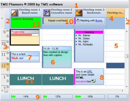
1) TPlanner caption Settings are controlled through the Planner.Caption property. It can be selected whether the caption is visible or not.
2) TPlanner navigator buttons
Settings are controlled through the Planner.NavigatorButtons property. It can be selected whether the Navigator buttons are visible or not.
3) TPlanner sidebar Settings are controlled through the Planner.Sidebar property. The Sidebar can be visible or not. It can be at left side, right side, top side or repeated between column in the grid.
4) TPlanner header Settings are controlled through the Planner.Header property. It can be selected whether the header is visible or not.
5) TPlanner grid
Various settings are controlled through the Planner properties as well as Planner.Display property
6) TPlannerItem
Normal text TPlannerItem with caption with time indication.
7) TPlannerItem Rich text TPlannerItem with fixed text caption.
8) TPlannerItem
HTML formatted TPlannerItem with gradient caption. The TPlannerItem can hold links to URLs or application handled anchors.
9) TPlanner footer Zone where completion of a resource can be displayed by a progress bar.
10) TPlannerItem In header displayed TPlannerItem.
11) TPlannerItem
Background TPlannerItem.
12)
TPlanner header custom drawing.
TPlanner supports a vertical view (as shown above) as well as a horizontal view. In the horizontal view, all elements of the TPlanner simply rotated. This means that the Sidebar here at left is displayed on top and the header and navigator buttons are displayed at the left side in horizontal mode. The position coordinates of TPlannerItem objects along vertical and horizontal axis in vertical mode become the coordinates along horizontal and vertical axis respectively in horizontal mode. The TPlanner component can be easily switched from vertical view to horizontal view by setting the TPlanner.Sidebar.Position property to spTop.
TPlannerProgrammatically setting header captions/group captions/custom groups
This planner header shows normal header captions and group captions

Programmatically, this can be set by filling the Planner.Header.Captions and Planner.Header.GroupCaptions stringlists in following way:
with Planner1.Header do
begin
  Captions.Clear; GroupCaptions.Clear;
  Captions.Add(''); // take first sidebar header section into account
  Captions.Add('A1');
  Captions.Add('A2');
  Captions.Add('A3');
  GroupCaptions.Add('Group A');
  Captions.Add('B1');
  Captions.Add('B2');
  Captions.Add('B3');
  GroupCaptions.Add('Group B');
end;This is line1
and here line 2
In the example above, the header group size is equal for all groups and is set by the property Planner.PositionGroups. In order to show different group sizes for different columns, the Planner.Header.CustomGroups can be used. To use custom position groups, set Planner.PositionGroups to 1. The code snippet below produces a header with 3 groups with respectively a span of 2 positions, span of 3 positions and span of 1 position:
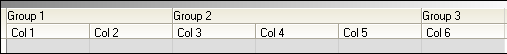
var
  i: Integer;
begin
  with planner1.Header do
  begin
    CustomGroups.Clear;
    with CustomGroups.Add do
    begin
      Caption := 'Group 1';
      Span := 2;
    end;
    with CustomGroups.Add do
    begin
      Caption := 'Group 2';
      Span := 3;
    end;
    with CustomGroups.Add do
    begin
      Caption := 'Group 3';
      Span := 1;
    end;

    Captions.Clear;
    Captions.Add('');
    for i := 1 to 6 do
      Captions.Add('Col '+inttostr(i));
    end;
end;TPlannerProgrammatically add an item and update non visible item indicators
When the Planner can be scrolled, little arrow indicators in the sidebar can indicate the presence of events in the non-visible regions of the planner grid. In the example screenshot below, this means that more items are present in the grid on the right side of the currently visible item.
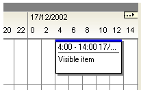
The feature is enabled by setting Planner.IndicateNonVisibleItems = true. The indicators are automatically displayed and updated when items are created or when the planner grid is scrolled. Whenever items are programmatically created, an update of the non visible item indicators can be forced with: Planner.UpdateNVI;
Example:
with Planner.CreateItem do
begin
  itembegin := 33;
  itemend := 37;
  completiondisplay := cdHorizontal;
  completion := 80;
end;
Planner.UpdateNVI;
TPlannerDisplaying multiple images in the TPlannerItem caption
Images in the TPlannerItem caption should be stored in the imagelist assigned to the TPlanner.PlannerImages property. Any number of images can be displayed in the caption by adding the image indexes to the public property TPlannerItem.ImageIndexList. This is a TList of integer values. To set image 2 and image 4 of the imagelist in the caption, following code can be used :
PlannerItem.ImageIndexList.Add(2);
PlannerItem.ImageIndexList.Add(4);