Tips and Frequently Asked Questions

 How to create programatically a plannerItem and start an ItemEditor
Example:
var
  plit: TPlannerItem;
begin
  plit := planner1.CreateItem;
  plit.itembegin := 4;
  plit.itemend := 6;
  plit.itempos := 0;
  plIt.Edit;
end;


 SelectPosRestricted property
When you want to control that when a user starts a selection within a position (resource) in the Planner, the select-drag will be restricted to the position where the select-drag started, a new property is available:
Planner.SelectPosRestricted: boolean;
Set this to true and even when columns or rows for resources are small and sometimes difficult to keep the mouse in the same resource during long select-drag operations, the selection will remain within the originally selected resource.

 Position gap area colors
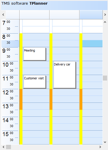
With the new OnPositionGapProp() event in T(DB)Planner, it is now possible to color code particular things in the position gap area. The position gap is enabled with setting Planner.PositionGap to a value different from zero. When this is enabled, the event OnPositionGapProp is triggered and via ABrush & APen properties, the position gap area color can be dynamically changed.
Sample code:
var
    workhourstart: TDateTime;
    workhourend: TDateTime;
    lunchhourstart: TDateTime;
    lunchhourend: TDateTime;

procedure TForm4.FormCreate(Sender: TObject);
begin
  Planner1.PositionGap := 10;

  workhourstart := EncodeTime(8,0,0,0);
  workhourend := EncodeTime(17,0,0,0);
  lunchhourstart := EncodeTime(12,0,0,0);
  lunchhourend := EncodeTime(13,0,0,0);
end;

procedure TForm4.Planner1PositionGapProp(Sender: TObject; Position,
  Index: Integer; ABrush: TBrush; APen: TPen);
var
  dt: TDateTime;
begin
  dt := Frac(Planner1.CellToTime(Position, Index));

  if (dt >= workhourstart) and (dt <= workhourend) then
  begin
    ABrush.Color := clYellow;
    APen.Color := clYellow;
  end;


  if (dt >= lunchhourstart) and (dt <= lunchhourend) then
  begin
    ABrush.Color := clWebOrange;
    APen.Color := clWebOrange;
  end;

end;


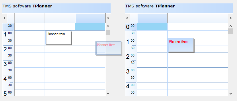
 Inter Planner drag & drop
This
sample project allows to perform direct & easy drag & drop of PlannerItems between two Planner instances


 How to customize the text of the sidebar
With the event Planner.OnPlannerGetSidebarLines , you can fully customize the text of the sidebar.
This event is triggered when the Planner needs the text for the 3 lines that can appear in the sidebar. With this event , you can customize the text, i.e. control the format of the hour displayed there.
Or for example to remove the text at specific time slots.
Example 1: hide the display for minutes:
procedure TForm4.Planner1PlannerGetSideBarLines(Sender: TObject; Index,
  Position: Integer; var HourString, MinuteString, AmPmString: string);
begin
  MinuteString := '''';
end;
Example 2:
procedure TForm4.Planner1PlannerGetSideBarLines(Sender: TObject; Index,
  Position: Integer; var HourString, MinuteString, AmPmString: string);
begin
  if index mod 4 = 0 then
    HourString := inttostr(....)
  else
    HourString := '''';
end;

 How to add images in a Planner header
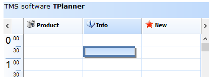
Using mini HTML formatted text in the caption you can insert images in the header.
You can do this with the <IMG> tag in the text with a reference to an image index in the imagelist assigned to Planner.PlannerImages.
For info on using mini HTML formatted text, please see:
https://www.tmssoftware.com/site/minihtml.asp
Example:
with Planner1.Header do
begin
Captions.Clear;
Captions.Add(''''); //take first sidebar header section into account
Captions.Add(''<img src="idx:0"> <b>Product</b>'');
Captions.Add(''<img src="idx:1"> <b>Info</b>'');
Captions.Add(''<img src="idx:2"> <b>New</b>'');
end;


 How to save and restore the planner row and column heights
There is not a built-in method that will save/load these sizes.
You can do this programmatically at application level by looping through columns & rows and save/load values for:
  Dbplanner1.GridControl.ColWidths[colindex]: integer
  Dbplanner1.GridControl.RowHeights[rowindex]:integer

 How to create a TPlanner with Planner.Mode.PlannerType = plTimeLine, with on the left side the time line and in the header the date
The non DB-aware Planner will not configure the header this way automatically.
So, you need to programmatically fill the headers with the date information.
This code snippet shows how you can do this on a default Planner:
var
  i: integer;
begin
  planner1.Mode.Date := Now;

  planner1.Header.Captions.Clear;
  planner1.Header.Captions.Add('');

  for i := 0 to planner1.Positions - 1 do
  begin
    planner1.Header.Captions.Add(DateToStr(Now + i));
  end;

  with planner1.CreateItem do
  begin
    ItemStartTime := Now + 1;
    ItemEndTime := Now + 1 + encodetime(2,0,0,0);
  end;
end;
 MultiDay Events in TPlanner and TDBPlanner
Multiday items will (by design - like in Outlook) be displayed in the header for each day where the event occurs.
You can do this by setting the property PlannerItem.InHeader :=true.
This means that for a non databound planner, you should add an inheader item for each day where the event occurs.
In the TPlanner this can't happen automatically as there is no imposed fixed relationship
between positions (columns) and days or resources you use.
Please make sure to increase Planner.header.Height so items can be shown there.
For the DB-aware TDBPlanner, this is handled automatically.
TDBPlanner will display the items that span multiple days in the header for each day where the item occurs.
It will display this as an item in the header on each day. It can indicate in the caption (when you set PlannerItem.CaptionType = ctTime)
the start/end time of the item.

 How to create a new PlannerItem when clicking on an empty cell
If Planner.AutoInsDel = true, the OnItemInsert event should be triggered.
When Planner.AutoInsDel = false, you need to programmatically create the item with Planner.CreateItem
This is also described in the Planner
PDF developers guide.

 Setting background color of an individual header
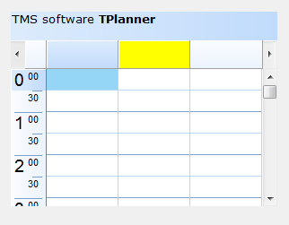
By default, the background color for header cells in the Planner is set with Planner.Header.Color / Planner.Header.ColorTo and this color is applied to all header cells. If there is a need to draw attention to a specific position in the Planner, it is easily possible to set a specific header for this position in a different color. This can be done by implementing the OnHeaderDrawProp() event like:
procedure TForm5.Planner1HeaderDrawProp(Sender: TObject; SectionIndex: Integer;
  var AColor, AColorTo: TColor; AFont: TFont);
begin
  if (SectionIndex = 1) then
  begin
    AColor := clYellow;
    AColorTo := AColor;
  end;
end;
The SectionIndex is the index of the header cell, starting with 0 for the first position. With AColor & AColorTo parameters, the background gradient color can be set.


 Preventing that items are moved to specific time slots
If you want to prevent that at runtime a PlannerItem is moved to a specific timeslot, this can be done from the OnItemMove event. In this event, simply restore the original PlannerItem coordinates and call Abort.
Sample code:
procedure TForm1.Planner1ItemMove(Sender: TObject; Item: TPlannerItem;
  FromBegin, FromEnd, FromPos, ToBegin, ToEnd, ToPos: Integer);
begin
  if topos = 2 then
  begin
    ShowMessage('Move to this position not allowed');
    item.ItemBegin := frombegin;
    item.ItemEnd := fromEnd;
    item.ItemPos := frompos;
    abort;
  end;
end;
 Printing 4 planners on 1 sheet
You can do this with:
1) Call printer.BeginDoc;
2) Set for the first planner, via Planner.PrintOptions the margins this way that there is ¼ of the page left
3) Call planner.PrintTo(Printer.Canvas);
4) Repeat steps 2,3 for other planners
5) Call printer.EndDoc;

 Adding a messagebox to query if it is allowed to effectively delete a PlannerItem
When the TMS T(DB)Planner.AutoInsDel is set to true, deleting a PlannerItem can be done by just selecting the PlannerItem and pressing DEL. To add a messagebox to query if it is allowed to effectively delete the PlannerItem, add following code to the OnItemDelete event:
procedure TForm2.Planner1ItemDelete(Sender: TObject; Item: TPlannerItem);
begin
  if MessageDlg('Delete this item?',mtConfirmation,[mbYes,mbNo],0) = mrNo then
    Abort;
end;
 Creating planner items for each disjunct selected time zone in the planner
It is possible to allow the user to select multiple disjunct cells in the planner. This enables the user to insert multiple events in one go on different places in the planner.
Disjunct selection is enabled by setting Planner.DisjunctSelect to true and disjunct selected cells are created by Ctrl & mouse click and drag in the planner. The disjunct selected cells can be marked in a different color by setting the property DisjunctSelectColor.
After disjunct selection, the selected time spans in the planner can be retrieved with Planner.Selections
This is a collection of TPlannerSelection objects. The TPlannerSelection object holds:
property SelBegin: Integer;
property SelEnd: Integer;
property SelPos: Integer;
as such, each item in this collection holds the coordinates of the selected time spans.
Example:
This example code creates planner items for each disjunct selected time zone in the planner
procedure TForm1.Button1Click(Sender: TObject);
var
  i: integer;
begin
  for i := 1 to planner1.Selections.Count do
    with planner1.CreateItem, planner1.Selections[i - 1] do
    begin
      ItemBegin := selbegin;
      ItemEnd := selend;
      ItemPos := selpos;
    end;
end;
 Using a non-linear time axis
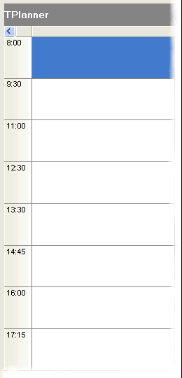
In some situations, it is not desirable that the time axis is divided in equal units. With the TPlanner put in plCustomList mode, the possible times for scheduling an event can be defined to avoid this. To handle the plCustomList mode, the TPlanner has a property TPlanner.DateTimeList. Following methods are defined:
TPlanner.DateTimeList.Clear;  //clears all datetime info from the list.
TPlanner.DateTimeList.Add(dt: TDateTime);  //adds a datetime value to the list
TPlanner.DateTimeList.Insert(Index: Integer; dt: TDateTime); // inserts a datetime value to the list
TPlanner.DateTimeList.Delete(Index: Integer);  //deletes the datetime at position Index from the list
TPlanner.DateTimeList.Items[Index]:  //TDateTime; returns the datetime values in the list
Example: setup the TPlanner through the DateTimeList in plCustomList mode
// setup of the DateTimeList
with Planner.DateTimeList do
begin
  Add(encodetime(8,0,0,0));
  Add(encodetime(9,30,0,0));
  Add(encodetime(11,00,0,0));
  Add(encodetime(12,30,0,0));
  Add(encodetime(13,30,0,0));
  Add(encodetime(14,45,0,0));
  Add(encodetime(16,00,0,0));
  Add(encodetime(17,15,0,0));
end;

// setup of the number of cells to display and cellheight
with Planner.Display do
begin
  DisplayStart := 0;
  DisplayEnd := 7;
  DisplayScale := 60;
end;
This results in the planner as:

When programmatically inserting an item, this can be done with:
with Planner.CreateItem do
begin
  itemstarttime := encodetime(11,0,0,0);
  itemendtime := encodetime(12,30,0,0);
end;

 Creating overlappable background items
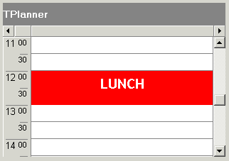
Normally, when adding a background item, this is by default a non overlappable item. Setting the Background property to true automatically also sets the AllowOverlap property to false. A background item cannot be selected, moved or sized. Background items are normally used to indicate fixed time allocations, such as a time for lunch:

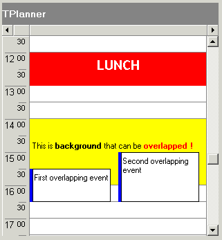
It can be convenient though to override this behaviour and create background items that only give a visual hint, cannot be selected or edited and over which other items can be positioned. To create such items, it is sufficient to reset the AllowOverlap property back to true after settting the Background property to true. (Note that this is not possible at design time) The code for this is:
with Planner1.CreateItemAtSelection do
begin
  Background := True;
  // reset AllowOverlap to create overlapable background item
  AllowOverlap := True;
  Text.Text := '

This is background that can be ' +
    'overlapped !';
  Alignment := taCenter;
  Color := clYellow;
end;
The yellow item created as such can be overlapped with normal TPlannerItem and its only function is a visual hint as background in the planner grid:


 Setting background color for individual grid cells
If there is an additional need to set colors of planner grid cells other than through the Display settings of PositionProps, this can be done with the property :
TPlanner.BackGroundColor[ACol, ARow: Integer]: TColor;
This sets the color for a given cell in the planner grid.

 Linking TPlannerItems
A TPlannerItem can be linked in various ways to another TPlannerItem. Linking two items means that if the user will move or size one item, the linked item will also move or size. Linking is achieved through 2 TPlannerItem properties :
TPlannerItem.LinkedItem: TPlannerItem; defines to which the item is linked
TPlannerItem.LinkType: TPlannerLinkType; defines the type of the link
The LinkType can be :
ltLinkFull: both ItemBegin and ItemEnd are linked. This means that item duration is always synchronised between the items. When the item moves or sizes, both begin and end of the linked item will do the same move or size.
ltLinkBeginEnd: ItemBegin of the item is linked to the ItemEnd of the linked item. This means that if the ItemBegin of the item changes, the ItemEnd of the linked item will change with the same delta
ltLinkEndBegin: ItemEnd of the item is linked to the ItemBegin of the linked item
ltLinkEndEnd: ItemEnd of the item is linked to the ItemEnd of the linked item
ltLinkBeginBegin: ItemBegin of the item is linked to the ItemBegin of the linked item
Example:
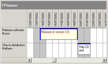
In this example, two events need to be planned: a release of the software and the shipping of software to distributors. It is clear that shipping to distributors can only happen after the software release and that if the software release is delayed, the shipping will be delayed as well. Therefore, the two events are added in the planner with a link between the ItemEnd of the software release to the ItemBegin of the software shipping.
var
  plIt1,plIt2: TPlannerItem;
begin
  plIt1 := planner1.CreateItem;
  with plIt1 do
  begin
    ItemStartTime := EncodeDate(2002,7,15);
    ItemEndTime := EncodeDate(2002,7,20);
    ItemPos := 0;
    Text.Text := 'Release of version 1.0';
  end;
  plIt2 := planner1.CreateItem;
  with plIt2 do
  begin
    ItemStartTime := EncodeDate(2002,7,21);
    ItemEndTime := EncodeDate(2002,7,22);
    ItemPos := 1;
    Text.Text := 'Ship CD and manuals';
  end;

  plIt1.LinkedItem := plIt2;
  plIt1.LinkType := ltLinkBeginEnd;
end;
The result in the planner grid is:

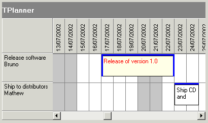
delaying the software release by 3 days automatically moves and delays the shipping:


 Saving the TPlanner to HTML
The SaveToHTML method generates a HTML file of the TPlanner with all its TPlannerItem objects. This is done with:
procedure SaveToHTML(FileName: string);
Example:
This example outputs the TPlanner in HTML in a table that has 80% width, centered on the page with bold header and sidebar font. It shows the output in a browser:
uses
  ShellAPI;

Planner1.HTMLOptions.Width := 80;
Planner1.HTMLOptions.SidebarFontStyle := [fsBold];
Planner1.HTMLOptions.HeaderFontStyle := [fsBold];
Planner1.HTMLOptions.PrefixTag := '<CENTER>';
Planner1.HTMLOptions.SuffixTag := '';
Planner1.SaveToHTML('myHTML.htm');
ShellExecute(0,'open','myHTML.htm',nil,nil,SW_NORMAL);
 Copying all TPlannerItem objects from Planner1 to Planner2 by a memory stream
If there are 2 TPlanner components on a form, the method below makes a copy of all TPlannerItem objects from Planner1 to Planner2 by a memory stream:
procedure TForm1.Save(Sender: TObject);
var
  ms: TMemoryStream;
begin
  ms := TMemoryStream.Create;
  Planner1.SaveToStream(ms);
  ms.Position := 0;
  Planner2.LoadFromStream(ms);
  ms.Free;
end;
More methods to save and load items in non data-aware Tplanner can be found on page 43 of the
PDF Developers Guide.

 Programmatically selecting & copying an item to the next position in the planner
Example:
Planner1.Items.Select(APlannerItem);
Planner1.Items.CopyToClipboard;
Planner1.SelectCells(Planner1.SelItemBegin,Planner1.SelItemEnd, Planner1.SelPosition + 1);
Planner1.Items.PasteFromClipboardAtPos;

 Searching items in the planner
This code fragment searches all items in the TPlanner for the word 'Meeting':
var
  plIt: TPlannerItem;
begin
  plIt := nil;
  repeat
    plIt :=
      Planner1.Items.FindText(plIt,'Meeting',[fnAutoGoto,fnText]);
    if Assigned(plIt) then
      ShowMessage('Found appointment');
  until plIt = nil;
  ShowMessage('No more items found');
end;
More functions are described in the
PDF developer guide p 39.
Important note:
When making changes that affect a lot of items in the planner or when adding or removing a lot of items, performance will vastly improve when enclosing the operations with
TPlanner.Items.BeginUpdate;
// do update, adding, removing of items here
TPlanner.Items.EndUpdate;

 Using a custom TPlannerItem class
For maintaining custom data with each planner item you can assign any TObject descendent class to the PlannerItem's public Object property. However there is a more convenient way to create a descendent class from TPlanner that has a TPlannerItem with new custom properties which can be used at design time and at run time to hold any additional values with each planner item. The code involved comes down to:
1. Write your descendent class of TPlannerItem and add the additional properties. Override the assign procedure to copy the extra properties added.
2. Write your descendent class of the TPlannerItems collection and override the GetItemClass method to instruct the collection to create collection items from your descendent TPlannerItem class.
3. Write your descendent class of TPlanner and override the protected CreateItems method to let the planner use your descendent TPlannerItems collection.
Following code where a new property MyProperty was added to the TPlannerItem, makes this clear:
Example:
unit MyPlanner;
interface

uses Windows, Messages, SysUtils, Classes, Graphics, Controls, Forms, Dialogs, Planner;
type
  TMyPlannerItem = class(TPlannerItem)
  private
    FMyProperty: string;
  public
    procedure Assign(Source: TPersistent); override;
  published
    property MyProperty: string read FMyProperty write FMyProperty;
  end;

  TMyPlannerItems = class(TPlannerItems)
  public
    function GetItemClass: TCollectionItemClass; override;
  end;

  TMyPlanner = class(TPlanner)
  private
    { Private declarations }
  protected
    { Protected declarations }
    function CreateItems: TPlannerItems; override;
  public
    { Public declarations }
  published
    { Published declarations }
  end;

procedure Register;

implementation

procedure Register;
begin
  RegisterComponents('TMS', [TMyPlanner]);
end;

{ TMyPlannerItems }

function TMyPlannerItems.GetItemClass: TCollectionItemClass;
begin
  Result := TMyPlannerItem;
end;

{ TMyPlanner }

function TMyPlanner.CreateItems: TPlannerItems;
begin
  Result := TMyPlannerItems.Create(Self);
end;

{ TMyPlannerItem }

procedure TMyPlannerItem.Assign(Source: TPersistent);
begin
  inherited Assign(Source);
  if Assigned(Source) then
    FMyProperty := TMyPlannerItem(source).MyProperty;
end;
end.
Note: the same method can be used for creating custom TPlannerItem classes with the TDBPlanner. In some events, such a TDBItemSource.OnFieldsToItem or TDBItemSource.OnItemToFields, the extra properties of the custom TPlannerItem class can be accessed by casting the Item parameter to the custom TPlannerItem class.

 Using TPlannerItem alarms
Through the Alarm property in a TPlannerItem and alarm handlers, all types of alarms can be triggered by the TPlannerItem. Note that alarms are enabled in the TPlanner by the property TPlanner.EnableAlarms. Different alarm handlers that play sound, send email, show a message, run a script, execute a program can be downloaded from
https://www.tmssoftware.com/planaddon.htm
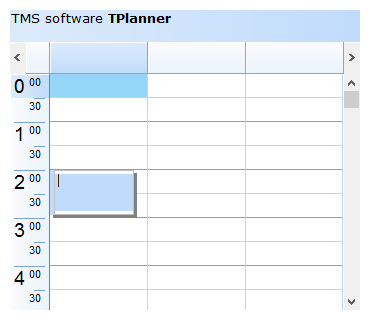
Example:
Following example creates a TPlannerItem in a day mode TPlanner that starts at 2AM and triggers an alarm message 30 minutes before the TPlannerItem starts :
with Planner1.CreateItem do
begin
  ItemStartTime := EncodeTime(2,0,0,0); // 02:00 AM
  ItemEndTime := EncodeTime(3,0,0,0); // 03:00 AM
  CaptionText := 'Item 1';
  Text.Text := 'This message tells the item starts in 30 minutes';
  CaptionType := ctText;
  Alarm.Active := True;
  Alarm.Handler := AlarmMessage1;
  Alarm.TimeBefore := EncodeTime(0,30,0,0); // 30 minutes
  Alarm.NotifyType := anNotes;
end;
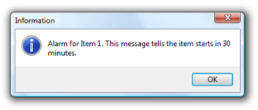
The item inserted in the TPlanner will thus trigger an alarm at 1.30AM . The AlarmMessage1 is a simple alarm handler that displays a message box. The selected text for the alarm message is the text of the TPlannerItem itself as selected by the NotifyType which is anNotes. At 1.30AM the message displayed is:

Alarm handlers are easy to write. An alarm handler descends for the TPlannerAlarmHandler class which is defined as:
TPlannerAlarmHandler = class(TComponent)
public
  function HandleAlarm(Address,Message:string; Tag, ID: Integer; Item: TPlannerItem): Boolean; virtual;
end;
One single function should thus be defined. The result of the function indicates whether the alarm has been successfully handled or not. If the user selects for example to snooze the alarm for a given amount of time, return false, update the TPlannerItem.Alarm.TimeBefore property to the new time of the alarm and it will be triggered again. The Address, Message, Tag and ID parameters of this function are taken from the TPlannerItem.Alarm property.
The TAlarmMessage alarm handler defines this function in the following way:
{ TAlarmMessage }
function TAlarmMessage.HandleAlarm(Address, Message: string; Tag, ID: Integer; Item: TPlannerItem): Boolean;
begin
  MessageDlg('Alarm for' +Item.CaptionText+#13+ HTMLStrip(Item.Text.Text),mtInformation,[mbok],0); Result := True;
end;

 Displaying multiple images in the TPlannerItem caption
Images in the TPlannerItem caption should be stored in the imagelist assigned to the TPlanner.PlannerImages property. Any number of images can be displayed in the caption by adding the image indexes to the public property TPlannerItem.ImageIndexList. This is a TList of integer values. To set image 2 and image 4 of the imagelist in the caption, following code can be used :
PlannerItem.ImageIndexList.Add(2);
PlannerItem.ImageIndexList.Add(4);

 Programmatically add an item and update non visible item indicators
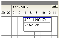
When the Planner can be scrolled, little arrow indicators in the sidebar can indicate the presence of events in the non-visible regions of the planner grid. In the example screenshot below, this means that more items are present in the grid on the right side of the currently visible item.

The feature is enabled by setting Planner.IndicateNonVisibleItems = true. The indicators are automatically displayed and updated when items are created or when the planner grid is scrolled. Whenever items are programmatically created, an update of the non visible item indicators can be forced with: Planner.UpdateNVI;
Example:
with Planner.CreateItem do
begin
  itembegin := 33;
  itemend := 37;
  completiondisplay := cdHorizontal;
  completion := 80;
end;
Planner.UpdateNVI;

 Programmatically setting header captions/group captions/custom groups
This planner header shows normal header captions and group captions

Programmatically, this can be set by filling the Planner.Header.Captions and Planner.Header.GroupCaptions stringlists in following way:
with Planner1.Header do
begin
  Captions.Clear; GroupCaptions.Clear;
  Captions.Add(''); // take first sidebar header section into account
  Captions.Add('A1');
  Captions.Add('A2');
  Captions.Add('A3');
  GroupCaptions.Add('Group A');
  Captions.Add('B1');
  Captions.Add('B2');
  Captions.Add('B3');
  GroupCaptions.Add('Group B');
end;: At design time it is easy to enter
multiline header captions by using „\n‟ as line separator. Setting at design time in the Captions stringlist editor : „This is line 1\n and here line2‟ will
result in a caption with:
This is line1
and here line 2
In the example above, the header group size is equal for all groups and is set by the property Planner.PositionGroups. In order to show different group sizes for different columns, the Planner.Header.CustomGroups can be used. To use custom position groups, set Planner.PositionGroups to 1. The code snippet below produces a header with 3 groups with respectively a span of 2 positions, span of 3 positions and span of 1 position:

var
  i: Integer;
begin
  with planner1.Header do
  begin
    CustomGroups.Clear;
    with CustomGroups.Add do
    begin
      Caption := 'Group 1';
      Span := 2;
    end;
    with CustomGroups.Add do
    begin
      Caption := 'Group 2';
      Span := 3;
    end;
    with CustomGroups.Add do
    begin
      Caption := 'Group 3';
      Span := 1;
    end;

    Captions.Clear;
    Captions.Add('');
    for i := 1 to 6 do
      Captions.Add('Col '+inttostr(i));
    end;
end;
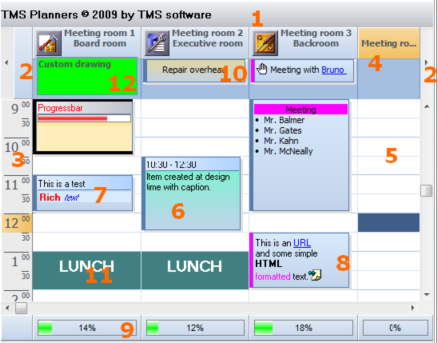
 Visual organisation of TPlanner / TDBPlanner

1) TPlanner caption Settings are controlled through the Planner.Caption property. It can be selected whether the caption is visible or not.
2) TPlanner navigator buttons
Settings are controlled through the Planner.NavigatorButtons property. It can be selected whether the Navigator buttons are visible or not.
3) TPlanner sidebar Settings are controlled through the Planner.Sidebar property. The Sidebar can be visible or not. It can be at left side, right side, top side or repeated between column in the grid.
4) TPlanner header Settings are controlled through the Planner.Header property. It can be selected whether the header is visible or not.
5) TPlanner grid
Various settings are controlled through the Planner properties as well as Planner.Display property
6) TPlannerItem
Normal text TPlannerItem with caption with time indication.
7) TPlannerItem Rich text TPlannerItem with fixed text caption.
8) TPlannerItem
HTML formatted TPlannerItem with gradient caption. The TPlannerItem can hold links to URLs or application handled anchors.
9) TPlanner footer Zone where completion of a resource can be displayed by a progress bar.
10) TPlannerItem In header displayed TPlannerItem.
11) TPlannerItem
Background TPlannerItem.
12)
TPlanner header custom drawing.
TPlanner supports a vertical view (as shown above) as well as a horizontal view. In the horizontal view, all elements of the TPlanner simply rotated. This means that the Sidebar here at left is displayed on top and the header and navigator buttons are displayed at the left side in horizontal mode. The position coordinates of TPlannerItem objects along vertical and horizontal axis in vertical mode become the coordinates along horizontal and vertical axis respectively in horizontal mode. The TPlanner component can be easily switched from vertical view to horizontal view by setting the TPlanner.Sidebar.Position property to spTop.

 Automatically selecting PlannerItems on mouse hovering
Normally, a PlannerItem is set in the selected state when the mouse clicks the PlannerItem. By default, to start editing a PlannerItem, it is required to first select it and then click again to start editing. It is easy to avoid the first click to select the item by programmatically auto select it on mouse hovering. Following code snippet will perform this automatic selection:
procedure TForm2.Planner1PlannerMouseMove(Sender: TObject; Shift: TShiftState;
  X, Y: Integer);
var
  item: TPlannerItem;
begin
  item := planner1.XYToItem(x,y);
  if Assigned(item) then
    Planner1.Items.Select(item);
end;
 Using balloons on PlannerItems
To have a balloon showing when the mouse hovers over a Planner item, set Planner.Balloon.Enable = true. It is important that when you create the Planner programmatically or reparent the Planner control, that Planner.Balloon.Enable is only set to true AFTER the parent for the Planner control is set.
Also check if theming is enabled in the project options.
Only when theming is enabled in the project options, the balloon will be visible.

 Detect if a cell has an item
This code snippet shows how it can be detected whether there is an item in the selected cells or not:
begin
  if not Assigned(Planner1.Items.FindFirst(Planner1.SelItemBegin, Planner1.SelItemEnd, Planner1.SelPosition)) then
  begin
    ShowMessage('Time slot in planner is empty');
  end;
end;

 Create a planner item with direct editing
For creating a planner item by just starting to type the text that should go in the planner item, the OnPlannerKeyPress can be used. To make sure that the key that is pressed to create the planner item is the first character of the planner item text, following code can be used :
procedure TForm1.Planner1PlannerKeyPress(Sender: TObject; var key:char; position, fromSel, fromSelPrecis, toSel, toSelPrecis: Integer);
begin
  with planner1.Items.Add do
  begin
    itempos := position;
    itembegin := fromSel;
    itemend := toSel;
    captiontype := ctTime;
    Text.Add(key);
    Edit;
    planner1.MemoEdit.SelStart := 1;
    planner1.MemoEdit.SelLength := 0;
  end;
end;

 This code snippet automatically creates a new planner item at the first available timeslot in planner position 0:
procedure
TForm1.Button1Click(Sender: TObject);
var
 i: Integer;
begin
for i := Planner1.Display.DisplayStart to Planner1.Display.DisplayEnd do
 begin
   if not Assigned(Planner1.Items.FindFirst(i,i + 1,0)) then
   begin
     with Planner1.CreateItem do
     begin
       ItemBegin := i;
       ItemEnd := i + 1;
       ItemPos := 0;
       Text.Text := 'first empty';
       CaptionType := ctNone;
     end;
     break;
   end;
 end;
end;

 This code snippet selects an item in the planner on mouse right click:
procedure TForm1.Planner1ItemRightClick(Sender: TObject; Item: TPlannerItem);
begin
 Planner1.Items.Select(Item);
end;

 How to create programatically a plannerItem and start an ItemEditor
 SelectPosRestricted property
 Position gap area colors
 Inter Planner drag & drop
 How to customize the text of the sidebar
 How to add images in a Planner header
 How to save and restore the planner row and column heights
 How to create a TPlanner with Planner.Mode.PlannerType = plTimeLine, with on the left side the time line and in the header the date
 MultiDay Events in TPlanner and TDBPlanner
 How to create a new PlannerItem when clicking on an empty cell
 Setting background color of an individual header
 Preventing that items are moved to specific time slots
 Printing 4 planners on 1 sheet
 Adding a messagebox to query if it is allowed to effectively delete a PlannerItem
 Creating planner items for each disjunct selected time zone in the planner
 Using a non-linear time axis
 Creating overlappable background items
 Setting background color for individual grid cells
 Linking TPlannerItems
 Saving the TPlanner to HTML
 Copying all TPlannerItem objects from Planner1 to Planner2 by a memory stream
 Programmatically selecting & copying an item to the next position in the planner
 Searching items in the planner
 Using a custom TPlannerItem class
 Using TPlannerItem alarms
 Displaying multiple images in the TPlannerItem caption
 Programmatically add an item and update non visible item indicators
 Programmatically setting header captions/group captions/custom groups
 Visual organisation of TPlanner / TDBPlanner
 Automatically selecting PlannerItems on mouse hovering
 Using balloons on PlannerItems
 Detect if a cell has an item
 Create a planner item with direct editing
 This code snippet automatically creates a new planner item at the first available timeslot in planner position 0:
 This code snippet selects an item in the planner on mouse right click: