Tips and Frequently Asked Questions

 Visual organisation of TPlanner / TDBPlanner

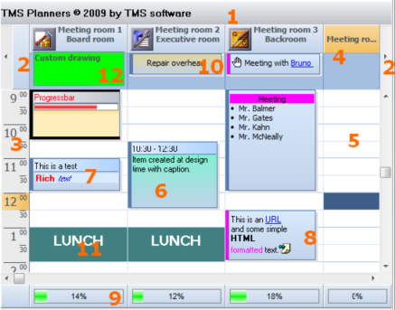
1) TPlanner caption Settings are controlled through the Planner.Caption property. It can be selected whether the caption is visible or not.
2) TPlanner navigator buttons
Settings are controlled through the Planner.NavigatorButtons property. It can be selected whether the Navigator buttons are visible or not.
3) TPlanner sidebar Settings are controlled through the Planner.Sidebar property. The Sidebar can be visible or not. It can be at left side, right side, top side or repeated between column in the grid.
4) TPlanner header Settings are controlled through the Planner.Header property. It can be selected whether the header is visible or not.
5) TPlanner grid
Various settings are controlled through the Planner properties as well as Planner.Display property
6) TPlannerItem
Normal text TPlannerItem with caption with time indication.
7) TPlannerItem Rich text TPlannerItem with fixed text caption.
8) TPlannerItem
HTML formatted TPlannerItem with gradient caption. The TPlannerItem can hold links to URLs or application handled anchors.
9) TPlanner footer Zone where completion of a resource can be displayed by a progress bar.
10) TPlannerItem In header displayed TPlannerItem.
11) TPlannerItem
Background TPlannerItem.
12)
TPlanner header custom drawing.
TPlanner supports a vertical view (as shown above) as well as a horizontal view. In the horizontal view, all elements of the TPlanner simply rotated. This means that the Sidebar here at left is displayed on top and the header and navigator buttons are displayed at the left side in horizontal mode. The position coordinates of TPlannerItem objects along vertical and horizontal axis in vertical mode become the coordinates along horizontal and vertical axis respectively in horizontal mode. The TPlanner component can be easily switched from vertical view to horizontal view by setting the TPlanner.Sidebar.Position property to spTop.
Pricing
TMS VCL UI Pack
€ 375
TMS VCL Subscription
€ 895
TMS ALL-ACCESS
€ 1,795