Frequently Asked Component Specific Questions
Options |
|
Display all FAQ items |
Displaying items 616 to 630 of 888, page 42 of 60
<< previous next >>

 TAdvSmoothTouchKeyboard
Saving and loading keyboard layouts
Keyboard layouts can be saved & loaded at any time. For this, TAdvTouchkeyboard exposes two methods:
SaveKeybLayout(FileName: string);
LoadKeybLayout(FileName: string);
TAdvSmoothDockControlling how long the item jumping lasts.
When an item is clicked or double clicked an extra visual feature can be started to indicate the item has been clicked: Set Jump to true to allow the item to jump. Set Jump to false to stop the jumping. This way it is under full control of the application code how long the item jumping lasts.

With this code a Timer is started to count 3 seconds before the item stops jumping:
var
  time, clickeditem: integer;
implementation

{$R *.dfm}

procedure TForm1.AdvSmoothDock1ItemClick(Sender: TObject; ItemIndex: Integer);
begin
  Timer1.Enabled := true;
  time := 0;
  clickeditem := ItemIndex;
  AdvSmoothDock1.Items[clickeditem].Jump := true;
end;

procedure TForm1.Timer1Timer(Sender: TObject);
var
  i: integer;
begin
  if time >= 3 then
  begin
    Timer1.Enabled := false;
    for I := 0 to AdvSmoothDock1.Items.Count - 1 do
       AdvSmoothDock1.Items[I].Jump := false;
  end;
  Inc(time);
end;TAdvSmoothImageListBoxUpdate smooth controls faster with BeginUpdate and EndUpdate
This short article describes the use of BeginUpdate and EndUpdate methods to allow faster updating and repainting.
When creating a smooth listbox or a smooth imagelistbox with 500+ items in code, it tends to be slow when starting the application.
For each item that is added / deleted or updated, the listbox is updated. It is just a matter of milliseconds to update the listbox for one item, but imagine the time that is needed to update 500 items. And these items are drawn with the default layout. With more advanced items the update process can be painfully slow.
Because we cannot predict when the user wants to update the listbox, we have implemented a BeginUpdate and EndUpdate which *blocks* the painting of the listbox until the EndUpdate is called. Then all the calculations and painting is executed once, with all the new information the user has inserted in the items.
Below is a code sample based on the TAdvSmoothListBox component to update all items between a BeginUpdate and EndUpdate.
var
  i: integer;
begin
  AdvSmoothListBox1.Items.BeginUpdate;
  for I := 0 to AdvSmoothListBox1.Items.Count - 1 do
  begin
    AdvSmoothListBox1.Items[i].Caption := 'Item Updated !';
  end;
  AdvSmoothListBox1.Items.EndUpdate;
Important note !: All BeginUpdate calls must end with an EndUpdate. In other words: The count of BeginUpdate and EndUpdate calls must be equal. When this condition is false, the listbox will not update, and the listbox will not respond to other update calls.
A List of components which currently implement the BeginUpdate and EndUpdate:
- AdvSmoothListBox (AdvSmoothListBox.Items.BeginUpdate / EndUpdate)
- AdvSmoothImageListBox (AdvSmoothImageListBox.Items.BeginUpdate / EndUpdate)
- AdvSmoothDock (AdvSmoothDock.BeginUpdate / EndUpdate)
- AdvSmoothExpanderGroup (AdvSmoothExpanderGroup.BeginUpdate / EndUpdate)
- AdvSmoothSplashScreen (AdvSmoothSplashScreen.BeginUpdate / EndUpdate)
- AdvSmoothTimeLine (AdvSmoothTimeLine.BeginUpdate / EndUpdate)
- AdvSmoothTouchKeyBoard (AdvSmoothTouchKeyBoard.Completion.BeginUpdate / EndUpdate)
TAdvSmoothImageListBoxAdding items & extra properties in code
In this code sample, the image will be directly (non threaded) loaded in the TAdvSmoothImageListBox:
procedure TForm1.AddItems;
var
  i: integer;
begin
//Adds 20 items
  for i := 0 to 20 do
  begin
    with AdvSmoothListBox.Items.Add do
    begin
      Enabled := True;
      //If enabled false then the item will be drawn in disabled fill
      Visible := false;
      //the item will be invisible
      Image.LoadFromFile(‘image1.jpg’);
      //the image will be loaded on the item
      Caption.Text := ‘Item ’+ inttostr(i); Splitter := false;
      //if splitter is true a splitter will be drawn between the items
      …
    end;
  end;
end;
To have the listbox background thread load the images for higher responsiveness of the application, following code can be used:
procedure TForm1.AddItems;
  var i: integer;
begin
//Adds 20 items
  for i := 0 to 20 do
  begin
    with AdvSmoothListBox.Items.Add do
    begin
      Enabled := True;
      //If enabled false then the item will be drawn in disabled fill
      Visible := false;
      //the item will be invisible
      Location := ‘image1.jpg’;
       //the image will be loaded by thread
      Caption.Text := ‘Item ’+ inttostr(i);
      Splitter := false;
      //if splitter is true a splitter will be drawn between the items
      …
     end;
  end;
end;
You can also add a whole directory of images either threaded or not threaded. When the threaded method is choosen, the images are loaded via a separate thread. This separate thread loads only the visible images for efficiency. As the list is scrolled, new visible item‟s images will be loaded by this thread.
Not threaded:
AdvSmoothImageListBox.AddImagesFromFolder(„C:\directory\*.jpg‟);
AdvSmoothImageListBox.AddImageLocationsFromFolder(„C:\directory\*.jpg‟);
Image types supported are: jpg, jpeg, bmp, png, gif, tiff and ico.
TAdvSmoothImageListBoxCustomizing ImageListBox items
Below is an overview of the important visual elements of the Image Listbox item.
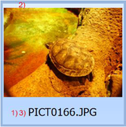
1) The item can contain HTML text and can be positioned at any place on the item area. With the TextAlign property the position of the text can be controlled.
2) The image of the item. The image can be positioned with the ItemAppearance.ImageAlign property. The image can be drawn taking the aspect ratio in account or not.
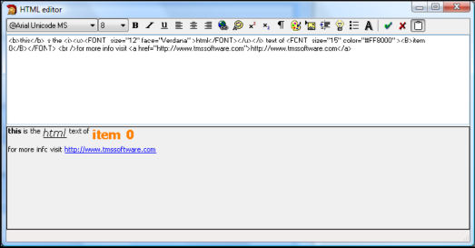
3) The HTML notes text of the item can be formatted with a design time HTML editor. The HTML can contain images listed in a TGDIPPictureContainer or a TImageList. When clicking on an anchor of the HTML text the event OnAnchorClick is called.
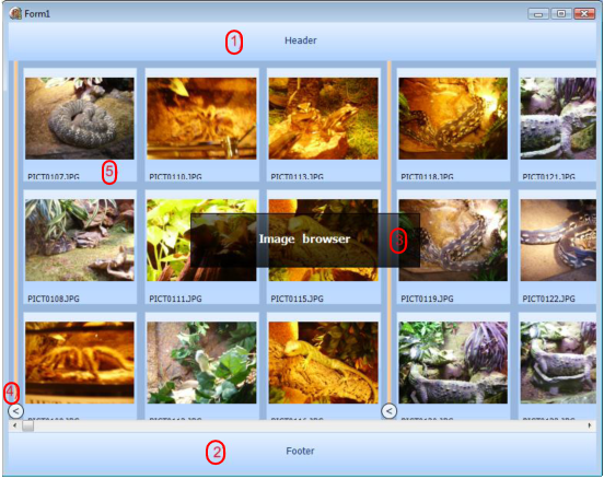
TAdvSmoothImageListBoxVisual organisation of TAdvSmoothImageListBox
TMS TAdvSmoothImageListBox is a component with the following main visual elements:
1) The header can contain information on how the items are organised or which types of items are displayed in the ListBox. Appearance of the header can be fully controlled: all characteristics of the fill can be set, text can be positioned in various locations, text can contain HTML formatting tags, additional images can be set. The header can also be set invisible.
2) The optional footer is identical to the header and allows displaying extra information at the bottom of the list, such as summary information for example like “Number of images: …”
3) This is an example of a top layer item which can be fully customized and can be placed on various positions on top of the listbox. A top layer item can also display HTML text. The fill of each top layer item can be fully customized including its opacity.
4) An item added to the collection can be either an item or a splitter. The splitter can contain text and also a collaps/expand button. With the expand/collaps buttons, all items between two splitters can be made visible or invisible.
5) An item added to the collection can contain an image and HTML text. Different appearance settings can be set to control the position of the image and text in the item. These settings can be found under TAdvSmoothImageListBox.ItemAppearance
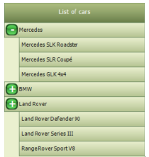
TAdvSmoothListBoxGrouping items
With the AdvSmoothListBox it is possible to group the items and expand or collapse them with a single click. The level property on an item allows you to define the different groups to collapse or expand. The indent property can be used to visually create a “node” that is indented to the right. An item has a public expanded property. With this property you can expand or collapse items with a level that is higher than the current item.
Sample:
with AdvSmoothListBox5.Items.Add do
begin
  Caption := 'Mercedes';
  GraphicLeftType := gtSmoothButton;
  ButtonCaption := '-';
  ButtonBevelColor := clBlack;
  ButtonColor := clGreen;
  GraphicLeftWidth := 25;
end;
with AdvSmoothListBox5.Items.Add do
begin
  Level := 1;
  Caption := 'Mercedes SLK Roadster';
  Indent := 30;
end;
with AdvSmoothListBox5.Items.Add do
begin
  Level := 1;
  Caption := 'Mercedes SLR Coupé';
  Indent := 30;
end;
with AdvSmoothListBox5.Items.Add do
begin
  Level := 1;
  Caption := 'Mercedes GLK 4x4';
  Indent := 30;
end;

with AdvSmoothListBox5.Items.Add do
begin
  Caption := 'BMW';
  GraphicLeftType := gtSmoothButton;
  ButtonCaption := '-';
  ButtonBevelColor := clBlack;
  ButtonColor := clGreen;
  GraphicLeftWidth := 25;
end;
with AdvSmoothListBox5.Items.Add do
begin
  Level := 1;
  Caption := 'BMW M3';
  Indent := 30;
end;
with AdvSmoothListBox5.Items.Add do
begin
  Level := 1;
  Caption := 'BMW Z4';
  Indent := 30;
end;
with AdvSmoothListBox5.Items.Add do
begin
  Level := 1;
  Caption := 'BMW X5';
  Indent := 30;
end;

with AdvSmoothListBox5.Items.Add do
begin
  Caption := 'Land Rover';
  GraphicLeftType := gtSmoothButton;
  ButtonCaption := '-';
  ButtonBevelColor := clBlack;
  ButtonColor := clGreen;
  GraphicLeftWidth := 25;
end;
with AdvSmoothListBox5.Items.Add do
begin
  Level := 1;
  Caption := 'Land Rover Defender 90';
  Indent := 30;
end;
with AdvSmoothListBox5.Items.Add do
begin
  Level := 1;
  Caption := 'Land Rover Series III';
  Indent := 30;
end;
with AdvSmoothListBox5.Items.Add do
begin
  Level := 1;
  Caption := 'Range Rover Sport V8';
  Indent := 30;
end;
Result:
TAdvSmoothListBoxCustomizing ListBox items
The ListBox item can be customized in many ways: various text elements, graphics, and controls. Below is an overview of the important visual elements of the ListBox item.
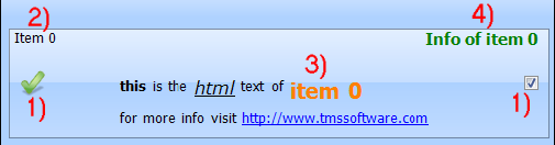
1) The item can contain a graphic on the left and the right side. The type of graphic can be changed with the property GraphicLeftType or GraphicRightType.
The types you can choose from are listed below. In case of gtDetailImage the image can be clicked to enter the details. When choosing gtCommonImage or gtCommonDetailImage, the function is the same as the gtImage or gtDetailImage type, but only uses a global image defined on TAdvSmoothListBox level that can be used for all items.
Supported types:
- gtButton, gtSmoothButton: button is displayed on the item
- gtCheckBox: checkbox is displayed on the item
- gtRadioButton: radiobutton is displayed on the item
- gtImage: image is displayed on the item
- gtDetailImage: image that shows detail control on click is displayed
- gtCommonImage: common listbox image is displayed on the item
- gtCommonDetailImage: common listbox detail image is displayed on the item
- gtNone: nothing is displayed
2) The caption text of the item. The caption can optionally be clicked and triggers the OnItemCaptionClick event.
3) The HTML notes text of the item can be formatted with a design time HTML editor. The HTML can contain images listed in a TGDIPPictureContainer or a TImageList. When clicking on an anchor of the HTML text the event OnAnchorClick is called.
4) The info of the item can contain extra information of the info and when clicked will trigger the OnItemInfoClick event.
TAdvSmoothListBoxVisual organisation of TAdvSmoothListBox
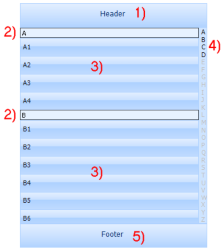
TMS Advanced Smooth ListBox is a component with the following main visual elements:
1) The header can contain information on how the items are organised or which types of items are in the ListBox. For example: “Contact list”. The header can also contain HTML text and images. The header can be visible or not.
2) In case you define the ListBox as a “Contact list” you can set the item sections visible. This allows you to group the items under the section of the same category. The categories which are currently available are alphabetical and numeric.
3) These are the ListBox items which can be fully customized in many ways: HTML text, images graphics, controls …
4) When you want to search an item you can easily navigate to the first item with the letter you clicked at the lookup bar.
5) The optional footer is identical to the header and allows displaying extra information at the bottom of the list, such as summary information for example like “Number of contacts: …”
TAdvSmoothListBoxAdding items & extra properties in code
In design time the AdvSmoothListBox has some items by default. Below you can see how to add items in code and in some cases extra properties can be set to change the item appearance.
procedure TForm1.AddPoints;
var
  i: integer;
begin
//Adds 20 items
  for i := 0 to 20 do
  begin
    with AdvSmoothListBox.Items.Add do
    begin
      Enabled := True;
      //If enabled false then the item will be drawn in disabled fill
      GraphicLeftType := gtCheckBox
      Checked := False;
      //the item will be checked if the type is a checkbox or a radiobutton
      Caption := ‘Item ’+ inttostr(i);
      Info := ‘Info ’+ inttostr(i);
      Notes := ‘Notes ’ + link
      Splitter := false;
      //if splitter is true a empty space will be drawn between 2 items
      DetailControl := Panel1
      //depending on the action chosen to visualize the details the detailcontrol will be shown.
      Level := 1;
      //Set the level property to allow expanding and collapsing item groups
      Indent := 30;
      //Set the indent property to visually indent the item.
    end;
  end;
end;TAdvSmoothMessageDialogUsing overlay textures
The AdvSmoothMessageDialog has a margin property to indent the messagedialog drawing. This opens the possibility to add overlay textures, textures that visually go out the draw area. Below is a sample of a default messagedialog with a margin and a texture. The captionfill.Picture is loaded with a PNG image and the picture position and size are customized.
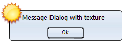
AdvSmoothMessageDialog1.Caption := 'Message Dialog with texture';
AdvSmoothMessageDialog1.Position := poScreenCenter;
AdvSmoothMessageDialog1.Execute;
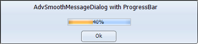
TAdvSmoothMessageDialogAdding a progressbar
The Message dialog supports a progressbar, that can be positioned inside the messagedialog with the ProgressBarPosition property.
The ProgressBarValue ProgressBarMaximum and ProgressBarMinimum properties determine the Range and position of the ProgressBar.
The ProgressBarAppearance can be fully customized to add text, change the look and feel of the progressbar.
 <
<
TAdvSmoothMessageDialogChanging the appearance of the message dialog
The message dialog can be fully customized for its 4 different elements:
- Buttons: The buttons have a separate appearance and can be formatted with a color, and opacity property. When a picture is needed to make the button more attractive use the picture and pictureposition property. The buttons can also be vertical or horizontal stacked depending on the type of message dialog needed.
The ButtonAreaFill property is used to fill the area of the buttons.
- Caption: The caption has a separate fill that is fully customizable. With the CaptionFont and CaptionPosition properties the caption text can be formatted.
- HTML: The HTML text has no separate Fill and is drawn directly on the message dialog.The HTML text can be customized in a separate dialog. With the OnAnchorClick event you can call a ShellExecute to open the URL.
procedure TForm1.AdvSmoothMessageDialog1AnchorClick(Sender: TObject; Anchor: string);
begin
  ShellExecute(0,'open',pchar(Anchor),nil,nil,SW_NORMAL);
end;
TAdvSmoothMessageDialogUsing the Execute & ExecuteDialog function
The TAdvSmoothMessageDialog has an Execute and ExecuteDialog function. The ExecuteDialog function returns a TModalResult. The Execute function returns a Boolean and this Boolean is only true when the ModalResult is mrOk or mrYes. When adding buttons and using the Execute function, make sure that there is a button with the ButtonResult mrOk or mrYes.
AdvSmoothMessageDialog1.Buttons.Clear;
AdvSmoothMessageDialog1.Position := poScreenCenter;
with AdvSmoothMessageDialog1.Buttons.Add do
begin
  ButtonResult := mrOk;
  Caption := 'Ok';
end;
with AdvSmoothMessageDialog1.Buttons.Add do
begin
  ButtonResult := mrCancel;
  Caption := 'Cancel';
end;

if AdvSmoothMessageDialog1.Execute then
  Label1.Caption := 'Ok Button clicked';
TAdvSmoothMessageDialogShowing a default message dialog
The TAdvSmoothMessageDialog supports functions to quickly show a default message dialog. By doing a find & replace in existing applications of ShowMessage to ShowSmoothMessage and MessageDlg to SmoothMessageDlg, you can quickly change an application to use the new dialogs. Below are the functions signatures that can be used:
procedure ShowSmoothMessage(const Msg: string; AStyle: TTMSStyle = tsOffice2007Luna);

function SmoothMessageDlg(const Title, Msg: string; DlgType: TMsgDlgType; Buttons: TMsgDlgButtons; HelpCtx: Longint; AStyle: TTMSStyle = tsOffice2007Luna): Integer; overload;

function SmoothMessageDlg(const Title, Msg: string; DlgType: TMsgDlgType; Buttons: TMsgDlgButtons; HelpCtx: Longint; DefaultButton: TMsgDlgBtn; AStyle: TTMSStyle = tsOffice2007Luna): Integer; overload;

function SmoothMessageDlgPos(const Title, Msg: string; DlgType: TMsgDlgType; Buttons: TMsgDlgButtons; HelpCtx: Longint; X, Y: Integer; AStyle: TTMSStyle = tsOffice2007Luna): Integer; overload;

function SmoothMessageDlgPos(const Title, Msg: string; DlgType: TMsgDlgType; Buttons: TMsgDlgButtons; HelpCtx: Longint; X, Y: Integer; DefaultButton: TMsgDlgBtn; AStyle: TTMSStyle = tsOffice2007Luna): Integer; overload;