Frequently Asked Component Specific Questions
Options |
|
Display all FAQ items |
Displaying items 1 to 1 of 1, page 1 of 1
<< previous next >>

 TAdvSmoothListBox
Customizing ListBox items
The ListBox item can be customized in many ways: various text elements, graphics, and controls. Below is an overview of the important visual elements of the ListBox item.
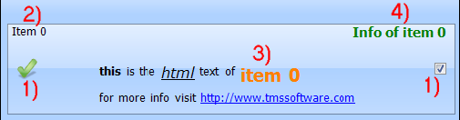
1) The item can contain a graphic on the left and the right side. The type of graphic can be changed with the property GraphicLeftType or GraphicRightType.
The types you can choose from are listed below. In case of gtDetailImage the image can be clicked to enter the details. When choosing gtCommonImage or gtCommonDetailImage, the function is the same as the gtImage or gtDetailImage type, but only uses a global image defined on TAdvSmoothListBox level that can be used for all items.
Supported types:
- gtButton, gtSmoothButton: button is displayed on the item
- gtCheckBox: checkbox is displayed on the item
- gtRadioButton: radiobutton is displayed on the item
- gtImage: image is displayed on the item
- gtDetailImage: image that shows detail control on click is displayed
- gtCommonImage: common listbox image is displayed on the item
- gtCommonDetailImage: common listbox detail image is displayed on the item
- gtNone: nothing is displayed
2) The caption text of the item. The caption can optionally be clicked and triggers the OnItemCaptionClick event.
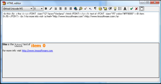
3) The HTML notes text of the item can be formatted with a design time HTML editor. The HTML can contain images listed in a TGDIPPictureContainer or a TImageList. When clicking on an anchor of the HTML text the event OnAnchorClick is called.
4) The info of the item can contain extra information of the info and when clicked will trigger the OnItemInfoClick event.