Frequently Asked Component Specific Questions
Options |
|
Display all FAQ items |
Displaying items 76 to 90 of 508, page 6 of 34
<< previous next >>

 TMS Advanced Dropdown Controls
Adding Images in TAdvMultiColumnDropDown
Assign an imagelist to the TAdvMultiColumnDropDown Control, choose a column with the columntype ctImage, this will allow the StringGrid to display images.
AdvMultiColumnDropDown1.DropDownAutoWidth := true;
with AdvMultiColumnDropDown1.Columns.Add do
begin
  Header := 'Column 1';
  AutoSize := true;
end;
with AdvMultiColumnDropDown1.Columns.Add do
begin
  Header := 'Column 2';
  AutoSize := true;
end;
with AdvMultiColumnDropDown1.Columns.Add do
begin
  Header := 'Column 3';
  AutoSize := true;
end;
with AdvMultiColumnDropDown1.Columns.Add do
begin
  Header := 'Column 4';
  ColumnType := ctImage;
end;

it := AdvMultiColumnDropDown1.Items.Add;
it.Text.Add('Item 1 at column 1');
it.Text.Add('Item 1 at column 2');
it.Text.Add('Item 1 at column 3');
it.ImageIndex := 0;

it := AdvMultiColumnDropDown1.Items.Add;
it.Text.Add('Item 2 at column 1');
it.Text.Add('Item 2 at column 2');
it.Text.Add('Item 2 at column 3');
it.ImageIndex := 1;
TMS Advanced Dropdown ControlsMoving the Minute and Hour pointer of the TAdvTimePickerDropDown
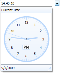 When clicking outside the circle of the watch the minute pointer is moved when clicking inside, the hour pointer is moved.
Clicking on the AM/PM text causes the time to switch from AM to PM or vice versa. The TAdvTimePickerDropDown component has many watch settings to automatically get the current date and time, show or hide the seconds and enable or disable the edit box.
Below are two properties to show the time picker and to show or hide the seconds.
AdvTimePickerDropDown1.ShowTimePicker := true;
AdvTimePickerDropDown1.ShowSeconds := true;
TMS VCL ChartVisual organisation of TMS Advanced Charts
TAdvChartView consists of multipane charts. This means that the chartview can have one or more panes and each pane can display a chart with a single or multiple series. The charts on the panes can scroll and zoom synchronously or can also do this independent of each other. The panes of the chartview are accessible through the component‘s Pane collection. The major elements of the chart are indicated on this screenshot:
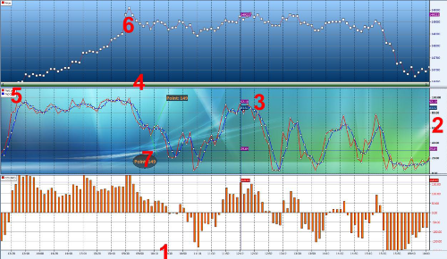
1: X–axis:
Displays the range of points in the chart in number format, a date/time format with unit types minute, day, month, year, custom drawn values or specified values per point. The X-axis supports scaling with mouse. Include poHorizontalScaling in Pane.Options property, then click and drag mouse left or right to see more or less points.
2: Y–axis:
Displays the range of series values from a defined minimum to maximum or via Autorange the best range can automatically be choosen. The Y-axis supports scaling with the mouse and/or keyboard. Include poVerticalScaling in Pane.Options property, then click and drag mouse up or down or press Shift Up/Down to expand or reduce the maximum and minimum value. The Y-axis can be set at the left side of the chart, the right side of the chart or both sides. Different Y-axis values can be shown for different series. The Y-axis also has the capability to show major & minor units with a different font.
3: Crosshairs:
When crosshairs are enabled, move the mouse in the pane area and values which intersect with the crosshair are shown either in the Y-axis area, at the crosshair intersection point, in a separate tracker window or the values can be programmatically retrieved to display in another control.
4: Navigator:
Enable the navigator to scroll left or right in the chart pane. The navigator also offers the same capability as the X–axis itself to zoom in/out.
5: Legend:
Displays the legend text for the number of current chart series added to the chart pane.
6: ChartType:
Choose a chart type and add markers to mark the Y–value of the point.
7: Annotations:
Add an annotation to add text to important points in the serie.
When a New TAdvChartView component is dropped on the form, the component contains one pane with 3 series. Double-click the TAdvChartView component to popup the pane editor that allows adding and removing series from the pane.
TMS VCL ChartApplying a 3D effect to chart series
It is possible to apply a 3D effect on the chart serie. This effect can be customized with a 3D Offset property. This is a property that controls the depth of the 3D view. In code, the equivalent to do this is:
AdvChartView.Panes[PaneIndex].Series[SerieIndex].3D := true;
AdvChartView.Panes[PaneIndex].Series[SerieIndex].3DOffset := 20;
- ctLine
- ctStackedBar & ctNormalBar
- ctStackedArea & ctNormalArea
- ctBand
- ctLineHistogram
- ctLineBar
- ctStackedPercentagebar
- ctStackedPercentageArea
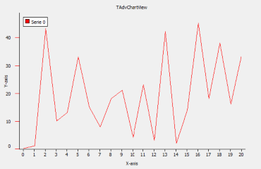
TMS VCL ChartAdding points to a specific chart pane with a specific chart serie
TAdvChartView
To visualize points the TAdvChartView component must be filled with values. Therefore the method AddSinglePoint adds points to a specific chart pane with a specific chart serie. After adding the points, set the Range of points you want to have visualized in the chart. In the sample below the range is set from 0 to 20 to display all 20 values. Note: Include the AdvChart Unit to use the value arEnabled for the AutoRange property as this type is defined in the unit AdvChart.
Example:
procedure TForm1.AddPoints;
var
  i: integer;
begin
  //Adds 20 Points with random value from 0 to 50 to the first Pane (0)
  //with the first Serie (0)
  for i := 0 to 20 do
  AdvChartView.Panes[0].Series[0].AddSinglePoint(RandomRange(0, 50));
  //Set Range from 0 to 20
  AdvChartView.Panes[0].Range.RangeFrom := 0;
  AdvChartView.Panes[0].Range.RangeTo := 20;
  //Set Auto Display Range to arEnabled
  AdvChartView.Panes[0].Series[0].Autorange := arEnabled;
end;
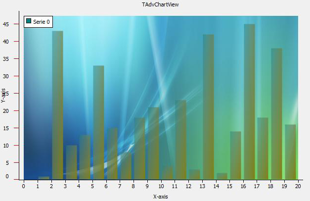
TAdvChartViewGDIP (GDI +)
To visualize points, use the same method for adding points as for the TAdvChartView component. To use transparency and complex gradients add a TAdvChartViewGDIP component to the form and add the code below. Add Unit AdvChartUtil to the Uses clause. The best way to see the transparency is to add a Background image.
Example:
procedure TForm1.GDIPGraphics;
begin
  //Adds Gradient start color and Gradient end color with a Forward
  //Diagonal Gradient type. The starting Transparency is 120 and the end
  //transparency is 255;
  AdvGDIPChartView.Panes[0].Series[0].Color := clTeal;
  AdvGDIPChartView.Panes[0].Series[0].ColorTo := clOlive;
  AdvGDIPChartView.Panes[0].Series[0].Opacity := 120;
  AdvGDIPChartView.Panes[0].Series[0].Opacity := 255;
  AdvGDIPChartView.Panes[0].Series[0].GradientType := gtForwardDiagonal;
end;
TMS VCL ChartUsing the TAdvChartTypeSelector
The TAdvChartTypeSelector component is used in the Serie editor dialog to choose a different chart type. It can also be separately used. The component shows a mini representation of the chart type. You can drop several TAdvChartTypeSelector components on the form, select the chart type for each TAdvChartTypeSelector and add code to the ChartType MouseDown event to set the selector in Selected mode and get the chart type of the chart type selector.
Example:
procedure TForm1.ChartTypeSelector1MouseDown(Sender: TObject; Button: TMouseButton; Shift: TShiftState; X, Y: Integer);
begin
(Sender as TAdvChartTypeSelector).Selected := true;
AdvChartView.Panes[0].Series[0].ChartType := (Sender as TAdvChartTypeSelector).ChartType;
end;
TMS VCL ChartUsing the pane,chart or annotations editors at runtime
To use the pane, chart or annotations editors at runtime simply drop the dialog component on the form, set the chart property to the TAdvChartView you want to edit and add the following code:
procedure TForm1.LoadPaneEditor;
begin
  AdvChartPanesEditorDialog.ChartView := AdvChartView1;
  AdvChartPanesEditorDialog.Execute;
end;
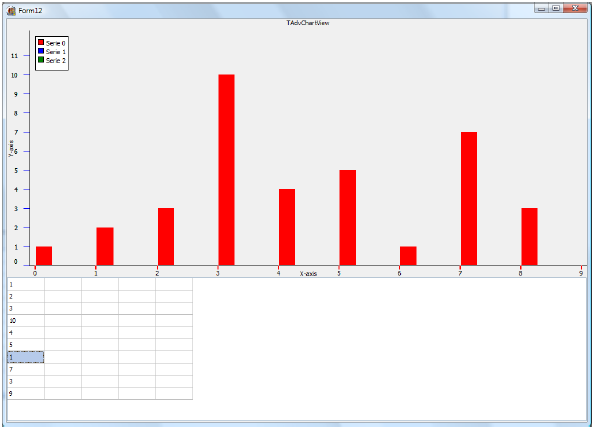
TMS VCL ChartLinking a TAdvChartView with a TAdvStringGrid
TAdvChartLink is a non-visual component and links a TAdvChartView with a TAdvStringGrid component. Please note that TAdvStringGrid is not included in TMS Advanced Charts. It is separately available at https://www.tmssoftware.com/site/advgrid.asp.
To start, drop a TAdvChartLink, TAdvChartView, TAdvStringGrid component on the form and set the Chartview and Grid properties in the TAdvChartLink component. To Edit the TAdvStringGrid set the goEditing property true in the Options set. The TAdvChartLink component has several properties. First the active property must be set true. To tell the TAdvChartLink which column in the grid will be used to display the data you must select an option from the DataType property.
For example select dtFullColumn. Then run the project and type your values in the first column of the grid. While typing, the chart will be updated.
Result:
TMS VCL ChartAdding and removing a Pane
Open the Pane Editor dialog and click on the - icon to remove the selected pane. Click on the + icon to add a new pane. Below is a sample code snippet to add a pane:
procedure TForm1.AddNewPane;
var
  p: TAdvChartPane;
begin
  p := AdvChartView.Panes.Add;
  // set properties of Pane here
end;
procedure TForm1.AddNewPane;
var
  p: TAdvGDIPChartPane;
begin
  p := AdvGDIPChartView.Panes.Add;
  // set properties of GDI+ Pane here
end;
procedure TForm1.RemovePane;
begin
  AdvChartView.Panes[0].Free;
end;
TMS VCL ChartAdding and removing series
Start the SerieEditorDialog and click on the - icon to remove or the + icon to add a series. You can add multiple series per pane. Here is an example to remove a series and to add a series to the first pane.
procedure TForm1.AddNewSerie;
var
  s: TChartSerie;
begin
  s := AdvChartView.Panes[0].Series.Add;
  // set properties of series here
end;
procedure TForm1.AddNewSerie;
var
  s: TAdvGDIPChartSerie;
begin
  s := AdvGDIPChartView.Panes[0].Series.Add;
  // set properties of GDI+ series here
end;
procedure TForm1.RemoveSerie;
begin
  AdvChartView.Panes[0].Series[0].Free;
end;
TParamCheckListUsing custom inplace editors
Using custom inplace editors is possible with the Parameter controls but require some preparing of the inplace editor to be used correct. The custom inplace editor is invoked with the style ‘CUSTOM’, ie:
Parameter control events
When the custom inplace editor is about to be edited, the event OnParamCustomEdit is triggered with parameters:
For TParamLabel:
TParamCustomEditEvent = procedure(Sender: TObject; href, value, props: string; EditRect: TRect) of object;
TParamCustomEditEvent = procedure(Sender: TObject; idx: Integer; href, value, props: string; EditRect: TRect) of object;
TParamCustomEditEvent = procedure(Sender: TObject; Node: TTreeNode; href, value, props: string; EditRect: TRect) of object;
From this event, following code can be used to show the custom inplace edit control:
mycustomcontrol.Parent := Sender;
mycustomcontrol.left := EditRect.Left;
mycustomcontrol.Top := EditRect.Top;
mycustomcontrol.Text := value;
mycustomcontrol.Param := href;
mycustomcontrol.OnUpdate := (Sender as TParamlabel).ControlUpdate;
mycustomcontrol.Visible := true;
mycustomcontrol.SetFocus;
procedure ControlUpdate(Sender: TObject; Param,Text:string);
Preparing the inplace edit control
Create a descendent component of the inplace edit control with following properties and events:
TParamUpdateEvent = procedure(Sender: TObject; Param, Text: string) of object;

TMyCustomControl = class(TMyControl)
private
  FParam: string;
  FOnUpdate: TParamUpdateEvent;
  procedure WMActivate(var Message: TWMActivate); message WM_ACTIVATE;
protected
  procedure DoExit; override;
  procedure CreateParams(var Params: TCreateParams); override;
public
  property Param: string read FParam write FParam;
  property OnUpdate: TParamUpdateEvent read FOnUpdate write FOnUpdate;
end;
{ TMyCustomControl }

procedure TMyCustomControl.CreateParams(var Params: TCreateParams);
begin
  inherited;
  with Params do
    Style := Style AND NOT WS_CHILD OR WS_POPUP;
end;

procedure TMyCustomControl.DoExit;
begin
  inherited;
  if Assigned(OnUpdate) then
    OnUpdate(Self,Param,Text);
end;

procedure TMyCustomControl.WMActivate(var Message: TWMActivate);
begin
  inherited;
  if Message.Active = 0 then
    Hide;
end;TParamLabelUsing custom inplace editors
Using custom inplace editors is possible with the Parameter controls but require some preparing of the inplace editor to be used correct. The custom inplace editor is invoked with the style ‘CUSTOM’, ie:
Parameter control events
When the custom inplace editor is about to be edited, the event OnParamCustomEdit is triggered with parameters:
For TParamLabel:
TParamCustomEditEvent = procedure(Sender: TObject; href, value, props: string; EditRect: TRect) of object;
TParamCustomEditEvent = procedure(Sender: TObject; idx: Integer; href, value, props: string; EditRect: TRect) of object;
TParamCustomEditEvent = procedure(Sender: TObject; Node: TTreeNode; href, value, props: string; EditRect: TRect) of object;
From this event, following code can be used to show the custom inplace edit control:
mycustomcontrol.Parent := Sender;
mycustomcontrol.left := EditRect.Left;
mycustomcontrol.Top := EditRect.Top;
mycustomcontrol.Text := value;
mycustomcontrol.Param := href;
mycustomcontrol.OnUpdate := (Sender as TParamlabel).ControlUpdate;
mycustomcontrol.Visible := true;
mycustomcontrol.SetFocus;
procedure ControlUpdate(Sender: TObject; Param,Text:string);
Preparing the inplace edit control
Create a descendent component of the inplace edit control with following properties and events:
TParamUpdateEvent = procedure(Sender: TObject; Param, Text: string) of object;

TMyCustomControl = class(TMyControl)
private
  FParam: string;
  FOnUpdate: TParamUpdateEvent;
  procedure WMActivate(var Message: TWMActivate); message WM_ACTIVATE;
protected
  procedure DoExit; override;
  procedure CreateParams(var Params: TCreateParams); override;
public
  property Param: string read FParam write FParam;
  property OnUpdate: TParamUpdateEvent read FOnUpdate write FOnUpdate;
end;
{ TMyCustomControl }

procedure TMyCustomControl.CreateParams(var Params: TCreateParams);
begin
  inherited;
  with Params do
    Style := Style AND NOT WS_CHILD OR WS_POPUP;
end;

procedure TMyCustomControl.DoExit;
begin
  inherited;
  if Assigned(OnUpdate) then
    OnUpdate(Self,Param,Text);
end;

procedure TMyCustomControl.WMActivate(var Message: TWMActivate);
begin
  inherited;
  if Message.Active = 0 then
    Hide;
end;TParamListBoxUsing custom inplace editors
Using custom inplace editors is possible with the Parameter controls but require some preparing of the inplace editor to be used correct. The custom inplace editor is invoked with the style ‘CUSTOM’, ie:
Parameter control events
When the custom inplace editor is about to be edited, the event OnParamCustomEdit is triggered with parameters:
For TParamLabel:
TParamCustomEditEvent = procedure(Sender: TObject; href, value, props: string; EditRect: TRect) of object;
TParamCustomEditEvent = procedure(Sender: TObject; idx: Integer; href, value, props: string; EditRect: TRect) of object;
TParamCustomEditEvent = procedure(Sender: TObject; Node: TTreeNode; href, value, props: string; EditRect: TRect) of object;
From this event, following code can be used to show the custom inplace edit control:
mycustomcontrol.Parent := Sender;
mycustomcontrol.left := EditRect.Left;
mycustomcontrol.Top := EditRect.Top;
mycustomcontrol.Text := value;
mycustomcontrol.Param := href;
mycustomcontrol.OnUpdate := (Sender as TParamlabel).ControlUpdate;
mycustomcontrol.Visible := true;
mycustomcontrol.SetFocus;
procedure ControlUpdate(Sender: TObject; Param,Text:string);
Preparing the inplace edit control
Create a descendent component of the inplace edit control with following properties and events:
TParamUpdateEvent = procedure(Sender: TObject; Param, Text: string) of object;

TMyCustomControl = class(TMyControl)
private
  FParam: string;
  FOnUpdate: TParamUpdateEvent;
  procedure WMActivate(var Message: TWMActivate); message WM_ACTIVATE;
protected
  procedure DoExit; override;
  procedure CreateParams(var Params: TCreateParams); override;
public
  property Param: string read FParam write FParam;
  property OnUpdate: TParamUpdateEvent read FOnUpdate write FOnUpdate;
end;
{ TMyCustomControl }

procedure TMyCustomControl.CreateParams(var Params: TCreateParams);
begin
  inherited;
  with Params do
    Style := Style AND NOT WS_CHILD OR WS_POPUP;
end;

procedure TMyCustomControl.DoExit;
begin
  inherited;
  if Assigned(OnUpdate) then
    OnUpdate(Self,Param,Text);
end;

procedure TMyCustomControl.WMActivate(var Message: TWMActivate);
begin
  inherited;
  if Message.Active = 0 then
    Hide;
end;TParamTreeViewUsing custom inplace editors
Using custom inplace editors is possible with the Parameter controls but require some preparing of the inplace editor to be used correct. The custom inplace editor is invoked with the style ‘CUSTOM’, ie:
Parameter control events
When the custom inplace editor is about to be edited, the event OnParamCustomEdit is triggered with parameters:
For TParamLabel:
TParamCustomEditEvent = procedure(Sender: TObject; href, value, props: string; EditRect: TRect) of object;
TParamCustomEditEvent = procedure(Sender: TObject; idx: Integer; href, value, props: string; EditRect: TRect) of object;
TParamCustomEditEvent = procedure(Sender: TObject; Node: TTreeNode; href, value, props: string; EditRect: TRect) of object;
From this event, following code can be used to show the custom inplace edit control:
mycustomcontrol.Parent := Sender;
mycustomcontrol.left := EditRect.Left;
mycustomcontrol.Top := EditRect.Top;
mycustomcontrol.Text := value;
mycustomcontrol.Param := href;
mycustomcontrol.OnUpdate := (Sender as TParamlabel).ControlUpdate;
mycustomcontrol.Visible := true;
mycustomcontrol.SetFocus;
procedure ControlUpdate(Sender: TObject; Param,Text:string);
Preparing the inplace edit control
Create a descendent component of the inplace edit control with following properties and events:
TParamUpdateEvent = procedure(Sender: TObject; Param, Text: string) of object;

TMyCustomControl = class(TMyControl)
private
  FParam: string;
  FOnUpdate: TParamUpdateEvent;
  procedure WMActivate(var Message: TWMActivate); message WM_ACTIVATE;
protected
  procedure DoExit; override;
  procedure CreateParams(var Params: TCreateParams); override;
public
  property Param: string read FParam write FParam;
  property OnUpdate: TParamUpdateEvent read FOnUpdate write FOnUpdate;
end;
{ TMyCustomControl }

procedure TMyCustomControl.CreateParams(var Params: TCreateParams);
begin
  inherited;
  with Params do
    Style := Style AND NOT WS_CHILD OR WS_POPUP;
end;

procedure TMyCustomControl.DoExit;
begin
  inherited;
  if Assigned(OnUpdate) then
    OnUpdate(Self,Param,Text);
end;

procedure TMyCustomControl.WMActivate(var Message: TWMActivate);
begin
  inherited;
  if Message.Active = 0 then
    Hide;
end;TDBAdvGridSelecting all rows in TDBAdvGrid
The index of the last row in the grid is RowCount -1.
To select all normal selectable rows use following code snippet:
Grid.SelectRows(Grid.FixedRows, Grid.RowCount - 1);