Blog
All Blog Posts | Next Post | Previous Post

 TMS WEB Core 1.5 Rimini tips & tricks
Friday, August 21, 2020

For building web client applications, TMS WEB Core has grown since its inception to an extremely rich framework offering RAD component based web development. Its possibilities are sheer unlimited and its functionality documented via an over 500 page developer guide, over 100 sample applications, lots of short videos, a video training of hours and hours of material by Wagner Landgraf and last but not least the TMS WEB Core book by Dr. Holger Flick.
And still there are so many interesting things to tell about the TMS WEB Core framework, hence this blog with tips & tricks.
TWebStringGrid cell customization
Today we offer a tip how TWebStringGrid cells can be extensively customized from code via cell CSS styles. TWebStringGrid is modeled after the VCL TStringGrid for making it intuitively familiar for Delphi VCL users. The grid basically offers fixed rows and columns, a row count, a column count and cells containing text and accessible via WebStringGrid.Cells[ACol,ARow]: string;In the browser, this grid is rendered as a HTML table and in HTML table, each cell is a TD HTML element. And here it becomes interesting as the TD HTML element is programmatically accessible and its attributes and style properties can be customized. The Pascal class for a HTML element is TJSHTMLElement. From this class, attributes can be easily accessed via TJSHTMLElement['attributename']. The HTML element style properties can be accessed via TJSHTMLElement.style.setProperty('propertyname','value') or TJSHTMLElement.style.removeProperty('propertyname').
So, this brings us to custimizing TWebStringGrid cells. Crucial here is the access to the TD HTML element for a cell which can be accessed via WebStringGrid.CellElement[ACol,ARow]: TJSHTMLElement.
With this, we can use following code to set a background color, font color and font-style for a cell with style properties and the text alignment via the align attribute:
var
  td: TJSHTMLElement;
begin
  // set text in the first normal cell
  webstringgrid1.Cells[1,1] := 'Hello world';
  webstringgrid1.ColWidths[1] := 192;

  // get the HTML element for the first cell
  td := webstringgrid1.CellElements[1,1];

  // change the alignment attribute for the cell
  td['align'] := 'right';

  // change the style property
  td.style.setProperty('background-color','red');
  td.style.setProperty('color','yellow');
  td.style.setProperty('padding-right','4px');
  td.style.setProperty('font-weight','bold');
end;
Adding controls in a TWebStringGrid cell
As we have access to the cell HTML TD element, this means we can also insert other HTML elements into the cell. For this, the browser API provides element.appendChild(childelement). Of course, we can create HTML elements directly and insert these in the cell this way, but it is so much more object / component oriented when we can create a TMS WEB Core framework control, set its properties and insert it in a cell. Note that every TMS WEB Core visual control has a reference to its container HTML element. This can be accessed via WebControl.ElementHandle. Knowing this, inserting a control into a WebStringGrid cell becomes easily:var td: TJSHTMLElement; begin // get the HTML element for the first cell td := webstringgrid1.CellElements[1,1]; td.appendChild(mywebcontrol.ElementHandle); end;
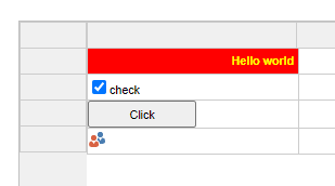
var
  td: TJSHTMLElement;
begin
  td := webstringgrid1.CellElements[1,2];
  chk := TWebCheckBox.Create(Self);
  chk.ElementPosition := epRelative;
  chk.TabStop := false;
  chk.Parent := WebStringGrid1;
  chk.Caption := 'check';
  chk.OnClick := ChkClick;
  td.appendChild(chK.ElementHandle);

  td := webstringgrid1.CellElements[1,3];
  btn := TWebButton.Create(Self);
  btn.ElementPosition := epRelative;
  btn.Caption := 'Click';
  btn.Parent := WebStringGrid1;
  btn.OnClick := BtnClick;
  td.appendChild(btn.ElementHandle);

  img := TWebImageControl.Create(Self);
  // "users.png" is an image added to the project that will be deployed to the output folder
  img.URL := 'Users.png';
  img.ElementPosition := epRelative;
  img.HeightStyle := ssAuto;
  img.WidthStyle := ssAuto;
  img.parent := WebStringGrid1;
  td := webstringgrid1.CellElements[1,4];
  td.appendChild(img.ElementHandle);
end;
  TForm1 = class(TWebForm)
  public
    { Public declarations }
    procedure BtnClick(Sender: TObject);
    procedure ChkClick(Sender: TObject);
  end;
What about TWebTableControl?
TWebTableControl is an alternative to TWebStringGrid for displaying 2 dimensional data. It differs from TWebStringGrid that it has auto flowing columns and rows. The good news is that in terms of customizing the cells of a TWebTableControl, it is 100% identical to TWebStringGrid. A cell element can be access via WebTableControl.CellElements[ACol,ARow]: TJSHTMLElement and from there you can do exactly the same as with a TWebStringGrid.Using CSS classes
It might be desirable to group various cell properties into a CSS class and directly set the same CSS class for multiple cells. You can declare in your project HTML file following CSS:
.redcell { background-color:red; color:white; font-weight: bold;}
.yellowcell { backgrond-color:yellow; color:black;
var
  td: TJSHTMLElement;
begin
  td := webstringgrid1.CellElements[1,1];
  td['class'] := 'redcell';

  td := webstringgrid1.CellElements[2,1];
  td['class'] := 'yellowcell';
end;
procedure TForm1.WebStringGrid1GetCellClass(Sender: TObject; ACol,
  ARow: Integer; AField: TField; AValue: string; var AClassName: string);
begin
  if (ACol = 1) then
     AClassName := 'redcell';
  if (ACol = 2) then
     AClassName := 'yellowcell';
end;
And for any other visual controls?
As explained, the container HTML element for each visual control is accessible via control.ElementHandle: TJSHTMLElement. This means we can manipulate CSS for the container HTML element via:
control.ElementHandle.style.setProperty('propertyname','value');
var
  i: integer;
begin
  for i := 0 to control.ElementHandle.childElementCount - 1 do
  begin
    TJSHTMLElement(control.children.items[i]).style.setProperty('propertyname','value');
  end;
end;
If you have not discovered TMS WEB Core yet, maybe you still have a few #staycation days left to allocate some time to explore it via the trial version. The nice thing about these tips and tricks is that these are applicable both to TMS WEB Core for Delphi/Lazarus and also to TMS WEB Core for Visual Studio Code. So, you can open up your favorite IDE and start your adventures in the web world.
Bruno Fierens

This blog post has received 1 comment.
All Blog Posts | Next Post | Previous Post
Saludos
de la Garza Fide