Blog
All Blog Posts | Next Post | Previous Post

 TMS FNC Ribbon : modern ribbon UI on every operating system and for every Pascal framework
Monday, September 4, 2017
With the FNC product line (framework-neutral-components), it is our vision to enable developers with a single UI controls set, a single learning-curve and a single license to have the freedom of choice to develop Delphi VCL Windows applications, Delphi FMX cross-platform applications for Windows, macOS, Android, iOS or even LCL based Lazarus applications for Windows, macOS or Linux.Since our study & research to realize this FNC layer, we have already created a powerful grid, a flexible planning/scheduling/calendar control, a feature-rich treeview, a rich editor, a toolbar and many more smaller UI controls. The next logical step was to create a ribbon UI control to enable building modern user interfaces for your VCL, FireMonkey Delphi applications of Windows, macOS or Linux applications created with Lazarus/FPC. Our ribbon UI control takes the hard work out of your hands to offer the subtle differences a Microsoft Office 2016 style colourful ribbon UI comprises on these different operating systems.
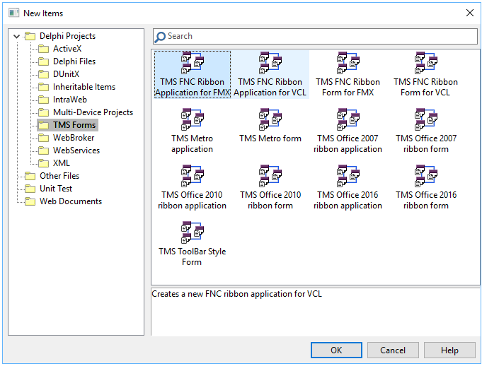
To get started, we have integrated ribbon application and ribbon form repository items in the Delphi "new item" wizard. You can select from there to create a new VCL or FMX ribbon project or to add a new VCL or FMX ribbon form to your existing project.
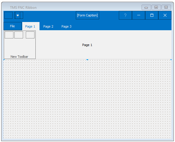
It is of course also possible to add a new ribbon UI to an existing form. To do so, drop the TTMSFNCRibbon control on the form and do not forget to descend your form from TTMSFNCRibbonForm instead of a TForm.
The ribbon architecture
Let's have a look at the TTMSFNCRibbon control itself. It consists of several parts, the main parts being:
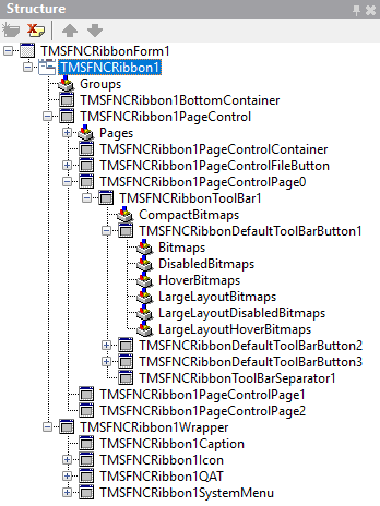
TMSFNCRibbonWrapper : This is the container component for the ribbon form caption that contains the QAT, caption text, system menu
TMSFNCRibbonQAT : This is the quick access toolbar that can sit in the window caption or below the ribbon. The position can be set via the property TTMSFNCRibbon.QATMode.
TMSFNCRibbonCaption : This represents the caption text of the window itself
TMSFNCRibbonSystemMenu : This is the application system menu typically used to close, minimize or maximize the form
TTMSFNCRibbonFileButton : This is the application menu button
TMSFNCRibbonPageControl : This is the page control that is used to paginate between different ribbon pages
TTMSFNCRibbonPageControlContainer : This is a single ribbon page that is a container for toolbars on the ribbon
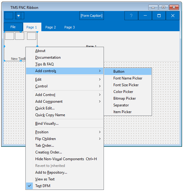
To add a toolbar and toolbar controls to the ribbon, right-click the TTMSFNCRibbonPageControlContainer and from the context menu select to add a toolbar.
Next, right-click the toolbar and from the context menu you can choose to add several toolbar controls.
The controls that can be added to the ribbon toolbar are not limited to this set of controls and as such other UI controls can be added as well to the toolbar. More later about the dynamic sizing configurability of the toolbar controls and the toolbar compact mode.
Matching the Microsoft Office 2016 theme, the TTMSFNCRibbon has a property Theme from where a number of predefined colors can be selected (like the MS Word, MS Excel, MS PowerPoint ribbon colors) but this property can also be set to rbtCustom and then a custom application color can be selected with TTMSFNCRibbon.CustomThemeColor. The TTMSFNCRibbon control will automatically calculate lighter & darker color variants to make up such custom color theme. The color & appearance of each individual element on the ribbon can be customized, but the easiest way to select a consistent looking color is clearly with the TTMSFNCRibbon.Theme and TTMSFNCRibbon.CustomThemeColor setting.
The ribbon toolbar
The place where buttons for interaction with your application are placed is the ribbon toolbar and typically, controls are grouped on toolbars that belong together. By default, the size of the toolbar will automatically adapt to the number & size of controls added to the toolbar. The default size is TMSFNCRibbonToolBar.AutoSize = true, TMSFNCRibbonToolBar.AutoWidth = true, TMSFNCRibbonToolBar.AutoAlign = true. This means that when adding controls to the toolbar, these will be added starting left aligned and the size of the toolbar will grow as controls are added. The toolbar can have a dynamic sizing behavior. That means that when the application window width will become smaller or larger, the toolbar can dynamically size to fit all toolbars in the width of the ribbon. The smallest mode for the toolbar is the compact state. In this state, the toolbar is only a button and the toolbar buttons will only become visible when the toolbar compact state button is clicked. In compact state, the toolbar can display a picture on the button and this is selected via TMSFNCRibbonToolBar.CompactBitmaps: TTMSFNCScaledBitmaps. This is a collection of bitmaps that can be used for different DPI sizes. The control will decide itself what bitmap to use from the collection depending on the DPI of the screen the application is running on. Further customization of the compact state is done via TTMSFNCRibbonToolBar.CompactAppearance, TTMSFNCRibbonToolBar.CompactWidth, TTMSFNCRibbonToolBar.CompactBitmapVisible. When the toolbar is not in compact state, its controls are visible but these can be visible in different sizes. The sizes a ribbon toolbar button can have is set with TMSFNCRibbonDefaultToolBarButton.MinimumLayout, TMSFNCRibbonDefaultToolBarButton.MaximumLayout. By default, the minimum size is bblBitmap, the maximum size is bblLarge and the size in between is bblLabel. When the application is maximized for example and thus the toolbar has sufficient space, all buttons on the toolbar can be shown in bblLarge state. When the application width shrinks, the controls on the toolbar can first reduce to bblLabel state where the controls become a label with attached glyph. When the form width further shrinks, the next step is when the toolbar controls are rendered in bblBitmap state, essentially, only showing the button glyph. Of course, if for a button the MinimumLayout and MaximumLayout are both set to bblLarge, the toolbar control size will never change during application for width changes. Only when the toolbar width cannot longer fit on the ribbon, the entire toolbar will go to compact state.
Visualizing this is probably the best way to make this more clear.
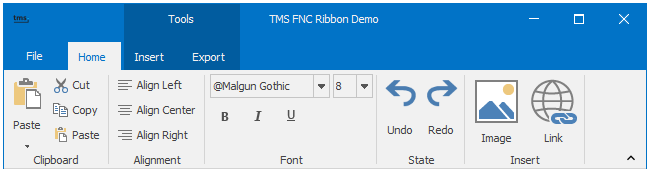
In this first step, notice the Insert toolbar that has sufficient space for hosting two large state buttons:
As the form width decreases, the Insert toolbar shrinks by putting its controls in label layout:
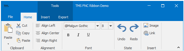
Making the form even smaller now makes the toolbar shrink its controls to bitmap layout:

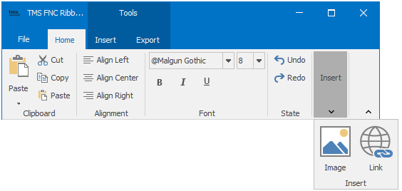
The final and smallest state of the toolbar is the compact state, where all its controls are hidden and the toolbar controls only become visible by clicking the compact state toolbar button to show the full toolbar in a popup:
The ribbon page groups
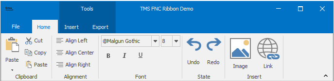
Another often used ribbon UI feature is the ribbon page groups. Sometimes functionality in the application has so much controls to interact with the features of the functionality that it is too much to have one ribbon page for it and that it is better to divide it in two or more pages. To make the ribbon pages look consistently together, the concept of page groups is used. This is a group indicator above the ribbon page tabs. Adding a ribbon page group can be easily done via the collection TTMSFNCRibbon.Groups. Add a new TMSFNCRibbonGroup item to this collection and here it can be configured what the index is of the first ribbon page in the group (TMSFNCRibbonGroup.StartPageIndex) and the last page (TTMSFNCRibbonGroup.EndPageIndex). The group can be given a group name set via TTMSFNCRibbonGroup.Text and with the group the selected ribbon page tab can have its own color set via TTMSFNCRibbonGroup.Color & TTMSFNCRibbonGroup.TextColor. The page group itself is a darker variant from the ribbon theme color. In this example, a ribbon page group was created for the Insert and Export page. The page group name is Tools and was created by setting TMSFNCRibbonGroup.StartPageIndex to 1 and TTMSFNCRibbonGroup.EndPageIndex to 2.
g := rb.Groups.Add;
g.Text := 'Tools';
g.StartPageIndex := 1;
g.EndPageIndex := 2;
The ribbon QAT
Frequently used functions, like a save, undo, ... function can be added to the always visible QAT (quick access toolbar). This QAT sits normally on the form caption or right below the ribbon. By default, on a new TMSFNCRibbon, the QAT is available on the caption. To add controls to it, also right-click the control at design-time and from the context menu select the controls to add. The QAT has by default an automatically managed option menu (at the right-side of the QAT). From this options menu, controls on the QAT can be hidden or made visible and the position of the QAT can be selected. The option menu can be further customized by implementing any of its menu event handlers like OnOptionsMenuCustomize, OnOptionsMenuItemCanShow, OnOptionsMenuMoreCommands, ...
Learn more
Several resources are available for you to learn more about our FNC abstraction layer and controls:
Blog post about FNC UI pack
Blog post about developing FNC custom controls
FNC controls video series
Conclusion
Our TMS FNC ribbon control has everything on board to allow you to add a ribbon UI to your applications, be it Delphi VCL Windows applications, cross platform FireMonkey applications or applications created with Lazarus for Windows, macOS or Linux. It is easy & fast to configure but at the same time can be extensively and in detail customized. Together with our FNC grid control, you can build Excel like user interfaces in a matter of hours, or in combination with our FNC rich editor a word processor like application, etc... Once you learned to use the TMS FNC Ribbon control, you can apply this knowledge to your next project developed against another UI control framework or you could reuse code from one application in a given framework for another application using another framework. We look forward to see awesome applications you create and hear about further needs you might have to facilitate your development and make it even faster.
Bruno Fierens

This blog post has received 8 comments.
 2. Monday, September 4, 2017 at 2:13:12 PM
Thank you Jacco!
2. Monday, September 4, 2017 at 2:13:12 PM
Thank you Jacco!
Pieter Scheldeman
3. Monday, September 4, 2017 at 2:58:41 PM
A pet peeve of mine is that most implementations of the Ribbon forget to specify the special font used by Group captions ("Clipboard", Alignment", "Font", "State", "Insert" in the last screenshot.) That font is different from the font used by button captions, yet you are using the same font.
Leonardo Herrera
4. Monday, September 4, 2017 at 4:34:26 PM
Good catch. The good news is that this font can be customized. See TTMSFNCRibbonToolBar.Font but it would indeed be good this was out of the box already a font matching better with the Microsoft Office used font.
Bruno Fierens
5. Monday, March 4, 2019 at 10:10:39 PM
Hey -- what are the licensing requirements for using the TMS ribbon?
Nick Hodges
6. Tuesday, March 5, 2019 at 5:29:47 PM
We obtained a license from Microsoft before they retired the UI licensing option.
Bruno Fierens
7. Sunday, August 9, 2020 at 4:49:17 PM
For what ever reason, the original form caption is showing, and the toolbar caption is showing, so I''m seeing double minimize, maximize and close buttons. I''m sure it''s a very simple setting, but what properties/methods turn the original form caption off? Thanks,
Curt
Curt Krueger
8. Wednesday, March 9, 2022 at 2:46:35 AM
I downloaded the trial and compiled the VCL\Ribbon\UDemo project. The very first thing I noticed is that the window shows the standard windows caption bar instead of the way it is pictured in your blog post. I have tried to find a setting to get it to display correctly but cannot find anything. Is this because I''m using the trial version? It is very frustrating.
David Lye
All Blog Posts | Next Post | Previous Post
Uijlenhoet Jacco