Frequently Asked Component Specific Questions
Options |
|
Display all FAQ items |
Displaying items 106 to 120 of 888, page 8 of 60
<< previous next >>

 TMS FNC Chart
Supported Platforms and Operating Systems
The following table shows supported platforms and operating systems for different RAD Studio versions:
http://docwiki.embarcadero.com/PlatformStatus/en/Main_Page
TMS FNC UI PackSupported Platforms and Operating Systems
The following table shows supported platforms and operating systems for different RAD Studio versions:
http://docwiki.embarcadero.com/PlatformStatus/en/Main_Page
How to display text in TVrDisplay
The TVrDisplay component serves as a container control, similar to a TPanel just that it has been written to look like the background of an LCD screen. It can't by itself not display text. You can add a TVrMatrixLabel as child control on this TVrDisplay and set the background color of the TvrMatrixLabel to the same color as TVrDisplay and have it display text via adding text to the TVrMartrixLabel.
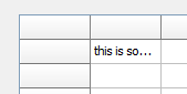
TAdvStringGridHow to draw text with end ellipsis when it is too long to fit in a cell
The grid has a built-in capability to draw text with end ellipsis when it is too long to fit in a cell. This is enabled for non word wrapped text when grid.EnhTextSize = true.
Example:
begin
  advstringgrid1.WordWrap := false;
  advstringgrid1.EnhTextSize := true;
  advstringgrid1.Cells[1,1] := ''this is some long text'';
end;
 TAdvTaskDialog
How to translate the CustomButtons
For the first string in the CustomButtons stringlist, the ButtonID is 100, the next 101 and so on...
TAdvStringGridHow to control that at specific column positions, no column can be dropped.
With the OnAllowColumnDrop event, it is possible to control that at specific column positions, no column can be dropped.
Example:
With a TAdvGridColumnPicker connected to a grid and the code:
procedure TForm1.AdvGridColumnPicker1AllowColumnDrag(Sender: TObject;
  ACol: Integer; var Allow: Boolean);
begin
  Allow := ACol > 2;

end;

procedure TForm1.AdvGridColumnPicker1AllowColumnDrop(Sender: TObject;
  ACol: Integer; var Allow: Boolean);
begin
  Allow := ACol > 2;
end;
TAdvStringGridProgrammatically show the filter dropdown for a grid column
When auto filtering is enabled, the filter is shown with: grid.ShowFilterDropDown(Column).
This way it is possible to hook-up the filter dropdown also to a hotkey for example instead of having it shown only when the mouse clicks the filter icon.
This code snippet how the Ctrl-F5 hotkey can show the filter dropdown for example:
procedure TForm1.AdvStringGrid1KeyDown(Sender: TObject; var Key: Word;
Shift: TShiftState);
begin
if (ssCtrl in Shift) and (Key = VK_F5) then
AdvStringGrid1.ShowFilterDropDown(AdvStringGrid1.Col);
end;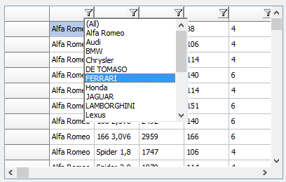 TAdvSmoothPanel
How to add buttons to the layout that span multiple rows or multiple columns.
On a regular TAdvSmoothExpanderPanel, the buttons are laid out proportionally on the surface of the panel and all buttons have the same size (AdvSmoothExpanderPanel.ButtonWidth, AdvSmoothExpanderPanel.ButtonHeight). When the new AlternativeLayout: Boolean property is set to true, it is possible to add buttons to the layout that span multiple rows or multiple columns or both. This way, buttons with different sizes can be added to the TAdvSmoothExpanderPanel.
To use the new feature, make sure to set TAdvSmoothExpanderPanel.AlternativeLayout = true and set both TAdvSmoothExpanderPanel.Columns, TAdvSmoothExpanderPanel.Rows to a value different from -1. Set the TAdvSmoothExpanderButton.ColumnSpan, TAdvSmoothExpanderButton.RowSpan to values bigger than 1 where larger buttons are desired.
Example:
A default TAdvSmoothExpanderPanel panel initialized with:
var
  i: integer;
begin
  AdvSmoothExpanderButtonPanel1.AlternativeLayout := true;
  AdvSmoothExpanderButtonPanel1.Columns := 4;
  AdvSmoothExpanderButtonPanel1.Rows := 4;
  AdvSmoothExpanderButtonPanel1.Buttons.Clear;

  for i := 0 to 9 do
    AdvSmoothExpanderButtonPanel1.Buttons.Add.Caption := ''Button ''+ inttostr(i);

  AdvSmoothExpanderButtonPanel1.Buttons[0].ColumnSpan := 2;
  AdvSmoothExpanderButtonPanel1.Buttons[0].RowSpan := 2;

  AdvSmoothExpanderButtonPanel1.Buttons[7].ColumnSpan := 2;
  AdvSmoothExpanderButtonPanel1.Buttons[7].RowSpan := 2;
end;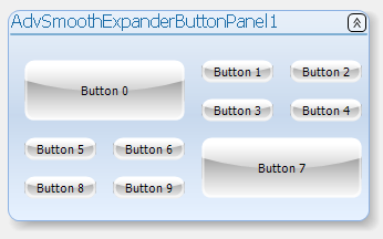 TAdvSmoothTileList
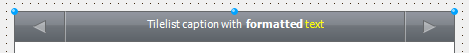
HTML formatted text in header and footer
When TAdvSmoothTileList.Header.ShowPages = false, a caption can be shown in the header and this can contain HTML formatted text:
begin
  AdvSmoothTileList1.Header.Caption := ''Tilelist caption with formatted text'';
end;
 TInspectorBar
How to use the TFormControlInspectorEditLink component
TFormControlInspectorEditLink allows to use any TWinControl based edit control that is placed on the form as inplace editor for the TInspectorBar.
To start using TFormControlInspectorEditLink, drop an instance on the form and also an instance of the edit control you want to use as inplace editor. Assign this control to TFormControlInspectorEditLink.Control. Then hook up the EditLink to TInspectorItem.EditLink and set TInspectorItem.PropertyType to ptCustom. Implement minimum the TFormControlInspectorEditLink.OnGetEditorValue / TFormControlInspectorEditLink.OnSetEditorValue events to get & set the value of the TInspectorItem as text from the control value.
Example:
To use a TAdvSearchEdit control as inplace editor for a TInspectorBar item, that performs filtering / lookup while typing in a dictionary, following code can be used applied on a default TInspectorBar:
procedure TForm1.FormCreate(Sender: TObject);
var
  sl: TStringList;
  i: integer;
begin
  AdvSearchEdit1.SearchButton.Visible := false;
  AdvSearchEdit1.CategoryButton.Visible := false;
  AdvSearchEdit1.DropDownHeader.Visible := false;

  // loading the dictionary file in the TAdvSearchEdit
  sl := TStringList.Create;
  try
    sl.LoadFromFile(''e:\tms\temp\dictionary.txt'');
    AdvSearchEdit1.LoadStrings(sl);
  finally
    sl.Free;
  end;

  // linking up the TAdvSearchEdit as inplace editor
  FormControlInspectorEditLink1.Control := AdvSearchEdit1;
  // inplace editor control will still hanbdle return key
  FormControlInspectorEditLink1.WantKeyReturn := true;

  InspectorBar1.Panels[0].ItemHeight := 26;
  InspectorBar1.Panels[0].Style := psProperties;

  for i := 0 to InspectorBar1.Panels[0].Items.Count - 1 do
  begin
    InspectorBar1.Panels[0].Items[i].EditLink := FormControlInspectorEditLink1;
    InspectorBar1.Panels[0].Items[i].PropertyType := ptCustom;
  end;
end;

procedure TForm1.FormControlInspectorEditLink1GetEditorValue(Sender: TObject;
  Item: TInspectorItem; var AValue: string);
begin
  AValue := AdvSearchEdit1.Text;
end;

procedure TForm1.FormControlInspectorEditLink1SetEditorValue(Sender: TObject;
  Item: TInspectorItem; AValue: string);
begin
  AdvSearchEdit1.Text := AValue;
end;
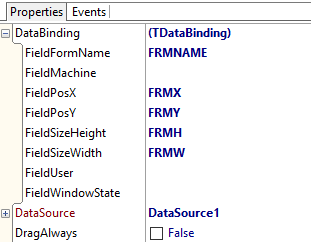
 TFormSize
Persist settings in a dataset
You can connect a dataset via a datasource to the TFormSize component to allow to persist the form position and size settings to a database. The FormSize.DataBinding property allows to define via which dataset field the data is persisted. Not all fields need to be defined but the minimum needed will be FieldFormName, FieldPosX, FieldPosY, FieldSizeWidth, FieldSizeHeight
 TAdvStringGrid
property grid.ControlLook.RadioRange: Boolean
Settings this property to true allows a shortened display of a radiogroup where the first radiobutton text value is shown left from the radiobutton and the last one right from the button. This allows to have only the minimum text left and right of the radiobutton group. Code snippet:
var
  sl: TStringList;
begin
  AdvStringGrid1.Cells[1,0] :=''Score'';
  AdvStringGrid1.Alignments[1,0] := taCenter;
  sl := TStringList.Create;
  sl.Add(''0'');
  sl.Add('''');
  sl.Add('''');
  sl.Add('''');
  sl.Add('''');
  sl.Add(''5'');
  AdvStringGrid1.ControlLook.RadioRange := true;
  AdvStringGrid1.ColWidths[1] := 120;
  AdvStringGrid1.AddRadio(1,1,1,0,sl);
end;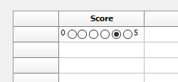 TAdvMemo
FullWordAtXY() and TokenAtXY() methods
FullWordAtXY() returns the full word found at the cursor position. This is the word within word boundaries.
The word boundary is a space character, so FullWordAtXY() returns the series of characters till a space is encountered.
TokenAtXY() returns the series of characters till a token delimiter is encountered.
A token is delimited by the characters: [#32, ''('', '')'', ''['', '']'', '','', ''.'', '':'', '';'', ''"'', '''''''', ''='']
TMS IntraWeb Component Pack ProTIWResponsiveList: How to use the ItemStyle parameter of the OnItemRender event
You can use the ItemStyle parameter of the OnItemRender event in the same way as the ItemStyle property of a list item. First add an item to the ItemStyles collection then use its name to apply the style to a specific list item.
Example to use a red font color for the first item in the list:
var
  si: TIWItemStylesItem;
begin
  si := TIWResponsiveList1.ItemStyles.Add;
  si.ItemStyle.Font.Color := clWebRed;
  si.Name := ''RedFont'';

procedure TformResponsiveList1.TIWResponsiveList1ItemRender(Sender: TObject;
  Index: Integer; var ItemStyle: string); begin
  if Index = 0 then
    ItemStyle := ''RedFont'';
end;
TMS FMX WebGMapsUsing the TLocationSensor with ReverseGeocoding on Android
When using the TLocationSensor and you wish to do a reverse geocoding call from the OnLocationChanged event on Android, you always have to use a TThread.Queue around your code to avoid network exceptions ( for example: "Project ABC.apk raised exception class EJNIException with message ''android.os.NetworkOnMainThreadException''").
Example:
procedure TForm1.LocationSensor1LocationChanged(Sender: TObject;
  const OldLocation, NewLocation: TLocationCoord2D);
begin
  TThread.Queue(nil,
  procedure
  var
    cp: String;
  begin
    TMSFMXWebGMapsReverseGeocoding1.Latitude := NewLocation.Latitude;
    TMSFMXWebGMapsReverseGeocoding1.Longitude := NewLocation.Longitude;
    TMSFMXWebGMapsReverseGeocoding1.LaunchReverseGeocoding;
    cp := TMSFMXWebGMapsReverseGeocoding1.ResultAddress.PostalCode;
  end
  );
end;