VCL
TMS Image Controls Pack
A collection of graphic and image controls
Feature overview
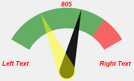
TAdvGauge- Modern looking gauge control
- Use text or pictures for minimum & maximum indication
- Single needle for position indication or dual needle for range indication
- Color, width, opacity control for needles
- Gauge scale can have single color or 2 zones in different colors
- Value can be displayed inside, above or below the needle
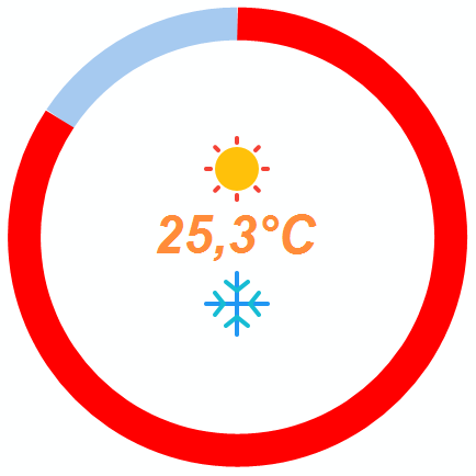
TAdvGaugeCircle
- Use custom images for the up and down keys
- Format the value text using standard Delphi Format arguments
- Set the font to match your application style
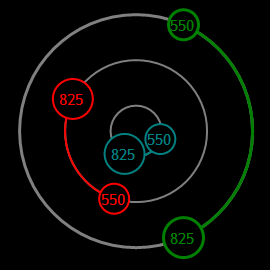
TAdvRangeCircles
- Use one or more circles as a scale to indicate values or ranges
- Configurable color per cicle
- Displayed values can be formatted via Delphi's Format function specifiers
- Indicator is configurable as value indicator or range indicator
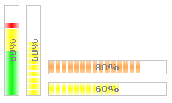
TAdvProgressBar
- Progressbar with level dependent color & stacked multicolor display
- Configurable levels
- Smooth & blocked display with gradients
- Various ways to display progress as a number
- Infinite 'running' progress style
TAdvCircularProgress
- SQL 2005 style progressbar
- Customizable block, active block colors & interval speed
- Real progress can be optionally indicated with Position, Min, Max properties and in color set by Appearance.ProgressSegmentColor

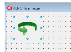
TAdvOfficeImage
- Small image component that can display PNG, GIF, JPEG, ICO, WMF, BMP images, including PNG images with alpha transparency.
TAdvPicture
- Very small component, yet can display BMP,ICO,WMF,EMF,JPEG,GIF and animated GIF files in various styles
- No other libraries required
TAdvReflectionImage
- Image with built-in automatic reflection display
- Support for PNG, BMP, GIF, JPEG images
- Configurable reflection effect
- Office style hint support
- Can save generated reflection in various formats to file

TAdvWiiProgressBar
- Nintendo Wii style progressbar
- Customizable block, active block colors & interval speed

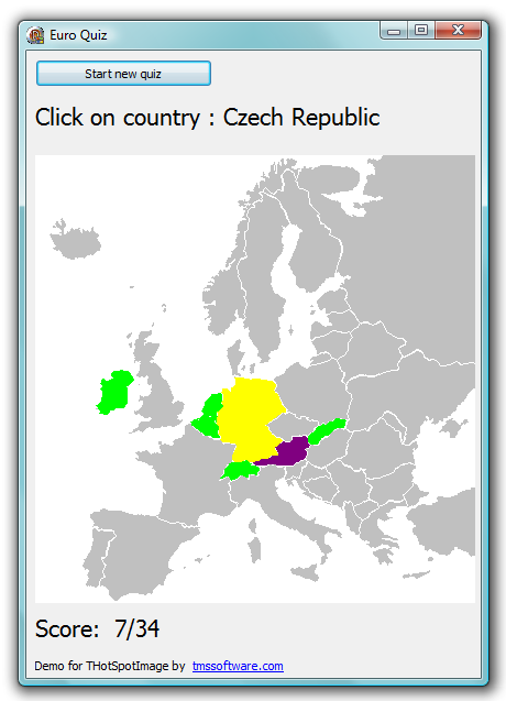
THotSpotImage
- Hotspots can be rectangle, ellipsis, polygon or rotated rectangles, rotated ellipsis
- Hotspot handling for hovering, hints, click, double clicks
- Includes design time hotspot editor with magic wand tool for automatic polygon selections
- Clipped or non-clipped hotspot hover-image or clicked-image
- Each HotSpot has a Down, Selected, Blink property for displaying clipped or non clipped clicked image after click on hotspot
- Supports image zoom
- Support for single or multiselect
- HotSpots can show in selectable color or overlay image when selected, down, or blinking
- Each HotSpot can have its own link
- Design-time and runtime usable hotspot editor
- Capability to set the cursor for hotspots
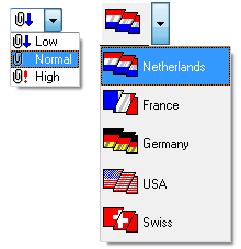
TImagePicker
- A dropdown image selector. Selects items from an image list with possibility to display text with the image in dropdown. The dropdown list supports various styles, including flat, etched, with focus border. Supports normal and incremental lookup for associated text.
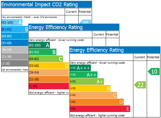
TMS EPC Chart
- ReadOnly or can be edited with mouse and/or keyboard
- Can show Current and/or Potential values
- Easy export to .BMP file
- Can be used as graphic (via SPBEPC.Picture property)
- Fully customizable text for title, top and bottom caption
TShader
- TPanel descendant component with transient between two colors, ideal as background for a form.
TTileBmp
- Component for displaying bitmap patterns tiled. Can be used to create tiled bitmap form backgrounds.
TWallPaper
- A graphic
control which can display bitmaps, icons, metafiles, JPEG
files and GIF files in various ways.
Image can be positioned : topleft, topright, bottomleft, bottomright, centered, tiled or stretched.
Help
Trial Downloads
Site license
unlimited developers in the company
€ 575 yearly renewal *
€ 1295

Compatibility
- Delphi 7, 2007, 2010, XE, XE2, XE3, XE4, XE5, XE6, XE7, XE8, 10 Seattle, 10.1 Berlin, 10.2 Tokyo, 10.3 Rio, 10.4 Sydney, 11 Alexandria, C++Builder 2007, 2009, 2010, XE, XE2, XE3, XE4, XE5, XE6, XE7, XE8, 10 Seattle, 10.1 Berlin, 10.2 Tokyo, 10.3 Rio, 10.4 Sydney, 11 Alexandria, DXE15, CXE15, DXE16, CXE16 (Professional/Enterprise/Architect)
Licensing
- Licensing FAQ
- License for commercial use: Single developer license, Small team license, Site license
- Includes full source code
- Ask questions to our engineers related to purchased product via Support Center
- Free 1 year updates and new releases
- After 1 year, a discount renewal is offered for a 1 year extension. *
* offer valid for 30 days after end of license. Discount price is subject to change.
Bookmarks
×
![]()