Blog
All Blog Posts | Next Post | Previous Post

 Extend TMS WEB Core with JS Libraries with Andrew:
Charting Part 2: Chart.js
Tuesday, August 23, 2022


Last time out, we started our new miniseries on charting by exploring a JavaScript library used to create Sparklines. These are very small charts that typically have no annotations and only a single data series, intended for use in-line within a block of text, or perhaps as simple widgets, or when there is a call for uncluttered interfaces. This time out, we're going to look at more traditional charts - those with axes, labels, titles, and so on. There are dozens of JavaScript libraries in this space, each with different strengths and weaknesses. Today, we're going to look at one of the most popular - Chart.js.
Motivation.
Sometimes you simply just need to display a traditional chart. A left axis. A bottom axis. A title. Some labels, perhaps. And perhaps a bit of animation or interactivity to spruce things up a bit. Maybe you're displaying scientific or financial information, where charts are expected to be formatted consistently. Or maybe you're just trying to convey information in as unambiguous a manner as possible. Whatever the reason, displaying a traditional chart is bound to come up from time to time.The choice of JavaScript library is going to largely depend on the variety of chart types and how much control you want to have over their rendering. Chart.js is popular mostly because of its simplicity, not because of its flexibility, nor because of how nice-looking the charts it generates are. More utilitarian than bespoke. We'll look at some other charting libraries in this miniseries, where they are decidedly not utilitarian. But for many applications, this isn't a negative quality. Rather, this is exactly what is required.
Getting Started.
We'll start here in the usual fashion, with the Chart.js library loaded via the Project.html file or using the Delphi Manage JavaScript Libraries function. It is a hugely popular library, so there should be no trouble finding a link to it in your CDN of choice. Here's what we'll be using in our example project.
<script src="https://cdn.jsdelivr.net/npm/chart.js@3/dist/chart.min.js"></script>
This library supports eight different chart types, not counting the numerous other types that can be added via plugins and other integration tools. It needs to connect to a <canvas> tag to do its work. I've gotten into the habit of using TWebHTMLDiv components much of the time, where a <canvas></canvas> element can be added to the HTML property to get us our <canvas> to work with.
Alternatively, a TWebPaintBox component is rendered as a <canvas> element more directly, so that can also be used. In this case, we'll go with a TWebHTMLDiv component as this outer container is what sets limits on the size of the resulting chart. We'll call this outer component divChart1 to start with, setting both the Name and ElementID properties to that value. Then we'll set the HTML property to the following, thus creating the <canvas> element and assigning it the id of #Chart1, while also setting it to fit the outer TWebHTMLDiv dimensions.
<canvas id="Chart1" width=100% height=100%></canvas>
To get a chart up and running, we'll try a very simple bar chart to start with, with some random data, just to get a feel for where we're starting from. We'll also set the chart on a dark background, where we'll immediately then have to figure out how to change a few colors.
The basic idea is simple enough, passing properties to the JavaScript library function that creates the actual chart component. Finding the properties and where they fit in the hierarchy can be a bit fiddly though. Also, when searching around for examples and within the documentation, there seems to be a significant difference in how these options are laid out in the current version (v3) as compared to previous versions. Something to be mindful of when searching Google for examples.
procedure TForm1.WebFormCreate(Sender: TObject);
begin

  asm
    var c1 = new Chart(
      document.getElementById('Chart1'), {
        type: 'bar',
        data: {
          labels: [1,2,3,4,5,6,7],
          datasets: [{
            label: 'Some Data',
            data: [8,6,7,5,3,0,9],
            backgroundColor: 'rgb(0,192,192)',
          }]
        },
        options: {
          aspectRatio: 1.5,
          plugins: {
            legend: {
              labels: {
                color: '#fff'
              }
            }
          },
          scales: {
            y: {
              ticks: {
                color: '#fff'
              },
              grid: {
                color: '#aaa'
              }
            },
            x: {
              ticks: {
                color: '#fff'
              },
              grid: {
                color: '#aaa'
              }
            }
          }
        }
      }
    );
  end;

end;
This leads us to the following chart. Some basic interaction is enabled by default. Hovering over a bar will show a tooltip with its value, for example. Clicking on the label at the top will toggle the visibility of that set of data. Not so useful here, but good to know. Also, the initial display is animated, which looks good.
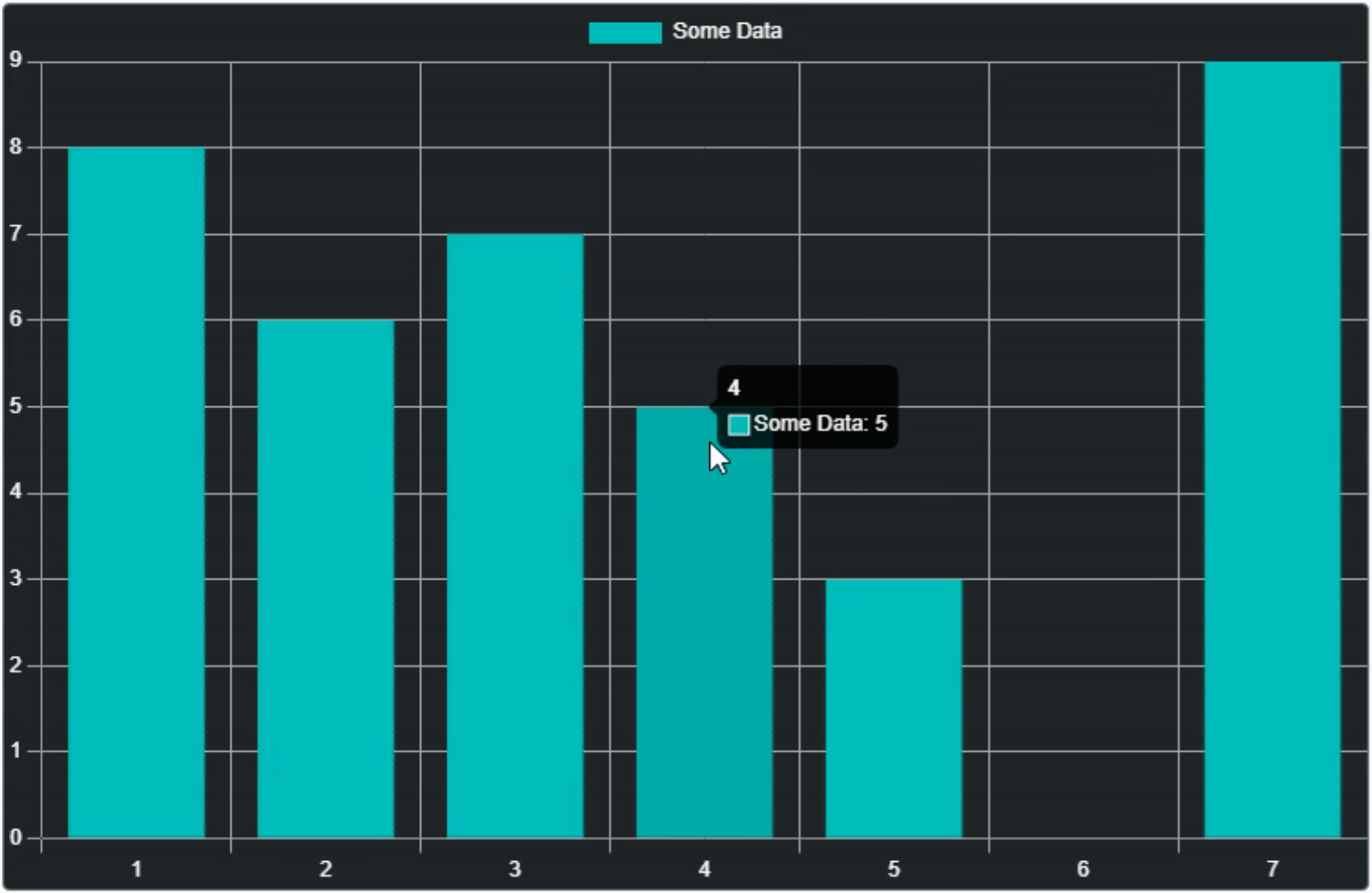
Chart.js Bar Chart Example.
Off to a good start here. A bit of work to set the various parameters, perhaps more than we'd like. We can encapsulate some of that with a function call of some kind if we're going to be doing a lot of chart work, so not something to be too concerned about.
The defaults for things like the axis ranges, font sizes, and so on work pretty well, and everything can be overridden when needed. However, the chart is drawn entirely through the <canvas> mechanism, so all these kinds of overrides have to happen via the JavaScript library itself - not much ability to do that via CSS. Depending on where you need to make changes, this may be problematic or a complete non-issue. Given that the charts themselves are on the simpler side, this isn't likely to be that much of a problem.
Using a canvas to draw the chart is something that separates different JavaScript charting libraries. For example, the Sparklines charts from last time rendered SVG images, as will some of the charting libraries we'll be covering later. SVG might be preferred here, due to its inherently scalable nature. In the case of canvas-based charts, they may render fine on-screen but may need to be re-rendered for printing or for inclusion in a PDF file, for example, as the canvas is rendered at a fixed DPI. That DPI can be very high, so not a deal-breaker by any means. Just something to be mindful of if you're doing anything other than just displaying the chart on a page where the DPI doesn't need to change.
Let's Try Something Simpler.
Like last time, if we're going to use this in Delphi, it would be helpful to hide some of that JavaScript code (well, the chart object definition, specifically) within a Delphi function of some kind. Nothing fancy here, really. But let's try and make it a little more flexible.JavaScript allows for creating variables and page elements on the fly without any kind of declarations ahead of time. So let's try and mimic that a little bit by having the function call create the chart entirely just by calling it with a few extra parameters. We'll keep track of the charts by creating an array of JSValue elements. This will allow us to make changes to the charts after they're created.
function TForm1.CreateChart(ChartType: String; Title: String; Top, Left, Width, Height: Integer; ChartLabels: Array of String): Integer;
var
  DivChart: TWebHTMLDiv;
  ChartName: String;
  ChartElem: TJSElement;
  ChartRef: JSValue;

  ChartGridColor: String;
  ChartAxisLabelColor: String;
  ChartTitleColor: String;
  ChartLegendColor: String;
begin
  // Create a new ChartArray spot
  Result := Length(ChartArray);
  ChartName := 'Chart'+IntToStr(Length(ChartArray));
  SetLength(ChartArray, Length(ChartArray)+1);

  // Create the surrounding TWEBHTMLDiv that holds the chart <cavas> element
  DivChart := TWebHTMLDiv.Create(Self);
  DivChart.Parent := Self;

  DivChart.ElementID := 'div'+ChartName;
  DivChart.ElementClassName := 'rounded border border-secondary bg-dark';
  DivChart.HTML.Text := '<canvas id="'+ChartName+'" width=100% height=100%></canvas>';

  DivChart.Top := Top;
  DivChart.Left := Left;
  DivChart.Width := Width;
  DivChart.Height := Height;

  // A reference to the <canvas> tag is used to initialize the chart
  ChartElem := DivChart.ElementHandle.firstElementChild;


  // Set some chart defaults - could pass these as parameters, for example
  ChartGridColor := '#aaa';
  ChartAxisLabelColor := '#fff';
  ChartTitleColor := '#77f';
  ChartLegendColor := '#0f0';

  // Create the actual chart
  asm
    ChartRef = new Chart(ChartElem, {
      type: ChartType,
      data: {
        labels: ChartLabels,
        datasets: []
      },
      options: {
        aspectRatio: Width / Height,
        layout: {
          padding: {
            top: 0,
            right: 10,
            bottom: 5,
            left: 10
          }
        },
        plugins: {
          title: {
            text: Title,
            color: ChartTitleColor,
            display: (Title.length > 0)
          },
          legend: {
            labels: {
              color: ChartLegendColor
            }
          }
        },
        scales: {
          x: {
            ticks: {
              color: ChartAxisLabelColor
            },
            grid: {
              color: ChartGridColor
            }
          },
          yAxes: {
            ticks: {
              color: ChartAxisLabelColor,
              paddingLeft:4
            },
            grid: {
              color: ChartGridColor
            }
          }
        }
      }
    });
  end;

  // Store the reference to the chart so we can use it later
  ChartArray[Length(ChartArray)-1] := ChartRef;

end;
This is basically what we were doing before, but now all the elements in the chart object definition are variables. Some are passed to the function as parameters. Some are just set in the function directly. Easily updated to reflect the kinds of parameters that might be needed for any particular situation, or to even just pass a TWebHTMLDiv as a parameter if it is already positioned on the page.
In this case, we're creating everything at runtime to have the most flexibility. Note also that it is possible to "move" elements on the page around after they're created, if necessary, using functions like appendChild. The CreateChart function doesn't actually have any data. So we'll need another procedure to handle that.
procedure TForm1.AddChartData(ChartNum: Integer; DataLabel, DataColor: String; Data: array of Integer);
var
  ChartRef: JSValue;
begin
  ChartRef := ChartArray[ChartNum];
  asm
    var newData = {
      label: DataLabel,
      borderColor: DataColor,
      backgroundColor: DataColor,
      data: Data
    }
    ChartRef.data.datasets.push(newData);
    ChartRef.update();
  end;
end;
And again here, we're passing parameters that we're interested in, but others could be added or some of these removed if it doesn't fit well for any particular reason. But with this in place, we can now create a bar chart and then populate it as follows.
procedure TForm1.WebFormCreate(Sender: TObject);
var
  ChartNum: Integer;

const
  ChartLabels: array[0..6] of String = ('Sun', 'Mon', 'Tue', 'Wed', 'Thu', 'Fri', 'Sat');

begin
  ChartNum := CreateChart('bar','Example Bar Chart #1', 10, 10, 500, 300, ChartLabels);
  AddChartData(ChartNum, 'Series A', 'rgba(192,0,192,0.8)', [8,6,7,5,3,0,9]);
  AddChartData(ChartNum, 'Series B', 'rgba(0,192,192,0.8)', [6,7,5,3,0,9,8]);
  AddChartData(ChartNum, 'Series C', 'rgba(192,192,0,0.8)', [7,5,3,0,9,8,6]);
end;
This creates a side-by-side style bar chart with three different series. Clicking on the series' labels at the top toggles them in the chart. And hovering the mouse over any of the bars shows the value, just as we had previously.
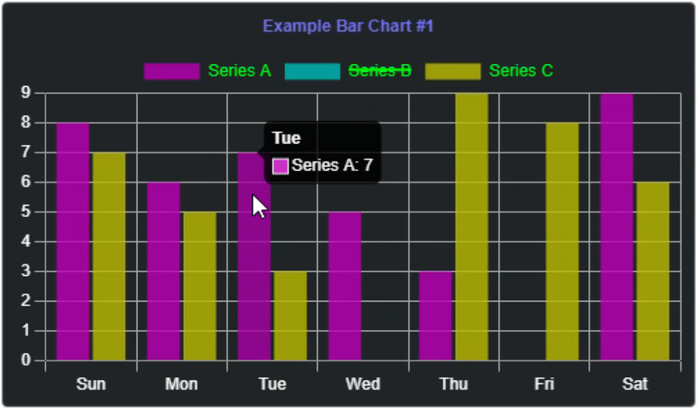
Dynamically Created Bar Chart.
To create more bar charts on the same page, we can just call the CreateChart function again, pass in some
different parameters to position the chart, and then add data as we did previously.
  ChartNum := CreateChart('bar','Example Bar Chart #2', 10, 520, 500, 300, ChartLabels);
  AddChartData(ChartNum, 'A', 'red',    [8,6,7,5,3,0,9]);
  AddChartData(ChartNum, 'B', 'green',  [6,7,5,3,0,9,8]);
  AddChartData(ChartNum, 'C', 'blue',   [7,5,3,0,9,8,6]);
  AddChartData(ChartNum, 'D', 'cyan',   [5,3,0,9,8,6,7]);
  AddChartData(ChartNum, 'E', 'purple', [3,0,9,8,6,7,5]);
This adds another chart on the same page. Note that we're using ChartNum as a way to reference the chart we want to add data to. This value is used to look up the JavaScript chart reference in ChartArray, which is updated when adding a new chart. If your project calls for maintaining a collection of charts with the ability to make changes to them after they've been created (like in a dashboard-style application, for example) this is one way to dynamically keep track of the chart objects.
Here's what the second chart looks like, just with more series and with solid colors instead of translucent colors.
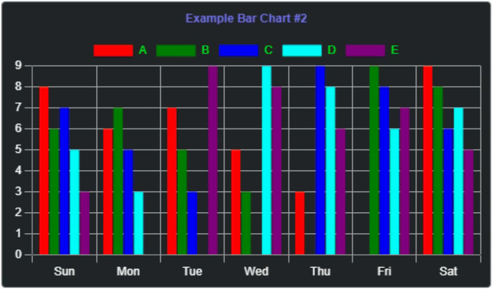
More Data Series.
There are more possibilities for styling here. Bars with rounded corners, gradient fills, pattern fills and more
are possible. For example, to round the tops of the bars, the AddChart function can be updated as follows.
procedure TForm1.AddChartData(ChartNum: Integer; DataLabel, DataColor: String; Data: array of Integer);
var
  ChartRef: JSValue;
begin
  ChartRef := ChartArray[ChartNum];
  asm
    var newData = {
      label: DataLabel,
      borderColor: DataColor,
      backgroundColor: DataColor,
      data: Data,
      borderRadius: {
        topLeft: 4,
        topRight: 4
      }
    }
    ChartRef.data.datasets.push(newData);
    ChartRef.update();
  end;
end;
Not dramatically different, but as we can't override anything with CSS, we're reliant on the Chart.js API to expose the things we're most likely to want to change. So long as you're not after anything too crazy, this works pretty well. Here's what it looks like.
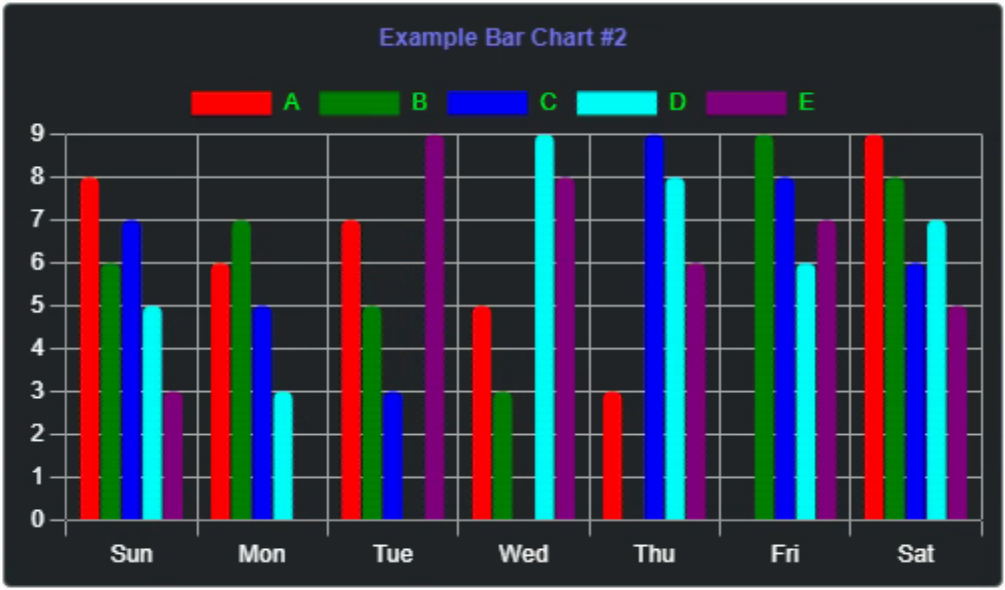
Rounded Bars.
Line Charts
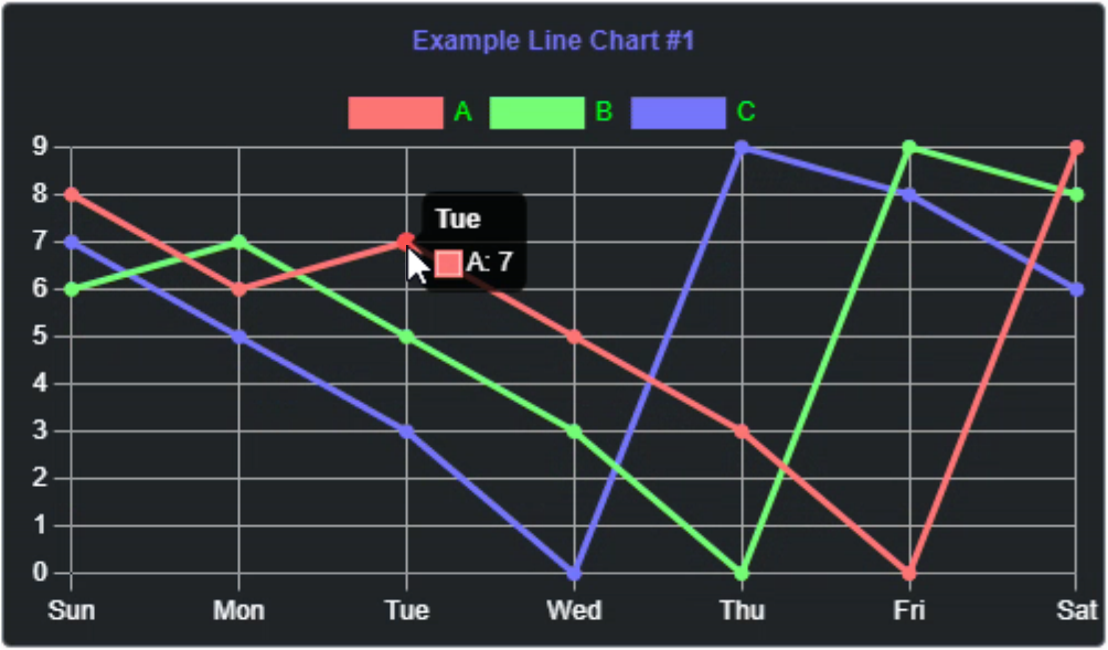
With that in place, creating more charts is relatively straightforward, mostly dependent on the format of the data being sent. We can even use the code as-is to create a few more chart types without any changes at all. For line charts, we're using the same format for the data, so not really much difference.
  ChartNum := CreateChart('line','Example Line Chart #1', 320, 10, 500, 300, ChartLabels);
  AddChartData(ChartNum, 'A', '#f77', [8,6,7,5,3,0,9]);
  AddChartData(ChartNum, 'B', '#7f7', [6,7,5,3,0,9,8]);
  AddChartData(ChartNum, 'C', '#77f', [7,5,3,0,9,8,6]);
This gets us a line chart with the same hover and series-hiding functionality as the bar charts.
If we wanted to try and read in a set of data like we used in the heartrate Sparkline last time, we could do something like the following. Here we're just picking out a small snippet of data and passing it around as we did with the other examples. Doesn't look particularly fantastic right away, but the data mechanism is what is being illustrated here, not so much the presentation.
procedure TForm1.WebFormCreate(Sender: TObject);
var
  ChartNum: Integer;
  ChartData: Array of Integer;
  ChartDataLabels: Array of String;
  ChartCSV: TStringList;
  i :Integer;
begin
  ChartCSV := TStringList.Create;
  ChartCSV.LoadFromFile('heartdata.csv');
  i := 0;
  while (i < 150) do
  begin
    SetLength(ChartData, Length(ChartData)+1);
    ChartData[i] := StrToInt(ChartCSV[5000+i]);
    SetLength(ChartDataLabels, Length(ChartDataLabels)+1);
    ChartDataLabels[i] := '';
    i := i + 1;
  end;

  ChartNum := CreateChart('line','Example Line Chart #2', 320, 520, 500, 300,ChartDataLabels);
  AddChartData(ChartNum, 'HeartRate', '#fff', ChartData);
end;
Here's what it looks like. The x-axis is blank in our example here, but with a bit of work, we could have that
showing a time sequence.
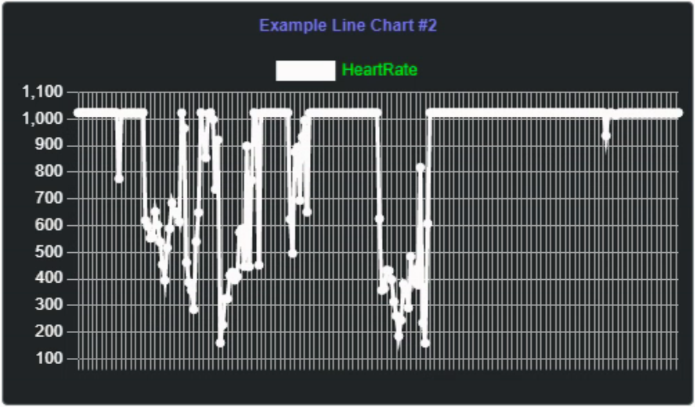
Line Chart with HeartRate Data.
Panning and Zooming
Aside from hovering over elements, not much interactivity is available by default. Fortunately, there is a plugin system that makes this kind of thing possible. To enable panning and zooming for all of our charts, we can use the following additional JavaScript libraries.
    <script src="https://cdn.jsdelivr.net/npm/hammerjs@2.0.8/hammer.min.js"></script>
    <script src="https://cdn.jsdelivr.net/npm/chartjs-plugin-zoom@1.2.1/dist/chartjs-plugin-zoom.min.js"></script>
In our CreateChart function, we can set up the defaults like this. There are more options than what is used here.
For example, you can toggle panning and zooming separately, limit pan and zoom to certain directions, or place
limits on how much zooming is allowed.
    const zoomOptions = {
      pan: {
        enabled: true,
        mode: 'xy'
      },
      zoom: {
        wheel: {
          enabled: true
        },
        pinch: {
          enabled: true
        },
        mode: 'xy'
      }
    };
There are also events generated, which can be used to display the amount of zoom or the panning details if
desired. It is also possible to reset the pan and zoom back to the original viewport. More documentation on this
functionality can be found in the zoom
plugin documentation.
Other Chart Types.
Included in Chart.js are a handful more chart types including area, donut, stacked and combined line and bar charts, pie charts, pie charts with multiple data series, scatter, polar, radar, and a few more. If those aren't enough, there are a few more available via plugins, including candlestick, venn, and even a basic word cloud chart. In most cases, the approach is the same, with just the matter of adding data in the format expected and passing in more color values (as JSON arrays) to get the desired output.
Also, while the same functions can be used for these other types, at least initially, changes can be made directly
after the chart is created. For example, a multi-series pie chart doesn't really need the axes displayed. So
here they are hidden separately, as was the legend.
  ChartNum := CreateChart('pie','Example Pie Chart #1', 640, 10, 500, 300, ['Activity','','Steps','','Move',''], False);
  AddChartData(ChartNum, 'A', '["rgba(255,128,128,1)","rgba(255,255,255,0.9)"]', [450,100]);
  AddChartData(ChartNum, 'S', '["rgba(128,128,255,1)","rgba(255,255,255,0.9)"]', [9000,1000]);
  AddChartData(ChartNum, 'M', '["rgba(128,255,128,1)","rgba(255,255,255,0.9)"]', [20,10]);

  ChartRef := ChartArray[ChartNum];
  asm
    ChartRef.options.scales.x.display = false;
    ChartRef.options.scales.y.display = false;
    ChartRef.options.plugins.legend.display = false;
    ChartRef.update();
  end;
This gets us a pie chart that looks like the following.
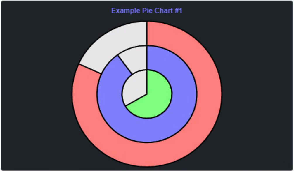
Multi-Series Pie Chart.
Just The Basics
That covers the basics of Chart.js. Rather utilitarian, as mentioned at the beginning, but there's enough here to cover quite a range of basic charting needs without too much effort. Additional styling customizations are possible with a bit more work, but the basics are here and they work pretty well.If this is the level of charting your TMS WEB Core project needs, perhaps Chart.js will be a good fit. There are other alternatives that may be worth exploring initially before spending too much time with Chart.js. These are at a similar level in terms of complexity and feature set. Not exactly the same, but worth checking into.
TMS FNC Charts is obviously a good candidate and is, of course, fully integrated into TMS WEB Core as well as all of the other FNC platforms. It provides a similar number of chart types as well as a few more options for interaction. Plenty of options for data binding and - a big benefit - an actual UI for editing chart parameters at design time. Not free, but if you have a TMS All Access subscription, then you're all set!
Steema HTML5 TeeCharts is a good candidate, mostly because anyone who has worked with Delphi for long enough has likely used Steema TeeCharts in a VCL project. Their JavaScript version is also not free but is very close in terms of UI and functionality to their VCL products. I haven't used it recently, but I did use it for a project a few years ago and found that it worked really well.
Google Charts is a free JavaScript library and is roughly in the same space as Chart.js. There are a dozen chart types available, and about a dozen more via additional plugins. Like many Google products, they aren't the most stylish or the most feature-laden, but they are very functional and if you're already using other Google products in your project, Google Charts will likely fit in well.
Next Up: D3
Chart.js and the other charting libraries mentioned above are all quite capable and can likely take care of the vast majority of a typical project's charting needs. But there are a few other libraries out there that are considerably more complex - and capable. D3 has been around for a very long time. But it is not as simple to use. In fact, many of the top charting JavaScript libraries are actually just front-ends to D3, providing the same power but without the complexity. Using TMS WEB Core, we'll see what can be done to make it a little more accessible here as well.
Related Posts
Charting Part 1: Sparklines
Charting Part 2: Chart.js
Charting Part 3: D3.js Introduction
Charting Part 4: D3.js Interaction
Charting Part 5: D3.js Animation
Charting Part 6: Tag Clouds
Follow Andrew on 𝕏 at @WebCoreAndMore or join our 𝕏 Web Core and More Community.
Andrew Simard

This blog post has not received any comments yet.
All Blog Posts | Next Post | Previous Post