Blog
All Blog Posts | Next Post | Previous Post

 Extend TMS WEB Core with JS Libraries with Andrew:
Image Sliders
Tuesday, July 12, 2022

With our Tabulator miniseries out of
the way, we're back to check out other interesting and useful JavaScript libraries that we can use in our TMS
WEB Core projects. This time out, we're going to have a look at image sliders, sometimes referred to as
image carousels. There's a TWebImageSlider included directly in TMS WEB Core that's ready to go, based on the
very capable Swiper. But we'll also
have a look at the popular Bootstrap
Carousel, the venerable Slick
Carousel, and the ultra-modern Glide. Each has its own default look, but they can all be customized in various ways. Some have dependencies to be
mindful of. But they're all well-tested and reliable, and any of them would make a solid addition to your
project.
Motivation.
Whether you need some kind of image slider in your project is usually self-evident. But sliders don't have to be used just for image content. A slider could be used instead of a combo box, displaying a set of cards to select from, where the user can cycle through different options. Or as an alternative to traditional menus. Or even to display notifications. Plenty of non-image possibilities. But no matter the type of content being displayed, a slider can have a big overall impact on a project. Finding a slider with the right mix of presentation and interaction options is important.
If your project is already using Bootstrap or jQuery, then
perhaps Bootstrap Carousel or Slick Carousel would be a natural fit, respectively. Or perhaps there's a key
feature in one of these sliders that with catch your attention and be important enough to your project to warrant
including a dependency that wasn't previously needed. As always, nothing but choices here, so let's have a look.
The Setup.
For our examples, we're going to use a set of 10 images of different sizes, just to make it easier to see what is going on. Generally, things work more smoothly and look considerably nicer when the images are all the same size, but that's often not an option. The intent though is to find a slider that can be added to our Actorious project to display sets of photos of People, Movies, or TV Shows. Which will typically be all the same size, conveniently.
All the sliders we'll be looking at today have no problems displaying content of different sizes,
even if we have to lean on them a little to get them to cooperate. The sample images are stored in an img folder
in the example project, and a link to that can be found at the end of this post. All the sliders use URLs to
reference the images, via <img> tags, naturally, so not hard to include these. With the contents of the img
folder added to our project, the images are automatically copied to either the Debug or Release folders as needed,
and can just be referenced via an img/filename.png link or URL.
TWebImageSlider and Swiper.
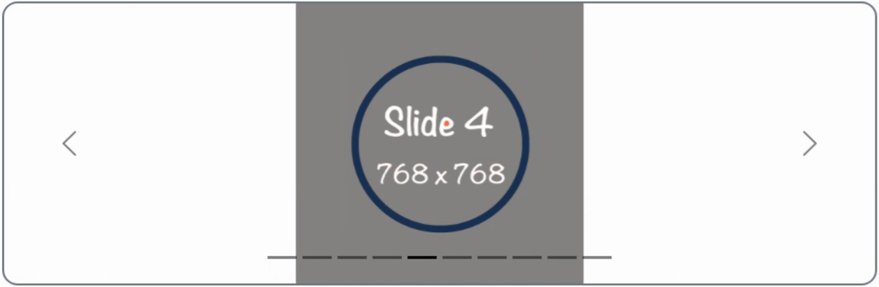
The obvious first choice for a TMS WEB Core project is to use the readily available TWebImageSlider component. Let's add this component to a new project and set the size to 900x300, just as a set size for our examples. Then, add the sample images via the ImageURLs property in the Delphi property inspector. Without doing anything else, we get the following slider, fully operational, and in record time.
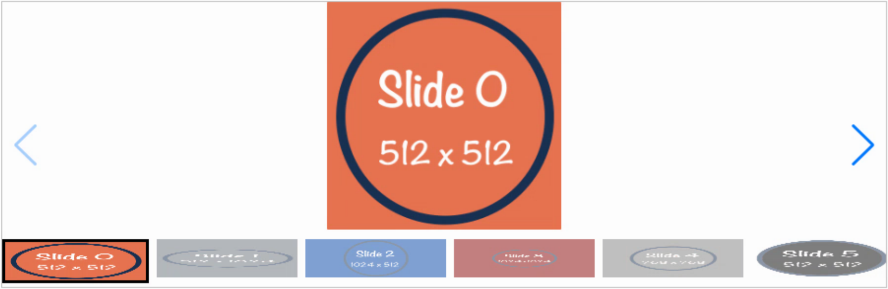
TWebImageSlider Defaults.
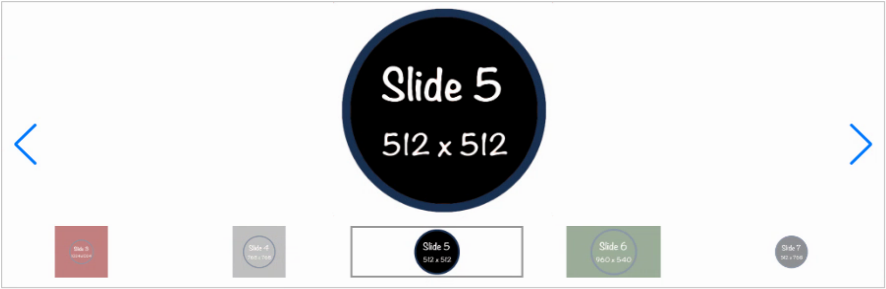
There are numerous options readily available. The most glaring thing that we'd like to address is to adjust
the thumbnails so they maintain their aspect ratios. That's an option, as well as the number of thumbnails shown,
and their size. These can be set via the Delphi IDE properties for the TWebImageSlider control. We can also
easily adjust the border color and width that is applied to the currently selected thumbnail, as well as the
spacing.
The color of the arrows can be adjusted, and bullets can be used instead of thumbnails if space is at a premium.
Also, the resulting project contains nothing but HTML and CSS, so CSS overrides can be used to make adjustments
beyond what is directly available in the properties. For example, perhaps it would be nice for those corners on
the thumbnail selection rectangle to be rounded. Lots of ways to do this, but let's use TMS WEB Core 2.0's new
TWebCSSClass component.
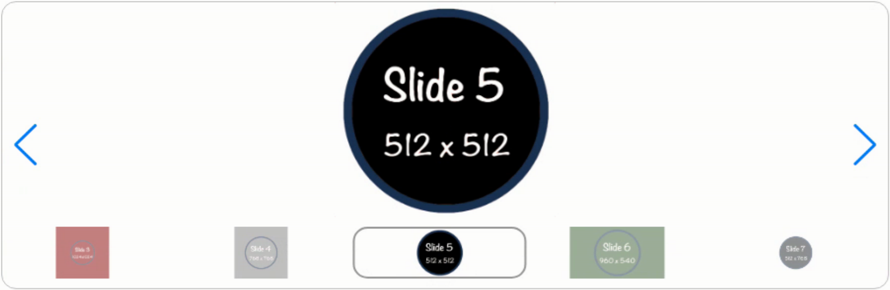
To adjust CSS with this new capability, simply drop a TWebCSSClass component on the
form and change the Border Radius property to 15. In
the CSSClassName property, we can add the class used to draw the selected thumbnail,
which happens to be swiper-slide-thumb-active. And if we add a class like roundborder
to the TWebImageSlider ElementClassName property and
also to the same TWebCSSClass Name property as well,
we can get the same rounding on the slider itself. Unfortunately, at the moment it seems we'll have to add the
ElementClassName property at runtime. Easy enough.
procedure TForm1.WebFormCreate(Sender: TObject);
begin
  divSlider.ElementHandle.classList.add('roundborder');
end;
And then we can immediately see the rounded thumbnail border as well as the rounded border for the TWebImageSlider
control itself. While it may not be all that sensible to do this for dozens of CSS properties, it makes it pretty
simple to add a CSS override here and there without needing to add a custom CSS file. A nice addition to TMS WEB
Core!
This is a super-quick way to get a fully functional slider into your project. And if it suits your needs, perfect!
But as with all the sliders, there are a few caveats to be mindful of. In this case, TWebImageSlider is using an implementation of Swiper.js to do its business. The Swiper.js library reference is automatically added to your Project.html, so no worries there. It references a copy hosted by TMS Software's servers, and as of this writing, the version of Swiper being used was v5.3.6. These files (swiper.min.js and swiper.min.css) can also be downloaded and hosted in your own project if desired, so not a problem either way. These add about 150 KB to your web app download.
The current version available from Swiper.js is currently at v8. Naturally, there are quite a few more capabilities offered in the later versions that don't get exposed with the Delphi wrapper as we see it here. If we wanted to use the latest version of Swiper and give up the convenience of configuring it via the Delphi IDE, then we're back to the usual JavaScript library situation. The newest Swiper can be added using the familiar JSDelivr CDN links. In fact, these can be used with the current project as-is. No changes are needed for the project to use the later version of the JavaScript library - it is backward-compatible with our current project. Just remember to remove the other links.
<script src="https://cdn.jsdelivr.net/npm/swiper@8/swiper-bundle.min.js"></script>
<link rel="stylesheet" href="https://cdn.jsdelivr.net/npm/swiper@8/swiper-bundle.min.css">
Surprisingly, this new version clocks in at about 46 KB. If we wanted to use Swiper fresh out of the box with the latest version (and considerably less Delphi integration) then we can drop a TWebHTMLDiv on the form with the same 900x300 dimensions and then set everything up manually. This certainly gives an idea as to how much work has gone into making TWebSlider work as well as it does! To start with, we'll set up some default HTML elements that Swiper uses to do its work. In the case of the thumbnails, it is actually just another entire Swiper instance, so we'll set that up as well. In the TWebHTMLDiv HTML property, we can start with this. Lots of tweaking done already.
<div class="roundborder" style="display:flex; flex-direction:column; height:100%; width:100%; overflow:hidden;">
  <div class="swiper" style="width:100%; height: 225px;">
    <div class="swiper-wrapper"> </div>
    <div class="swiper-button-prev"></div>
    <div class="swiper-button-next"></div>
  </div>
  <div class="thumb" style="width:100%; height: 55px; margin-top:10px; margin-bottom:10px;">
    <div class="swiper-wrapper"> </div>
  </div>
</div>
The main idea here is that there is an outer wrapper to set the overall dimensions, and then two Swiper sections. The relative height of the main slider versus the thumbnail slider is set explicitly. This could just as easily be configured to be more responsive and adjust to fit its container overall but was set up this way to be consistent with all the other examples. From here, a bit of coding is needed to create the content (the images) and initialize the two Swiper sliders.
procedure TForm1.WebFormCreate(Sender: TObject);
var
  i: Integer;
  slides: string;
  thumbs: string;
begin

  // Swiper

  // Define our slides
  slides := '';
  thumbs := '';
  for i := 0 to 9 do
  begin
    // the images we're displaying
    slides := slides+'<div class="swiper-slide" style="display:flex; justify-content:center;">'+
                     '<img src="img/Slider_slide_'+IntToStr(i)+'.png" height=100% />'+
                     '</div>';

    // could use smaller images here, possibly
    thumbs := thumbs+'<div class="swiper-slide" style="display:flex; justify-content:center;">'+
                     '<img src="img/Slider_slide_'+IntToStr(i)+'.png" height=75 />'+
                     '</div>';
  end;

  // Add them to Swiper
  divSwiper.ElementHandle.firstelementChild.firstelementChild.FirstElementChild.innerHTML := slides;
  divSwiper.ElementHandle.firstElementChild.lastElementChild.FirstElementChild.innerHTML := thumbs;

  asm
    // Create the main slider
    const swiper = new Swiper('.swiper', {
      slidesPerView: 3,
      spaceBetween: 10,
      centeredSlides: true,
      effect: "coverflow",
      coverflowEffect: {
        rotate: 45,
        slideShadows: false,
      },
      navigation: {
        nextEl: '.swiper-button-next',
        prevEl: '.swiper-button-prev',
      }
    });

    // Create the thumbnail slider
    var thumb = new Swiper ('.thumb', {
      slidesPerView: 6,
      spaceBetween: 5,
      centeredSlides: true,
      slideToClickedSlide: true
    });

    swiper.controller.control = thumb;
    thumb.controller.control = swiper;
  end;
We also can use some extra Swiper features, such as the "coverflow" effect. The same WebCSSClass component we used before is still in place, but in this case, we need to update the CSSClassName to reflect just the thumbnail image, so we can add .thumb .swiper-slide-active to the list and we also need to set the border as it isn't enabled by default in this scenario. We also snuck the roundborder class into the top <div> in the HTML. The result is the same slider we had before, but a little fancier.
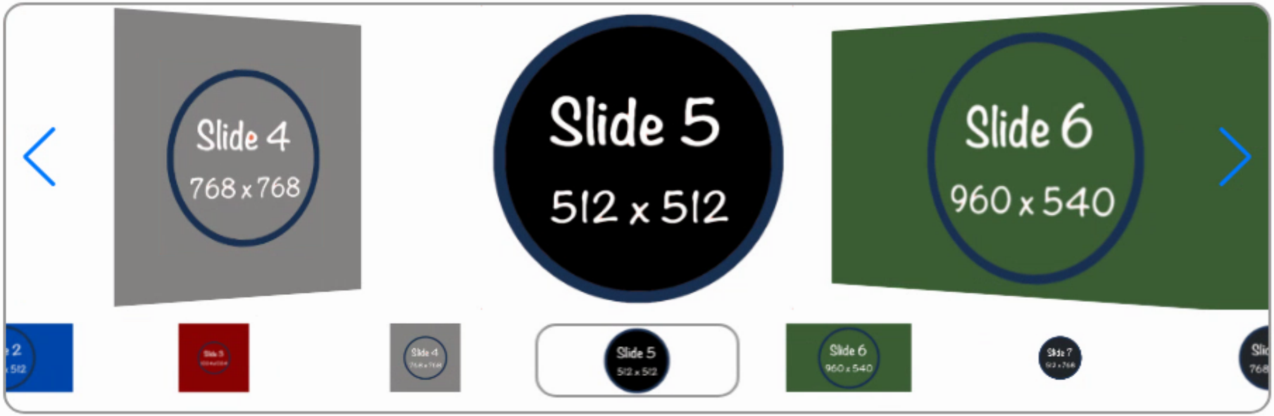
Swiper with Coverflow.
Swiper includes a looping option so that when you get to the last slide it loops around to the first slide. There are various conditions for this mode that may be incompatible with various other modes. It didn't work particularly well for our example here, as the thumbnails and slides would quickly get out of sync for some reason. But it did work fine in other testing, without the thumbnails for example. There's a "cube" effect that is similar to "coverflow". And various shadows and other enhancements can be added if that suits your theme.
Overall, both TWebImageSlider and Swiper offer a solid slider experience and are well worth considering. But by no
means are these the only options to explore.
Bootstrap Carousel.
If you're using Bootstrap already (and there are plenty of solid reasons why you should be) then Bootstrap Carousel might be of interest. No additional library is needed - it is part of the Boostrap package already. But no built-in Delphi support here, so we're starting with a blank page. As usual, we'll need the Bootstrap JavaScript library if it isn't being loaded already. Here are the links taken directly from the Bootstrap homepage.
<link href="https://cdn.jsdelivr.net/npm/bootstrap@5.2.0-beta1/dist/css/bootstrap.min.css" rel="stylesheet" integrity="sha384-0evHe/X+R7YkIZDRvuzKMRqM+OrBnVFBL6DOitfPri4tjfHxaWutUpFmBp4vmVor" crossorigin="anonymous">
<script src="https://cdn.jsdelivr.net/npm/bootstrap@5.2.0-beta1/dist/js/bootstrap.bundle.min.js" integrity="sha384-pprn3073KE6tl6bjs2QrFaJGz5/SUsLqktiwsUTF55Jfv3qYSDhgCecCxMW52nD2" crossorigin="anonymous"></script>
Bootstrap 5 comes in at a 53 KB download. Which I checked, several times. Doesn't seem right that we get all of Bootstrap including its carousel for a few KB more than Swiper? And Swiper is already pretty tiny? In any event, from here, we'll start with our usual TWebHTMLDiv dropped on a blank form, set to 900x300. And because we've already got Bootstrap on hand, we can add 'rounded border border-secondary" to the ElementClassName to get our nice rounded border directly. No fussing with CSS at all. The documentation doesn't offer up an example of their carousel that uses thumbnails, but they do have various indicators we can use. As with Swiper, we've got a block of HTML that is used to organize all of the elements. So we can add this to the HTML property of our TWebHTMLDiv.
<div id="carouselExampleIndicators" class="carousel slide carousel-dark h-100"  data-bs-interval="false">
  <div class="carousel-inner">
  </div>
  <div class="carousel-indicators">
  </div>
  <button class="carousel-control-prev" type="button" data-bs-target="#carouselExampleIndicators" data-bs-slide="prev">
    <span class="carousel-control-prev-icon" aria-hidden="true"></span>
    <span class="visually-hidden">Previous</span>
  </button>
  <button class="carousel-control-next" type="button" data-bs-target="#carouselExampleIndicators" data-bs-slide="next">
    <span class="carousel-control-next-icon" aria-hidden="true"></span>
    <span class="visually-hidden">Next</span>
  </button>
</div>
Here, we're dealing with a set of images, a set of buttons that are at the bottom, and the usual previous/next buttons. The bits at the top control a few things. Adding the class 'carousel-dark' is used to make the various controls darker (if you have lots of white in your background or images). And by default, Bootstrap Carousel will advance between slides all its own. This example does away with that. In order to add the images, we do the same sort of thing we did previously, adding links directly via HTML. A little trickier here to figure out how to add to the first AND second elements, but not too troublesome.
procedure TForm1.WebFormCreate(Sender: TObject);
var
  i: Integer;
  slides: string;
  buttons: string;
begin
  slides := '';
  buttons := '';
  for i := 0 to 9 do
  begin
    if (i = 0) // starting with slide zero
    then slides := slides +'<div class="carousel-item h-100 active">'
    else slides := slides +'<div class="carousel-item h-100">';

    slides := slides +'<img'+
                        ' src="img/Slider_Slide_'+IntToStr(i)+'.png"'+
                        ' alt="Slide '+IntToStr(i)+'"'+
                        ' style="height:100%; display:block; width:auto; margin:auto;"'+
                        '/>'+
                    '</div>';

    if (i = 0)
    then buttons := buttons + '<button type="button" data-bs-target="#carouselExampleIndicators" data-bs-slide-to="'+IntToStr(i)+'" class="active" aria-current="true" aria-label="Slide '+IntToStr(i)+'"></button>'
    else buttons := buttons + '<button type="button" data-bs-target="#carouselExampleIndicators" data-bs-slide-to="'+IntToStr(i)+'" aria-label="Slide '+IntToStr(i)+'"></button>';
  end;

  divCarousel.ElementHandle.firstElementchild.firstElementChild.innerHTML := slides;
  TJSHTMLElement(divCarousel.ElementHandle.firstElementChild.children[1]).innerHTML := buttons;
end;
By default, Bootstrap Carousel already supports looping around to the start, so no worries there. And there are plenty of Bootstrap classes tossed around throughout to deal with how the images are sized, how the buttons link to the slides, and so on. The result is the following.
Bootstrap Carousel.
While simpler in terms of display and the options available, Bootstrap Carousel is still a solid contender,
particularly if you're already using Bootstrap in your project. It is very efficient in terms of resources and
support needed, and it might fit in well with the typical minimalist themes that Bootstrap is normally associated
with. Probably the least drama out of all the sliders we're looking at, which is something in itself.
Slick Carousel.
If you've been around awhile doing any kind of web development work, then there's a good chance you've crossed paths with Slick Carousel at some point. It has been around for ages, and despite being more than a little past its expiration date, it is still rather popular. How popular, you ask?slick-carousel is the 5th most popular package on jsDelivr, with 5 333 308 368 CDN hits in the last month
So yeah. Pretty popular. And it hasn't had an update in something like five years. How bizarre is that? Pretty bizarre. It refers to itself as "the last carousel you'll ever need" which is a bold statement, to be sure, but the fact that it is still so popular says something. Points for stability, in any event.
But, before we even get started, the first potential roadblock is that it is, being as old as it is, dependent on jQuery. And it would be hard to justify adding jQuery to your project now just for this slider when other solid sliders are available without jQuery. Not that jQuery is itself in any way bad or anything. And there are plenty of reasons to use Slick Carousel and by extension jQuery in your project. Perhaps your project is part of a collection of projects for a website and there is a desire to keep a consistent interface, and Slick Carousel is already prominently used. Or perhaps you're very familiar with Slick Carousel and are in a bit of a rush. Not judging here, plenty of reasons. The main point is once again that there are nothing but choices available to the TMS WEB Core developer, and Slick Carousel is certainly one of them.
Getting started is the same as the others we've looked at. A TWebHTMLDiv component set to 900x300 and a few lines added to your Project.html file.
<script src="https://cdn.jsdelivr.net/npm/jquery@3.6.0/dist/jquery.min.js"></script>
<script type="text/javascript" src="//cdn.jsdelivr.net/npm/slick-carousel@1.8.1/slick/slick.min.js"></script>
<link rel="stylesheet" type="text/css" href="//cdn.jsdelivr.net/npm/slick-carousel@1.8.1/slick/slick.css"/>
<link rel="stylesheet" type="text/css" href="//cdn.jsdelivr.net/npm/slick-carousel@1.8.1/slick/slick-theme.css"/>
Getting Slick Carousel setup is pretty easy, all things considered. There are benefits to jQuery, particularly when it comes to shortening up code. To get to the same place we were at with Bootstrap, we don't have to define any HTML at all, just define the Slick Carousel instance and load the images. Here's an example.
 // Slick Carousel
  asm
    $('#divSlick').slick({
      variableWidth: true,
      centerMode: true,
      dots: true
    });
    for (var i = 0; i < 10; i++) {
      $('#divSlick').slick('slickAdd','<div><img style="height:296px; width:auto; margin:auto;" src="img/Slider_Slide_'+i+'.png"></div>');
    }
    $('.slick-arrow').css('z-index',9999);
    $('.slick-arrow').css('margin-left','50px');
    $('.slick-arrow').css('margin-right','50px');
    $('.slick-arrow').css('transform','scale(3)');
    $('.slick-dots').css('bottom','10px');
  end;
That gets us started. The main trouble with Slick Carousel is that by default its controls are outside of the containing element. So we move them back in and adjust their sizes a bit to taste, and we're off and running. Here jQuery is on the job in terms of adjusting CSS. Looping is on by default, but the buttons at the bottom are not. Easily enabled. Everything here can be customized further. For example, if you don't much care for their prev/next arrows, they can be changed.
Slick Carousel.
It isn't too hard to see how this has such a following. Easy defaults and working right away. It isn't a monster
in
terms of download weight either. Including jQuery, this combination comes out to about the same 50
KB as the other options we've looked at so far. So a solid contender as well, if a bit on the plain side
initially. But with all the history, people have found a way to make it do amazing things. Here's an example of a
coverflow implementation using Slick Carousel: https://codepen.io/wesleysilva/pen/vVJZgK
Pretty impressive!

Slick Carousel Coverflow Example.
Glide.
Our final JavaScript slider, Glide, has no dependencies and sports some newer technologies, like being able to build projects with ES6 modules (about as far away from jQuery as you can get!). That's a bit beyond where we're at so far with JavaScript libraries, and fortunately, there's a pre-built option we can use along the same lines we're already accustomed to.
    <script src="https://cdn.jsdelivr.net/npm/@glidejs/glide"></script>
    <link rel="stylesheet" href="https://cdn.jsdelivr.net/npm/@glidejs/glide/dist/css/glide.core.min.css">
    <link rel="stylesheet" href="https://cdn.jsdelivr.net/npm/@glidejs/glide/dist/css/glide.theme.min.css">
Similarly, there is an HTML template used to structure the slider, similar to the approach taken with Bootstrap Carousel. Lots of options here, but to get started we'll aim for something similar to the Bootstrap Carousel and Slick Carousel appearance with navigation arrows and dots at the bottom.
<div class="glide h-100">
  <div class="glide__track h-100" data-glide-el="track">
    <ul class="glide__slides h-100">
    </ul>
  </div>
  <div class="glide__arrows" data-glide-el="controls">
    <button class="text-dark glide__arrow glide__arrow--left" data-glide-dir="<">prev</button>
    <button class="text-dark glide__arrow glide__arrow--right" data-glide-dir=">">next</button>
  </div>
  <div class="glide__bullets" data-glide-el="controls[nav]">
  </div>
</div>
Bootstrap classes were used to deal with various formatting issues and to keep the slider within the dimensions we've set. The Prev/Next buttons are there to be fully customized, with the attributes being used as the means of triggering various actions. Kind of convenient in this case to have buttons that have both light and dark elements so they don't disappear, regardless of the image underneath. Something similar could be done with the other sliders. For the code to initialize the Glide element, it is not much different from the others.
  slides := '';
  buttons := '';
  for i := 0 to 9 do
  begin
    slides := slides + '<li class="glide__slide d-flex justify-content-center align-items-center h-100">'+
                       '<img style="max-width: 296px; max-height: 296px;" src="img/Slider_Slide_'+IntToStr(i)+'.png"></li>';
    buttons := buttons +'<button class="glide__bullet" data-glide-dir="='+IntToStr(i)+'"></button>';
  end;
  divGlide.ElementHandle.firstElementChild.firstElementChild.FirstElementChild.innerHTML := slides;
  divGlide.ElementHandle.firstElementChild.lastElementChild.innerHTML := buttons;

  asm
    var glide = new Glide('.glide',{
      type: 'carousel',
      perView: 3,
      gap: 10,
      focusAt: "center"
    }).mount();
  end;
In this slider, there's not really support for slides of different widths. So we've instead fixed the width and adjusted the height to keep the aspect ratio correct. By default, when it gets to the end of the list of images, it would "rewind" back to the beginning, but setting the "type" to "carousel" makes it work like the other sliders we've seen. But here it is an option, which is nice.
Glide.
The end result is very similar to the other sliders. And, like the other sliders, there are a great many more things that can be done. Curiously, the "coverflow" type of display that is shown at the top of the Glide.js website isn't easily configured in their actual slider. A bit of misleading advertising there, but it is indeed possible. Not in time to get this post out the door though. Will be looking to try that out very soon, however.
Overall, this is also a pretty solid slider with a pile of options and not really any difficulty getting started. If you aren't keen to use jQuery or Bootstrap and don't care for Swiper, then this is another solid alternative
that happens to also be very efficient. The download for Glide is only about 10 KB.
Sliding Away.
If you're interested in lazy-loading slider images, a good amount of material on lazy-loading, in general, can be found in the last Tabulator post on Performance, most of which could easily be applied directly to the <img> tags used throughout this post. Otherwise, that's about it for sliders today. If you've used a different slider, or have had particularly good or bad experiences with any of these sliders, please post a comment and let us know what's up. More comments = better posts!SliderExample.zip attached.
Follow Andrew on 𝕏 at @WebCoreAndMore or join our 𝕏 Web Core and More Community.
Andrew Simard

This blog post has not received any comments yet.
All Blog Posts | Next Post | Previous Post