Blog
All Blog Posts | Next Post | Previous Post

 Extend TMS WEB Core with JS Libraries with Andrew:
Tabulator Part 4: Interacting with Tabulator
Thursday, June 23, 2022

Last time, we looked at the many possible customizations for Tabulator and other parts of a TMS WEB Core Project that were generally focused on the "look" of the application. This included a handful of customizations to the content and format of the tables, as well as to other elements like images, fonts, and buttons. The overall theme was changed a few times, resulting in the styling we have now, with a handful of CSS customizations to tweak every little detail. This time out, we're going to dig a bit deeper into the "feel" of the application. Interacting with various elements, particularly with Tabulator, breathing a little more life into the application.
Motivation.
While there are many JavaScript grids available that work great within TMS WEB Core projects, and even when considering elements beyond grids and projects beyond TMS WEB Core, there are aesthetic properties (what we can see) but also interactive properties (what we can do) of the elements we select, as developers. The aesthetic properties are perhaps easier to see and adjust, and in the TMS WEB Core project we've been creating, now called Actorious, we've seen how easy it is to use CSS to override the appearance of very nearly anything we want, from scrollbars to cell padding to fonts to borders.
Customizing interactions for a particular element is potentially more difficult, however, and we're generally more reliant on an element's built-in capabilities to help us out. But a web application has enormous potential for customizations even in this area. We can add functionality and change element behaviors at will, with the goal of making the user experience as enjoyable as possible. So in this post, we're going to explore a bunch of these kinds of enhancements, while striving for a certain level of consistency and performance, filing off some rough edges along the way.
Tooltips.
Let's ease into this topic with something that seems simple enough. Tooltips. In Delphi, they're called hints. And they work the same way straight out of the box in a TMS WEB Core application. Add a button to a form. Add something to the Hint property. Hovering your mouse over the button produces a tooltip. We're done, right? Well, if you've been following along, you must know by now that we're certainly not done at all. We've not even really started!
When it comes to tooltips generally, there are quite a few things you can customize to make them more useful or, alternatively, to get them out of your way. The properties we're going to address here relate to the overall look of the tooltip, the placement (relative to what it is linked to), as well as the delay - how quickly a tooltip appears and disappears.
For some tooltips, we actually want them to be almost instant. And for others, we'd rather not see them at all most of the time. Also, keep in mind that tooltips might have varying levels of usefulness under different conditions. Having a tooltip that shows "Biography" when you have a button that is clearly labeled "Biography" probably doesn't make much sense, initially. But later, when that row of buttons shrinks to just an icon if the form is displayed on a narrower display, suddenly the tooltip might be more useful.
The look of a tooltip is also a consideration, and generally, we'd like the look to remain the same throughout the application. If your TMS WEB Core project uses Bootstrap, then your tooltips will look a little fancier than if you use the defaults. For our application, we'd like to be really fancy and have a border and a drop shadow and even the ability to display HTML if necessary (images, specifically) in our tooltips.
Let's start by customizing the Bootstrap tooltips, and then we will figure out how to be sure they get applied everywhere. If adjusting the look of something sounds like CSS, you're absolutely correct. Here's what we're going to use for the customization. What I was going for here is to have the same background as everything else, but a nice border and an arrow that matches the border. With a little shadow for good measure.
/* Bootstrap 5 Tooltips
** NOTE: Only tested with Bootstrap 5.2.
*/

/* This is for the whole tooltip */
.tooltip.show {
  filter: drop-shadow(0px 0px 3px black);
  opacity: 0.95;
}
/* The tooltip contents */
.tooltip-inner {
  font-family: 'Cairo', sans-serif !important;
  background: var(--bs-dark);
  border: 2px solid var(--bs-secondary);
}
/* style any included image */
.tooltip-inner > img {
    border-radius: 0.2rem;
    margin-top: 6px;
    margin-bottom: 4px;
}
/* These adjust the arrow colors based on tooltip placement direction */
.bs-tooltip-auto[data-popper-placement^=top] .tooltip-arrow::before {
  border-top-color: var(--bs-secondary) !important;
}
.bs-tooltip-auto[data-popper-placement^=right] .tooltip-arrow::before {
  border-right-color: var(--bs-secondary) !important;
}
.bs-tooltip-auto[data-popper-placement^=bottom] .tooltip-arrow::before {
  border-bottom-color: var(--bs-secondary) !important;
}
.bs-tooltip-auto[data-popper-placement^=left] .tooltip-arrow::before {
  border-left-color: var(--bs-secondary) !important;
}
The trickiest bit is the last part where we're changing the color of the arrow. The CSS is different based on the direction of the arrow (those rules can't be combined). It works well enough, though. The section with the image styling will come into play in a little bit, where we want the tooltip to show either the photo or poster images. But here's what our themed tooltips look like.
With that out of the way, we'd like to use this same theme everywhere. This will be a bit of a headache as we'll see, but let's start adding it to various places and see where things get more complicated. Also, we'd like the ability to place the tooltip on a specific side of the element that we're hovering over. In the above example, the tooltip is below the button. For the row of buttons across the top, this is likely the best placement. For other buttons, we'd prefer something else. To help with this, here's a Delphi function that can be used to set the placement explicitly. It also sets the delay values, 1000ms before the tooltip is displayed, and 100ms before it is hidden. Which is what we'll use for our defaults most of the time.
procedure TForm2.SetBootstrapTooltip(button: TWebButton; placement: string);
var
  btn: TJSHTMLElement;
  title: String;
begin
  btn := button.ElementHandle;
  title := button.Hint;
  asm
    var tooltip = new bootstrap.Tooltip(btn, {
      title: title,
      placement: placement,
      customClass: 'custom-tooltip',
      delay: { "show": 1000, "hide": 100 }
    });
  end;
end;
To use this to set a tooltip for a Button, set the Button hint property and then call the procedure, using the button as the first parameter and the direction of placement as the second parameter, where the placement can be 'top', 'bottom', 'left' or 'right'. If you find that the tooltips are not displaying as Bootstrap tooltips (without the custom CSS styling), it could be that Bootstrap has not initialized its tooltips yet. This is documented on their website, naturally, but take care that you're using the latest version of Bootstrap, or at least that you're using the initialization code that corresponds to whatever version you are using. As of Bootstrap 5.2, this is what they recommend. Previous variations used jQuery for this initialization. Like with Bootstrap 4, where jQuery was a dependency anyway.
procedure TForm2.WebFormShow(Sender: TObject);
begin
  asm
    // Lets make sure all our Bootstrap tooltips are accessible
    const tooltipTriggerList = document.querySelectorAll('[data-bs-toggle="tooltip"]')
    const tooltipList = [...tooltipTriggerList].map(tooltipTriggerEl => new bootstrap.Tooltip(tooltipTriggerEl))
  end;
end;
What the above two code snippets are doing, essentially, is creating Bootstrap tooltip objects in the DOM. In the first case, the tooltip is created explicitly and linked to the button. In the second case, a search is being done for all elements that have been set to have a tooltip, button or otherwise, as defined by an element having the property "data-bs-toggle" set to "tooltip". So let's add some tooltips to other places and see this in action.
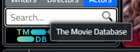
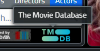
For the data attribution images that appear at the top left, a TWebHTMLDiv component has been set up with some internal code to show the links to TMDb and WikiData, referencing image files in the project's img folder. The HTML is just added to the HTML property of the TWebHTMLDiv component, and initially, it might look something like this.
<a href="https://www.themoviedb.org" class="px-2" target=_blank>
  <img width="55px" style="margin-top:3px;" src=img/tmdb.svg >
</a>
<a href="https://www.wikidata.org" class="px-2">
  <img width="85px" style="margin-top:3px;" src=img/wikidata.png>
</a>
This just presents two image links, and clicking on one will load the URL into a new tab. A bit of Bootstrap formatting and margin fiddling to make it look as good as we can under the circumstances, and not much else to it. In order to add a Bootstrap tooltip in this situation, we can do the following.
<a href="https://www.wikidata.org"
   target=_blank>
  <img width="80px"
       src="img/wikidata.png"
       title="WikiData"
       data-bs-toggle="tooltip"
       data-bs-placement="top"
       data-bs-delay={"show":1000,"hide":100}>
</a>

<a href="https://www.themoviedb.org"
   target=_blank
   title="The Movie Database"
   data-bs-toggle="tooltip"
   data-bs-placement="top"
   data-bs-delay={"show":1000,"hide":100}>
  <img width="50px"
       src="img/tmdb.svg" >
</a>
Here, we're setting all the Bootstrap tooltip parameters manually via HTML, including the delay. Note carefully though that even if you specify a placement, it might move somewhere else if there's no room available in the direction you've requested. For example, in this case, if TMDB was on the left, the tooltip width would be displayed beyond the left edge of the window, so the tooltip is moved to be right instead. Swapping the images so that WikiData is on the left makes this a little nicer, as its shorter title doesn't go beyond the edge of the window. Also, tooltips will work on either the <a> or the <img> elements. The anchor element would probably be a better choice.
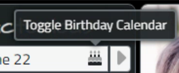
In our FlatPickr control, we can display an icon that can be used to open and close the calendar drop-down. This is useful if you decide you don't want to actually change the date. Other icons can be added as well, such as for clearing a date or selecting a specific date, like 'today'. In our application, the calendar has a birthday icon to differentiate it from the other calendars that have been added. To set up this icon with a tooltip, the TWebHTMLComopnent for FlatPickr might contain HTML that looks like the following.
<div id="divFlatPickr" class="d-flex" style="width: 100%; height:100%; border:none;">
  <input type="text" class="bg-light boder border-0"  data-input  placeholder="Birthday...">
  <a class="input-button bg-none"
        style="margin: 0px 0px 0px -20px;"
        data-toggle
        title="Toggle Birthday Calendar"
        data-bs-toggle="tooltip"
        data-bs-placement="top"
        data-bs-delay={"show":1000,"hide":100}>
    <i class="fa-duotone fa-cake-candles text-dark"></i>
  </a>
</div>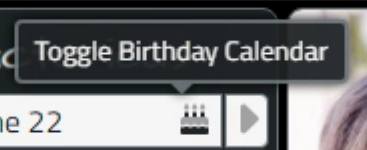
To be a little bit pedantic about the positioning, more as an example than anything else, we can also add a CSS class to the tooltip and then make subsequent adjustments just for that one tooltip, or a set using the same class. So in this case, it would be nice to move the tooltip a little bit right. We can add data-bs-class="tooltip-nudge-right" to the definition above, and then the following bit of CSS to get what we're after.
.tooltip-nudge-right {
  margin-left: 7px !important;
}
Alright. That seems to work pretty well. What about Tabulator, then? Well, we've got several options. And there are some special considerations that arise due to Tabulator's use of a "Virtual DOM". This means that not all of the rows in a Tabulator table are available on the page at one time. This is in part how it achieves such excellent performance. But it means that we can't just assign tooltips and assume they'll work. The assignment has to happen when they are visible in the DOM. But first, let's deal with the easy variations.
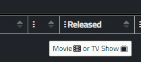
For column headers, a tooltip can be defined based on the title. So if you have a column header that is too long to display in the column, the full name can be displayed in the tooltip instead. We have such a column in our RolesTabulator, where we don't actually display a title at all in the Movie/TV Shows column as the column just has one icon in it. So to add a column tooltip for that column, we can just add an extra section to its column definition. We can even include Font Awesome Icons.
   { title: "", field: "Type", width: 50, headerTooltip:"Movie <i class='fa-duotone fa-film'></i> or TV Show <i class='fa-duotone fa-tv-retro'></i>",
            formatter:function(cell, formatterParams, onRendered){
              if (cell.getValue() == 'tv') return '<div class="d-flex h-100 align-items-center justify-content-center"><i class="fa-duotone fa-tv-retro fa-xl fa-swap-opacity text-dark"></i></div>';
              if (cell.getValue() == 'movie') return '<div class="d-flex h-100 align-items-center justify-content-center"><i class="fa-duotone fa-film fa-xl text-dark"></i>';
        }},
But these aren't Bootstrap tooltips, and our theme is not being applied. This can be addressed in different ways. First, they can be customized to look like our Bootstrap tooltips. In fact, they can look like whatever you want, by using a function and creating the HTML elements directly. For example, this gets us pretty close, but without the arrow and without any kind of placement logic. Fully customizable though, so with a bit more work, those could both be addressed. See below :-)
  { title: "", field: "Type", width: 50,
            headerTooltip:function(e, cell, onRendered){
              //e - mouseover event
              //cell - cell component
              //onRendered - onRendered callback registration function

              var el = document.createElement("div");
              el.style.backgroundColor = "#212529"; // Bootstrap 5 Dark
              el.style.color = "#ffffff";
              el.style.border = "2px solid #6c757d"; // Bootstrap 5 Secondary
              el.style.padding = "8px";
              el.style.borderRadius = "0.25rem";
              el.style.fontFamily = "font-family: 'Cairo', sans-serif";
              el.style.fontSize = "0.875rem" // same as Bootstrap Tooltip font
              el.innerHTML = "Movie <i class='fa-duotone fa-film'></i> or TV Show <i class='fa-duotone fa-tv-retro'></i>";

              return el;
            },
            formatter:function(cell, formatterParams, onRendered){
              if (cell.getValue() == 'tv') return '<div class="d-flex h-100 align-items-center justify-content-center"><i class="fa-duotone fa-tv-retro fa-xl fa-swap-opacity text-dark"></i></div>';
              if (cell.getValue() == 'movie') return '<div class="d-flex h-100 align-items-center justify-content-center"><i class="fa-duotone fa-film fa-xl text-dark"></i>';
        }},
Another way to address it is to create a Bootstrap tooltip that is manually connected to the column header. To make this a little easier, we can add a class to the column using the cssClass column definition, and then once the table has been created, we can find this class in the table and connect a tooltip to it. As this only happens once when the table is created, it shouldn't impact performance. Here's the updated column definition.
        { title: "", field: "Type", width: 50, cssClass:"MovieTVColumn",
            formatter:function(cell, formatterParams, onRendered){
              if (cell.getValue() == 'tv') return '<div class="d-flex h-100 align-items-center justify-content-center"><i class="fa-duotone fa-tv-retro fa-xl fa-swap-opacity text-dark"></i></div>';
              if (cell.getValue() == 'movie') return '<div class="d-flex h-100 align-items-center justify-content-center"><i class="fa-duotone fa-film fa-xl text-dark"></i>';
        }},
And then this is run after the table has been fully created, in WebFormCreate, and gives us the tooltip we're after.
asm
    RoleTabulator.on("tableBuilt", function() {
      var collection = document.getElementsByClassName('tabulator-col MovieTVColumn');
      if (collection.length == 0) {console.log('Column MovieTVColumn was not found.'); }
      else {
        for (let i = 0; i < collection.length; i++) {
          var tooltip = new bootstrap.Tooltip(collection[i], {
            title: "Movie <i class='fa-duotone fa-film mx-1'></i> or TV Show <i class='fa-duotone fa-tv-retro mx-1'></i>",
            placement: 'top',
            html: true,
            customClass: 'custom-tooltip',
            delay: { "show": 1000, "hide": 100 }
          })
        }
      }
    });
end;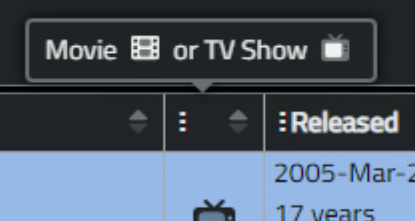
For rows, or specifically the cells within the rows, things can get a little more complicated, depending on what you're trying to do. Options abound, as usual though, and we can take the same approach with the column header tooltips to start with. For example, a 'tooltip' property can be added to the column definition, and a function can be written to do whatever you want in terms of content or styling for the tooltip, just as we did previously.
Let's take it a step further and use it to define a tooltip that contains an image for the first column of the Roles tabulator. And when looking at images, the idea is for the tooltip to be instant, so this works out pretty well all around. Here's the column definition. The extra math/translate is to ensure that the tooltip appears in the same spot relative to the photo each time, regardless of where the mouse pointer is when the tooltip is triggered.
        { title: "", field: "Poster", width:45, headerSort:false, resizable: false, headerHozAlign: "center", hozAlign:"center",formatter: "image", headerMenu: false,
          tooltip:function(e, cell, onRendered){
              let rect = e.target.getBoundingClientRect();
              let x = e.clientX - rect.left; //x position within the element.
              let y = e.clientY - rect.top;  //y position within the element.
              var el = document.createElement("div");
              el.classList.add('tooltip');
              el.classList.add('show');
              el.classList.add('imageright');
              el.style.background = "none";
              el.style.border = "0";
              el.style.transform = "translate("+(27-parseInt(x))+"px,"+(-68-parseInt(y))+"px)";
              el.style.margin = "4px";
              el.innerHTML = "<div class='tooltip-inner'>"+cell.getRow().getCell('Title').getValue()+"<br /><img src="+cell.getValue()+" width=92 height=136></div>";
              return el;
          },
          formatterParams:{height:68, width:45},
          mutator: checkimage, mutatorParams: {imgtype: "tvmovie"}},
As we're not really using Bootstrap at all here, we'll need to add an extra little bit for the arrow. This is handled entirely through CSS, and is linked via the "imageright" class that we added above. This is drawn with borders, turning off all but one of the borders to get a triangle of a size determined by the border width. CSS shenanigans, but pretty commonly used in many circumstances.
/* When using Tabulator to draw the tooltips, here's the missing left arrow */
.tooltip.show.imageright .tooltip-inner::after {
    content: "";
    position: absolute;
    top: 50%;
    left: -10px;
    margin-top: -12px;
    border-width: 8px;
    border-style: solid;
    border-color: transparent var(--bs-secondary) transparent transparent;
}
Only one item left. And it is a bit of a headache. We want to do the same thing with the images, but for the columns that have the Top Movies and Top TV Shows, where there are multiple images in each. My initial thinking here, which would have worked fine in a grid that doesn't have a "Virtual DOM", was to augment the <img> definitions that are used in the generation of these columns to include the tooltip. This sort of worked. It looked like this.
        { title: "Movies", width: 230, headerSort: false, formatter:function(cell, formatterParams, onRendered){
          function addPoster(title, picture) {
            posters = posters + '<img src="'+cell.getRow().getCell(picture).getValue()+'" '+
                                     'width=45 height=68 '+
                                     'title="'+cell.getRow().getCell(title).getValue()+'<br /><img src='+cell.getRow().getCell(picture).getValue()+' width=92 height=136>" '+
                                     'data-bs-toggle="tooltip" data-bs-html="true" data-bs-placement="top">';
          }
          var posters = '';
          if (cell.getRow().getCell('Title_1').getValue()) addPoster('Title_1', 'Poster_1');
          if (cell.getRow().getCell('Title_2').getValue()) addPoster('Title_2', 'Poster_2');
          if (cell.getRow().getCell('Title_3').getValue()) addPoster('Title_3', 'Poster_3');
          if (cell.getRow().getCell('Title_4').getValue()) addPoster('Title_4', 'Poster_4');
          if (cell.getRow().getCell('Title_5').getValue()) addPoster('Title_5', 'Poster_5');
          return posters
        }},
There were two problems with this approach, which may not be problems in other circumstances. First, there's nothing here that tells Bootstrap to create the tooltips - just the definitions of the tooltips. Related to this, if you were going to be adding so many tooltips, suddenly tooltip lifecycle management becomes a potential issue - just creating an endless stream of tooltips is likely not a good idea.
But the deal-killer wasn't that. It was that these don't even get added to the DOM until the table scrolls them into view. So while this worked beautifully when the table was first loaded, as soon as the table is scrolled far enough, they stop working. And that was with a brute-force update of all the tooltips, using the same code we have above for initializing them. So a bit of a disappointment, but still useful in other settings.
What's the solution? Well, it turns out that the event handler for Tabulator's tooltips will pass along the element that triggered the tooltip, and in this case, the individual image within the cell. So what then? Well, as we're just presenting a bigger version of the image, and we know what image was in the cell in the first place, we'll just need to stash the title somewhere, and we can then do everything in the event itself. We still have to do all the drawing of the tooltip, but we can just copy&paste most of it. Here's the end result, the column definition for Top Movies. The column definition for Top TV Shows is of course nearly identical.
        { title: "Top Movies", width: 230, headerSort: false,
            tooltip:function(e, cell, onRendered){
              let rect = e.target.getBoundingClientRect();
              let x = e.clientX - rect.left; //x position within the element.
              let y = e.clientY - rect.top;  //y position within the element.
              var el = document.createElement("div");
              el.classList.add('tooltip');
              el.classList.add('show');
              el.classList.add('imageright');
              el.style.background = "none";
              el.style.border = "0";
              el.style.borderRadius = "0.3rem";
              el.style.transform = "translate("+(27-parseInt(x))+"px,"+(-68-parseInt(y))+"px)";
              el.style.margin = "4px";
              var pic = e.target.outerHTML;
              var title = pic.substring(pic.indexOf('atitle')+8,pic.indexOf('src=')-2);
              var image = pic.substring(pic.indexOf('src')+4,pic.indexOf('width=')-1);
              el.innerHTML = "<div class='tooltip-inner'>"+title+"<br /><img src="+image+" width=92 height=136></div>";
              if (title.length > 0) { return el}
              else {return null };
            },
            formatter:function(cell, formatterParams, onRendered){
              function addPoster(title, picture) {
                if (cell.getRow().getCell(title).getValue()) {
                  posters = posters + '<img atitle="'+cell.getRow().getCell(title).getValue()+'" '+
                                      'src="'+cell.getRow().getCell(picture).getValue()+'" '+
                                      'width=45 height=68>';
                }
                else {
                  posters = posters + '<img atitle="" src="img/blank.png" width=45 height=68>'
                }
              }
              var posters = '';
              addPoster('Title_1', 'Poster_1');
              addPoster('Title_2', 'Poster_2');
              addPoster('Title_3', 'Poster_3');
              addPoster('Title_4', 'Poster_4');
              addPoster('Title_5', 'Poster_5');
              return posters
            }},
That about covers it for tooltips! Far more trouble than it might have seemed, but at the end of the day, everything is still performant and we've got more interaction. The Photos were changed from the w45 format we used last time to w185. Which is more than we need here, but scaling up the w45 images looked terrible and there wasn't any available size between the two. For the Posters, they were already w92, so having that as the tooltip height made a bit of sense. And no need to load any extra images in either case as the tooltips are using the same images that were already loaded for the table.
Image Clicks.
Alright. It might have seemed odd to start with tooltips, but there was a thought process at work. Last time, we were dealing primarily with how things looked, without touching the mouse. If we move the mouse around, we get tooltips. Maybe some other "hover" behavior as well, but nothing other than the defaults for the time being.
The next step in the interaction journey is when someone actually clicks on something. Now, most of the time this is also rather trivial and not worth covering. But in our case, we're going to just briefly sort out the images. The idea is that if you click on any of them, the fullscreen viewer will show the image in its original (maximum) resolution. We're already doing this for the main Photo that is loaded at the top when selecting a person in the ActorTabulator. We just want to do the same thing when clicking on any of the images in the table.
To do that, we're going to use one of the Tabulator events. Let's start with the Actor Photos first. We can just add this as another element in the column definition. Here, we're setting a form variable and then calling the Delphi function to make it visible. We can do the same for the Posters, with the exception that the Poster default format is w92 instead of w185.
          cellClick: function(e,cell){
              pas.Unit2.Form2.ViewerURL = cell.getValue().replace('/w185/','/original/');
              pas.Unit2.Form2.divPhotoClick(null);
            }
For the sets of photos (Top Movies, Top TV Shows) we again have a scenario where the cell has multiple elements that we need to address. But we've already done the work previously and we again just swap the photo for the best quality image and be on our merry way.
            cellClick: function(e,cell){
              var pic = e.target.outerHTML;
              var image = pic.substring(pic.indexOf('src')+4,pic.indexOf('width=')-1);
              pas.Unit2.Form2.ViewerURL = image.replace('/w92/','/original/');
              pas.Unit2.Form2.divPhotoClick(null);
            }}
The only other point to bring up is that those pesky tooltips will be popping up all the time, even when clicking on images. To calm things down a bit, we just need to be sure to set the focus somewhere else (like the viewer <div> element) so that all the visible tooltips are hidden.
Button Clicks.
Button clicks. What could be simpler, right? Just to make things a little more fun, we've got the top menu as a list of buttons. A few variations have come up as we've been going along, and the current arrangement (for now!) is a single Bootstrap button group. To get it laid out the way we want, where the buttons stretch to fill the available space, properly rounding the first and last buttons, one approach is the following.
- Add a TWebPanel to the form.
- In the ElementBodyClassName property, add the following: btn-group btn-group-sm d-flex align-items-stretch.
- Use the ElementClassName property to set an outer border.
- Add to the ElementBodyClassName property to set an inner border.
- Add as many TWebButtons to the TWebPanel as needed.
- Set the alignment so they are all left-justified.
- Set the height of the panel to an absolute height.
- Set the buttons to an absolute height and an auto width.
- Set ElementClassName of all buttons to btn btn-secondary.
- Change the default button to btn btn-primary/
There are lots of other ways to set them up, but this works pretty well. Interacting with them can also be handled in any number of different ways, and may be different depending on how many buttons you're dealing with. It may also be desirable to change how Bootstrap handles grouped buttons, so no need to do anything any set way here.
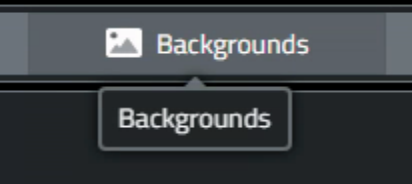
In Actorious, the buttons are essentially set up to control a TWebPageControl component. So a button click will change the active page, make itself the highlighted button, and unselect any of the other buttons. There are dozens of ways to make this prettier, more easily scaled, or just nicer from a coding standpoint, but whatever you end up doing, ultimately it is going to be implementing some variation of this kind of idea. For a handful of buttons, this is fine.
procedure TForm2.btnBioClick(Sender: TObject);
begin
  divInfoPages.ActivePage := pageBio;

  // Highlight this button
  btnBio.ElementHandle.classlist.replace('btn-secondary','btn-primary');

  // Dehighlight these buttons
  btnPhoto.ElementHandle.classlist.replace('btn-primary','btn-secondary');
  btnVideo.ElementHandle.classlist.replace('btn-primary','btn-secondary');
  btnBackground.ElementHandle.classlist.replace('btn-primary','btn-secondary');
  btnConnect.ElementHandle.classlist.replace('btn-primary','btn-secondary');
  btnSettings.ElementHandle.classlist.replace('btn-primary','btn-secondary');
  btnAbout.ElementHandle.classlist.replace('btn-primary','btn-secondary');
end;
In the Sample Project where we had hundreds of buttons, we took a different approach. A search was done for all the related buttons that were currently highlighted and just those were unhighlighted. What works for your situation may be very different. And whether any optimization is needed beyond the above will depend on how many buttons you're dealing with, how often the code is changing, and all kinds of other things.
Sorting.
Now we're left with the interactions that this post was originally intended to cover - Sorting, Grouping, and Filtering data within Tabulator. These are the basic functions we've come to expect from almost any grid-style component. There are plenty of grids that offer all of them out of the box and plenty that offer none. And plenty more that offer every conceivable step between. This is one of the discriminating factors, to be honest, when it comes to choosing a grid. But before we get into the details, we should talk about what is needed by the user versus what might be desired by the developer. Or vice versa.
Over the years I've crafted many different grid-type interfaces for customers to use, where the customers vary dramatically in terms of their technical skills and level of interest in the job that they happen to be doing. Sometimes, a great deal of effort has gone into creating a highly flexible and performant tool, only for it to go unused, and worse, under-appreciated. I'm sure many of us have been there before - showcasing our latest accomplishments in glorious detail, while the people paying the bill are at a serious loss as to why they don't just keep using Microsoft Excel. It's good enough for them, it should be good enough for everyone, right?
When it comes to things like sorting, grouping, and filtering data in a grid, it doesn't take long before you've left the comforts of the Excel interface and people can quickly become confused or simply not even understand that other capabilities are present. So having a clean and consistent interface is really important, keeping out anything that isn't necessary. Or providing different screens or pages for people who need them, and hiding some of the complexity from those that don't (yet) have any interest. Sorting is the least troublesome of the three, partly because it has the least number of things to be confused about. And we largely covered sorting last time, so for this post, I just want to cover a few little hints and tips that may save some headaches along the way.
In Tabulator, and most any grid control, it is entirely possible to redefine the contents of a column to be whatever you want it to be, including having data from other cells, combined data from other cells, or data from elsewhere entirely. If the data, in its final presentation, looks like something that should be sorted, and there's some value in someone sorting it, then, by all means, add the sort button (or don't turn it off, most likely). And spend the few minutes that it takes (in Tabulator or any other grid) to set some sensible defaults. In Tabulator, you can even set what direction the sort defaults to when a button is first clicked, which is different than the default sort for the table. And you can set the sort button to cycle between up, down, and unsorted as well, which is not all that common.
Be sure that the sorting matches the column data. For example, we could combine "field a" and "field b" into one column, but we need to be clear about which field is used for sorting. Or if there isn't an obvious choice, then don't offer a sort for that column, but instead have the option for "field a" and "field b" to be presented as separate columns with the option to sort them individually, if it makes sense to do so. Sorting multiple columns at a time is reasonably common, but this is not the default in Tabulator. Easy option to add. But unlikely that anyone other than a developer would go out of their way to use it. Which is probably why it isn't the default.
Data comes in many forms, so sometimes the format of the data will have an impact. Everyone is accustomed to sorting dates, well, by date. Sometimes it is helpful to have the same dates broken up into their constituent parts, and perhaps even a few extra variations like week number or Julian date. Extra columns with these variations can be very helpful when it comes to sorting data in useful ways, and also for grouping and filtering data.
Weekdays in particular can introduce curious problems. Maybe someone wants to sort by weekday, to see what's going on regularly on Tuesdays. So do you sort by the string representation of the weekday, or by the numeric day of the week? Or do you sort by the date and just show the weekday instead? And we don't need to go into what day is the first day of the week, again, I'm sure! But different arrangements may come up that may be useful for different things. Best to be very clear when you're doing anything off the beaten path.
Numeric fields tend to be less problematic in this regard, but if you've got data with units, having conversions to other units or aggregates can be super helpful. And be sure that your sorting mechanism is set to sort by a numeric value and not by a string representation of that value. The Tabulator sorting options include various overrides for just this sort of thing. This is perhaps more important in JavaScript, where types are a little bit more fluid than we might be accustomed to. Having multiple versions of fields in this case is generally not such a good idea as it is easier to get confused when looking at data and forgetting to look at the column header to know the units. Which may or may not be visible in the header if it has a longer title, to begin with.
At the end of the day, a useful sorting system is trivial to implement and use, and the defaults in Tabulator work really well. The trick is in finding the balance between the data displayed and the number of fields that users are willing to sift through to organize the data for their specific needs. The next iteration of Actorious will add quite a few more fields for just this reason, but we'll have to come up with a way to make it easy to get at them for those that are motivated. And safely tucked away for those that are not.
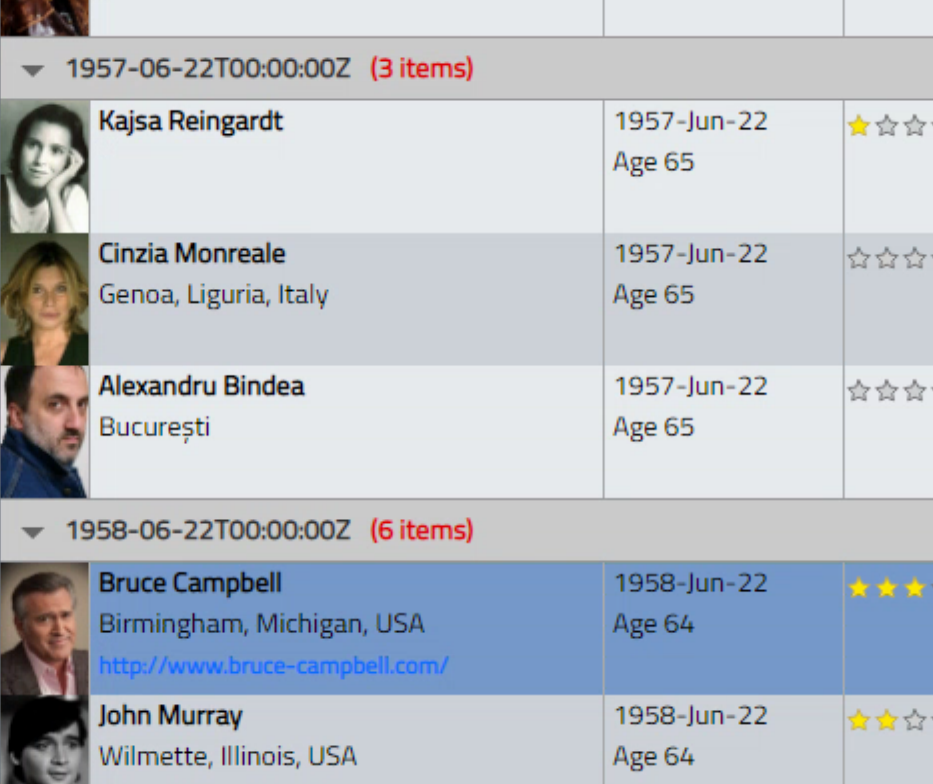
Grouping.
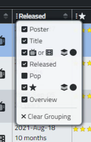
All the usual suspects are here with grouping in Tabulator. Group headers and footers. Group calculations and the rest of it. Lots of examples in the documentation as well. For our purposes, let's add a grouping button to a few columns, but add the option into the column selection interface so it doesn't clutter up the main interface. Clicking on the circles there will then enable the grouping option for that column, and can be assigned separately from whether it is visible or not. A separate menu item will allow clearing all the grouping selections at once. This is a bit of a work in progress, but here's what we've got so far.
   // Tabulator: http://tabulator.info/docs/5.2/menu
    // define column header menu as column visibility toggle
    var headerMenu = function(){
        var menu = [];
        var columns = this.getColumns();
        var groups = this.getGroups();
        var table = this;

        for(let column of columns){

          if (!(column.getDefinition().title == null)) {

            // Build menu item
            let label = document.createElement("div");
            label.classList.add("d-flex");
            label.classList.add("flex-fill");
            label.classList.add("align-items-center");

            // Create checkbox element using font awesome icons
            let icon = document.createElement("i");
            icon.classList.add("flex-grow-0");
            icon.classList.add("ColVis");
            icon.classList.add("fa-solid");
            icon.classList.add(column.isVisible() ? "fa-check-square" : "fa-square");

            // Menu title
            let title = document.createElement("div");
            title.classList.add("ps-1");
            title.classList.add("ColVis");
            title.classList.add("flex-grow-1");
            if (column.getDefinition().field == 'Photo') {
              title.innerHTML = 'Photo';
            }
            else if (column.getDefinition().field == 'Poster') {
              title.innerHTML = 'Poster';
            }
            else if (column.getDefinition().field == 'Type') {
              title.innerHTML = '<i class="fa-duotone fa-tv-retro fa-swap-opacity"></i> or <i class="fa-duotone fa-film"></i>';
            }
            else {
              title.innerHTML = column.getDefinition().title;
            }

            var grpAllow = false;
            if (column.getDefinition().field == 'DOB')      grpAllow = true;
            if (column.getDefinition().field == 'DOD')      grpAllow = true;
            if (column.getDefinition().field == 'Roles')    grpAllow = true;
            if (column.getDefinition().field == 'PopInt')   grpAllow = true;
            if (column.getDefinition().field == 'Type')     grpAllow = true;

            let groupicon = document.createElement("div");
            let group = document.createElement("div");
            if(grpAllow) {
              groupicon.classList.add("flex-grow-0");
              groupicon.classList.add("GroupVis");
              groupicon.classList.add("fa-duotone");
              groupicon.classList.add("fa-layer-group");
              groupicon.classList.add("ps-3");
              groupicon.classList.add("user-select-none");

              group.classList.add("GroupVis");
              group.classList.add("flex-grow-0");
              group.classList.add("ps-1");
              group.classList.add("fa-solid");
              group.classList.add("fa-circle");
            }
            else {
              groupicon.classList.add("flex-grow-0");
              groupicon.classList.add("px-3");
              groupicon.classList.add("user-select-none");
            }

            label.appendChild(icon);
            label.appendChild(title);
            label.appendChild(groupicon);
            label.appendChild(group);

            //create menu item
            menu.push({
                label:label,
                action:function(e){
                    //prevent menu closing
                    e.stopPropagation();

                    var colchg = false;
                    var grpchg = false;

                    if (e.target.classList.contains('ColVis')) {colchg = true}
                    else if (e.target.classList.contains('GroupVis')) {grpchg = true}
                    else if (e.target.parentElement.classList.contains('ColVis')) {colchg = true}
                    else if (e.target.parentElement.classList.contains('GroupVis')) {grpchg = true}

                    // Toggle current column visibility
                    if (colchg) {
                      column.toggle();
                      if (column.isVisible()) {
                        e.currentTarget.firstElementChild.firstElementChild.classList.replace("fa-square","fa-check-square");
                      }
                      else {
                        e.currentTarget.firstElementChild.firstElementChild.classList.replace("fa-check-square","fa-square");
                      }
                    }

                    // toggle current column grouping
                    if (grpchg) {
                      column.getTable().setGroupBy(column.getField());
                      column.getTable().redraw(true);
                    }

                }
            });
          }
        }

        // Add a separator
        let sep = document.createElement("div");
        sep.innerHTML = '<hr class="w-100 p-0 m-0 border-1 border-top border-secondary user-select-none">';
        menu.push({
          label:sep,
          action:function(e){
          }
        });

        // Add a separator
        let clrgroup = document.createElement("div");
        clrgroup.innerHTML = '<i class="fa-solid fa-xmark pe-1"></i>Clear Grouping';
        menu.push({
          label:clrgroup,
          action:function(e){
            e.stopPropagation();
//            var table = Tabulator.findTable("#divActorTabulator")[0];
            table.setGroupBy(false);
            table.redraw(true);
          }
        });

       return menu;
    };
Lots going on here, but essentially we're just creating a headerMenu like last time, with an extra column to show the grouping option. ome extra care is taken with the formatting this time out, and we also have to change a bit how we handle menu choices, as a click can now mean two separate things. At the moment, this will just group by a single column, which is plenty sufficient for our purposes. The clear option is provided to unset the grouping. And the same menu function can be used in either table.
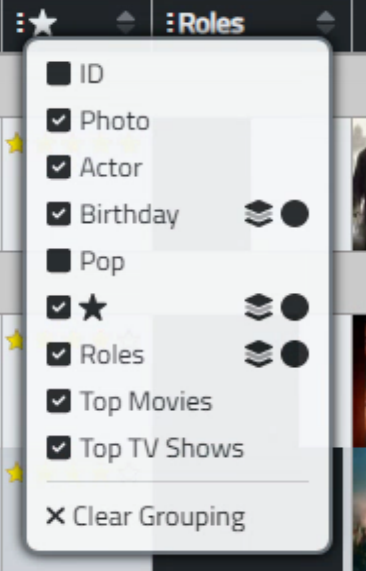
When rows are grouped, there are more options to sort through, such as deciding what to display in the group header, whether groups are automatically expanded or not, how to style the group expand/collapse button, what to do about footers, column calculations, and so on. There are also extra considerations related to dragging rows when groups are in play. Dragging a row from one group to another can set the value of the group, that kind of thing.
Note also that the list of columns to be grouped can be restricted to only those that make sense for grouping. Grouping by Photo wouldn't make much sense for example, so it (hopefully) won't be an option. The code above also doesn't properly set check marks in the circles or allow for more than one level of grouping. These kinds of things can be implemented if desired though.
Filtering.
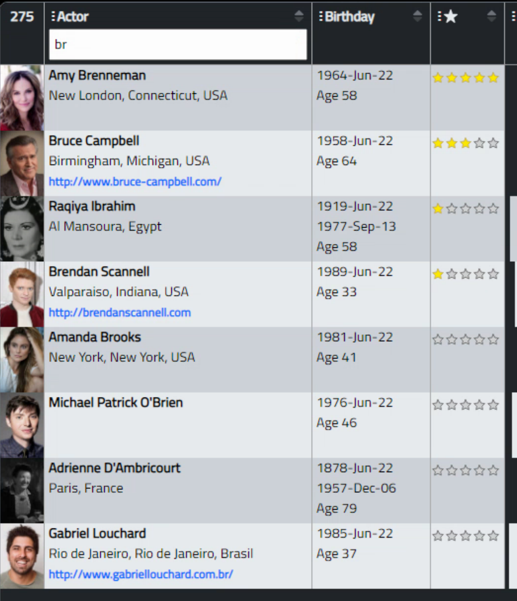
The last topic in our adventure today is all about filtering. The idea is simple enough. Limit the data in the table using some criteria. The trouble though is that different kinds of data need different kinds of editors to enter said criteria. Tabulator does its best with what it has, with built-in filtering that works by default as you'd expect it to. Adding headerFilter: true to the "Name" column, we get the following. Typing 'br' does a cans-insensitive search and we get a short list returned.
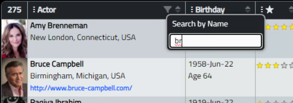
This works well and is simple enough, but takes up quite a bit of space. Instead, let's add a filter button and then have a popup for entering the value instead. Tabulator has a bunch of mechanisms for adding various menus and popups to column headers and rows, and we've been using one already - the headerMenu that we use for column selection. Adding a second menu causes a bit of trouble as by default it uses the same icon and is positioned to the left of the column header. However, given that everything is in nicely structured HTML and CSS, we can really monkey around with things however we like.
What we really want is to have a filter icon appearing on the right, beside the sort icon. Using Chrome's developer tools, we can actually locate the specific element and then move it around. A class was added for the column, and 'flex' was used along with the 'order' mechanism to switch the display order, and a few more CSS shenanigans later, we end up with the following.
#divActorTabulator > div.tabulator-header > div.tabulator-headers > div.tabulator-col.tabulator-sortable.Name > div > div > div.tabulator-col-title {
  display: flex;
}
#divActorTabulator > div.tabulator-header > div.tabulator-headers > div.tabulator-col.tabulator-sortable.Name > div > div > div.tabulator-col-title > span:nth-child(1) {
  order: 1;
  text-align: right ;
  flex-grow: 1;
  margin-right: -10px;
}
This places the filter icon exactly where it is supposed to be, on the right next to the sort icon. While it might seem like a lot of trouble, it works quite well and the same approach can be used when making all kinds of changes to layouts of elements elsewhere. Just find the CSS selector and add some CSS to it, or its neighbors, to get whatever effect you're after. This is where my personal disdain for <canvas> tags comes from. As soon as you hit a <canvas> tag, there's really nothing you can do with it. You can move it around or overlay things on top of it, but whatever is in it is what you're stuck with, most of the time. Not the case with pure CSS and HTML implementations. And with those being as capable as they are today, any rationale for using <canvas> tags is quickly disappearing.

When someone clicks on the filter, then we want it to pop up some kind of interface for entering the filter criteria. This is just going to be a text search, so nothing too fancy, but when we get into editing data, we'll set up more complex filters with date ranges and that sort of thing. For now, let's just get this one filter up and running. There is a ready-made example on the Tabulator site, so we can use that to start and then add some customization to fit our theme. The code that generates the popup UI looks something like this.
var headerNameFilter = function(e, column, onRendered){
      var container = document.createElement("div");
      container.classList.add("rounded");
      container.classList.add("border-2");
      container.classList.add("bg-dark");
      container.classList.add("mt-2");
      var label = document.createElement("label");
      label.innerHTML = "Search by Name";
      label.style.display = "block";
      label.classList.add("text-white");
      label.classList.add("mb-2");
      label.classList.add("ms-1");

      var input = document.createElement("input");
      input.placeholder = "Actor/Director/Writer...";
      input.value = column.getHeaderFilterValue() || "";
      input.classList.add('rounded-1');
      input.classList.add('border-0');
      input.classList.add('ps-2');

      input.addEventListener("keyup", (e) => {
          column.setHeaderFilterValue(input.value);
      });

      container.appendChild(label);
      container.appendChild(input);

      return container;
    }

    //create dummy header filter to allow popup to filter
    var emptyHeaderFilter = function(){
      return document.createElement("div");;
    }
Then, to make use of that, we've got to update the column definition with a few extra pieces. The cssClass is what we're using to fiddle with the filter icon location. The headerPopup entries are what define how the popup itself actually works. The full definition, including the code that combines the fields for display, now looks like the following.
        { title: "Actor", field: "Name", minWidth: 230, cssClass:"Name",
            headerPopup:headerNameFilter,headerPopupIcon:"<i class='fa-duotone fa-filter'></i>", headerFilter:emptyHeaderFilter, headerFilterFunc:"like",
            formatter:function(cell, formatterParams, onRendered){
              var actor = '<div style="padding:0px 4px;"><strong>'+cell.getRow().getCell('Name').getValue()+'</strong>';

              var birthplace = cell.getRow().getCell('BP').getValue();
              if (birthplace == null) { birthplace = '<br />'}
              else {birthplace = '<br />'+birthplace };

              var homepage = cell.getRow().getCell('Home').getValue();
              if (homepage == null) { homepage = '<br /></div>' }
              else {homepage = '<br /><small><strong><a style="text-decoration:none;" href="'+decodeURIComponent(homepage)+'" target="_blank">'+decodeURIComponent(homepage)+'</a></strong></small></div>'};

              return actor+birthplace+homepage;
            }},
And we are then left with the following interface. Not too bad. For other fields with other data types, this can be extended with more input fields or different kinds of input fields. Perhaps another use for FlatPickr. There are many built-in filter functions. Here, we're using a "like" function. Custom filter functions can also be used. So many options!
Next Up: Editing.
In our next outing, we'll take up the issue of editing data in Tabulator. The Actorious app will also be getting a bit of an overhaul to add many more of these fields and groups and filters and so on, so we'll have lots of examples on hand. In the meantime, please drop a comment below and let me know how this is working out for you, what you'd like to see more of (please don't say tooltips!), what you'd like to see less of, and so on. We're past the halfway mark for Tabulator.
Related Posts:
Tabulator Part 2: Getting Data Into Tabulator
Tabulator Part 3: Viewing Data In Tabulator
Tabulator Part 4: Interacting With Tabulator
Tabulator Part 5: Editing Data In Tabulator
Tabulator Part 6: Getting Data Out Of Tabulator
Tabulator Part 7: Performance
Follow Andrew on 𝕏 at @WebCoreAndMore or join our 𝕏 Web Core and More Community.
Andrew Simard

This blog post has not received any comments yet.
All Blog Posts | Next Post | Previous Post