Blog
All Blog Posts | Next Post | Previous Post

 Using TAdvStickyPopupMenu
Wednesday, January 21, 2009
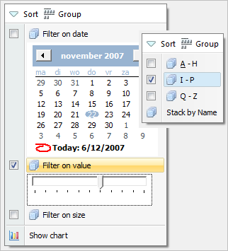
In some cases it is not desirable and even annoying that a menu immediately disappears when a selection is made. To address such situations, the new component TAdvStickyPopupMenu was created. The TAdvStickyPopupMenu component was modelled
after the new menu that can be found in the Windows Vista File Explorer.
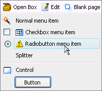
 The TAdvStickyPopupMenu consists of a button bar (top area of the menu) and menu items. The styles of the TAdvStickyPopupMenu are identical to the styles of a TAdvPopupMenu or TAdvMainMenu and are controlled by the same styler (TAdvMenuOfficeStyler) This way, the TAdvStickyPopupMenu can be set in Office 2003, Office 2007, Visual Studio .NET, Windows XP or Windows Vista styles.
To show the menu, call TAdvStickyPopupMenu.ShowMenu(x,y: integer); with X,Y being either screen coordinates or form coordinates for the position where the menu should appear. It is controlled by the property TAdvStickyPopupMenu.DisplayRelative drScreen or drForm what type of coordinates is used as X,Y parameters.
The TAdvStickyPopupMenu ButtonBar
 On top of the menu, it is possible to have an
optional buttonbar. When TAdvStickyPopupMenu.ShowButtonsBar is true and the
TAdvStickyPopupMenu.ButtonBar collection contains buttons, this will be shown.
 Note that the height of the buttonbar is controlled by the styler with AdvMenuOfficeStyler.SideBar.Size.
Each button in the ButtonBar can have a caption & image from the imagelist set with TAdvStickyPopupMenu.ButtonImages. A click on a ButtonBar button can either automatically hide the menu (like a classical popupmenu) when property TButtonBarItem.HideOnClick = true or the menu remains visible when clicked when property TButtonBarItem.HideOnClick = false. The click on the ButtonBar button can be handled by event TButtonBarItem.OnClick or via TAdvStickyPopupMenu.OnButtonClick.
The TAdvStickyPopupMenu menu items
 Several types of menu items are possible :
 - Normal menu item : this is a menu item that can be enabled or disabled and that has a caption and an imagelist image
- A CheckBox menu item : this is a menu item with a checkbox, optionally an imagelist image and a caption. When AutoCheck = true, the checkbox automatically toggles on a click, otherwise the property TStickyMenuItem.Checked should be used.
- A Radiobutton menu item : this is a menu item with a radiobutton, optionally an imagelist image and a caption
- A splitter menu item : when MenuItem.Style = isSplitter, the item appears as just a splitter line
Just like with a ButtonBar button, a click on a menu item can either automatically hide the menu (like a classical popupmenu) when property TStickyMenuItem.HideOnClick = true or the menu remains visible when clicked when property TStickyMenuItem.HideOnClick = false. The click on the menu item can be handled by event TStickyMenuItem.OnClick or via TAdvStickyPopupMenu.OnItemClick.
In addition to this event, the OnCheckClick is triggered when a checkbox item is clicked or OnRadioClick is triggered when a radio menu item is clicked.
OwnerDraw menu items
Finally, it is possible to have custom drawing of the menu item image or the full menu item. To use this, each TStickyMenuItem has two events, OnDrawImage and OnDrawItem.This code draws a simple cross as menu item image:
procedure
TForm1.AdvStickyPopupMenu1MenuItems2DrawImage(Sender: TObject;
 Canvas: TCanvas; ARect: TRect; Selected: Boolean);
begin
 Canvas.MoveTo(ARect.Left, ARect.Top);
 Canvas.LineTo(ARect.Right, ARect.Bottom);
 Canvas.MoveTo(ARect.Right, ARect.Top);
 Canvas.LineTo(ARect.Left, ARect.Bottom);
end;
This code draws the menu item text with an italic font:
procedure
TForm1.AdvStickyPopupMenu1MenuItems2DrawItem(Sender: TObject;
 Canvas: TCanvas; ARect: TRect; Selected: Boolean);
begin
 Canvas.Font.Style := [fsItalic];
 Canvas.TextOut(ARect.Left, ARect.Top, (Sender as
TStickyMenuItem).Caption);
end;
Bruno Fierens

This blog post has not received any comments yet.
All Blog Posts | Next Post | Previous Post