Blog
All Blog Posts | Next Post | Previous Post

 The Next Evolution of Charting in Delphi: Look & Feel
Wednesday, March 18, 2026
Intro
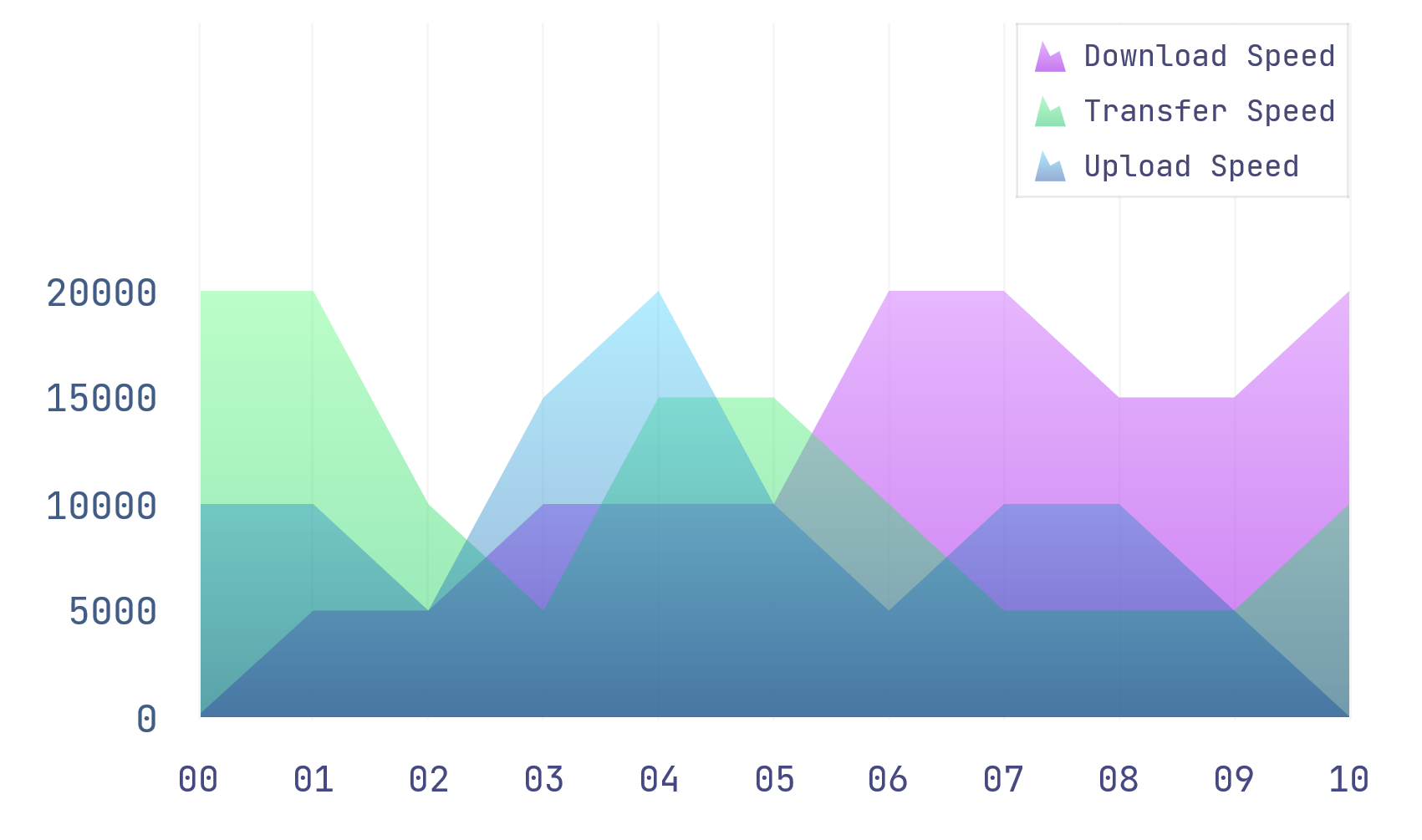
Great charts do more than display numbers, they shape how users experience your application. With TMS FNC Chart, you can turn a default chart into a polished, brand-ready visual that feels built for your product, from cleaner legends and sharper axes to custom color schemes, markers, animation, and 3D effects.
Watch The Video
Watch the companion walkthrough on YouTube:
Quick Highlights
Use the Object Inspector or the built-in chart editor to restyle the chart shell, legend, title, axes, and series.
Switch between the built-in Excel-compatible color scheme and your own custom color list through
Appearance.ColorScheme.Build a mixed chart with an area series and a bar series, then refine it with labels, markers, gradients, and a shared zero-based Y range.
Add runtime polish with threshold-based point coloring, bitmap markers, animation, 3D, and pie-slice emphasis.
Start in the Designer, Not in Code
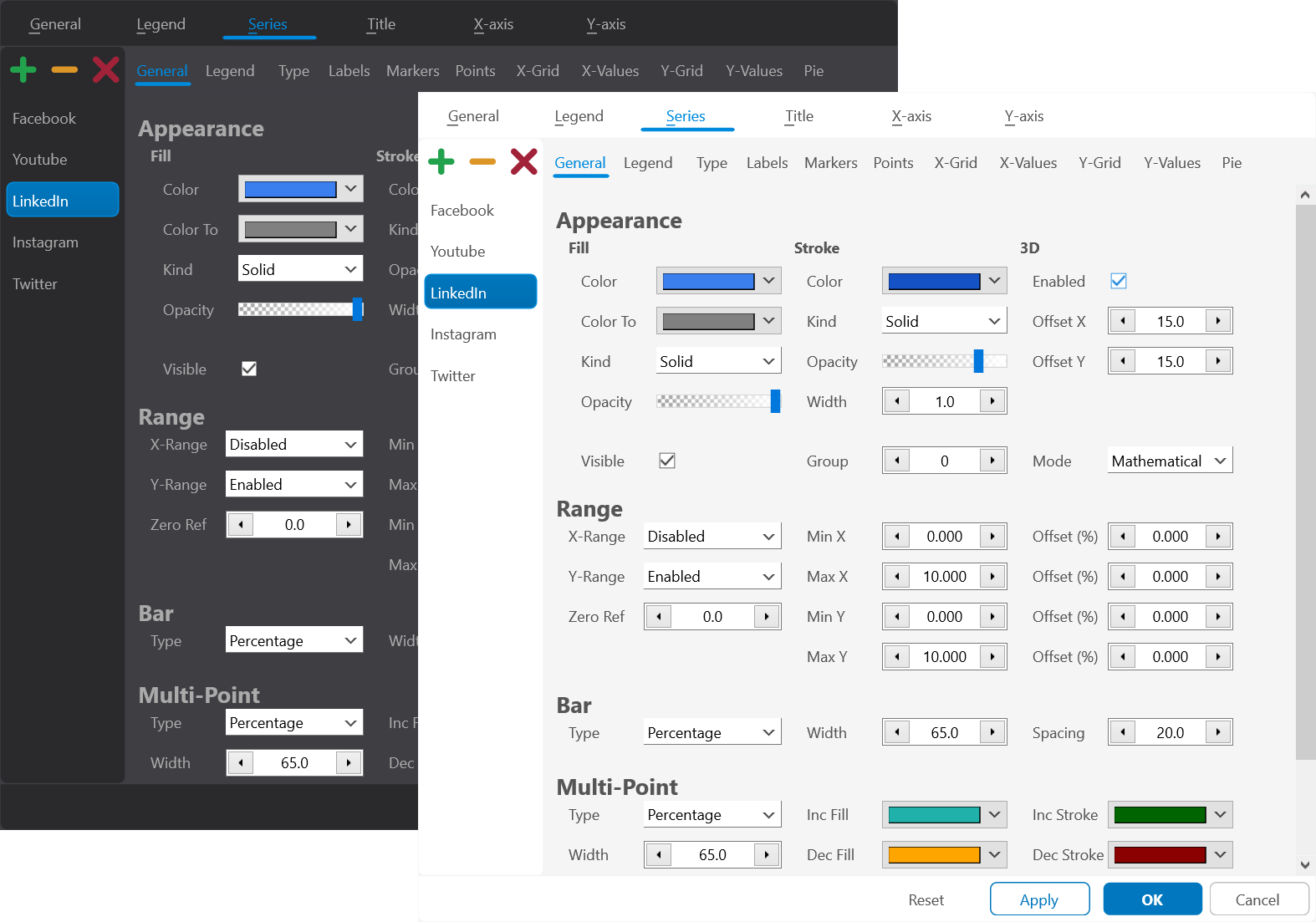
A practical way to begin is with a default chart dropped on a form, then work outward from the chart shell before fine-tuning the series. The Object Inspector exposes the expected property groups, such as Appearance, Legend, Title, and the Series collection. Double-clicking the chart opens the design-time editor, which is the faster way to discover the visual model of the component.
That editor groups styling into the same areas you care about when polishing a chart: chart type, appearance, legend, title, X-axis, Y-axis, and series. You can move the legend, restyle its background and font, place the title at the top or bottom, and position axes at the bottom, top, center, left, or right. Duplicate center axes are especially useful when you want a more analytical or dashboard-like look instead of the standard edge-bound layout.
Highlight: The design-time editor is not just a convenience. It is the fastest way to find the right visual direction before you lock anything into source code.
Color Schemes, Backgrounds, and the Chart Shell
A useful distinction is the difference between styling a single series and styling the chart as a system. That starts with the chart shell itself. The chart background can be a plain color, a gradient, or even a texture. Stroke color and opacity are adjusted from the same editor, so the outer frame of the chart can be subtle or intentionally visible depending on the application.
Color handling is also broader than setting one fill color at a time. Use Appearance.ColorScheme to switch between the built-in Excel-compatible palette and a custom color list. That matters because the palette is reused automatically as series are added, and the same list also drives pie colors. In other words, color scheme selection becomes part of the chart configuration, not an afterthought applied series by series.
Highlight: Picking a color scheme first gives every later series a coherent default look, which is far easier to maintain than manually coloring every chart variant.
Once you have a look you like, the chart can also persist that styling as settings. This is especially useful when you want to ship a default theme, reload a saved dashboard layout, or let users tweak the appearance and store it for the next session.
procedure TFormLookAndFeel.SaveAndRestoreChartSettings;
begin
  TMSFNCChart1.SaveSettingsToFile();

  // Later, or in a new session:
  TMSFNCChart1.LoadSettingsFromFile();
end;
Building the Sales Chart Programmatically
Once the chart shell is in place, a mixed chart with an area series for monthly sales and a bar series for profit percentage is a good example of how the styling model becomes practical. The LegendText is set per series, the X-axis is constrained to the 12 months of the year, and the Y-axis is configured as a common zero-based range so both series share a clean baseline.
This setup also shows an important distinction between chart modes. For business data like monthly sales, smStatistical is the right fit because points are distributed as categories rather than as mathematically scaled X coordinates. On top of that, the area series gets a gradient fill and border styling, while the bar series shows labels and markers.
procedure TFormLookAndFeel.BuildSalesChart(const ASales, AProfit: array of Double);
var
  I: Integer;
  SalesSerie: TTMSFNCChartSerie;
  ProfitSerie: TTMSFNCChartSerie;
begin
  TMSFNCChart1.BeginUpdate;
  try
    TMSFNCChart1.Series.Clear;

    SalesSerie := TMSFNCChart1.Series.Add;
    SalesSerie.LegendText := 'Month sales';
    SalesSerie.ChartType := ctArea;
    SalesSerie.Mode := smStatistical;
    SalesSerie.AutoYRange := arCommonZeroBased;

    ProfitSerie := TMSFNCChart1.Series.Add;
    ProfitSerie.LegendText := 'Profit %';
    ProfitSerie.ChartType := ctBar;
    ProfitSerie.Mode := smStatistical;
    ProfitSerie.AutoYRange := arCommonZeroBased;
    ProfitSerie.Labels.Visible := True;
    ProfitSerie.Markers.Visible := True;

    for I := 0 to 11 do
    begin
      SalesSerie.AddPoint(ASales[I], FormatSettings.LongMonthNames[I + 1]);
      ProfitSerie.AddPoint(AProfit[I], FormatSettings.LongMonthNames[I + 1]);
    end;
  finally
    TMSFNCChart1.EndUpdate;
  end;
end;
The exact values can be randomized or loaded from your own dataset, but the structure is what matters: add the series, set the intent of each series, then add point values and labels. That order keeps appearance and data readable in the source.
Axis labels and spacing deserve their own pass as well. When there is not enough room to show labels horizontally, rotating the X-axis values is often enough to keep the chart readable without changing the data.
procedure TFormLookAndFeel.ConfigureMonthLabels;
var
  S: TTMSFNCChartSerie;
  I: Integer;
  Pt: TTMSFNCChartPoint;
begin
  TMSFNCChart1.BeginUpdate;
  try
    TMSFNCChart1.Clear;
    S := TMSFNCChart1.Series.Add;
    S.Mode := smStatistical;
    S.AutoXRange := arEnabled;
    S.XValues.Angle := -90;

    for I := 1 to 12 do
    begin
      Pt := S.Points.Add;
      Pt.XValueText := FormatSettings.LongMonthNames[I];
    end;
  finally
    TMSFNCChart1.EndUpdate;
  end;
end;
Runtime Styling: Markers, Events, Orientation, Animation, and 3D
This is where the component starts to feel less like a static chart and more like a visual system. First, the bar series is upgraded with marker styling, switching from built-in shapes to a bitmap marker loaded from a PNG. That alone makes it clear that markers can carry semantic meaning, not just decoration.
Dynamic customization can then be added through point-level styling: bars above a threshold can be recolored at runtime. This is a strong pattern because it moves the visual logic closer to the data. Instead of hard-coding one static color, the chart responds to business rules as it renders.
procedure TFormLookAndFeel.HighlightStrongMonths(ASerie: TTMSFNCChartSerie);
var
  I: Integer;
begin
  for I := 0 to ASerie.Points.Count - 1 do
    if ASerie.Points[I].YValue > 40 then
      ASerie.Points[I].Color := gcLime;
end;
Bitmap markers are equally straightforward. Instead of relying on a generic glyph, you can turn every point into a small branded icon or a visual cue that matches the meaning of the series.
procedure TFormLookAndFeel.UseBitmapMarkers(ASerie: TTMSFNCChartSerie);
begin
  ASerie.Markers.Visible := True;
  ASerie.Markers.Bitmap.LoadFromFile('dollar.png');
  ASerie.Markers.Width := 32;
  ASerie.Markers.Height := 32;
  ASerie.Markers.Shape := msBitmap;
end;
From there, global presentation controls can further refine the result. The chart background can be changed to a texture, the orientation can flip between vertical and horizontal, animation can make bars grow from zero to their values, and 3D rendering can be toggled on for the series. Animation is especially useful because it makes the loading or refresh of a chart easier to follow.
procedure TFormLookAndFeel.EnableArea3D;
var
  S: TTMSFNCChartSerie;
  I: Integer;
begin
  TMSFNCChart1.BeginUpdate;
  try
    TMSFNCChart1.Clear;
    S := TMSFNCChart1.Series.Add;
    S.ChartType := ctArea;
    S.Mode := smStatistical;
    S.AutoYRange := arEnabledZeroBased;
    S.Enable3D := True;
    S.XGrid.Visible := True;
    S.YGrid.Visible := True;
    for I := 0 to 10 do
      S.AddPoint(RandomRange(25, 75));
  finally
    TMSFNCChart1.EndUpdate;
  end;
end;
Highlight: Mix static styling with event-driven styling. Set the baseline look in properties, then use runtime logic to emphasize the values that matter.
Pie Charts Reuse the Same Appearance Model
Switching from the sales chart to a pie chart uses the same overall approach. The series collection is cleared, a new pie series is added, labels are made visible, and extra top and bottom margin is applied so an exploded slice still fits cleanly within the chart area. The same color-scheme logic used for line, area, and bar charts is reused for the pie colors.
That is an important design detail. Even though the visual language changes completely, the appearance model stays familiar. Labels, margins, colors, animation, and per-point emphasis still behave like part of the same component rather than like a separate API you need to learn from scratch.
procedure TFormLookAndFeel.BuildPieChart;
var
  S: TTMSFNCChartSerie;
begin
  TMSFNCChart1.BeginUpdate;
  try
    TMSFNCChart1.Legend.Visible := False;
    TMSFNCChart1.Series.Clear;

    S := TMSFNCChart1.Series.Add;
    S.ChartType := ctPie;
    S.Legend.Visible := True;
    S.Pie.AutoSize := False;
    S.Pie.Size := 250;
    S.Stroke.Color := gcBlack;
    S.Labels.Visible := True;

    S.AddPoint(Random(100) + 40, gcDarkred, 'Dark Red');
    S.AddPoint(Random(100) + 40, gcSteelblue, 'Steel Blue');
    S.AddPoint(Random(100) + 40, gcYellowgreen, 'Yellow Green');
    S.AddPoint(Random(100) + 40, gcLightseagreen, 'Light Sea Green');
    S.AddPoint(Random(100) + 40, gcOrange, 'Orange');
  finally
    TMSFNCChart1.EndUpdate;
  end;
end;
The Same Ideas Carry Over to WEB Core
The same chart logic also carries over cleanly to a TMS WEB Core application. The point is not that the chart merely compiles for another target, but that the same appearance concepts survive the move: the same mixed area-plus-bar chart, the same color treatment, and the same general configuration flow appear in the browser after Delphi code is transpiled to JavaScript. That cross-framework consistency is one of the strongest arguments for investing a little time in the chart editor and in a clean programmatic setup.
Conclusion
This is less about one special property and more about a repeatable styling workflow for TMS FNC Chart. Start with the design-time editor to discover the right layout, lock in the chart shell with backgrounds, legends, titles, and axes, then refine each series with chart type, labels, markers, and color scheme. Finally, add runtime rules for thresholds, animation, 3D, or pie-slice emphasis. That combination is what turns the default sample chart into something that actually matches the look and feel of your application.
Pieter Scheldeman
Related Blog Posts
-
TMS FNC Chart 4.0
-
The Next Evolution of Charting in Delphi: Getting Started
-
The Next Evolution of Charting in Delphi: Data Import & Export
-
The Next Evolution of Charting in Delphi: Look & Feel
-
The Next Evolution of Charting in Delphi: Data Binding
-
The Next Evolution of Charting in Delphi: Multipoint Series

This blog post has not received any comments yet.
All Blog Posts | Next Post | Previous Post