Blog
All Blog Posts | Next Post | Previous Post

 Extend TMS WEB Core with JS Libraries with Andrew:
InteractJS Revisited: Moving Elements
Monday, May 15, 2023

Motivation.
In the Catheedral
project, which we're still working through (Part 1 can be found here),
there is a part of the UI where the user should be able to rearrange elements (buttons in this case) on the
page. We'll get into the details of what this looks like in the Catheedral app in an upcoming post very shortly. But this is not
unlike, say, rearranging the icons on an iPhone home screen. In fact, we even covered how to implement "jiggle
mode" in this Basics
Part 3 post on animation. What we didn't cover was how to implement the part where the user could move
the icons to different set positions.
When we covered InteractJS previously, we learned how to move and resize elements, which involved adding some JavaScript that looked for certain classes. We then added these classes to the elements where we wanted to enable certain behaviors. This worked pretty well, and we'll be doing something similar here, but we'll expand it a bit to add in the necessary structure we're working within.
Often, when moving elements around, we don't
want to just drop them anywhere - we'd like them to drop into set positions. And if those positions are already
occupied, we'd like to perhaps shift them out of the way, or swap them, or do something so that we end up with
an orderly result. Just like a chess board, where there are only 64 valid positions and there can only be one piece in each position.
We could toss a bunch of TWebButtons on a page and start from there, as we did in the Basics post. But we
could also very quickly build an app to show how this sort of interface might be created in a more complete
application. This will give us a much better platform to test our solutions. And it also gives us the
opportunity for a few interesting side adventures along the way.
Overview.
Alright. Our example application has a configuration section (the left side) and an interactive section (the right side). For the configuration section, this is primarily a list of options that we can adjust, along with buttons linked to presets, so we don't have to manually set as many options each time we run the app. Changes to these options will then be reflected in the interactive section, so we can see the impact and try out the new configuration.
The interactive section has been set up as a set of layers. There are configuration options for each layer. Depending on what is required, not all layers need to be visible. In practice, likely some of them won't be.
- Holder. This is the outermost <div> element (a TWebHTMLDiv component) that is largely a stand-in for the page, form, tab sheet, or whatever it is that is the main component holding the elements that we're wanting to rearrange.
- Pattern. This is a <canvas> element (in retrospect, I should have made it an SVG instead!) that shows the available positions. This is also what calculates where the available positions are. So while it doesn't need to be displayed, we still need the logic used to generate the pattern. The pattern itself is drawn with the help of many configuration options. In an application where the dimensions don't change (much), an image background could be just as useful and perhaps even better here, as there would be no drawing time required, and additional cosmetic touches would perhaps be easier.
- Container. This is another <div> element (also a TWebHTMLDiv component) that serves as the primary container for the elements we're going to be moving around. This should be aligned with the pattern beneath it, but it can include other styles, opacity, and that kind of thing, perhaps as an extra opportunity to style whatever is rendered in the <canvas> element.
- Elements. This is where the elements to be moved can be found. They are configured as TWebHTMLDiv
components as well, but a TWebButton could also have been used instead.
The configuration section has just two main parts. At the top, there is a collection of buttons. A refresh button to redraw everything. A set of buttons that are used to select presets. And a "jiggle mode" button.
Below the
buttons is the list of configuration items. This is just a basic key/value sort of situation, with an ID and a
group for good measure. The options in this case provide access to mostly either HTML classes (the first
group), or CSS properties, with a couple of other minor exceptions. To display and edit the options, we're just
going to use a regular Tabulator table. Pretty easy, but we'll go through that in just a moment. Here's what
we're working with.
Example Project.
Here, we can see "jiggle" mode is enabled, which is why the buttons at the top are not aligned. But this is
the essence of the project - make changes on the left, and they are implemented on the right. For example, we
can change the dimensions, colors, styles, number of positions, number of buttons, and so on, to set up and
experiment with an arrangement that we're considering using in other projects.
So to get started, we'll need a new project. I've gone with a TMS WEB Core PWA app this time out, just to be a
little different. We'll be using Bootstrap, Font Awesome 6 Free, Tabulator, and InteractJS libraries.
    <!-- Bootstrap 5 -->
    <link href="https://cdn.jsdelivr.net/npm/bootstrap@5.3.0-alpha2/dist/css/bootstrap.min.css" rel="stylesheet" crossorigin="anonymous">
    <script src="https://cdn.jsdelivr.net/npm/bootstrap@5.3.0-alpha2/dist/js/bootstrap.bundle.min.js" crossorigin="anonymous"></script>

    <!-- Font Awesome 6 Free -->
    <link rel="stylesheet" href="https://cdn.jsdelivr.net/npm/@fortawesome/fontawesome-free@6.2.1/css/all.min.css" integrity="sha256-Z1K5uhUaJXA7Ll0XrZ/0JhX4lAtZFpT6jkKrEDT0drU=" crossorigin="anonymous">

    <!-- Tabulator -->
    <script src="https://cdn.jsdelivr.net/npm/tabulator-tables@5/dist/js/tabulator.min.js"></script>
    <link href="https://cdn.jsdelivr.net/npm/tabulator-tables@5/dist/css/tabulator.min.css" rel="stylesheet" crossorigin="anonymous">

    <!-- InteractJS -->
    <script src="https://cdn.jsdelivr.net/npm/interactjs/dist/interact.min.js"></script>
Bootstrap is used for the usual things - button styling, maybe a bit of rounding here and there. Classes that are used as shortcuts for CSS, mostly. Font Awesome is just used for a few icons at the top and for our chess board. More on that later. We'll see in a little bit that it is possible to create icons without Font Awesome or any library loaded. Tabulator is used for the table, more on that in just a moment. And InteractJS is the library we're using to help with moving things around. We've used all of these in previous blog posts. Many times in the case of Bootstrap, Font Awesome, and Tabulator. Not quite as many for InteractJS, but maybe after this post it will be making more frequent appearances.
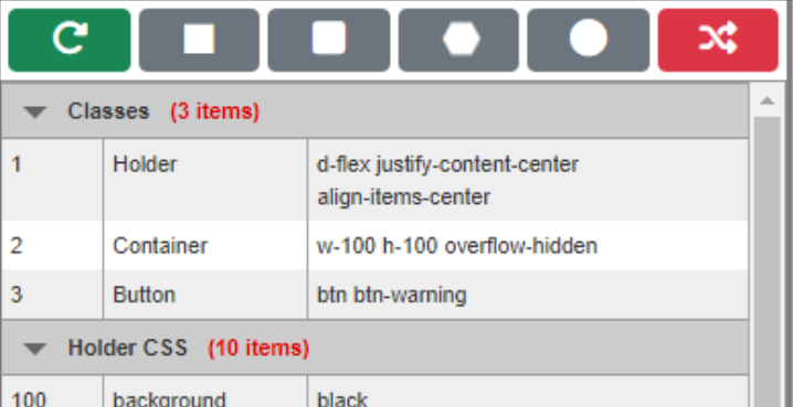
Configuration Options.
The options list is a little bit like the Delphi Object inspector. A list of properties (numbered, in this
case) along with the ability to edit their values. This list is created using Tabulator, a data table that
we've used in many of our projects. It is perhaps a little bit more than we need, but it isn't really any more
difficult to set up and use than the alternatives. Check out this miniseries
if you're not already familiar with it. We're going to load it up with a set of data that we just create
directly in code. This is done in WebFormCreate.
Because there are so many options we'd like to use, we'll set up a handful of different versions of the configuration options, and then have buttons to flip between them. We'll have five versions.
- Rectangle
- Rounded Rectangle
- Hexagon
- Ellipse
- Chess
The list of configuration options is the same for each, just with different values. We'll see what these are in a
little more detail, but first, let's get our data created and a Tabulator table up and running. The data is just a JSON array that we can create directly. Here's what the Rectangle version looks like. We're defining it as a "window"
variable in JavaScript so that it works a bit like a global variable. We could also define a Form variable and use it
that way. As always, there are many ways to accomplish the same goals. This appears in WebFormCreate.
  asm
    window.Options_Rectangle = [
      { ID:  1, Group: "Classes", Option: "Holder", Value: "d-flex justify-content-center align-items-center" },
      { ID:  2, Group: "Classes", Option: "Container", Value: "w-100 h-100 overflow-hidden" },
      { ID:  3, Group: "Classes", Option: "Button", Value: "not-draggable btn btn-warning" },

      { ID: 100, Group: "Holder CSS", Option: "background",    Value: "black" },
      { ID: 101, Group: "Holder CSS", Option: "border",        Value: "" },
      { ID: 102, Group: "Holder CSS", Option: "border-radius", Value: "0.5rem" },
      { ID: 103, Group: "Holder CSS", Option: "top",           Value: "10px" },
      { ID: 104, Group: "Holder CSS", Option: "left",          Value: "10px" },
      { ID: 105, Group: "Holder CSS", Option: "width",         Value: "850px" },
      { ID: 106, Group: "Holder CSS", Option: "height",        Value: "850px" },
      { ID: 107, Group: "Holder CSS", Option: "margin",        Value: "0px" },
      { ID: 108, Group: "Holder CSS", Option: "padding",       Value: "0px" },
      { ID: 109, Group: "Holder CSS", Option: "position",      Value: "absolute" },

      { ID: 200, Group: "Container CSS", Option: "background",    Value: "" },
      { ID: 201, Group: "Container CSS", Option: "border",        Value: "" },
      { ID: 202, Group: "Container CSS", Option: "border-radius", Value: "" },
      { ID: 203, Group: "Container CSS", Option: "top",           Value: "0px" },
      { ID: 204, Group: "Container CSS", Option: "left",          Value: "0px" },
      { ID: 205, Group: "Container CSS", Option: "width",         Value: "" },
      { ID: 206, Group: "Container CSS", Option: "height",        Value: "" },
      { ID: 207, Group: "Container CSS", Option: "margin",        Value: "" },
      { ID: 208, Group: "Container CSS", Option: "padding",       Value: "" },
      { ID: 209, Group: "Container CSS", Option: "position",      Value: "" },

      { ID: 300, Group: "Button CSS", Option: "background",    Value: "" },
      { ID: 301, Group: "Button CSS", Option: "border",        Value: "0px" },
      { ID: 302, Group: "Button CSS", Option: "border-radius", Value: "0px" },
      { ID: 303, Group: "Button CSS", Option: "width",         Value: "90px" },
      { ID: 304, Group: "Button CSS", Option: "height",        Value: "90px" },
      { ID: 305, Group: "Button CSS", Option: "margin",        Value: "5px" },
      { ID: 306, Group: "Button CSS", Option: "padding",       Value: "0px" },
      { ID: 307, Group: "Button CSS", Option: "position",      Value: "absolute" },

      { ID: 400, Group: "Buttons", Option: "Quantity",   Value: "25" },
      { ID: 401, Group: "Buttons", Option: "Move Class", Value: "dragplop" },
      { ID: 402, Group: "Buttons", Option: "X Offset",   Value: "0px" },
      { ID: 403, Group: "Buttons", Option: "Y Offset",   Value: "0px" },
      { ID: 404, Group: "Buttons", Option: "Animation",  Value: "jiggly" },

      { ID: 500, Group: "Pattern", Option: "Arrangement",  Value: "Rectangle" },
      { ID: 501, Group: "Pattern", Option: "top",          Value: "25px" },
      { ID: 502, Group: "Pattern", Option: "left",         Value: "25px" },
      { ID: 503, Group: "Pattern", Option: "width",        Value: "100px" },
      { ID: 504, Group: "Pattern", Option: "height",       Value: "100px" },
      { ID: 505, Group: "Pattern", Option: "margin",       Value: "10px" },
      { ID: 506, Group: "Pattern", Option: "border-color", Value: "var(--bs-warning)" },
      { ID: 507, Group: "Pattern", Option: "border-width", Value: "15px" },
      { ID: 508, Group: "Pattern", Option: "border-style", Value: "dash" },
      { ID: 509, Group: "Pattern", Option: "fillcolor",    Value: "blue" },
      { ID: 510, Group: "Pattern", Option: "radius",       Value: "" }
    ];
  end;
We've defined four fields - ID, Group, Option, and Value. The first is a number, and the rest are strings. Nothing too fancy at the moment. Just think of it as a block of data. We then want to create a Tabulator instance and drop this data into it. Tabulator needs to attach itself to a <div> element on the page (a TWebHTMLDiv component in our case). To make it a little easier to reference, we'll define a Form variable called tabOptions (declared with the JSValue type).
We don't need to configure much in this table. We have a
TWebHTMLDiv component on our Form called divOptions (with the ElementID property set to divOptions as well) which is where we want Tabulator to live.
    this.tabOptions = new Tabulator("#divOptions", {
      data: window.Options_Rectangle,
      layout: "fitColumns",
      groupBy: "Group",
      headerVisible: false,
      index: "ID",
      columns: [
        { title: "ID", field: "ID", width: 50 },
        { title: "Group", field: "Group", visible: false },
        { title: "Option", field: "Option", width: 100 },
        { title: "Value", field: "Value",
            editor: "textarea",
            editorParams: {
              elementAttributes: {
                rows: 1
              },
              selectContents: true,
              shiftEnterSubmit: true
            },
            formatter: "textarea"
        }
      ]
    });
Here's a breakdown of what this is doing.
- The data value in this case corresponds to the JSON array that we want to load when the table is
first created. The names appearing in the JSON array are automatically mapped to fields.
- layout indicates how the column widths are calculated. "fitColumns" resizes them to fit the
available space, factoring in columns that have fixed widths, and stretching the others.
- groupBy indicates that we want to group the records by one of the fields, the "Group" field in this case.
- headerVisible relates to column headers. Our table is simple enough that we don't need it. We don't
really want to sort these columns, which is another reason why you might want to have visible column headers.
- index is used to identify which field will be used by various lookup functions we'll be using. Not strictly necessary, but it makes things a little easier. We can then look up values by the number of the option.
- columns is used to define an array of columns that will be in the table. Fields can be hidden, but they must be defined in a column if we want to be able to access them.
We've got four columns corresponding to our four fields, though one is a grouping column so it doesn't appear as a normal column.
- ID is used to look up the option we're interested in. The ID values are the "key" in the key/value
pairs here. Although the table is sorted by this field, it is only sorted because the JSON that is used
happens to be sorted by this value, not because Tabulator has sorted it (though it is quite capable of doing
this).
- Group is an arbitrary label assigned to the options so that they appear together. As it is used in the grouping function of the table, it doesn't need to be visible as a column. By default, groups are automatically expanded. There are options within Tabulator to adjust this, or to have multiple groups, and so on.
- Option is used to define the CSS properties or other options that we'd like to change. In some cases,
an option refers to a set of class names. In a couple of cases, it refers to something else entirely.
- Value is the most complex column here, but really it's just a text field. In HTML, a multi-line text field (a TWebMemo field for example) is created as a <textarea> tag, which we indicate in Tabulator by assigning a "formatter" of "textarea". Because we also want to edit this field, we need to define the editor attribute as "textarea" as well. But Tabulator also has other options for fine-tuning many of its editors. In this case, we want the editor to show only one row initially, we want the contents to be selected whenever we enter the editor, and to save the values, we can move to another cell, or hit Shift+Enter. Hitting Enter will just add a new line.
Not too terrible, right? The <textarea> works a bit better than just a single line of text because some
of us (that'd be me, primarily) tend to go overboard when adding Bootstrap classes. And it is a bit of a
nuisance to not be able to see them all at once. Having a <textarea> that automatically expands to show
all of them is a welcome improvement. But it brings us to our first little side adventure.
CSS Text Wrapping.
One of the nice things about HTML and CSS is that we can display content in an element and it will, if we've not interfered too much, automatically wrap the text and even expand the element vertically to fit it all in. Most of the time, this works great. In our case here, though, we've got an annoying little problem to solve. CSS will automatically wrap text whenever there is a space between words, but also whenever there is a word with a hyphen in it. When we have long class names, like one of my favorite sets, "d-flex h-100 justify-content-center align-items-center", without fail there is a wrap mid-way through one of the last two classes.
Not a world-ending problem, to be sure, but annoying all the same. So how do we change it to not break on
hyphens? Not such an easy thing as it turns out. The trick, though, is to not use hyphens. Instead, use
non-breaking-hyphens. But those are hard to type! Instead, whenever we edit one of these fields, we'll replace
all the hyphens with non-breaking hyphens. We just have to remember to reverse the operation before we use them
anywhere else.
To do this, we can add a Tabulator "cellEdited" event. One version of the non-breaking-hyphen can be found in
Unicode character \u2011.
    this.tabOptions.on("cellEdited", function(cell){
       cell.setValue(cell.getValue().replaceAll('-','\u2011'));
    });
But we already have a bunch of data defined with a number of classes with hyphens already. What to do about those? Well, after we've defined the data, we can just run through it, replacing any hyphens we find, before we add the data to Tabulator.
window.Options_Rectangle.forEach(element => element.Value = element.Value.replaceAll('-','\u2011'));JavaScript has a lot of short-hand notation for things, especially loops. Here, we're just iterating through all the JSON array elements, and updating the Value field. The result is non-breaking-hyphens in our table.
Non-Breaking Hyphens.
There, isn't that better? We could do the same for the Options column, but as that isn't likely to change, we
can just set the width to be wide enough to hold the widest entry, which is what we've done. Tabulator could
even do this for us if we were to choose a different layout option.
Building Interactivity.
Alright. We've got a list of configuration options. But what are we going to use all those options for? Well, we're going to build, largely from an empty <div> element or two, the rest of our interface, purely in code. As we're going to want to do this repeatedly, starting from a blank slate each time, we'll set up a Delphi "Update" method that we can call. We'll call it the first time once the Tabulator table has been created. We'll call it whenever we make a change to a configuration option. And we can also call it by clicking on the Refresh button at the top-left, or any of the shape buttons as these replace the configuration options with a different set.
Initially, then, we'll get the first call out of the way as part of the Tabulator setup. This appears in WebFormCreate, right after
the Tabulator creation function. When Tabulator is first called, it builds a table using an asynchronous mechanism. We only know it is done when it calls its own "tableBuilt" event. As we passed Tabulator a preset set of data in the "data" setup option, as soon as it indicates that it is finished, we know that everything is ready to go, so we can call our Update function right away.
    var This = this;
    this.tabOptions.on("tableBuilt", function(){
       This.Update();
       This.tabOptions.redraw(true);
    });
    this.tabOptions.on("cellEdited", function(cell){
       cell.setValue(cell.getValue().replaceAll('-','\u2011'));
       This.Update();
    });
Note the This = this statement. Why is it needed? Well, in a typical TMS WEB Core application, when using
JavaScript inline (between the asm... ...end blocks) we can refer to Delphi Form variables and methods by adding
a "this." prefix. However, when writing code that appears inside a JavaScript event, the "this." prefix is
often overwritten and is instead pointing at whatever was responsible for triggering the event.
In Tabulator events, this might be the table itself. So we've lost our reference to our Delphi Form variables and methods. To get around this, a new variable "This" is created, pointing at whatever "this" was pointing at previously, so that when the event is called, we still have a valid reference. As JavaScript is case-sensitive, we can get away with this kind of thing. Might be silly, but it works. We could use any other name as well.
Our Delphi Update function is then tasked with the bulk of the initial work of creating our interface. As we
covered earlier, this interface is constructed as a series of layers on the page.
    <divHolder> -> Holder layer
        <canvas> -> Pattern layer
        <divContainer> -> Container layer
            <div> -> Button layer
            <div> -> Button layer
            <div> -> Button layer
            ...
            <div> -> Button layer
        </divContainer>
    </divHolder>
The Update function needs to run through and apply the configuration options to each of the
components found in these layers.
Application Layout.
In our application, we have a pair of TWebHTMLDiv components, divLeft and divRight, with a TWebSplitter between them. The divLeft component contains divOptions, where Tabulator is connected, along with divTop, where the buttons are located. The divRight component takes up the rest of the page and contains divHolder, which is what we're treating as our bottom-most layer.
Just as a minor side note, the TWebSplitter works great, much like the
regular Delphi VCL TSplitter. Splitters in web applications might not be the most popular thing, but it is
there if needed. One small adjustment is to limit its range - we don't want to shrink divLeft too much, nor
does it need to take up the whole page. We can use the following to limit it so that the width of divLeft is
kept safely in the 250px - 750px range.
procedure TForm1.WebSplitter1Move(Sender: TObject);
begin
  divLeft.Width := Max(250, divLeft.Width);
  divLeft.Width := Min(750, divLeft.Width);
end;
The minimum, 250px, gives us enough space to display the configuration options with all three columns still usable. For the buttons at the top, they can be displayed without wrapping, and will automatically stretch to fit the space available. This is accomplished by applying a few extra Bootstrap classes to the divTop component's ElementClassName property.
w-100 flex-fill flex-wrap order-1 h-auto d-flex flex-row justify-content-stretch align-items-center p-1 gap-1
For the individual buttons, the 'flex-fill' Bootstrap class has been added to their ElementClassName properties as well. This makes it so that the buttons can wrap if the width is too small, and also have the buttons fill the space available if we have more space than we need. Not such a big priority in our current application, but if we were to add more buttons, or buttons with longer text, this would be more important.
Lookup Methods.
Before we get into our Update function, we are going to set up a few functions to retrieve configuration options from Tabulator. Tabulator is of course a JavaScript library. We can access it from Delphi pretty easily, but as we'll be doing this a lot, it is helpful to build a few wrappers as Delphi functions. Along the way, we can also address a few other things to save us a little time when we go to use these.
First, we'll need
a function that can just return the name of the option. Many of these are going to end up being directly
applied as CSS property names, so we'll need a way to get at them. We'll just pass in the option index value,
and get back a string that is the option name.
function TForm1.GetOption(ID: Integer): String;
begin
  Result := '';
  asm
    Result = this.tabOptions.getRow(ID).getCell('Option').getValue();
  end;
end;
Note that we've defined tabOptions as a Form variable, and we used this when setting up Tabulator specifically so we can use
it here. We're using a Delphi function, which means we're going to return a result. In this
case, we can return a result directly from JavaScript, but we just have to be sure that we use the proper case for "Result".
Tabulator's getRow() and getCell() functions do exactly what we'd expect, but
in order to get the actual contents of the cell we also need one more - getValue(). Repeating this, we can get
the option value this way as well. Note that we have to remember to put back the breaking-hyphens that we had
earlier replaced with non-breaking-hyphens.
function TForm1.GetValue(ID: Integer): String;
begin
  Result := '';
  asm
    Result = this.tabOptions.getRow(ID).getCell('Value').getValue().replaceAll('\u2011','-');
  end;
end;
The next variant is similar again, but in this case, we want to get an integer value. The values we're entering
are typically going to be CSS values, so they'll have something like a "px" suffix as this is what is required
in CSS. We could also augment this in case we were using other units, and maybe include a conversion
calculation for rem or em, but as we're primarily entering px values and expecting px values, this isn't critical
at this stage. We're using parseInt to ensure we've got a number either way. Note that this would work without replacing 'px' with an empty string, but has been left in as a reminder that this is the kind of data that is coming into the function.
function TForm1.GetIntValue(ID: Integer): Integer;
begin
  Result := 0;
  asm
    Result = parseInt(this.tabOptions.getRow(ID).getCell('Value').getValue().replace('px',''));
  end;
end;
And finally, we've got another little side-adventure to try and figure out what to do about colors. In CSS, we
can enter color values in a number of different formats.
- A hex value, like #800000.
- An rgb value, like rgb(128,0,0).
- An hsl value, like hsl(0, 100%, 25%).
- A color name, like maroon.
- A CSS variable, like var(--bs-warning).
In Delphi, we're expecting a TColor value, which is something like a BGR value instead of RGB. So these are not the same. At all. And as all of our other configuration options use CSS values, we'd like to use the CSS values for color as well, and also because we've got a lot more options to choose from. So how do we go about converting from some random CSS color value into a TColor value?
The trick is to convert the arbitrary CSS color value into something we can work with more directly, like an RGB value. To do that, we'll need to jump through a few hoops. Essentially, what we're doing
here is creating a new element on the page, setting its color to be the CSS value we're interested in, and then
using getComputedStyle() to retrieve the RGB value that the browser has actually calculated for the same element color property. This returns a value that we can
then convert to individual values for r, g, and b. Then, we can use Delphi's RGB() function to convert those
into a TColor value.
function TForm1.GetColorValue(ID: Integer): TColor;
var
  r,g,b: Integer;
begin
  asm
    var d = document.createElement("div");
    d.style.color = this.tabOptions.getRow(ID).getCell('Value').getValue().replaceAll('\u2011','-');
    document.body.appendChild(d)
    var rgbvalues = window.getComputedStyle(d).color
    d.remove();
    [r,g,b] = rgbvalues.match(/\d+/g).map(Number);
  end;
  Result := RGB(r,g,b);
end;
Note that we have to do the same extra step of putting back the breaking hyphens, and also remove the element that we had just added. This is a relatively expensive function, given all the different steps and what they actually involve (browser rendering and so on) but ultimately this gets us what we're after - a TColor value.
With these functions now all defined and tested, we're ready to get to work on our Update function.
Step 1: Reset
There are three arrays defined at the Form level that we'll be using to keep track of things.
- Buttons. An array of TWebHTMLDiv components, but could be a TWebButton array as well. We'll be populating this with components we create dynamically.
- Positions. An array of TPoint objects, this tells us the [X, Y] coordinates for each of the positions we're working with.
- Contents. An array of integers, this is used to indicate which of the buttons is in a given position. Same number of elements as Positions.
Note that there are ultimately a fixed number of Position array elements, but that this fixed number is determined dynamically by the size and dimension of the Positions that fit in the design, calculated in the Pattern section. Once the Pattern section is complete, the number of Positions (and the related number of Contents array elements) doesn't change until the configuration is changed again.
The number of Buttons cannot
exceed the number of Positions elements in our particular arrangement, though this is just a design choice. We
could just define more Positions than are displayed if we had a situation that called for that.
  // Reset Arrays
  i := 0;
  while i < Length(Buttons) do
  begin
    Buttons[i].Free;
    i := i + 1;
 end;

  SetLength(Buttons,0);
  SetLength(Positions,0);
  SetLength(Contents,0);
Note that the Buttons array elements (TWebHTMLDiv components) are created dynamically, so we're freeing them here. We often don't need to worry about such things in TMS WEB Core, quite a departure from Delphi VCL projects, but in this case, it is needed so that they're removed from the page. These will be recreated in the sections that follow. We want to reset them at the start of each Update so that we don't, for example, end up with a mismatch between positions and buttons later on, if either changes due to configuration options changes.
Step 2: Holder Layer.
The first layer is used primarily to provide a background for our interface. We're not doing anything particularly fancy, necessarily, but the options allow for setting the classes applied to this element as well as a handful of CSS properties. Using our helper functions defined previously, we can apply an arbitrary set of CSS properties and values to the TWebHTMLDiv component.
Here, we're just iterating through a block, from option #101
to option #109, and applying any that have a value. If we wanted to augment or otherwise alter the list of CSS
properties in the original declarations made in WebFormCreate, we'd then have to update the for loop with the
new range. Note also that this is where the requirement for using CSS syntax for the values comes from, at
least in the case of these options.
  // This is our working area
  divHolder.Width := GetIntValue(105);
  divHolder.Height := GetIntValue(106);

  // Set Holder Properties
  divHolder.ElementClassName := GetValue(1);

  // Set Holder CSS Properties
  for i := 100 to 109 do
    if Trim(GetValue(i)) <> ''
    then divHolder.ElementHandle.style.setProperty(GetOption(i), GetValue(i));
Note also that we're replacing the contents of ElementClassName with whatever is in the configuration options.
So any design-time value set in the Object Inspector will be overwritten here. We'll be using this same
mechanism for updating classes and CSS properties for the Container and Button layers as well.
Step 3. Configure Pattern Layer.
Contained within the Holder TWebHTMLDiv component is a <canvas> element, created by dropping a TWebPaintBox component onto it. This element is intended to fill the Holder layer so as to be able to cover it completely if necessary with whatever our Pattern contains. We'll need to clear this <canvas> element as part of each new call to our Update function.
As we're using a <canvas> element and not regular CSS,
the configuration options have arbitrary names. We'll need to manually retrieve them and work them into
our drawing algorithm rather than just handing them over to CSS. This is where a case for using an SVG element
instead of a <canvas> element could easily be made. But for now, here's what we're pulling out of the
configuration options.
  // Set Pattern area
  Canvas.Top := 0;
  Canvas.Width := 0;
  CanvasWidth := divHolder.Width;
  CanvasHeight := divHolder.Height;

  // Reset the canvas
  asm canvasPattern.getContext("2d").clearRect(0,0,CanvasWidth,CanvasHeight); end;

  // Get pattern design parameters
  Pattern  := GetValue(500);
  PTop     := GetIntValue(501);
  PLeft    := GetIntValue(502);
  PWidth   := GetIntValue(503);
  PHeight  := GetIntValue(504);
  PMargin  := GetIntValue(505);
  PBorder  := GetColorValue(506);
  PStyle   := GetValue(508);
  PFill    := GetColorValue(509);
  PFillOpp := OppositColor(PFill);
  PRadius  := GetIntValue(510);

  // Configure brush (background)
  canvasPattern.Canvas.Brush.Color := PFill;

  // Configure pen (border)
  canvasPattern.Canvas.Pen.Color := PBorder;
  canvasPattern.Canvas.Pen.width := GetIntValue(507);
  canvasPattern.Canvas.Pen.Style := TPenStyle.psSolid;
  if PStyle = 'dash' then  canvasPattern.Canvas.Pen.Style := TPenStyle.psDash;
  if PStyle = 'dot' then  canvasPattern.Canvas.Pen.Style := TPenStyle.psDot;
We're primarily just going to be drawing primitive shapes in our <canvas> element, so the Canvas.Brush and Canvas.Pen properties need to be set accordingly. We could expand these options for more complex drawing, but this is plenty sufficient to get us where we're going. For example, we've got support for a few of the options for the Pen drawing style, but there are a handful of others we could add as well. It can also get a bit confusing when we're talking about margins and borders for a <canvas> element, as these are very different from the equivalents in CSS.
Recall also that the pattern here may not even need to be displayed if we instead use a fixed background image
or some other layer to serve the same purpose. This is an example of <canvas> drawing but that's only one
way to do this. What we're really after is the Positions array - a set of points that will indicate where our
Buttons are to appear.
Step 4 - Draw Pattern.
This is where we draw the pattern directly into the <canvas> element. The general idea here is that we have a set of shapes, visual placeholders for our Buttons, and we want to draw the outline of those shapes into the <canvas> element in the specific places where the Buttons will later overlap. The width and height of these shapes will determine how many will fit - we've set this up to move down the <canvas> element once we've reached the right edge so that none of these placeholders are clipped by the boundaries of the Holder layer.
Note that we could have the Pattern originate from a different starting point, or move in another (potentially non-linear) direction. Doesn't really matter for the pattern itself, necessarily. What is going to be important later is that we're using this ordering to help with how buttons are moved around. We could create an interesting interface if we had many small buttons arranged in a spiral pattern, for example.
One of the key configuration options here is the "Arrangement" of these placeholders. We'll start with the
default "Rectangle" which is what we'll also use if the value isn't supplied, or if it doesn't match one of the
other values.
x := PLeft;
y := PTop;
PRow := 0;
PColumn := 0;
while (y < CanvasHeight - PHeight) do
begin
// Add to Positions
SetLength(Positions,Length(Positions)+1);
Positions[Length(Positions)-1] := Point(x,y);
...
else // Rectangle (default)
begin
canvasPattern.Canvas.MoveTo(x,y);
canvasPattern.Canvas.Rectangle(x+PMargin, y+PMargin, x+PWidth-PMargin, y+PHeight-PMargin);
if x + 2*( PWidth ) < CanvasWidth then
begin
x := x + PWidth;
PColumn := PColumn + 1;
end
else
begin
x := PLeft;
y := y + PHeight;
PRow := PRow + 1;
PColumn := 0;
end
end;
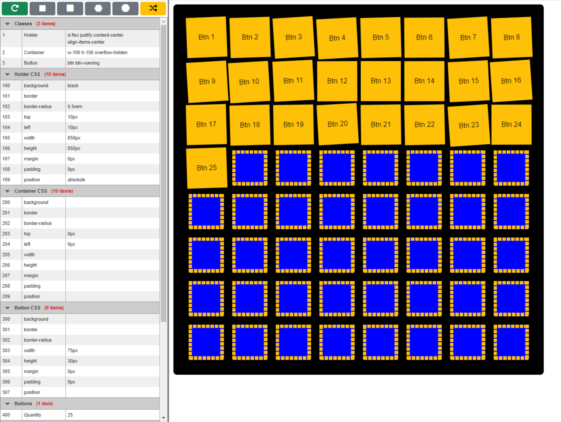
end;This ultimately just draws a series of rectangles (complete with border) across and then down the page, being careful not to draw a rectangle if it will exceed the width or height of divHolder. If we use the data we originally created in WebFormCreate to draw the "Rectangle" pattern it defines, we'll end up with something that looks like the following.
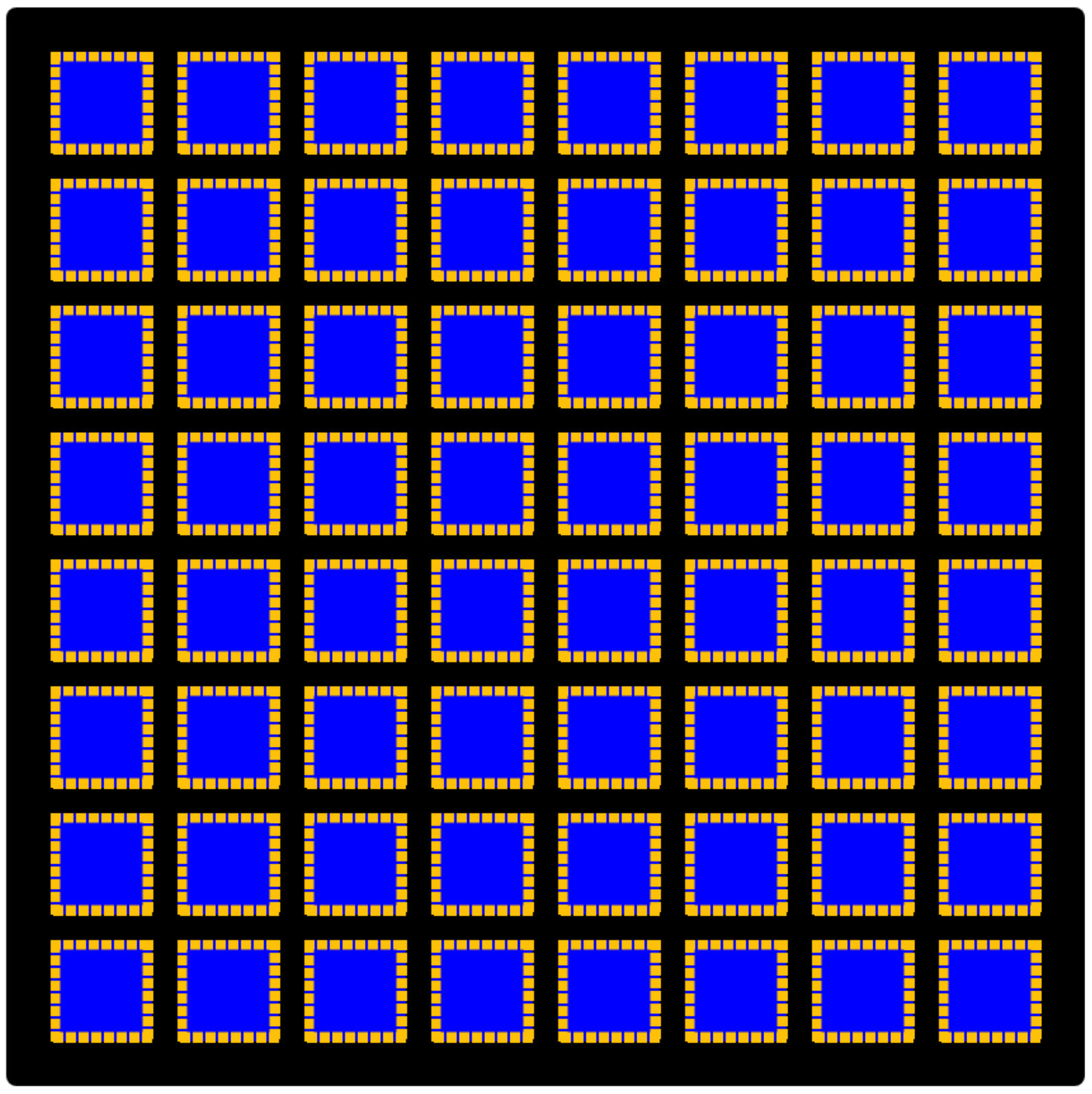
Rectangle Pattern.
As the pattern is being drawn, we're also making a note in the Positions array of where we're currently
drawing. For a rectangle pattern, such as this, this isn't overly complicated.
With a few tweaks to the
configuration options, we could draw a rounded rectangle pattern in the same way, essentially just using a
different <canvas> drawing primitive - RoundRect() instead of Rectangle(). Here, we're after the same
horizontal and vertical alignment as we have with Rectangle.
    if Pattern = 'RoundedRectangle' then
    begin
      canvasPattern.Canvas.MoveTo(x,y);
      canvasPattern.Canvas.RoundRect(x+PMargin, y+PMargin, x+PWidth-PMargin, y+PHeight-PMargin, PRadius, PRadius);

      if x + 2*( PWidth ) < CanvasWidth then
      begin
        x := x + PWidth;
        PColumn := PColumn + 1;
      end
      else
      begin
        x := PLeft;
        y := y + PHeight;
        PRow := PRow + 1;
        PColumn := 0;
      end
    end
Fiddling with the configuration options a little bit, we can get something like this. We can change the size of the pattern, its dimensions, and so on, allowing us to experiment a little until we find the look we're after.
RoundedRectangle Pattern.
To help make it a little easier to experiment with initially, each of our examples has been set up as a preset -
a set of data values in WebFormCreate - that we can quickly apply by using one of the buttons at the top-left of our project. For
example, to see the RoundedRectangle arrangement, click on the button with the rounded rectangle on it. It runs the
following code. The first line replaces our configuration table with the alternate set. The second line calls
our update function to redo everything with these new values.
procedure TForm1.btnRoundedRectangleClick(Sender: TObject);
begin
  asm this.tabOptions.setData(window.Options_RoundedRectangle); end;
  Update;
end;
What if we wanted to use circular or elliptical buttons, where they are staggered so as to take up less space? Well, we've got an arrangement called "Ellipse" that is just for this purpose. And we can use another <canvas> drawing primitive - Ellipse() - to take care of this for us as well. The tricky bit is figuring out the offsets between pattern placements to get the staggering just right. The patterns for each row need to be centered between the elements of the previous row, but that comes about naturally as a result of the offset calculations.
    else if Pattern = 'Ellipse' then
    begin
      canvasPattern.Canvas.MoveTo(x,y);
      canvasPattern.Canvas.Ellipse(x+PMargin, y+PMargin, x+PWidth-PMargin, y+PHeight-PMargin);
      PXRadius := (PWidth - PMargin) / 2;
      PYRadius := (PHeight - PMargin) / 2;

      if x + PWidth + ( PMargin + 2*PXRadius*sqrt(2) ) < CanvasWidth then
      begin
        x := Trunc(x + PMargin + 2*PXRadius*sqrt(2));
        PColumn := PColumn + 1;
      end
      else
      begin
        if PRow mod 2 = 0
        then x := Trunc(PLeft + PMargin/2 + PXRadius*sqrt(2))
        else x := PLeft;
        y := Trunc(y + PMargin + PYRadius*sqrt(2));
        PRow := PRow + 1;
        PColumn := 0;
      end
    end
The math here was originally used for calculating the distance between tangent circles where their centers are at 45-degree angles, but extending to ellipses seems to work pretty well. The ellipse itself is drawn within the bounds of the enclosing rectangle, so this all works out just as we'd like.
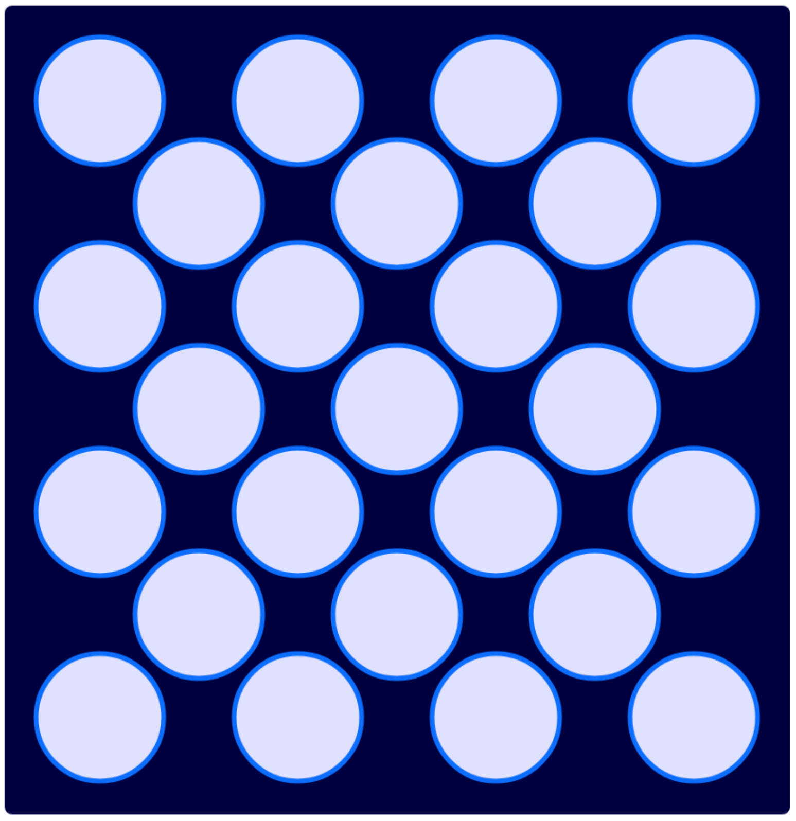
Ellipse Pattern.
We end up with evenly-spaced circles, and if we adjust the margin down a little more, the tangent points all line up nicely. More important than the pattern displayed, though, is that we end up with a different set of points added to our Positions array. These correspond to where the circles are drawn in the pattern. As a result, later when we get to the Buttons layer, we'll know where the buttons need to be drawn.
We could use this same mechanism to calculate the Positions array without ever actually drawing a pattern if that was what the situation called for. On an iPhone home screen, for example, there isn't an underlying pattern visible that corresponds to the layout of the home screen icons.
Finally, when it comes to tiling patterns and simple polygons, there are two more simple polygons that completely cover a plane when tiled - triangles and hexagons (we've already covered rectangles). Hexagons are more interesting for our purposes, so let's give those a try. If you're interested in irregular polygons, or even better yet, irregular tiling, a mathematical discovery just this month might be of interest - einstein tiles. Expect these to appear shortly in a flooring store near you!
Drawing hexagons isn't necessarily difficult - we even have yet another <canvas> drawing primitive to
help us out - Polygon(). The tricky part is figuring out where to put the points. This is another area where an
SVG file would have been a lot easier, but we've got the math sorted out. One more wrinkle, though, is that
we're starting to see the limits of integer arithmetic that our Polygon() function uses. It is very slight but
noticeable. As we've already got the math sorted out, we can drop into JavaScript and draw the same lines
without that limitation.
    else if Pattern = 'Hexagon' then
    begin
      canvasPattern.Canvas.MoveTo(x,y);
      cx := x + PRadius + PMargin;
      cy := y + PRadius + PMargin;
      PiSix := Pi / 6;

      asm
        var ctx = canvasPattern.getContext("2d");
        ctx.beginPath();
        ctx.moveTo(cx+PRadius*Math.cos( 2*PiSix), cy+PRadius*Math.sin( 2*PiSix));
        ctx.lineTo(cx+PRadius*Math.cos( 4*PiSix), cy+PRadius*Math.sin( 4*PiSix));
        ctx.lineTo(cx+PRadius*Math.cos( 6*PiSix), cy+PRadius*Math.sin( 6*PiSix));
        ctx.lineTo(cx+PRadius*Math.cos( 8*PiSix), cy+PRadius*Math.sin( 8*PiSix));
        ctx.lineTo(cx+PRadius*Math.cos(10*PiSix), cy+PRadius*Math.sin(10*PiSix));
        ctx.lineTo(cx+PRadius*Math.cos(12*PiSix), cy+PRadius*Math.sin(12*PiSix));
        ctx.closePath();
        ctx.fillStyle=this.GetValue(509);
        ctx.strokeStyle=this.GetValue(506);
        ctx.lineWidth=PBorderW;
        ctx.fill();
        ctx.stroke();
      end;

//      canvasPattern.Canvas.Polygon([
//        Point(Trunc(cx+PRadius*cos( 2*PiSix)), Trunc(cy+PRadius*sin( 2*PiSix))),
//        Point(Trunc(cx+PRadius*cos( 4*PiSix)), Trunc(cy+PRadius*sin( 4*PiSix))),
//        Point(Trunc(cx+PRadius*cos( 6*PiSix)), Trunc(cy+PRadius*sin( 6*PiSix))),
//        Point(Trunc(cx+PRadius*cos( 8*PiSix)), Trunc(cy+PRadius*sin( 8*PiSix))),
//        Point(Trunc(cx+PRadius*cos(10*PiSix)), Trunc(cy+PRadius*sin(10*PiSix))),
//        Point(Trunc(cx+PRadius*cos(12*PiSix)), Trunc(cy+PRadius*sin(12*PiSix)))
//      ]);

      if x + PWidth + ( 2*PMargin + 3*PRadius ) < CanvasWidth then
      begin
        x := Trunc(x + 2*PMargin + 3*PRadius);
        PColumn := PColumn + 1;
      end
      else
      begin
        if PRow mod 2 = 0
        then x := Trunc(PLeft + (2*PMargin + 3*PRadius)/2)
        else x := PLeft;
        y := Trunc(y + PMargin + PRadius*sqrt(3)/2);
        PRow := PRow + 1;
        PColumn := 0;
      end
    end
The hexagons that we're drawing have a radius that we can set. The horizontal distance between two hexagons is
exactly equal to the length of one of the sides of the hexagon. Which also happens to be the same as the radius. We're drawing hexagons that are always comprised of six equilateral triangles, so this works out pretty well.
Vertically, we'll need a different calculation involving sqrt(3)/2 which is the distance between the bottom of
the hexagon, and the radius of the hexagon. Isn't math fun? In any event, we get the pattern we're after.
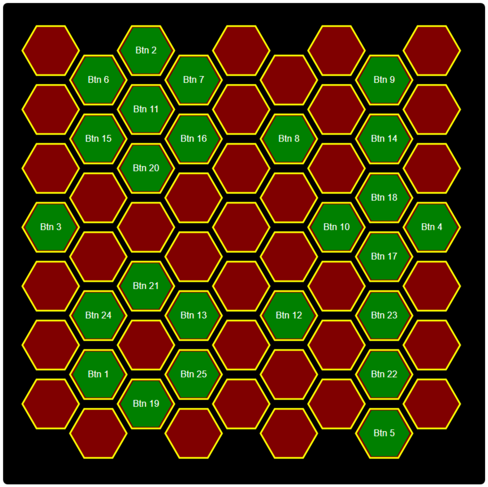
After adding a few colors and changing a few configuration parameters, we ended up with the following.
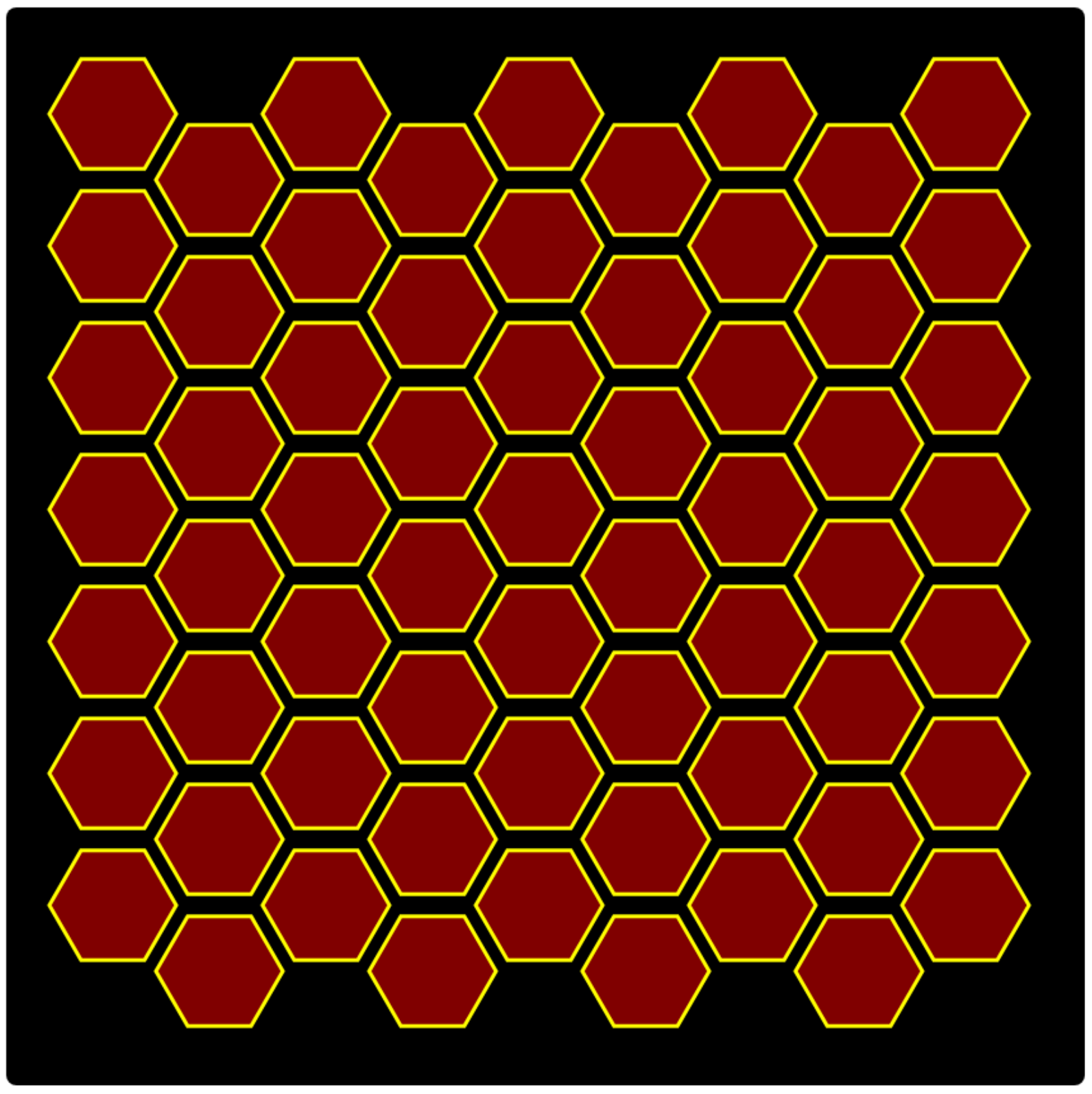
Hexagon Pattern.
As with the ellipse arrangement, here we're particularly interested in populating our Positions array with the
coordinates of where these hexagons are drawn so that we can draw buttons in these locations. The gaps between
the hexagons, as well as the colors, border width, and so on are all items we've added to the configuration
options.
While drawing these patterns, we've also been keeping track of which row and column we're drawing. The
main reason for this is so that we could apply different colors in alternating steps. If we were interested
in drawing a chess board, we'd like the squares to be the opposite colors. And, just for fun, we've even got an
"opposite" color function to help out.
function TForm1.OppositeColor(AColor: TColor): TColor;
begin
  Result := RGB(255-GetRValue(ColorToRGB(AColor)),
                255-GetGValue(ColorToRGB(AColor)),
                255-GetBValue(ColorToRGB(AColor)));
end;
To show it in action, a "Chess" preset has been added. It is the same as the Rectangle preset but with the extra color changes.
    else if Pattern = 'Chess' then
    begin
      canvasPattern.Canvas.MoveTo(x,y);
      if (PRow mod 2) = (PColumn mod 2)
      then canvasPattern.Canvas.Brush.Color := PFill
      else canvasPattern.Canvas.Brush.Color := PFillOpp;
      canvasPattern.Canvas.Rectangle(x+PMargin, y+PMargin, x+PWidth-PMargin, y+PHeight-PMargin);

      if x + 2*( PWidth ) < CanvasWidth then
      begin
        x := x + PWidth;
        PColumn := PColumn + 1;
      end
      else
      begin
        x := PLeft;
        y := y + PHeight;
        PRow := PRow + 1;
        PColumn := 0;
      end
    end
The alternating bit is found in the beginning, comparing the PRow mod 2 and PColumn mod 2 values, alternating
colors depending on whether they are the same or not. Playing around with color combinations again, we end up
with something like the following.
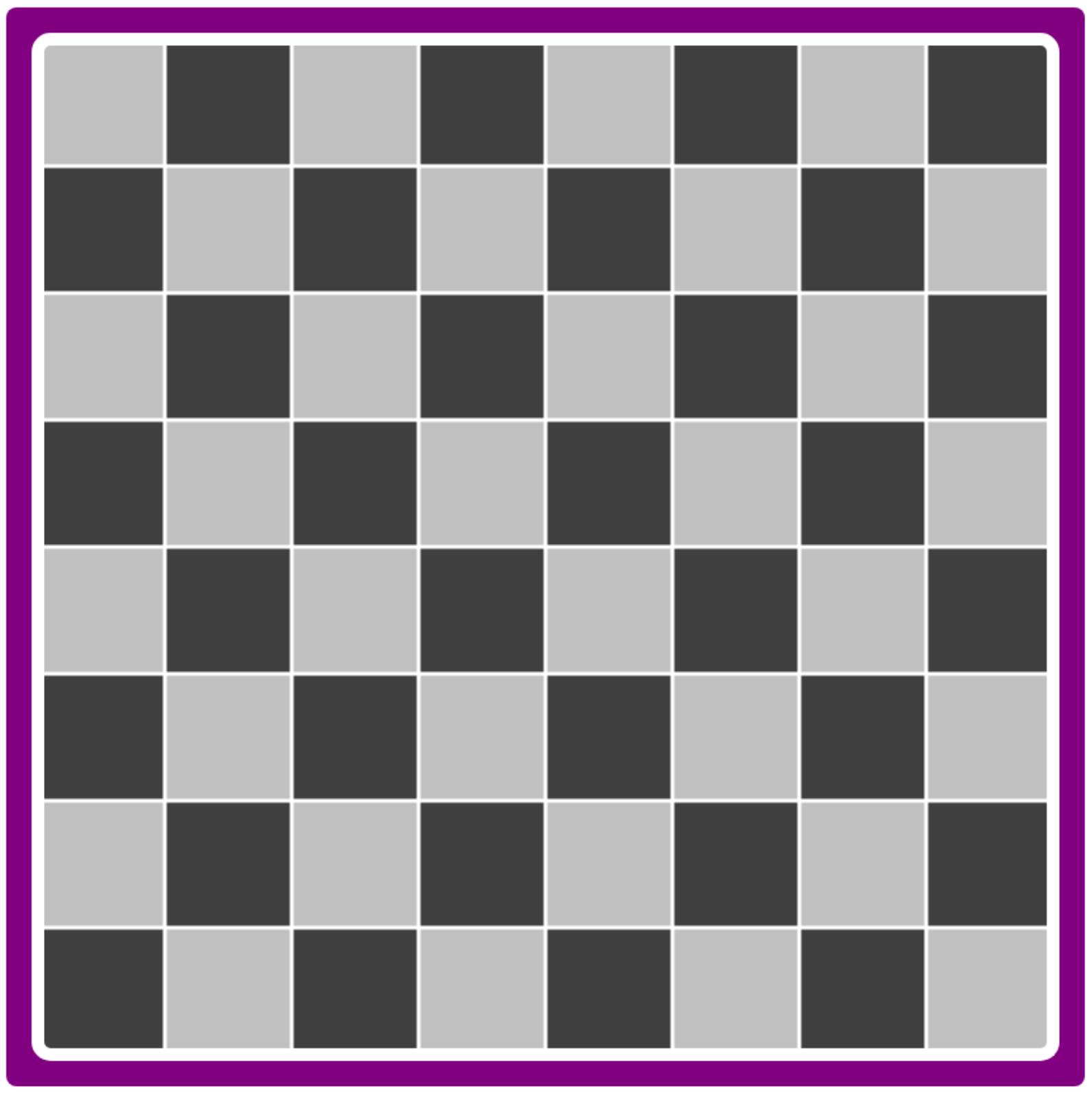
Chess Pattern.
And with that, we've got all of our patterns in place, each generating a set of entries in the Positions array
corresponding to the locations for our buttons. Other patterns are possible, such as triangle patterns or other
irregular or non-repeating patterns, depending on what kind of interface you might be building. This covers the
more common cases. Adding other patterns should be reasonably straightforward.
Step 5 - Container Layer.
The pattern layer was fairly complex, or at least a lot of code to go through. Only two layers left. The
first of these is the Container layer. This is the container that holds the buttons. It may also be invisible,
or it may contain CSS or Bootstrap classes that can impact both the visual appearance of our interface as well
as how the buttons are positioned on the page. We actually used it in the chessboard above, where the Container
is used to draw the thick white border around the squares, inside the purple Holder element. But, like the
Holder element, this is just a TWebHTMLDiv component that we can configure with classes or CSS properties - or
both.
  // Set Container Classes
  divContainer.ElementClassName := GetValue(2);

  // Set Container CSS Properties
  for i := 200 to 209 do
    if Trim(GetValue(i)) <> ''
    then divContainer.ElementHandle.style.setProperty(GetOption(i), GetValue(i));
Note that this is created as a component inside of the Holder <div> element, but as a sibling to the Pattern <canvas> element, so it can be positioned entirely separately. This can be useful in case there is a need for those two elements to be offset independently from one another. This might be the case if the Pattern drawn in the <canvas> was intended to reach the edges of the Holder element, but the buttons needed to be offset in some way.
Step 6 - Button Layer.
This layer is concerned with dynamically creating the actual buttons for the interface. We could use
TWebButton components for this, but we've used TWebHTMLDiv components just as we've been using for everything else. One
of the configuration options allows us to select how many buttons we'll be creating. For our purposes here,
we'll limit the buttons created to no more than the number of available positions. This is just an arbitrary
choice. We could extend the Positions array to allow for more buttons than can be displayed, for example.
Creating components dynamically in TMS WEB Core works much the same way as it does in a traditional Delphi VCL application. Here, we can pass in the HTML id as part of the Create() function and set the Parent property to be the
divContainer component we were just working with in the last step. After that, we're just setting classes and
CSS properties as we were doing previously, while also updating the arrays, tags, and labels as needed.
 // Create Buttons - But only as many as we have space for
  setLength(Buttons, Min(Length(Positions), (StrToIntDef(GetValue(400),10))));
  setLength(Contents, Length(Positions));

  i := 0;
  while i < Length(Contents) do
  begin

    // We have more buttons than we do places to put them
    if i > Length(Buttons) - 1 then
    begin
        Contents[i] := -1;
    end
    else
    begin

      // Add a new Button to the Container
      Buttons[i] := TWebHTMLDiv.Create('Button-'+IntToStr(i+1));
      Buttons[i].Parent := divContainer;

      // Set Button Properties
      Buttons[i].HTML.Text := '<div class="d-flex h-100 justify-content-center align-items-center"><div>Btn '+IntToStr(i+1)+'</div></div>';
      Buttons[i].ElementClassName := Pattern+' '+GetValue(3);
      Buttons[i].onClick := ButtonClick;
      Buttons[i].Tag := i+1;

      // Set Button CSS Properties
      for j := 300 to 307 do
        if Trim(GetValue(j)) <> ''
        then Buttons[i].ElementHandle.style.setProperty(GetOption(j), GetValue(j));

      // Assign Position and Contents
      Contents[i] := i;
      Buttons[i].Top := Positions[i].Y;
      Buttons[i].Left := Positions[i].X;
      Buttons[i].Width := GetIntValue(303);
      Buttons[i].Height := GetIntValue(304);

    end;
    i := i + 1;
  end;
The buttons are positioned according to the Positions array values. The size and shape of the buttons are determined by the configuration options in the "Button CSS" group. For rectangular buttons, we don't need to do much other than size them and adjust the margin to get them to fit over the Pattern. For the ellipse buttons, we can do the same, but by assigning the CSS property border-radius with a value of 50%, we can turn it into a circle. For example, our Button CSS looks like this.
      { ID: 300, Group: "Button CSS", Option: "background",    Value: "" },
      { ID: 301, Group: "Button CSS", Option: "border",        Value: "" },
      { ID: 302, Group: "Button CSS", Option: "border-radius", Value: "50%" },
      { ID: 303, Group: "Button CSS", Option: "width",         Value: "120px" },
      { ID: 304, Group: "Button CSS", Option: "height",        Value: "120px" },
      { ID: 305, Group: "Button CSS", Option: "margin",        Value: "15px" },
      { ID: 306, Group: "Button CSS", Option: "padding",       Value: "0px" },
      { ID: 307, Group: "Button CSS", Option: "position",      Value: "absolute" },
The dimensions are set so that the buttons are smaller than what is laid out in the Pattern, and the margin is used to center the button. As we've set the border-radius to 50%, we get a circular button. In addition, we're also adding a class to the button that corresponds to the pattern. An ellipse in this case. This allows us to add a bit of custom CSS beyond even what is in our configuration.
We could also add whatever custom CSS we might use as additional configuration options. Lots of choices here. In this case, there's an extra CSS property that isn't necessarily needed for all of the other Patterns: clip-path. This allows us to limit the button interaction to a different area than what the containing <div> element might allow. This is a good way to handle shapes in particular, where you don't want a touch event or mouse hover event to kick in unless it is really over the element and not the invisible corner of a bounding rectangle for the shape.
.Ellipse {
  clip-path: circle(50%);
}
Adjusting the number of buttons we want in the configuration options, we end up with the following.
 Circular Buttons.
Taking this a step further, we'll do the same for the hexagon pattern. But before reaching for the nearest
search engine to figure out if CSS supports trigonometric functions (it does!), we can define a clip-path that
represents a polygon without having to use trigonometry. Just goes to show you that there's almost always more
than one way to accomplish the same task. There's even likely a way to use this percentage approach to replace the trigonometry we were using earlier.
clip-path: polygon(25% 5%, 75% 5%, 100% 50%, 75% 95%, 25% 95%, 0% 50%);
With the other buttons, we included the "btn btn-primary" Bootstrap classes, which resulted in the TWebHTMLDiv components being rendered to look like buttons, complete with hover colors. For these hexagons, we've left that off, so we no longer get a hover effect. We can get that back by adding it to the custom CSS. The Hexagon custom CSS now looks like this.
.Hexagon {
  cursor: pointer;
  clip-path: polygon(25% 5%, 75% 5%, 100% 50%, 75% 95%, 25% 95%, 0% 50%);
}
.Hexagon:hover {
  background: var(--bs-dark) !important;
}
And this results in the following display, with the hexagon buttons perfectly aligned to the Pattern below, and with the mouse and touch events precisely aligned to the shape of the buttons.
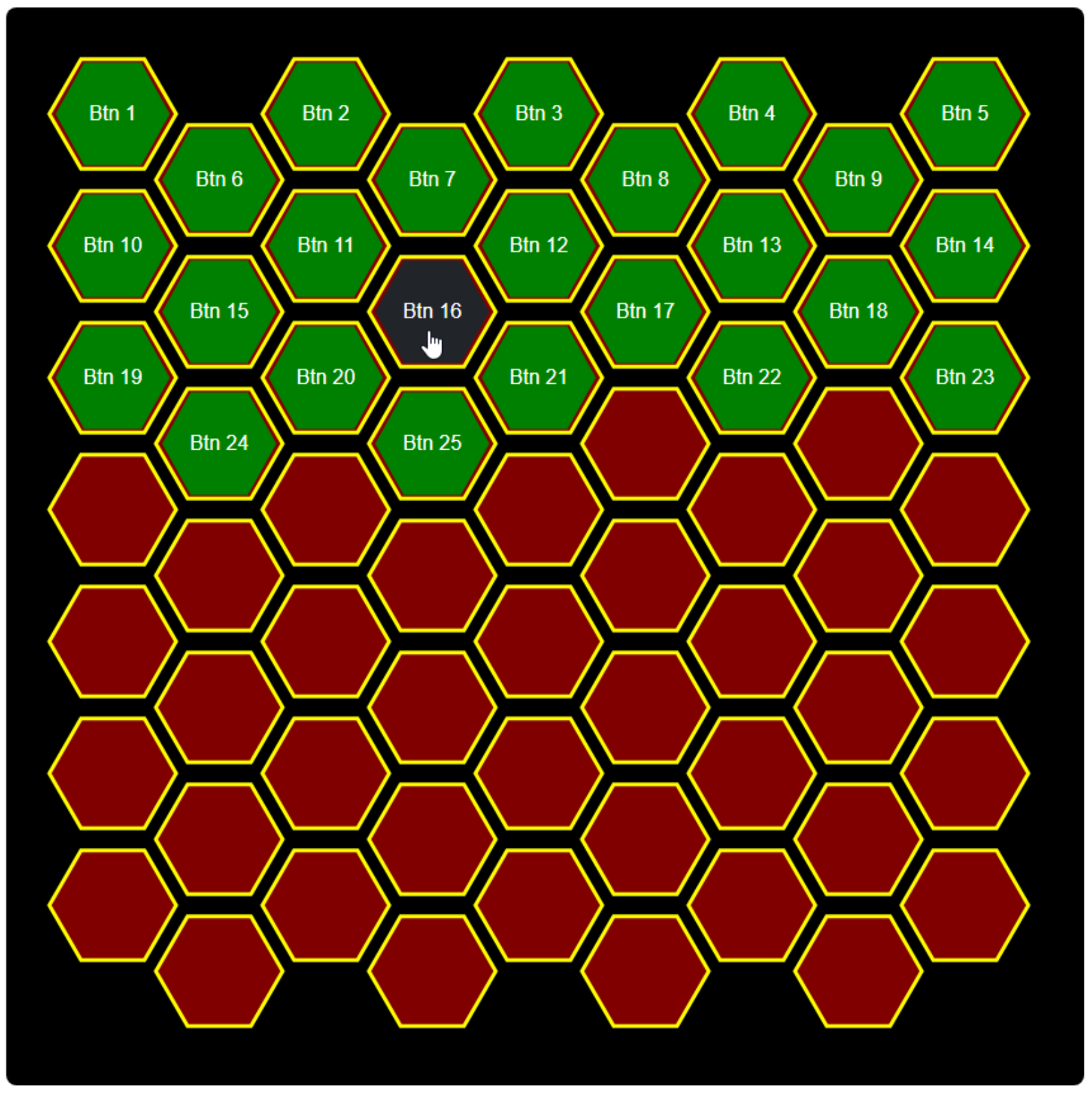 Hexagon Buttons.
For the Chess configuration, we don't want to just insert a set of arbitrary buttons in sequential order. We
would rather set up a default chessboard. To do this, we're going to add a new function that replaces the
button text and tag with the Font Awesome icon for the appropriate chess piece. We'll also need to adjust the positions
to correspond to where the buttons (pieces) should be at the start of a new game. We can then just call this
function after the rest of our layout work is done.
procedure TForm1.AddChessPieces;
var
  ChessIcon: Array[0..11] of String;
  ChessPiece: Integer;
  i: integer;
  Wrapper: String;
  BoardLayout: Array[0..31] of Array[0..1] of Integer;
begin
  // Reset the Contents array
  for i := 0 to 63 do
    Contents[i] := -1;

  // Extra wrapper for placing the piece as a button
  Wrapper := '<div class="d-flex h-100 justify-content-center align-items-center">';

  // These are the icons we're going to use
  ChessIcon[ 0] := '<i class="fa-solid fa-chess-king fa-4x White"></i>';
  ChessIcon[ 1] := '<i class="fa-solid fa-chess-queen fa-4x White"></i>';
  ChessIcon[ 2] := '<i class="fa-solid fa-chess-rook fa-4x White"></i>';
  ChessIcon[ 3] := '<i class="fa-solid fa-chess-bishop fa-4x White"></i>';
  ChessIcon[ 4] := '<i class="fa-solid fa-chess-knight fa-4x White"></i>';
  ChessIcon[ 5] := '<i class="fa-solid fa-chess-pawn fa-4x White"></i>';
  ChessIcon[ 6] := '<i class="fa-solid fa-chess-king fa-4x Black"></i>';
  ChessIcon[ 7] := '<i class="fa-solid fa-chess-queen fa-4x Black"></i>';
  ChessIcon[ 8] := '<i class="fa-solid fa-chess-rook fa-4x Black"></i>';
  ChessIcon[ 9] := '<i class="fa-solid fa-chess-bishop fa-4x Black"></i>';
  ChessIcon[10] := '<i class="fa-solid fa-chess-knight fa-4x Black"></i>';
  ChessIcon[11] := '<i class="fa-solid fa-chess-pawn fa-4x Black"></i>';

  // Default Chess positions [piece#][piece, position]

  //Rank 8: Black
  BoardLayout[ 0] := [ 8,  0];
  BoardLayout[ 1] := [10,  1];
  BoardLayout[ 2] := [ 9,  2];
  BoardLayout[ 3] := [ 7,  3];
  BoardLayout[ 4] := [ 6,  4];
  BoardLayout[ 5] := [ 9,  5];
  BoardLayout[ 6] := [10,  6];
  BoardLayout[ 7] := [ 8,  7];
  // Rank 7: Black (Pawns)
  BoardLayout[ 8] := [11,  8];
  BoardLayout[ 9] := [11,  9];
  BoardLayout[10] := [11, 10];
  BoardLayout[11] := [11, 11];
  BoardLayout[12] := [11, 12];
  BoardLayout[13] := [11, 13];
  BoardLayout[14] := [11, 14];
  BoardLayout[15] := [11, 15];
  // Rank 2: White (Pawns)
  BoardLayout[16] := [ 5, 48];
  BoardLayout[17] := [ 5, 49];
  BoardLayout[18] := [ 5, 50];
  BoardLayout[19] := [ 5, 51];
  BoardLayout[20] := [ 5, 52];
  BoardLayout[21] := [ 5, 53];
  BoardLayout[22] := [ 5, 54];
  BoardLayout[23] := [ 5, 55];
  // Rank 1: White
  BoardLayout[24] := [ 2, 56];
  BoardLayout[25] := [ 4, 57];
  BoardLayout[26] := [ 3, 58];
  BoardLayout[27] := [ 1, 59];
  BoardLayout[28] := [ 0, 60];
  BoardLayout[29] := [ 3, 61];
  BoardLayout[30] := [ 4, 62];
  BoardLayout[31] := [ 2, 63];

  // Perform Layout
  for i := 0 to 31 do
  begin
    Buttons[i].Tag := BoardLayout[i][0];
    Buttons[i].HTML.Text := Wrapper+ChessIcon[BoardLayout[i][0]]+'</div>';
    Buttons[i].Top := Positions[BoardLayout[i][1]].Y - 25;
    Buttons[i].Left := Positions[BoardLayout[i][1]].X - 25;
    Contents[BoardLayout[i][1]] := i;
  end;
end;
To help a bit with styling, we can also add custom CSS rules, particularly to change the color of the pieces as well as draw an outline around them, in the opposite color. We can also add a hover state, and use different colors here as well.
.Chess i.White:hover {
  color: yellow;
}
.Chess i.Black:hover {
  color: purple;
}
.Chess .White {
  color: white;
  filter: drop-shadow(0px 0px 1px black);
}
.Chess .Black {
  color: black;
  filter: drop-shadow(0px 0px 1px white);
}
Here's our updated chessboard.
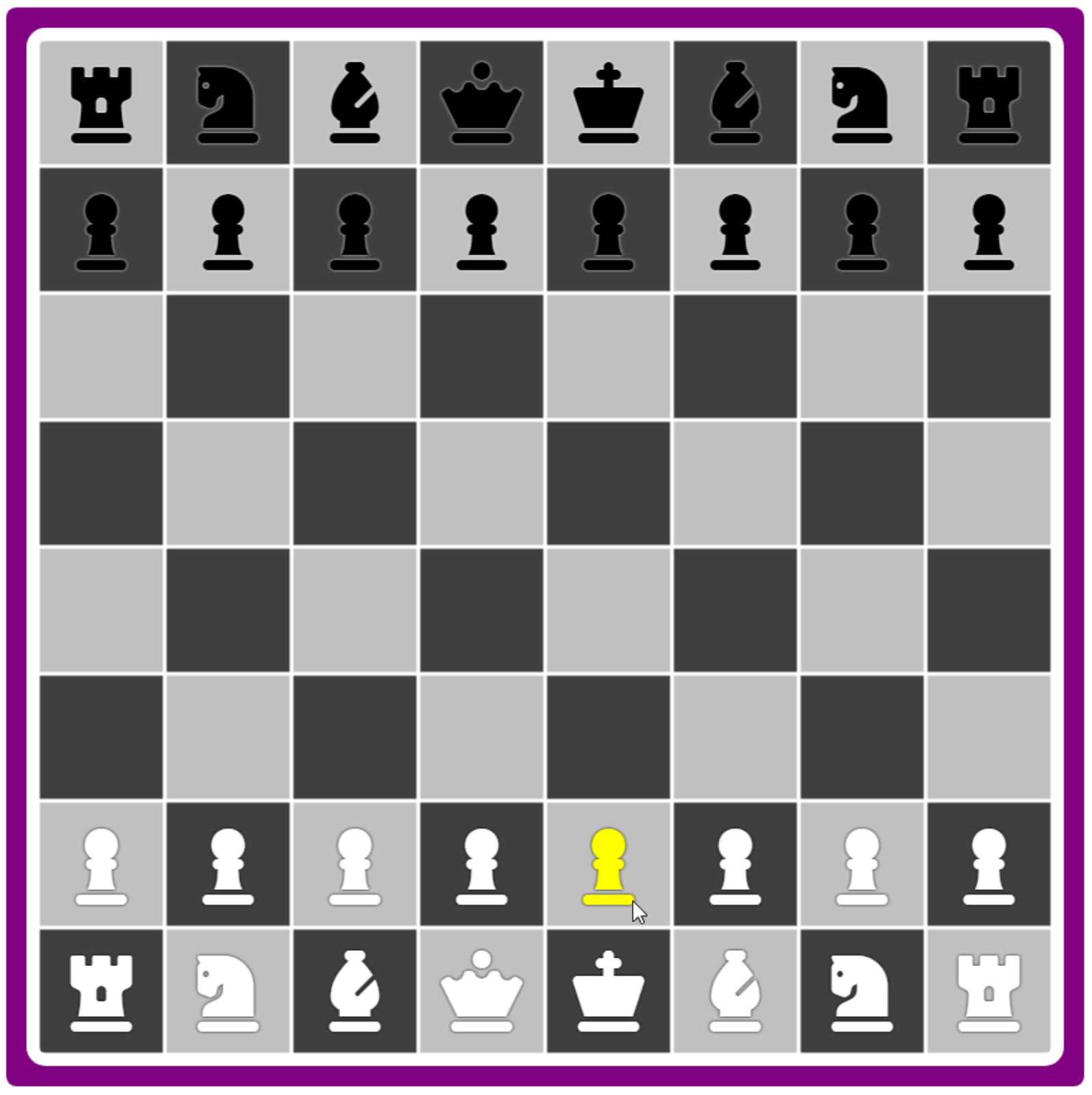
Chess Layout.
We've now got all of our arrangements sorted out, with buttons placed however we like, and even further
customized to have different styles and different content based on whatever criteria we'd like to have.
Jiggly Mode.
In many user interfaces, there is a different "mode" that is used to indicate when the interface can be
altered. On an iPhone, this is sometimes referred to as "jiggly mode" as the icons on the home screen "jiggle"
as an indication that they can be moved around. We first covered this in the Basics 3 post on animation here. To add this to our project involves a few steps. First, we have to add a few CSS properties to our buttons that
help randomize the jiggling. We can do this in Step 6 above. Here's what we'll be adding.
      // Set Jiggle Animation Properties
      Buttons[i].ElementHandle.style.setProperty('transform-origin',IntToStr(Trunc(10+Random(80)))+'% '+IntToStr(10+Random(80))+'%');
      Buttons[i].ElementHandle.style.setProperty('animation-duration',FloatToSTr(0.40+Random*0.40)+'s');
      Buttons[i].ElementHandle.style.setProperty('animation-iteration-count','infinite');
      Buttons[i].ElementHandle.style.setProperty('animation-timing-function','ease-in-out');
Next, in our custom CSS, we'll have to add the CSS @keyframes animation rule to specify what it is exactly that we'll be animating. In this case, we're just animating the button rotation.
@keyframes jiggly {
  0% { transform: rotate(0deg); }
  25% { transform: rotate(3deg); }
  50% { transform: rotate(0deg); }
  75% { transform: rotate(-3deg); }
  100% { transform: rotate(0deg); }
}
And finally, we'll need to have the means to enable or disable this animation. We do this by adding or
removing the CSS "animation-name" property from the elements we want to jiggle. In this case, it is the buttons. We
can wire up another button at the top-left of our interface that works as a toggle function. We'll also use a
Form variable to indicate what the current jiggle mode is.
procedure TForm1.JiggleOn;
var
  i: Integer;
begin
  JiggleMode := True;
  btnJiggle.ElementHandle.classList.replace('btn-danger','btn-warning');
  i := 0;
  while i < Length(Buttons) do
  begin
    if Assigned(Buttons[i]) then
    begin
      Buttons[i].ElementHandle.style.setProperty('animation-name',GetValue(404));
    end;
    i := i + 1;
  end;
end;

procedure TForm1.JiggleOff;
var
  i: integer;
begin
  JiggleMode := False;
  btnJiggle.ElementHandle.classList.replace('btn-warning','btn-danger');
  i := 0;
  while i < Length(Buttons) do
  begin
    if Assigned(Buttons[i]) then
    begin
      Buttons[i].ElementHandle.style.removeProperty('animation-name');
    end;
    i := i + 1;
  end;
end;

procedure TForm1.btnJiggleClick(Sender: TObject);
begin
  if JiggleMode
  then JiggleOff
  else JiggleOn;
end;
Now, clicking on the button toggles "jiggle mode". If we wanted to have more than one @keyframe animation type, we've got it covered by another configuration option. For example, having larger, wider buttons can look a little crazy if the jiggling isn't tamped down a bit.
And we at long last have everything we need to proceed with
the actual intent of this blog post - moving elements around.
InteractJS.
Initially, we can set up the InteractJS library to provide a class that we can add to our buttons that just allows us to move the buttons around. While we're moving them, we'd also prefer that they stop jiggling temporarily.
Normally, InteractJS is configured to not actually alter the position of elements. Rather, it
adds a CSS transform that includes a translate() value corresponding to the amount the element has been moved. This can be helpful in many situations, but it doesn't really provide much benefit here as we're primarily
interested in moving from one defined location in our Positions array to another defined location. But to
start, let's get this up and running.
We already added the JavaScript library when we started this post, so we'll need to add a Javascript function to define the class that enables dragging. We're going to have different classes for the different move styles we're after.
There is an example that can be taken directly from the InteractJS website that shows how to
implement the 'draggable' class. We can add this to our WebFormCreate method, and then toggle the 'draggable'
class on our buttons at the same time that we toggle the animation-name property that enables jiggle mode. Here's an abbreviated version for our purposes. The code to update the element with the move information has
been removed, as well as many of the comments.
  // InteractJS 'draggable' class
  asm
    var This = this;

    // Drag Anywhere
    interact('.draggable')
      .draggable({
        inertia: true,
        modifiers: [
          interact.modifiers.restrictRect({
            restriction: 'parent',
            endOnly: true
          })
        ],
        onstart: function(event) {
          This.ZCounter += 1;
          event.target.style.setProperty('z-index',This.ZCounter);
          event.target.style.removeProperty('animation-name');
        },
        onend: function(event) {
          event.target.style.top = (parseFloat(event.target.style.top.replace('px','')) + parseFloat(event.target.getAttribute('data-y')))+'px';
          event.target.style.left = (parseFloat(event.target.style.left.replace('px','')) + parseFloat(event.target.getAttribute('data-x')))+'px';
          event.target.style.removeProperty('transform');
          event.target.removeAttribute('data-x');
          event.target.removeAttribute('data-y');
          event.target.style.setProperty('animation-name','jiggling');
        },
        listeners: {
          move: dragMoveListener
        }
      });

    function dragMoveListener (event) {
      var target = event.target
      var x = (parseFloat(target.getAttribute('data-x')) || 0) + event.dx
      var y = (parseFloat(target.getAttribute('data-y')) || 0) + event.dy
      target.style.transform = 'translate(' + x + 'px, ' + y + 'px)'
      target.setAttribute('data-x', x)
      target.setAttribute('data-y', y)
    };
    window.dragMoveListener = dragMoveListener

  end;
The code that is run at the start and the end of the drag helps ensure that whatever is being dragged is the topmost element relative to the others. While dragging, InteractJS uses the transform: translate mechanism to store the current position. Once the drag is complete, those values are used to set the top and left values explicitly again. Note that element.style.top and element.style.left are slightly different than element.offsetTop and element.offsetLeft values, and in particular, differ in how margins are calculated. We've gone with this approach so that we're consistent with how the buttons were originally placed.
To get this working in our project, another configuration option has been added (#401) that defines the class
name to add to the button when jiggle mode is enabled. And that's all we've got to do to make an element
interactive in this way - the InteractJS library monitors for this class automatically. Here's the updated
JiggleOn function.
procedure TForm1.JiggleOn;
var
  i: Integer;
begin
  JiggleMode := True;
  btnJiggle.ElementHandle.classList.replace('btn-danger','btn-warning');
  i := 0;
  while i < Length(Buttons) do
  begin
    if Assigned(Buttons[i]) then
    begin
      Buttons[i].ElementHandle.style.setProperty('animation-name',GetValue(404));
      Buttons[i].ElementHandle.classList.replace('not-draggable',GetValue(401));
    end;
    i := i + 1;
  end;
end;
The class "draggable" is then what we'll use when we want to just move elements around the page without any kind of alignment. By default, "not-draggable" is included in the class list, and we're just swapping that for whatever move style we're using for that preset.
The "draggable" move style might be useful in a scenario where you have a bunch of elements that can be set at any X/Y position and you don't care if they overlap. The last moved element will be on top.
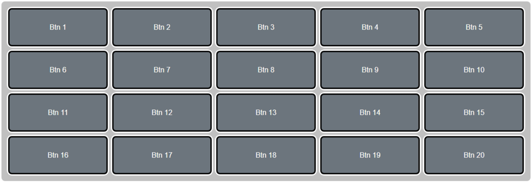
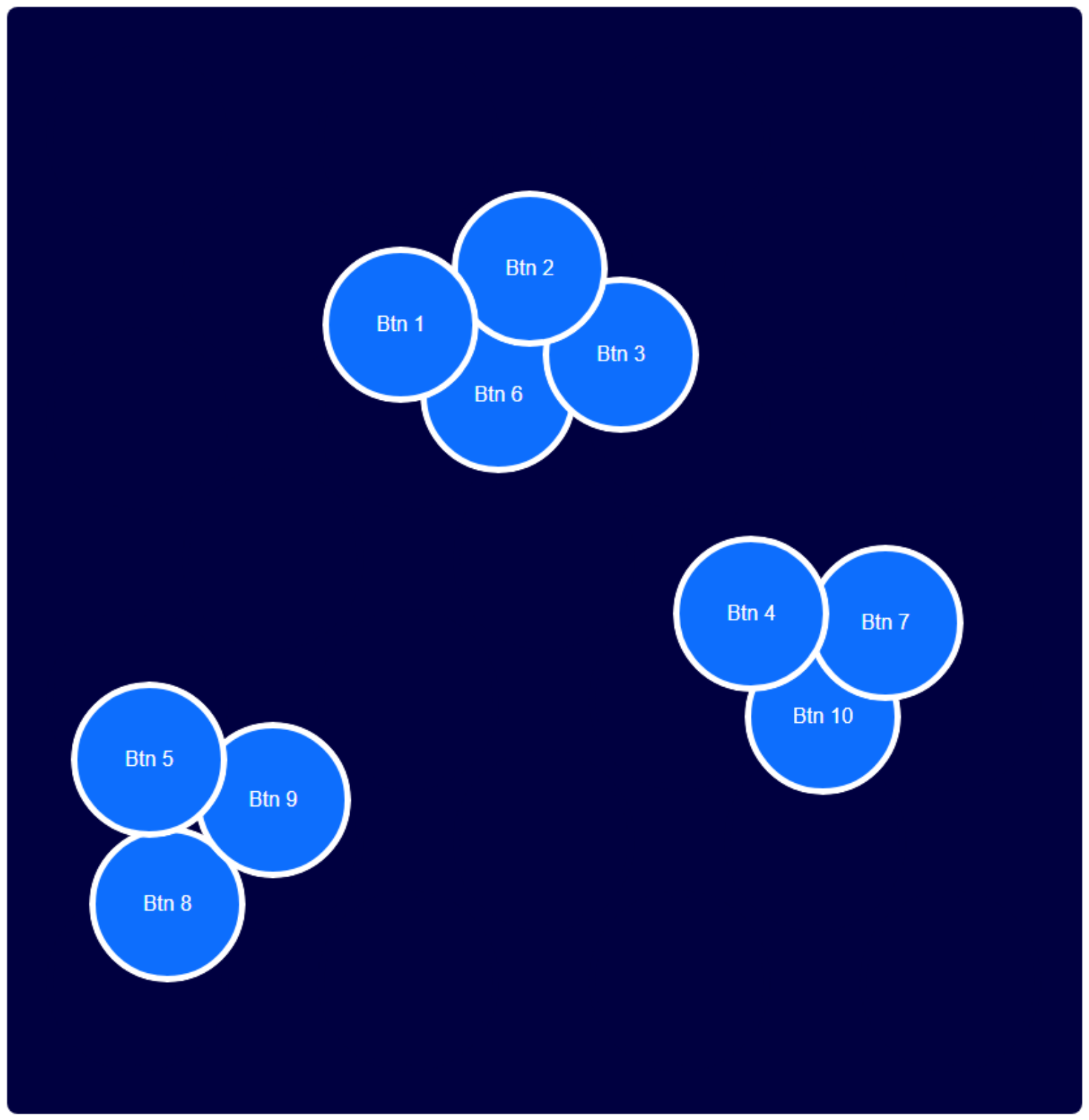 Move Class: draggable.
With this kind of drag style, it is probably best to not have a pattern visible. The pattern would then just
be used to lay out the initial positions for the elements while allowing them to be dragged anywhere within the
container.
Drag and Drop.
Let's add a new move style class, "dragdrop". Here, once we've finished dragging an element, we'd like it to "drop" into the nearest available position. If there's something there already, we'll just ignore it. As the z-index is incremented for the most recently dragged element, it will overlap whatever is below it. But we can drag it away again to reveal the original element. It effectively works as a stacking mechanism.
This follows the original draggable function pretty closely, but the "onend" part does a search to find the
nearest position just based on the distance between the current point and the points defined in the Positions
array. Note here that we are accessing the Positions array (an array of TPoints) directly from within JavaScript. The
X/Y values of TPoint are mapped to x/y values in the JavaScript variation.
        onend: async function(event) {
          var PosX = (parseFloat(event.target.style.left.replace('px','')) + parseFloat(event.target.getAttribute('data-x')));
          var PosY = (parseFloat(event.target.style.top.replace('px','')) + parseFloat(event.target.getAttribute('data-y')));
          event.target.style.top = PosY+'px';
          event.target.style.left = PosX+'px';
          event.target.style.removeProperty('transform');
          event.target.removeAttribute('data-x');
          event.target.removeAttribute('data-y');

          // Find nearest Position
          var minDistance = 999999;
          var NewX = 0
          var NewY = 0;
          var dist = 0;
          for (var i = 0; i < This.Positions.length; i++) {
            dist = Math.sqrt(Math.pow(This.Positions[i].x - PosX,2) + Math.pow(This.Positions[i].y - PosY,2));
            if (dist < minDistance) {
              minDistance = dist;
              NewX = This.Positions[i].x;
              NewY = This.Positions[i].y;
            }
          }

          await sleep(50);
          event.target.style.setProperty('transition','top 0.2s linear, left 0.2s linear');
          event.target.style.top = NewY + 'px';
          event.target.style.left = NewX + 'px';
          setTimeout(function(){
            event.target.style.setProperty('animation-name','jiggling');
            event.target.style.removeProperty('transition');
          },200);
        },
The last bit is also a little tricky. What we're angling for here is that when the drag stops (the mouse button is released), we want to animate the movement from that position into the final position found in the Positions array. We first update the current position of the element to the dropped position - dispensing with the InteractJS transform, just as we did previously. This takes a non-zero amount of time, however, so we wait for 50ms for this change to take effect. Then, we add the CSS transition property to animate the move from there to the new position over a period of 200ms.
If we didn't wait for the original 50s, this would have resulted in the jiggle animation moving from the original position of the element before the dragging started - not a good look.
Finally, we get rid of the transition property so it isn't applied the next time we move the element, and then we re-enable jiggling. If we enabled it previously, it would also animate between the original position of the element and the final position.
With this move style enabled, we can make quick work of moving elements into new Positions. Each drag and drop
will automatically align with the nearest available spot, allowing us to quickly rearrange all the buttons in
whatever random configuration we want.
Move Class: dragdrop.
We might use this kind of mechanism if the elements were something functionally equivalent to cards - they
don't go away or interact with any other elements, and they can be stacked and rearranged endlessly. Or perhaps
this might be a control panel where each button performs a specific function, and we want to group similar
functions together. But we'll leave it to the user to arrange how those functions are laid out, as they are
best suited to determine that grouping. This might be especially powerful if the user is also defining the
function of the buttons themselves.
Drag and Pop.
A small variation on this mechanism would be to remove the underlying elements if they occupy the same spot in
the Positions array. We have the Contents array to help us track what is in each of the Positions, so we'll
have to both check that to figure out what to delete, and also update that with the new value. The Contents
array tracks which element is in each of the available Positions. And the element's Tag property tracks where
it currently is in the Positions array as well. This makes it easy to update the Contents array, removing any
existing element from the new position, and removing the current element from its original position. We can
update the above code with the following.
          // Find nearest Position
          var minDistance = 999999;
          var NewX = 0
          var NewY = 0;
          var dist = 0;
          var posn = -1;
          for (var i = 0; i < This.Positions.length; i++) {
            dist = Math.sqrt(Math.pow(This.Positions[i].x - PosX,2) + Math.pow(This.Positions[i].y - PosY,2));
            if (dist < minDistance) {
              minDistance = dist;
              NewX = This.Positions[i].x;
              NewY = This.Positions[i].y;
              posn = i;
            }
          }

          var btnid = parseInt(event.target.id.replace('Button-',''))-1;
          if ((This.Contents[posn] !== btnid) && (This.Contents[posn] !== -1)) {
            This.Buttons[This.Contents[posn]].Free();
          }
          This.Contents[This.Buttons[btnid].FTag$1] = -1;
          This.Contents[posn] = btnid;
          This.Buttons[btnid].FTag$1 = posn;
This mechanism might be useful when only one element can occupy a position at one time. When a collision occurs, the original element is dispensed with. Like in chess.
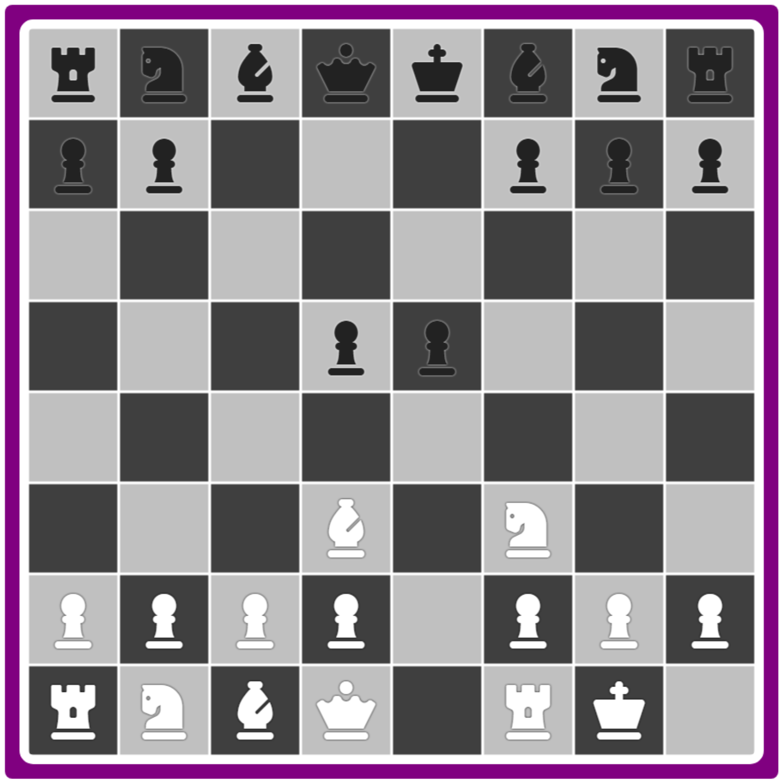
Move Style: dragpop.
Additional changes for this move style involve dealing with the removal of elements from the TButton array. Here, we've
called the Free() function from JavaScript but also set it to null. The array element still exists, but we'll
have to check if it is null in our JiggleOn and JiggleOff functions. Another approach would be to remove the
array element entirely, reducing the array size in the process.
Drag and Swap.
In this variation, rather than removing the conflicting element, we'll just move it into the original position
of the incoming element, effectively swapping their positions.
          var btnid = parseInt(event.target.id.replace('Button-',''));
          if ((This.Contents[posn] !== btnid) && (This.Contents[posn] !== -1)) {
            var swapped = document.getElementById('Button-'+This.Contents[posn]);
            var OldX = This.Positions[This.Buttons[btnid].FTag$1].x;
            var OldY = This.Positions[This.Buttons[btnid].FTag$1].y;
            swapped.style.removeProperty('animation-name');
            swapped.style.setProperty('z-index',This.ZCounter-1);
            This.Contents[This.Buttons[btnid].FTag$1] = This.Contents[posn];
            This.Buttons[This.Contents[posn]].FTag$1 = This.Buttons[btnid].FTag$1;
          }
          This.Contents[posn] = btnid;
          This.Buttons[btnid].FTag$1 = posn;

          await sleep(50);
          event.target.style.setProperty('transition','top 0.2s linear, left 0.2s linear');
          event.target.style.top = NewY + 'px';
          event.target.style.left = NewX + 'px';
          if (swapped !== undefined) {
            swapped.style.setProperty('transition','top 0.4s linear, left 0.4s linear');
            swapped.style.top = OldY + 'px';
            swapped.style.left = OldX + 'px';
            setTimeout(function(){
              swapped.style.setProperty('animation-name','jiggling');
              swapped.style.removeProperty('transition');
            },400);
          }
          setTimeout(function(){
            event.target.style.setProperty('animation-name','jiggling');
            event.target.style.removeProperty('transition');
          },200);
        }
We've got to do a bit more work to also perform the setup for a second moving element, adjusting its z-index so that it also floats above the other elements as it gets moved. The time for the transition is also increased as it will have a larger distance to travel in most cases. This might be a great choice if all the available positions are filled with buttons, or if you just want to rearrange buttons in the least disruptive way possible.
Move Style: dragswap.
Where it might not be so great is if you wanted to take the last button and move it into the first position,
while shifting everything over, as you'd effectively have to swap every button to achieve that ordering.
Drag and Plop.
To accomplish that more naturally, we'll create another move style. In this case, wherever the element is dropped into a spot
that has an element already, the elements will be shifted over to allow it to fit. If the new element is moving
to a position farther down the array, the elements that are preceding it are shifted up to fill up the space.
If the new element is moving to a position farther up the array, the elements that are following it are shifted
down to make room. This complicates things quite a bit. To help, we'll construct an array of elements that
need to move so we can set them all in motion at the same time.
          var btnid = parseInt(event.target.id.replace('Button-',''));
          var oldposition = This.Buttons[btnid].FTag$1;

          window.move = [];
          if ((oldposition < position) && (This.Contents[position] !== -1)) {
            for (var i = oldposition; i < position; i++) {
              if (This.Contents[i+1] !== -1) {
                var btn = document.getElementById('Button-'+This.Contents[i+1]);
                move.push({
                  "b": btn,
                  "x": This.Positions[i].x,
                  "y": This.Positions[i].y,
                  "i": This.Contents[i+1],
                  "p": i
                });
                btn.style.removeProperty('animation-name');
              }
            }
          }
          else if ((oldposition > position) && (This.Contents[position] !== -1)) {
            for (var i = oldposition; i > position; i--) {
              if (This.Contents[i-1] !== -1) {
                var btn = document.getElementById('Button-'+This.Contents[i-1]);
                move.push({
                  "b": btn,
                  "x": This.Positions[i].x,
                  "y": This.Positions[i].y,
                  "i": This.Contents[i-1],
                  "p": i
                });
                btn.style.removeProperty('animation-name');
              }
            }
          }
          else if (This.Contents[position] == -1) {
            This.Contents[oldposition] = -1;
          }

          await sleep(50);

          event.target.style.setProperty('transition','top 0.2s linear, left 0.2s linear');
          event.target.style.top = NewY + 'px';
          event.target.style.left = NewX + 'px';
          setTimeout(function(){
            event.target.style.setProperty('animation-name',This.GetValue(404));
            event.target.style.removeProperty('transition');
          },200);

          if (move.length > 0) {
            for (var i = 0; i < move.length; i++) {
              move[i].b.style.setProperty('transition','top 0.4s linear, left 0.4s linear');
              move[i].b.style.top = move[i].y + 'px';
              move[i].b.style.left = move[i].x + 'px';
              This.Buttons[move[i].i].FTag$1 = move[i].p;
              This.Contents[move[i].p] = move[i].i;
            }

            setTimeout(function(){
              for (var i = 0; i < move.length; i++) {
                move[i].b.style.setProperty('animation-name',This.GetValue(404));
                move[i].b.style.removeProperty('transition');
              }
            },400);
          }

          This.Contents[position] = btnid;
          This.Buttons[btnid].FTag$1 = position;
The move array indicates which elements are to move, and to where. Once we've sorted out what is in the move array, we can then apply all the changes at the same time. A bit of a nightmare to code, relatively speaking, but it gets us the desired results.
Move Style: dragplop.
With a much larger number of elements being moved around, we're pretty reliant on the browser sorting out the
transitions and looking after everything. This seems to work pretty well. And with a small tweak, we can even
get a variation on this that doesn't allow blank spaces in our positions.
Drag and Crop.
For our final trick, we'd like it if we only use up the minimum amount of positions - no blank positions allowed. In the above example, there were no blank spaces anyway. The only way we get blank spaces is if the number of buttons is less than the number of positions, and we move a button to a blank space.
In this case, it
is just a matter of finding the last position without a button and automatically moving a dropped button there
if it is dropped on a position without a button already. Put another way, after we calculate the nearest
position, if that position is empty, we change the nearest position to be the last position with a button in it
already.
          // We can't allow this this
          if (This.Contents[position] == -1) {
            position = This.Buttons.length - 1;
            NewX = This.Positions[position].x;
            NewY = This.Positions[position].y;
          }
Everything then proceeds as it did previously with the "Drag and Plop" algorithm. This gets us pretty close to
what an iPhone home screen experience is like. The main difference is that we have to actually drop the button
for the rearrangement to take place, rather than having the rearrangement happen as we drag a button around the
page.
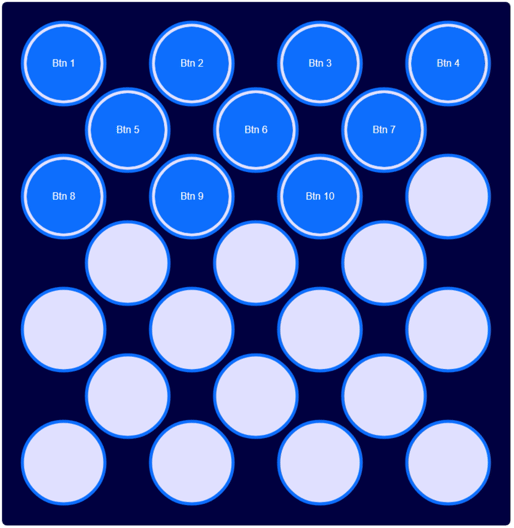
Move Style: dragcrop.
Elements Moved.
There are many other ways we could handle these kinds of interactions and many additional features we could add. Such as an X icon to remove a button. Or the aforementioned "rearrange while dragging" rather than on drop. Hopefully, though, there's enough here to demonstrate many of the more common use cases. And enough of an explanation that you can quickly add these kinds of interactions to your own TMS WEB Core projects.
The InteractJS library itself also includes many more advanced features related to dragging and dropping elements. At some point, they plan to release a "pro" version which includes plans for some of the interactions we've built today. But now we don't have to wait.
As is often the case when working with TMS WEB Core, there is almost always a way, and often several ways, to accomplish a given task. And there is often also a way to accomplish almost any task with a bit of work. Sometimes a bit of JavaScript helps as well.
A copy of this project is attached, where each of the presets uses
a different move style by default. But with our configuration options, you can easily assign any move style to
any of the presets, or create something entirely new and apply whichever move style you like. And, as always,
any comments, questions, or other feedback is always appreciated.
Follow Andrew on 𝕏 at @WebCoreAndMore or join our 𝕏 Web Core and More Community.
Andrew Simard

This blog post has received 2 comments.
 2. Monday, May 15, 2023 at 11:43:46 PM
Thanks! A little more involved than usual, but we''ll be using this stuff in some upcoming posts, so the extra effort should be worthwhile, I hope!
2. Monday, May 15, 2023 at 11:43:46 PM
Thanks! A little more involved than usual, but we''ll be using this stuff in some upcoming posts, so the extra effort should be worthwhile, I hope!
Andrew Simard
All Blog Posts | Next Post | Previous Post
Randall Ken