Frequently Asked Component Specific Questions
Options |
|
Display all FAQ items |
Displaying items 256 to 270 of 888, page 18 of 60
<< previous next >>

 TMS IntraWeb Component Pack Pro
TIWAdvEdit: + and - signs
The - sign is only allowed if Signed is set to true and if it is placed in the first position of the TIWAdvEdit text.
The + sign is not allowed with EditType set to edFloat.

 TMS FMX UI Pack
TTMSFMXPlanner: How to use a custom editor for inserting and updating items
Using a custom editor is demonstrated in the Editing demo. You need to drop a custom content panel / control on the form and pass it through the OnGetCustomContentPanel event. The OnItemToCustomContentPanel and OnCustomContentPanelToItem is used to transfer data between item and panel.
procedure TForm1.TMSFMXPlanner1CustomContentPanelToItem(Sender: TObject;
  AContentPanel: TControl; AItem: TTMSFMXPlannerItem); var
  c: TCheckBox;
  b: TColorComboBox;
begin
  c := FindChild(AContentPanel, ''chkOperation'') as TCheckBox;
  b := FindChild(AContentPanel, ''cboCategory'') as TColorComboBox;
  AItem.BeginUpdate;
  AItem.Color := b.Color;
  AItem.DataBoolean := c.IsChecked;
  AItem.EndUpdate;
end;

procedure TForm1.TMSFMXPlanner1GetCustomContentPanel(Sender: TObject;
  AItem: TTMSFMXPlannerItem; var AContentPanel: TControl); begin
  if Assigned(AItem) and (AItem.Resource = 1) then
    AContentPanel := Panel1;
end;

procedure TForm1.TMSFMXPlanner1ItemToCustomContentPanel(Sender: TObject;
  AItem: TTMSFMXPlannerItem; AContentPanel: TControl); var
  l: TLabel;
  c: TCheckBox;
  img: TImage;
  b: TColorComboBox;
begin
  l := FindChild(AContentPanel, ''lblPatient'') as TLabel;
  l.Text := ''Patiënt: '' + AItem.Title;
  c := FindChild(AContentPanel, ''chkOperation'') as TCheckBox;
  c.IsChecked := AItem.DataBoolean;
  img := FindChild(AContentPanel, ''imgPatient'') as TImage;
  img.Bitmap.Assign(TMSFMXBitmapContainer1.FindBitmap(AItem.DataString));
  b := FindChild(AContentPanel, ''cboCategory'') as TColorComboBox;
  b.Color := AItem.Color;
end;

 TMS FMX UI Pack
TTMSFMXPlanner: LiveBindings
The TTMSFMXPlanner is currently not LiveBindings enabled. We have already added this on our feature request list for investigation. Currently, the planner needs to display items by adding them to the collection manually. If you want to retrieve them from a database, you will need to write the traditional first next loop. Each item has a DBKey property that can be filled with the unique key of the item in the database. I suggest to write a query that fetches the items between the display start and end time in the planner. The current display start and end time can be retrieved with:
  TMSFMXPlanner1.DisplayStartDateTime;
  TMSFMXPlanner1.DisplayEndDateTime;
You can navigate to the next or previous date / time with the navigation buttons at the top (Interaction.TopNavigationButtons), or programmatically with:
TMSFMXPlanner1.NavigateToNextDateTime / TMSFMXPlanner1.NavigateToPreviousDateTime.
Reloading the query can be done in the OnAfterNavigateToDateTime.

 TMS FMX UI Pack
TTMSFMXGrid: How to have multiple columns with etComboBox type
To have several columns in the combobox, you need to fill the CellComboBox through an event, that is triggered before the combobox is shown.
Sample code:
procedure TForm1.FormCreate(Sender: TObject);
begin
  TMSFMXGrid1.DefaultColumnWidth := 100;
end;

procedure TForm1.TMSFMXGrid1CellEditGetData(Sender: TObject; ACol,
  ARow: Integer; CellEditor: TFmxObject; var CellString: string);
begin
  if CellEditor is TComboBox then
  begin
    (CellEditor as TComboBox).Items.Clear;
    (CellEditor as TComboBox).Items.Add(''Item 1 for '' + IntToStr(ACol) + '':'' + IntToStr(ARow));
    (CellEditor as TComboBox).Items.Add(''Item 2 for '' + IntToStr(ACol) + '':'' + IntToStr(ARow));
    (CellEditor as TComboBox).Items.Add(''Item 3 for '' + IntToStr(ACol) + '':'' + IntToStr(ARow));
  end;
end;

procedure TForm1.TMSFMXGrid1GetCellEditorType(Sender: TObject; ACol,
  ARow: Integer; var CellEditorType: TTMSFMXGridEditorType);
begin
  CellEditorType := etComboBox;
end;


 TMS FMX UI Pack
TTMSFMXGrid: How to set a bitmap client-aligned in a grid cell
Sample code:
procedure TForm1.TMSFMXGrid1GetCellProperties(Sender: TObject; ACol,
  ARow: Integer; Cell: TFmxObject);
begin
  if Cell is TTMSFMXBitmapGridCell then
    (Cell as TTMSFMXBitmapGridCell).Bitmap.Align := TAlignLayout.Client;
end;

 TColumnComboBox
How to copy columns and their items from one TColumnComboBox to another instance
This code performs a fast copy of all columns and their items from one TColumnComboBox to another instance:
begin
  ColumnComboBox2.BeginUpdate;

  ColumnComboBox2.Columns.Assign(ColumnComboBox1.Columns);

  ColumnComboBox2.ComboItems.Assign(ColumnComboBox1.ComboItems);

  ColumnComboBox2.EndUpdate;
end;

 TMS VCL Chart
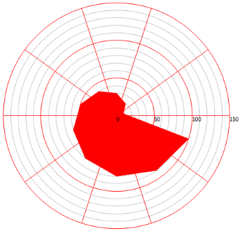
How to configure the y-axis and y-grid of a spider chart
Simply drop a chart on the form and set the code in the formcreate. The y-axis and y-grid are configured to display every 20 units.
Sample code:
var
  s: TChartSerie;
  p: TChartPane;
  I: Integer;
begin
  AdvGDIPChartView1.BeginUpdate;
  AdvGDIPChartView1.Panes.Clear;
  p := AdvGDIPChartView1.Panes.Add;
  p.YAxis.AutoUnits := False;
  p.YGrid.AutoUnits := False;
  s := p.Series.Add;
  s.ChartType := ctSpider;
  s.Pie.Size := 300;
  s.YAxis.AutoUnits := False;

  s.YAxis.MajorUnit := 50;
  s.YAxis.MinorUnit := 10;

  p.YGrid.MinorDistance := 10;
  p.YGrid.MajorDistance := 50;

  p.YGrid.MajorLineColor := clRed;

  for I := 0 to 9 do
  begin
    s.AddSinglePoint((I + 1) * 10);
  end;

  AdvGDIPChartView1.EndUpdate;


 TMS VCL Chart
How to use gantt charts

 TMS Advanced Toolbars & Menus
How to use TAdvOfficeHint for controls that do not have an OfficeHint property
You can use TAdvOfficeHint also for controls that do not have an OfficeHint property, for example in our HTML controls. By implementing the event OnBeforeShowHint, you can control the information for the hint also for controls that do not have an OfficeHint property, only a hint property. This way, you do not need to use THTMLHint. TAdvOfficeHint can also display HTML formatted text.

 TMS ToolPanels
Programmatically inserting a toolpanel
This code snippet shows how to programmatically create and insert a new toolpanel in a TAdvToolPanelTab:
var
  tp: TAdvToolPanel;
begin
  tp := TAdvToolPanel.Create(advtoolpanelTab1);
  tp.Caption := ''New panel'';
  AdvToolPanelTab1.InsertPanel(tp);
end;

 TAdvPicture
Could not load image. Invalid format.
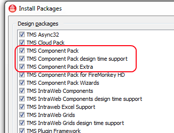
When you get an error "Could not Load Image. Invalid Format" when assigning an image to picture components please make sure all packages are installed & active, in particular the design time package TMSDEDxxxx.BPL
Please check in the IDE under Component, Install packages that all relevant TMS Component Pack packages listed and active:


 TMS Aurelius
Composite keys
Aurelius fully supports tables that use composite keys. One of our goals was to provide fully flexibility and maximum possibility of using Aurelius with existing applications. If you already have a database model with composite keys that is running over many years with many customers, it’s fully understandble it’s hard to change that and you can use Aurelius with it, no problem.
But if you are designing a new application or have an opportunity to change that, we strongly advise you to do so. The reason is that it will increasing complexity and you will lose some Aurelius automatic features. Just as an example, when you do something like this in Aurelius:
Manager.SaveOrUpdate(Object);
It will automatically INSERT (Save) or UPDATE the record in database given the current state of Object. If the Object has an Id, it will be updated. Such mechanism is not possible with composite keys (or “None” generators) because even if you are inserting a new record, you must provide the Object with some of id fields already filled, so in this case Aurelius can’t tell if it must do a Save or Update.
As another consequence of this, cascades become also trickier. Suppose you have a complex object tree that you have several associated objects. When you persist the object, Aurelius will try (if you configured to do so by using SaveUpdate cascades) to also persist associated objects so you don’t need to do it manually for each of them. Such mechanism becomes also complicated with “None” generators because Aurelius can’t tell if it must save or update the objects, thus you would have to do it manually.
In conclusion, as previously said, Aurelius fully supports complex database structures (it can even use relationships that do not relates to primary keys, but unique keys, for example). However, the most “standard” (or simple) your structure is, the more automatic and neat features of Aurelius you can use. So please take that in consideration when designing your database with composite keys.

 TMS IntraWeb Component Pack Pro
TIWAdvWebGrid: How to add an image (with text) to a cell
You can use HTML tags to add an image to a column of type ctNormal or simply add the image name + path for a Column of type ctImage.
Examples:
ctNormal column:
Add an image to a cell:
TIWAdvWebGrid1.Cells[0,0] := ''<img src="https://www.tmssoftware.com/site/img/tmslogo.png" style="width:128px;height:50px;">'';
Add an image & text to a cell:
TIWAdvWebGrid1.Cells[1,0] := ''<img src="image.png"><br>row ' + IntToStr(RowIndex);
ctImage column:
TIWAdvWebGrid1.Cells[2,0] := ''https://www.tmssoftware.com/site/img/tmslogo.png'';


 TMS IntraWeb Component Pack Pro
TIWAdvWebGrid: How to read/write the state of a checkbox
You can use RowSelect(RowIndex), which returns a boolean value, to know if a row with a column of type ctCheckBox is checked or not.
Example:
TIWAdvWebGrid1.RowSelect[0] := true;
The ctCheckBox method can only be used for a single column. When multiple checkbox columns are required you can use the ctDynCheckBox ColumnType instead of ctCheckBox. You can read/write the state of a ctDynCheckBox columntype by using IWAdvWebGrid.DynEdits[ColumnIndex,RowIndex]. A value of ‘0’ will display an unchecked checkbox and a value of ‘-1’ will display a checked checkbox.
Example:
//Set checkbox in column 0 and row 1 to checked:
TIWAdvWebGrid1.DynEdits[0, 1] := ''1'';

//Set checkbox in column 1 and row 2 to checked:
TIWAdvWebGrid1.DynEdits[1, 2] := ''1'';

//Set checkbox in column 1 and row 3 to unchecked:
TIWAdvWebGrid1.DynEdits[1, 2] := ''0'';
If you would like to use the ctDynCheckBox column type, please note that by design there is no server event attached to this column type. To update the ctDynCheckBox values you’ll need, for example, an external button with a click event assigned. From the click event you can retrieve the DynEdits values from the AdvWebgrid and update the database manually.

 TMS IntraWeb Component Pack Pro
TIWAdvWebGrid: How to display the active row in a scrollable grid
If scrolling is enabled (by setting Scroll.Style to scAlways or scAuto) and Scroll.ScrollIntoView is True the TIWAdvWebGrid will automatically scroll to the row specified in the ActiveRow property.