Blog
All Blog Posts | Next Post | Previous Post

 VCL Grid goodies
Thursday, February 4, 2021

Today, we like to show how easy it is to just enable the various grid filtering features in our VCL power grid TAdvStringGrid and offer this to end users with just setting a few properties.
The grid has different filtering options, but there are tree main types:
1. A filter dropdown : this is a dropdown list from where the user can select the values for filtering
2. A filter dropdown checklist : this is a dropdown checklist from where the user can select one or more values
3. A filter edit : this is an edit control in the grid header where the user can type the filter condition
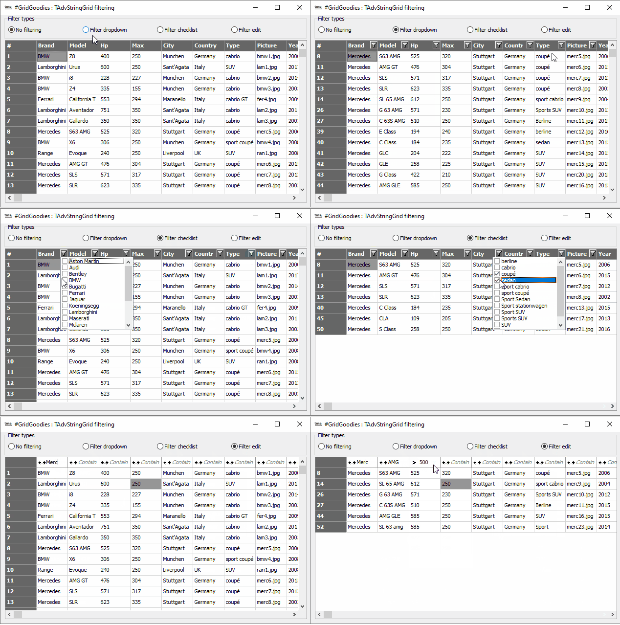
Filter dropdown
To enable this, all you need to do is set grid.FilterDropDownAuto := true. This will show in every column header a filter dropdown icon that can be clicked. The dropdown list is automatically filled with the unique values in the column. Of course this can be further customized. The list of values can be programmatically filled from the event grid.GetColumnFilter(). This event is triggered per column and allows to add custom values for the dropdown or remove values. When the list is empty, no filter dropdown icon will appear. The filtering can work on a per column basis, i.e. when a filter is selected, it performs the filtering on the column and doesn't take filtering on other columns in account. Or the filtering can be incremental. This means that when a filter was applied to column X, applying a filter on column Y will be a filter applied to the already filtered rows by column X. This feature is enabled or disabled with a single property as well:: grid.FilterIncremental: boolean.Note that to programmatically force the filtering to end, set grid.FilterActive = false and you might want to clear the filter conditions set this way via calling grid.Filter.Clear.
Filter dropdown checklist
This is very similar to a regular filter dropdown. All you need to do here is set an additional property grid.FilterDropDownCheck := true in addition to grid.FilterDropDownAuto := true and the dropdown will be a checklist from which one or more values can be selected.
Filter edit
With a filter edit, the user can type in the filter condition himself in the column header cell. There is an additional icon in the header from where the user can select the filter function, such as "Contains", "Starts with", "Larger than", etc...
Filter editing is enabled with a single property grid.FilterEdit.Enabled := true. When the user typed a filter condition and presses enter, the filter is applied. When we set again grid.FilterEdit.Enabled := false, the filtering is removed.
We summarized this with a demo that shows these 3 filter types. Other than the code to load the CSV file containing the sample data, there is nothing more to this than the setup of the grid filter when the user clicks the filter selection via the radiogroup:
procedure TForm1.RadioGroup1Click(Sender: TObject);
begin
  AdvStringGrid1.FilterEdit.CaseSensitive := false;
  AdvStringGrid1.FilterIncremental := true;
  AdvStringGrid1.FilterActive := false;
  AdvStringGrid1.Filter.Clear;
  AdvStringGrid1.FilterEdit.Enabled := false;
  AdvStringGrid1.FilterDropDownAuto := false;
  AdvStringGrid1.FilterDropDownCheck := false;

  case RadioGroup1.ItemIndex of
  1:
    begin
      AdvStringGrid1.FilterDropDownAuto := true;
    end;
  2:
    begin
      AdvStringGrid1.FilterDropDownAuto := true;
      AdvStringGrid1.FilterDropDownCheck := true;
    end;
  3: AdvStringGrid1.FilterEdit.Enabled := true;
  end;
end;

Bruno Fierens

This blog post has received 4 comments.

 2. Friday, February 19, 2021 at 2:15:28 PM
Good suggestion. At this moment controls are not yet in the FNC HTML engine. We had plans to revise this engine in FNC and we will consider the control support then.
Bruno Fierens
 3. Friday, October 7, 2022 at 2:00:58 PM
Regarding filter edit:
 It will be nice to apply the filter automatically after every key stroke puls timer (100ms), instead of pressing enter.
Hraschan Harald

 4. Friday, October 21, 2022 at 9:57:52 AM
Good suggestion. We''ll consider to add this optionally, as making it default could affect performance when a large amount of information is in the grid.
Bruno Fierens
All Blog Posts | Next Post | Previous Post
Do you have any plans to port these #GRIDGOODIES on the TMS FNC Grid?
STOICESCU Tiberiu