Blog
All Blog Posts | Next Post | Previous Post

 Presenting the TMS software website redesign
Monday, May 23, 2016
Since 1995, the year tmssoftware.com started focussing on offering components & tools for developers, it was time for a fifth major overhaul of our website. Since the beginning of this year, a lot work went into this overhaul behind the scenes for this overhaul. Some of the main goals of this website overhaul we set at the beginning of this project were:- Improved product discoverability
- Graphically evolve into a more modern style, influenced by Apple, Google material design, Windows 10 style
- Improved organisation of products by technologies and overview of product structure
- Find sufficient differentiating and recognizable style elements
- Move to responsive design for optimal UX for mobile, tablet, desktop
- Improved readability of information with more space, more contrast, more consistent and better structure of product pages
- Make the site more consistent with common web practices
Improved product discoverability
There is product discoverability from website top down navigation and from entering the website via search. Instead of showing the latest product releases, the home page is now centered around products. Products can be discovered from the main "Products" menu with a popup showing an overview of our most popular products organised by product type.
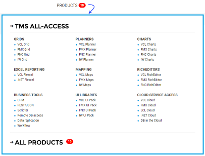
. At the same time, there is an overview of technologies/frameworks our products are based on and from there, the visitor is guided to the products per technology. Within the technology boxes on the main page, we have also featured our most popular products within this technology and the visitor can navigate to it directly by clicking it.
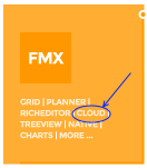
Equally important is discoverability from entering the website via searches. Here we have on product pages immediately references to equivalent products for different technologies. If you'd search for a cross platform scheduling/planner components via Google and were directed to the VCL product page, you can immediately see in the top right corner that we have the product also available for other technologies/frameworks.

Graphically evolve into a more modern style
Where the previous website was still more influenced by the Office 2007 style, early iOS style, it was a choice to move to a more minimal style typically used these days. We removed the old DVD box analogy representing the software, we removed gradients, grayish & soft elements and now have a more sharp, slightly harder graphical design.
Improved organisation of products
There is a strong focus on organisation of products by technology or framework. This is already visible on the main page where we have currently 8 boxes representing 8 technologies/frameworks we have products for. Each technology or framework is represented by a specific color and these colors should help increase the awareness under what technology a product can be used.
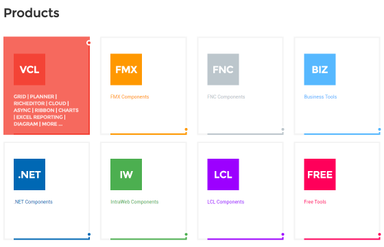
Some products support multiple technologies/frameworks. Whereas this was not possible in the former website, now, products supporting multiple frameworks at the same time will be listed under each technology/framework these support. As such, our ORM product TMS Aurelius will appear under VCL, FMX and the business logic category as it falls into each of these categories.
Differentiating and recognizable style elements
Our logo has been slightly restyled with the underlining of the part 'tmssoftware' and ending the line with a corner under the dot. Where a square logo is needed like for avatars, this is reduced to 'tms' underlined ending under the dot.


This line & dot element is repeated for various boxes on our website and subtle animations stress this line & dot element.
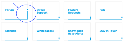
We also like to think of the dot on the line a kind of similar to putting the dot on the i, hinting at our drive and continuous striving for delivering our products and support with the highest possible quality.
Responsive design
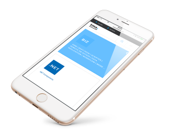
We had noticed that about 20% of our website traffic was coming from mobile devices & tablets, so we considered this important enough to also focus on offering a good UX for users on mobile phones and tablets. Our website will now automatically adapt to have a good usability on all these different browser form factors.
Improved readability
Where in our former website, the product information or blogs were often squeezed between the left sidebar and the right-side download box or blog history & selector, we removed the boxes at the right side of these pages and we add the capability to hide the left sidebar. This way, the full page can be used to read our product information and blogs and have this space available for bigger screenshots as well.
Consistency with common web practices
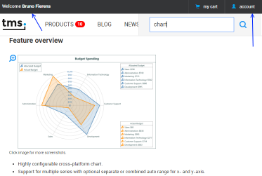
We paid attention to keep our website consistent with typical & common web practices these days. You'll find the website sign-in button in the top right corner of the page. You find the company information, social media links, website sitemap and commonly used page references always the bottom of the website in the footer area. In a similar way, after login the website will always display your user account name on top as well as the main menu in a fixed non-scrolling area. A search functionality across our product pages, web forum and FAQs is also available and always visible in the top right corner.
In a nutshell, we hope you will not only find our v5.0 website more visually pleasing but also easier to navigate and discover products. While v5 was tested and approved by a small group of people in the past couple of weeks, as of today, it is available for everyone. This means that from today, we're eager to learn from you how you experience the v5 website and more importantly, if you have more ideas and suggestions to improve it even further. With your inputs and help, we can continue to strive for perfection or "to put the dot on the line" in our case. But at the same time,keeping the famous words of painter Salvador Dali in mind: "Have no fear of perfection, you will never reach it".
Bruno Fierens

This blog post has received 19 comments.
 2. Monday, May 23, 2016 at 7:31:51 PM
Nice design. Good Job.
2. Monday, May 23, 2016 at 7:31:51 PM
Nice design. Good Job.Are you thinking about an App for support your forums?
Cilleruelo Gonzalo Juan C.

 3. Monday, May 23, 2016 at 8:12:35 PM
I''m not sure what you had envisioned as "app for support"?
Bruno Fierens
 4. Tuesday, May 24, 2016 at 12:51:46 AM
Well done!
Jiri
 5. Tuesday, May 24, 2016 at 4:30:45 AM
I want use chrome browser .
5. Tuesday, May 24, 2016 at 4:30:45 AM
I want use chrome browser .chrome browser is NG.
Internet Explore is OK.
Isao Hirai

 6. Tuesday, May 24, 2016 at 8:30:41 AM
Please press F5 to force Google to refresh the cached CSS
Bruno Fierens
 7. Tuesday, May 24, 2016 at 12:48:20 PM
Great redesign!
7. Tuesday, May 24, 2016 at 12:48:20 PM
Great redesign!Very nice work!
Malinovszky László
 8. Tuesday, May 24, 2016 at 1:19:10 PM
Like!
Bossier Edwin
 9. Tuesday, May 24, 2016 at 3:12:33 PM
Great job, beautiful, modern and clean design.
9. Tuesday, May 24, 2016 at 3:12:33 PM
Great job, beautiful, modern and clean design.Thumbs up!
Karel Janecek
 10. Wednesday, May 25, 2016 at 12:01:23 PM
Great Design! Very Clean and perfect Navigation !
Lindau Andreas
 11. Friday, May 27, 2016 at 3:32:44 PM
You have now a big problem with the forums:
11. Friday, May 27, 2016 at 3:32:44 PM
You have now a big problem with the forums:Getting messages like this:
Error
You do not have permission to reply to posts in this forum
or this:
Error Error
You must be a registered forum member in order to post in this forum.
is the norm.
Good design but a bad job in back.
Cilleruelo Gonzalo Juan C.

 12. Friday, May 27, 2016 at 3:34:50 PM
With respect to forum rules, NOTHING changed, so, make sure you are logged in as customer and you should be able to post, reply, ... in the forum.
12. Friday, May 27, 2016 at 3:34:50 PM
With respect to forum rules, NOTHING changed, so, make sure you are logged in as customer and you should be able to post, reply, ... in the forum.If there is a doubt, force a logout and login again.
Bruno Fierens
 13. Friday, May 27, 2016 at 3:36:38 PM
I''ve tried disconnect an back to connect. But this don''t solve the problem.
13. Friday, May 27, 2016 at 3:36:38 PM
I''ve tried disconnect an back to connect. But this don''t solve the problem.Seems like if my account has been blocked.
Have you any limit for questions in the forum?
Cilleruelo Gonzalo Juan C.
 14. Friday, May 27, 2016 at 3:37:37 PM
I''ve tried disconnect an back to connect. But this don''t solve the problem.
14. Friday, May 27, 2016 at 3:37:37 PM
I''ve tried disconnect an back to connect. But this don''t solve the problem.Seems like if my account has been blocked.
Have you any limit for questions in the forum?
Cilleruelo Gonzalo Juan C.

 15. Friday, May 27, 2016 at 3:38:05 PM
Your account is NOT blocked. It works without ANY issue from here. If a problem persists on your side, contact us by email, a blog comment is NOT the place to deal with this kind of support.
Bruno Fierens
 16. Friday, May 27, 2016 at 3:41:14 PM
Is not question of rules, but question of running.
16. Friday, May 27, 2016 at 3:41:14 PM
Is not question of rules, but question of running.I''ve made logout and login again....
I can''t do new entries in the forum.
Cilleruelo Gonzalo Juan C.

 17. Friday, May 27, 2016 at 3:41:34 PM
Last response: contact us by email, here is NOT the place to deal with this kind of support!
Bruno Fierens
 18. Thursday, June 2, 2016 at 12:34:07 PM
It normally bugs me significantly when very usable websites opt for a flashier Web 2.0 update and ruin the usability for the site. THIS update is the exception that proves not all designs are simply make-work projects for under-worked workers anxious to look busy when the boss is lurking around. I think it''s clean and still compact enough not wear out my scrolling wheel. Job well done to all that were involved in doing this
Gary Mugford
 19. Tuesday, June 14, 2016 at 8:59:39 PM
Congratulation on your new website. I love your new design. The website is much more clear now. Keep up the good work!
Dmitri Luchtmeijer (DIGIBILITIES)
All Blog Posts | Next Post | Previous Post
Marcos Douglas