Blog
All Blog Posts | Next Post | Previous Post

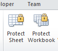
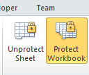
 How to design an inconsistent UI
Friday, January 21, 2011
From the silly inconsistencies dept:Excel 2010: Ribbon with unprotected workbook and unprotected sheet:

Excel 2010: Ribbon with protected workbook and protected sheet:

Adrian Gallero

This blog post has received 3 comments.
 2. Tuesday, January 25, 2011 at 5:57:37 PM
Robert,
2. Tuesday, January 25, 2011 at 5:57:37 PM
Robert,I don''t do much UI design, so I can''t recommend much, just the normal Windows and Ribbon guidelines.
But well, in this example, I guess no guideline would help, it is just common sense. You either make both buttons have a "selected" and "no selected" state, or make both buttons change captions. It is really incredible Microsoft didn''t noticed that one.
For what is worth, office 2011 for the mac has it right, both buttons behave the same way (both get selected, and they don''t change captions). Looks like the Microsoft mac BU has more attention to detail.
Adrian Gallero
 3. Saturday, February 12, 2011 at 11:10:08 PM
How about the excel ribbon''s cute feature that puts Copy as Picture, under the Paste menu, and then under As Picture submenu:
3. Saturday, February 12, 2011 at 11:10:08 PM
How about the excel ribbon''s cute feature that puts Copy as Picture, under the Paste menu, and then under As Picture submenu:Paste -> As Picture -> Copy as Picture?
Warren
Warren
All Blog Posts | Next Post | Previous Post
Robert Edgar