Blog
All Blog Posts | Next Post | Previous Post

 Beta of new series of components to create Office 2010 style user interfaces
Monday, April 19, 2010
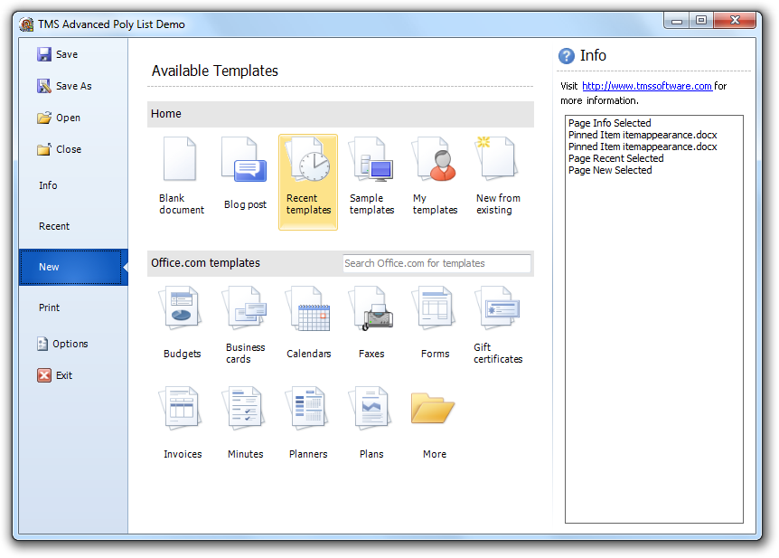
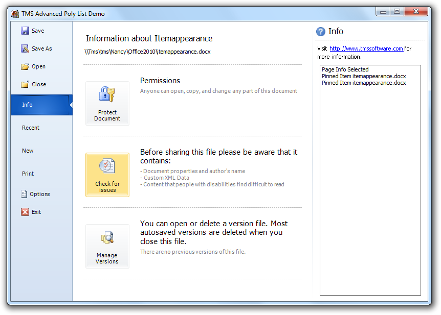
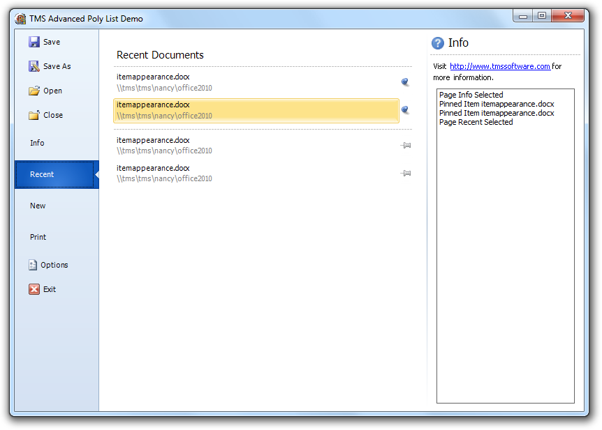
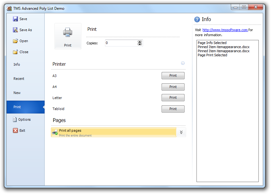
IntroductionSomething that immediately draws the attention in the just RTM'd Office 2010 is the new application menu. It is a very clearly laid out page of the various actions and options that can chosen & configured from there. On closer inspection, it is really packed with specific & very different user interface elements. To name just a few: small buttoned item, large buttoned item, dropdown list, check list, inplace edit controls, fixed items, formatted text items and so on.
It was our goal to bring the capability to create such modern & fresh user interfaces to Delphi & C++Builder. A lot of thought went particularly into making such user interfaces easy and fast. We wanted to offer a solution that allows you to create a full & finished user interface in less than one hour rather than needing a lot of work to layout controls on a form and have a designer continue to work for hours to get everything look "right". Also, it is our understanding that such solution can be used in way more scenarios than just for building an application menu for a ribboned application.
Architecture
Although the user interface elements are quite different in the application menu, many behaviors are common, like mouse hovering, mouse selection, focusing, .. as well as many style elements like normal state appearance, selected state appearance, hovered state appearance. Another thing that is common is that most items are treated as lists. Therefore, the basis of the architecture is a polymorph list of items descending from the TCustomItem class. The TCustomItem class knows of the minimum required common mouse, keyboard, selection, painting handling. From TCustomItem, we created already a wide range of ready to use classes:
- TButtonItem: Item with associated button, text
- TCheckItem: Item with checkbox, text,
- TRadioItem: Item with radiobutton, text
- TGroupItem: Item with group caption and area that can be used to host another control
- TDropDownItem: Item with text and dropdown button. A new polymorph list of items can be shown from the dropdown
- THTMLItem: Item with capability to show HTML formatted text
- TImageItem: Item with image and text and various postioning methods for image versus text
- TLargeButtonedItem: Item with large button with image
- TImageTextItem: Item with text and image and different positioning for image versus text
- TTextItem: Item with text and optional description line
- TImageTextButtonItem: Item with associated button, text and image
- TWedgeItem: Variation of TTextItem with selection displayed with wedge on any of the 4 sides of the item
- TExpandableImageSectionItem: Item with image and text and button that can collaps or expand different items under the item
- THTMLSectionItem: Section item with HTML formatted text
- TImageSectionItem: Section item with image and text
- TImageTextButtonSectionItem: Section item with image, text and additional button
Various list control types
Managing the polymorph list of items in memory is one thing, for actually displaying the items, we provide several controls. The base class that manages the list is TCustomItemsContainer. This holds & manages the list of items. We have provided 5 controls descending from this:
- TAdvVerticalPolyList: A scrollable list of items vertically (ie. under each other) organised
- TAdvHorizontalPolyList: A scrollable list of items horizontallly (ie. next to each other) organised
- TAdvPolyList: A grid structure of items with configurable number of columns or rows
- TAdvPolyBox: A control in which items can be absolutely positioned
- TAdvPolyPager: A page control where a vertical list of items can be used to select a page
uses
   GDIPHTMLItem;
var
  hi: THTMLItem;
begin
  hi := THTMLItem(AdvVerticalPolyList1.AddItem(THTMLItem));
  hi.Caption := 'Hello world';
end;
The component was designed with the capability to add custom items in mind. The base class TCustomItem has a number of virtual methods to override to create a different behavior. As an example, the TCheckItem class represents an item with a checkbox. Here, we need to override the drawing to draw the checkbox itself and override the mouse up handling to toggle the checkbox when mouse up happens over the checkbox. The minimal implementation of this class looks like:
  TCheckItem = class(TGraphicItem)
  private
    FOnInternalItemCheckChanged: TItemCheckEvent;
    FOnItemCheckChanged: TItemCheckEvent;
    FChecked: Boolean;
    procedure SetChecked(const Value: Boolean);
  protected
    class function CustomClassName: String; override;
    function DrawText(g: TGPGraphics; ARect: TGPRectF; ItemAppearance: TItemAppearance; DoText: Boolean = true): TGPRectF; override;
    procedure Draw(g: TGPGraphics; ItemAppearance: TItemAppearance); override;
    procedure DoMouseUp(Sender: TObject; Button: TMouseButton; Shift: TShiftState;
      pX, pY: Integer; Interaction: TItemInteraction; ItemAppearance: TItemAppearance); override;
  published
    property Checked: Boolean read FChecked write SetChecked default false;
    property OnItemCheckChanged: TItemCheckEvent read FOnItemCheckChanged write FOnItemCheckChanged;
end;Picturecontainer to reuse images
In modern user interfaces, PNG images have almost become the norm. The PictureContainer component offers one central repository of images used in the application. It can be placed on a datamodule for example and reused in several forms to avoid inflating the DFM file with images that are used multiple times. The PictureContainer can host images of several sizes mixed contrary to a TImageList. Each image in the PictureContainer has an identifier name and with this name, the image can be choosen for an item.
Samples
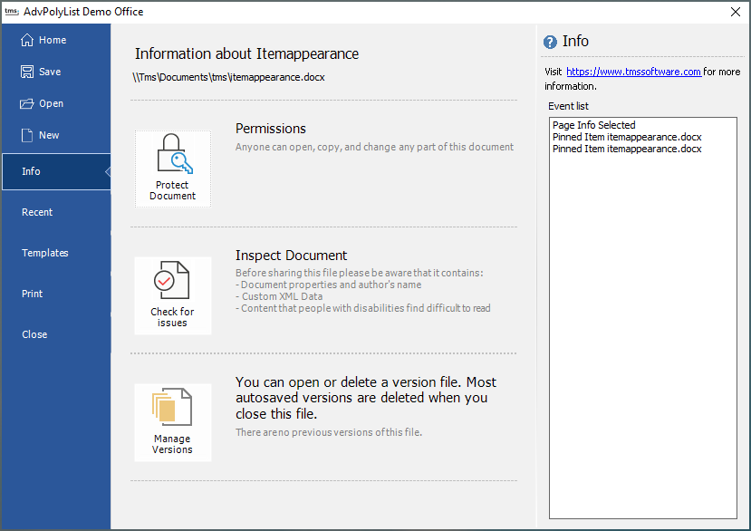
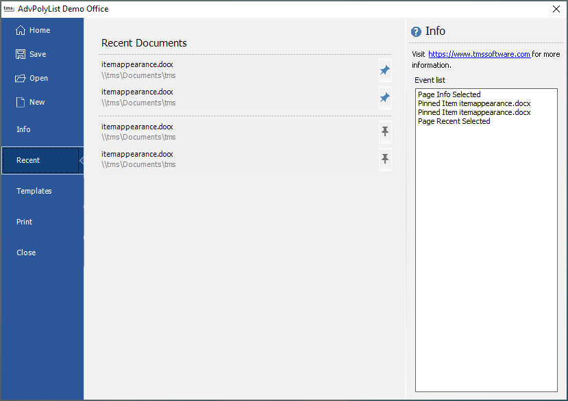
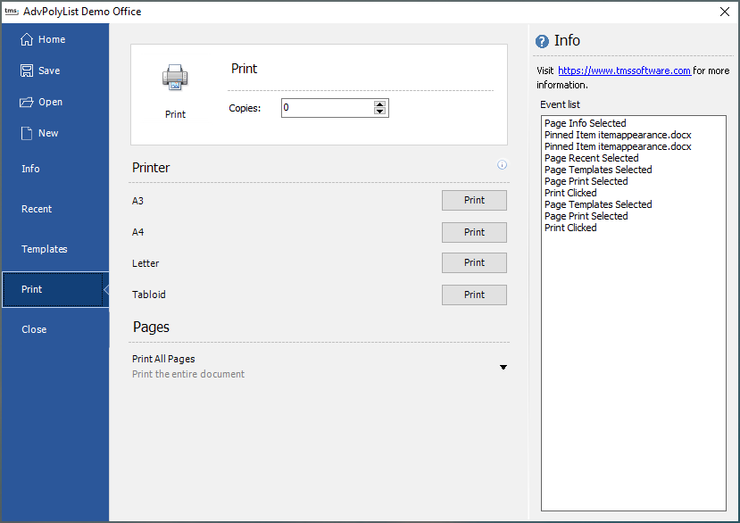
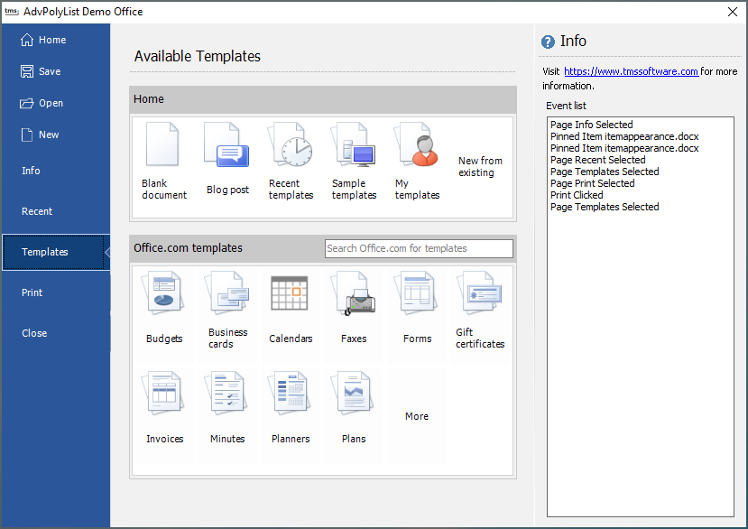
Office 2010 application menu emulation
|
|
|
|
|
Different items with HTML support, checkboxes, GDIPPictureContainer support and automatic scrollbars, list in list support
|
|
Horizontal poly list with image items, aspect ratio and custom scrollbar handles
|
|
Drop down item with embedded poly list
|
|
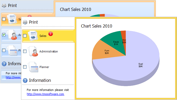
TAdvPolyPager : Page control with polymorph list for selection
|
|
Large buttoned item with description, Wedge item, and MonthCalendar as embedded control
|
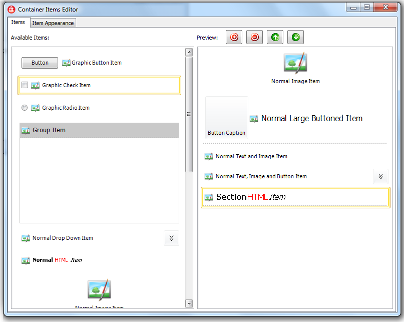
The design time editor in RAD Studio which lists all available item classes with drag & drop support to insert/remove/reorder items
You can start using the new poly list controls new by downloading the beta version. This is available now for Delphi 6,7,2005,2006,2007,2009,2010 and C++Builder 6,2006,2007,2009,2010. We have made sure it can be installed along any existing other TMS Component. We look forward to all your feedback & comments and wish you success creating exciting user interfaces using the new lists.
Bruno Fierens

This blog post has received 11 comments.
2. Tuesday, April 20, 2010 at 8:38:44 AM
Yes, we expect this to be part of TMS Component Studio, TMS VCL Subscription
Bruno Fierens
3. Friday, April 30, 2010 at 2:05:02 PM
What about the TAdvNavBar? :(Will it ever get Office 2010 treatment?
Petersson Johan
4. Saturday, May 1, 2010 at 9:21:57 AM
Yes, you can expect more Office 2010 style enhancements.
Bruno Fierens
5. Saturday, May 1, 2010 at 1:38:34 PM
Any rough ETA??
Petersson Johan
6. Sunday, May 2, 2010 at 2:47:41 PM
End of Q2 / early Q3
Bruno Fierens
7. Monday, May 3, 2010 at 3:02:12 PM
Will this be included in TMS Component Pack? or not..
Demir Alper
8. Monday, May 3, 2010 at 3:05:28 PM
Yes, will become part of TMS Component Pack
Bruno Fierens
9. Monday, May 3, 2010 at 3:56:03 PM
"Yes, will become part of TMS Component Pack "You are impressive.. I''am waiting for it..
Thank you...
Demir Alper
10. Monday, May 10, 2010 at 2:35:30 PM
Is a microsoft license required?Ruschmeyer Monika
 11. Monday, May 10, 2010 at 5:34:14 PM
Poly list controls can be used for so much more than just the Office 2010 application menu. They extend these controls and are in several ways more versatile. Ribbon UI licensing does not apply on such separate controls.
11. Monday, May 10, 2010 at 5:34:14 PM
Poly list controls can be used for so much more than just the Office 2010 application menu. They extend these controls and are in several ways more versatile. Ribbon UI licensing does not apply on such separate controls.
Bruno Fierens
All Blog Posts | Next Post | Previous Post
Tierney Andrew