TAdvStringGrid
Example 82 : The edColorPickerDropDown and edImagePickerDropDown inplace editors
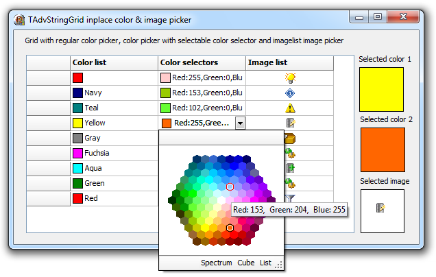
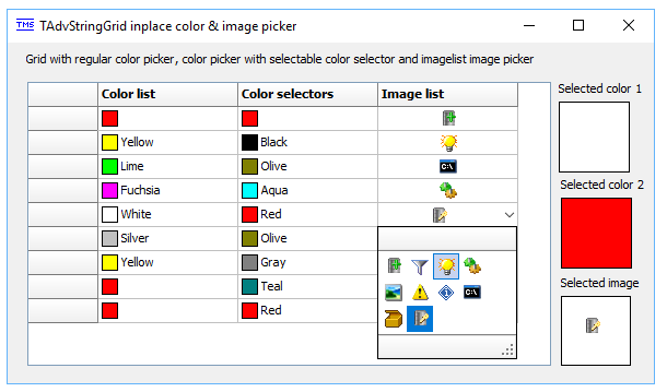
 This sample shows how a color picker can be used to change the color of a shape added to a grid cell, how a color picker with different color selection styles can be used and also how the image added to a cell can be edited with an image picker. The two editor types used here are : edColorPickerDropDown and edImagePickerDropDown. The type of the inplace editor is as always choosen via the OnGetEditorType event:
procedure TForm2.AdvStringGrid1GetEditorType(Sender: TObject; ACol,
  ARow: Integer; var AEditor: TEditorType);
begin
  case ACol of
  1,2: AEditor := edColorPickerDropDown;
  3: AEditor := edImagePickerDropDown;
  end;
end;
procedure TForm2.AdvStringGrid1GetEditorType(Sender: TObject; ACol,
  ARow: Integer; var AEditor: TEditorType);
begin
  case ACol of
  // column 1 and 2 use the color picker
  1,2: AEditor := edColorPickerDropDown;
  // column 3 uses the image picker
  3: AEditor := edImagePickerDropDown;
  end;

  if (ACol = 2) then
  begin
    // adds buttons in the footer to allow to select the style for column 2
    AdvStringGrid1.ControlLook.DropDownFooter.Buttons.Clear;
    AdvStringGrid1.ControlLook.DropDownFooter.Buttons.Add.Caption :='List';
    AdvStringGrid1.ControlLook.DropDownFooter.Buttons.Add.Caption := 'Cube';
    AdvStringGrid1.ControlLook.DropDownFooter.Buttons.Add.Caption := 'Spectrum';
  end
  else
  begin
    // basic color picker for column 1
    AdvStringGrid1.ControlLook.DropDownFooter.Buttons.Clear;
  end;
end;

procedure TForm2.AdvStringGrid1DropDownFooterButtonClick(Sender: TObject; ACol,
  ARow, ButtonIndex: Integer);
begin
  // event triggered when a button on the dropdown footer is clicked. Is used to change the color selector style
  case ButtonIndex of
  0: AdvStringGrid1.ColorPickerDropDown.ColorSelectionStyle := csList;
  1: AdvStringGrid1.ColorPickerDropDown.ColorSelectionStyle := csColorCube;
  2: AdvStringGrid1.ColorPickerDropDown.ColorSelectionStyle := csSpectrum;
  end;
end;
AdvStringGrid1.AddShape(1,i,csRectangle,clRed,clBlack, haBeforeText, vaCenter);
The grid cell text can be set to the color value. How this color is shown in the cell is selected with grid.ColorPickerDropDown.ColorValueText. This can be set to:
cvtNone: no text displayed
cvtHex: color is shown as hexadecimal value
cvtWebName: color is shown (when possible) as web color name
cvtRGB: color is shown as RGB value
For column 1, the displayed text is choosen as cvtWebName, for the 2nd column, it is set to RGB via the code in the grid.OnGetEditorProp event:
procedure TForm2.AdvStringGrid1GetEditorProp(Sender: TObject; ACol,
  ARow: Integer; AEditLink: TEditLink);
begin
  AdvStringGrid1.ColorPickerDropDown.ColorSelectionStyle := csList;
  if ACol = 1 then
    AdvStringGrid1.ColorPickerDropDown.ColorValueText := cvtWebName
  else
    AdvStringGrid1.ColorPickerDropDown.ColorValueText := cvtRGB;
end;
 In the last column, an imagelist image is added in the cell. This is added with the method:
AdvStringGrid1.AddDataImage(3,i,0,haCenter,vaCenter);
The image picker editor is specified via the OnGetEditorType event. When no images are assigned to the image picker, the control will automatically pick up all images in the imagelist associated with the grid. In this sample, the image picker is just configured to show the images in a list with 4 columns and the dropdown width is also preset:
  AdvStringGrid1.ImagePickerDropDown.Columns := 4;
  AdvStringGrid1.ImagePickerDropDown.DropDownWidth := 128;
Delphi project & source files for downloading included in the main demos distribution for Delphi
×
![]()