TAdvStringGrid
Example 36 : using the new ControlLook property to select different inplace editor control looks
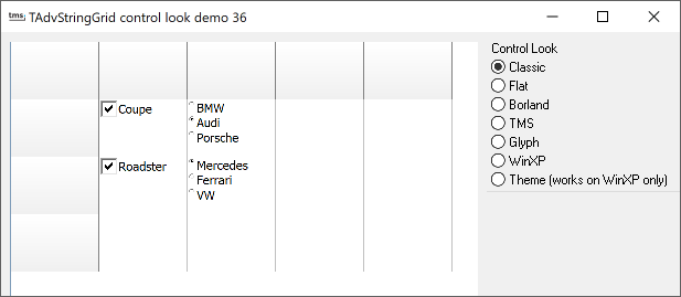 TAdvStringGrid 2.0 unifies
properties that control the look of inplace editors in the new
ControlLook property. The main property here is the property
grid.ControlLook.ControlStyle. Following values can be choosen :
TAdvStringGrid 2.0 unifies
properties that control the look of inplace editors in the new
ControlLook property. The main property here is the property
grid.ControlLook.ControlStyle. Following values can be choosen :
csClassic : classic Windows control look, ie. 3D checkbox, radiobutton and buttons
csFlat : flat Windows control look
csBorland : BWCC.DLL style checkboxes and radiobuttons (note BWCC.DLL is not required, this is just a reference to the DLL that used to implement this)
csTMS : a variation on the Borland IDE style
csGlyphs : use the own supplied glyphs for checkboxes and radiobuttons
csWinXP : emulated Windows XP look, ie a fixed set of checkbox and radiobuttons that look like the standard Windows XP Luna visual style
csTheme : real Windows XP look using Windows XP visual styles. The checkbox and radiobutton look will adapt according to the selected Windows XP visual style
Be carefull to check if TAdvStringGrid is running on Windows XP before applying the csTheme control style, as in this style the checkbox and radiobuttons will not be rendered.
Delphi project & source files for downloading included in the main demos distribution for Delphi.
×
![]()