TAdvStringGrid
Example 35 : Using the TColumnComboBox as TAdvStringGrid inplace editor
 Some time ago, a user asked for
help to use the ColumnComboBox as inplace editor for
TAdvStringGrid through the EditLink mechanism. While we pointed
to example
app 24 for a more
detailed look into the use of EditLinks, providing a good
EditLink for the ColumnComboBox edit control is a little more
involved and therefore by helping the user out by providing this
EditLink for TColumnComboBox, it is most likely also useful for
lots of other users.
Some time ago, a user asked for
help to use the ColumnComboBox as inplace editor for
TAdvStringGrid through the EditLink mechanism. While we pointed
to example
app 24 for a more
detailed look into the use of EditLinks, providing a good
EditLink for the ColumnComboBox edit control is a little more
involved and therefore by helping the user out by providing this
EditLink for TColumnComboBox, it is most likely also useful for
lots of other users.
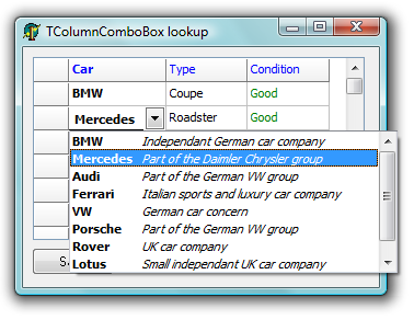
About the ColumnComboBox
The use of the ColumnComboBox as inplace editor has a simple goal. Extra information (text as well as an image) can be used to provide the user with help or visual clue about the item to be selected. TColumnComboBox comes in just handy for this requirement as it can have a selectable edit column (that is the column that is used to reflect the edit value from), a different lookup column (that is the column used for keyboard lookup) and it can have any number of columns that contain text in different fonts or colors and finally an image from an imagelist can be used to give a visual clue about the items.
Writing the EditLink
Most of the work to integrate any control as inplace editor for TAdvStringGrid has been encapsulated in the base class TEditLink. To use a new inplace editor comes down to inheriting a new component, TColumnComboEditLink in this case and implement a few methods. If the inplace editor has a lot of properties, it is desirable to expose the properties of this inplace editor in the EditLink component. This makes it possible to set these properties at design time, saving us again from writing any code to use the control.
Implemented methods
The constructor Create: In the constructor the stringlist used to hold the ColumnComboBox items is created. The item list can be set at design time and the text for different columns is separated by commas (Note that text with spaces must be enclosed by " characters)
constructor TColumnComboEditLink.Create(AOwner: TComponent);
begin
  inherited;
  FCombo := nil;
  FDropHeight := 200;
  FDropWidth := 150;
  FItems := TStringList.Create;
  WantKeyUpDown := True;
end;
The CreateEditor method: this method is called whenever this inplace editor is about to be used. The EditLink has an internal reference to a ColumnComboBox instance, and thus, this instance is created the first time the ColumnComboBox is needed. The parent is set to the owning Windows control, ie the grid. Its OnExit and OnKeyDown events are routed to the EditLink EditExit and EditKeyDown handlers. These handlers determine with which keys the inplace editor should hide or move to a next cell.
procedure TColumnComboEditLink.CreateEditor(AParent: TWinControl);
begin
  inherited;
  if not Assigned(FCombo) then
  begin
    FCombo := TColumnComboBox.Create(AParent);
    FCombo.Parent := AParent;
    FCombo.OnExit := EditExit;
    FCombo.OnKeydown := EditKeyDown;
  end;
end;
The destructor Destroy: Here the created stringlist for holding the ColumnComboBox items is freed.
destructor TColumnComboEditLink.Destroy;
begin
  FItems.Free;
  inherited;
end;
The EditExit method: Whenever the inplace editor looses focus, it should hide
procedure TColumnComboEditLink.EditExit(Sender: TObject);
begin
  HideEditor;
end;
The GetEditControl method: This function is required to return the edit control as a TWinControl as the grid uses its Windows handle to do the work for making it available as inplace editor at the correct position etc...
function TColumnComboEditLink.GetEditControl: TWinControl;
begin
  Result := FCombo;
end;
The GetEditorValue method: Method used to get the value of the editor that should be placed in the cell. This method returns the text value of the EditColumn at the selected ColumnComboBox item
function TColumnComboEditLink.GetEditorValue: string;
begin
  if FCombo.ItemIndex >= 0 then
    Result := FCombo.ColumnItems[FCombo.ItemIndex,FEditColumn];
end;
The SetEditorValue method: Method to set the current value of the grid's cell in the inplace editor. In this case, this value is used to lookup and position the selected item in the ColumnComboBox equal the the grid's cell value.
procedure TColumnComboEditLink.SetEditorValue(s: string);
var
  i: Integer;
begin
  if (FEditColumn < 0) or (FEditColumn > FCombo.Columns.Count) then
    Exit;

  for i := 1 to FCombo.ComboItems.Count do
  begin
    if FCombo.ColumnItems[i - 1,FEditColumn] = s then
    begin
      FCombo.ItemIndex := i - 1;
      Break;
    end;
  end;
end;
The SetCellProps method: The purpose of this method is to allow setting the inplace editor properties such as color and font equal to the cell's font and color settings, to let the inplace editor seaminglessly match with the cell characteristics.
procedure TColumnComboEditLink.SetCellProps(AColor: TColor;
AFont: TFont);
begin
 FCombo.Color := AColor;
 FCombo.Font := AFont;
 FEditColor := AColor;
 FEditFont := AFont;
end;
The SetProperties method: This is the main method to control all additional properties of the custom inplace editor. It is called whenever the custom inplace editor is about to be displayed. In case of the ColumnComboBox EditLink this is a little elaborate as a lot of ColumnComboBox properties have been exposed to allowing setting these at design time and the properties must now be used to apply these to the actual inplace editor. As can be seen here, the EditLink Items stringlist is used to set the ColumnComboBox items as well as a ImageList if used.
procedure TColumnComboEditLink.SetProperties;
var
  i: Integer;
begin
  inherited;
  FCombo.Flat := FFlat;
  FCombo.Etched := FEtched;
  FCombo.DropHeight := FDropHeight;
  FCombo.Height := FDropHeight;
  FCombo.DropWidth := FDropWidth;
  FCombo.LookupColumn := FLookupColumn;
  FCombo.LookupIncr := FLookupIncr;

  if FFlat then
    FCombo.EditHeight := FCellHeight - 6
  else
    FCombo.EditHeight := FCellHeight - 4;

  FCombo.EditColumn := FEditColumn;
  FCombo.GridLines := FGridLines;

  FCombo.BeginUpdate;
  FCombo.Columns.Clear;

  if Assigned(FImages) then
   FCombo.Images := FImages
  else
   FCombo.Images := nil;

  for i := 1 to FColumns do
  begin
    with FCombo.Columns.Add do
   begin
   {$IFDEF ASG194}
   Color := FEditColor;
   Font.Assign(FEditFont);
   {$ENDIF}
    end;
  end;

  FCombo.ComboItems.Clear;
  for i := 1 to FItems.Count do
  begin
   with FCombo.ComboItems.Add do
   Strings.CommaText := FItems.Strings[i - 1];
  end;
  FCombo.EndUpdate;
end;
Further customizing from TAdvStringGrid
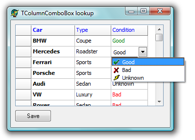
Once the ColumnComboEditLink is implemented, it is ready to be used. For the sample app, 3 ColumnComboEditLink components were used to allow setting up the items at design time without writing code. First requirement is using the OnGetEditorType event to specify a custom inplace editor is to be used and assign the grid's EditLink property to specify which EditLink to use for the inplace editor.
procedure TForm1.AdvStringGrid1GetEditorType(Sender: TObject; ACol, ARow: Integer; var AEditor: TEditorType);
begin
  if ACol = 1 then
  begin
    AEditor := edCustom;
    AdvStringGrid1.EditLink := ColumnComboEditLink1;
  end;
  if ACol = 2 then
 begin
    AEditor := edCustom;
    AdvStringGrid1.EditLink := ColumnComboEditLink2;
  end;
  if ACol = 3 then
  begin
    AEditor := edCustom;
    AdvStringGrid1.EditLink := ColumnComboEditLink3;
  end;
end;
Next, some more customization is done from the OnGetEditorProp event. This event is called right after the custom inplace editor is created and thus accessible for further control. In this event, the ColumnComboBox column width, font styles and possible images can be set.
procedure TForm1.AdvStringGrid1GetEditorProp(Sender: TObject; ACol, ARow: Integer; AEditLink: TEditLink);
begin
  if ACol in [1,2] then
  with (AEditLink as TColumnComboEditLink).Combo do
  begin
    BeginUpdate;
    Columns.Items[0].Width := 64;
    Columns.Items[1].Width := DropWidth - 64;
    Columns.Items[1].Font.Style := [fsItalic];
    EndUpdate;
  end;

  if ACol = 3 then
  begin
    with (AEditLink as TColumnComboEditLink).Combo do
    begin
    BeginUpdate;
    Columns.Items[0].ColumnType := ctImage;
    Columns.Items[0].Width := 20;
    Columns.Items[0].Font.Color := clBlack;

    Columns.Items[1].Width := DropWidth - 64;
    Columns.Items[1].Font.Color := clBlack;

    ComboItems.Items[0].ImageIndex := 1;
    ComboItems.Items[1].ImageIndex := 0;
    ComboItems.Items[2].ImageIndex := 2;
    EndUpdate;
    end;
  end;
end;
Now everything is into place to start having fun with inplace ColumnComboBox editors.
Delphi project & source files for downloading included in the main demos distribution for Delphi.
×
![]()