Hi to all,
i have a problem, in a chart with only one serie and bar type, with the value label.
In some chart the value label is showed well, in other chart the label is "cutted" on the top as in this image
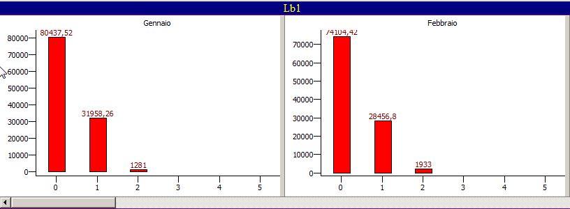
As you can see, in the first chart (on the left) the first label is ok, in the second chart the same label is cutted.
my setting (these are only test to learn the use of charts)
Procedure TChartFrame.ImpostaGrafico;
Var S : String;
begin
S:=FirstCharUp(FormatSettings.LongMonthNames[Mese]);
TAdvGDIPChartView1.BeginUpdate;
TAdvGDIPChartView1.Panes.Add;
TAdvGDIPChartView1.Panes[0].Range.RangeFrom:=0;
TAdvGDIPChartView1.Panes[0].Range.RangeTo:=5;
TAdvGDIPChartView1.Panes[0].Legend.Visible:=False;
TAdvGDIPChartView1.Panes[0].AxisMode:=amAxisChartWidthHeight;
TAdvGDIPChartView1.Panes[0].YAxis.AutoSize:=True;
TAdvGDIPChartView1.Panes[0].Title.Text:=S;
TAdvGDIPChartView1.Panes[0].Title.Position:=tTop;
TAdvGDIPChartView1.Panes[0].Title.Alignment:=taCenter;
TAdvGDIPChartView1.Panes[0].Series.Add;
TAdvGDIPChartView1.Panes[0].Series.BarChartSpacing:=20;
TAdvGDIPChartView1.Panes[0].Series[0].ShowValue:=True;
TAdvGDIPChartView1.Panes[0].Series[0].ValueFont.Color:=clMaroon;
TAdvGDIPChartView1.Panes[0].Series[0].ChartType:=ctBar;
TAdvGDIPChartView1.Panes[0].Series[0].AutoRange:=arEnabled;
TAdvGDIPChartView1.Panes[0].Series[0].XAxis.XYValues:=False;
TAdvGDIPChartView1.Panes[0].Series[0].YAxis.AutoUnits:=True;
TAdvGDIPChartView1.Panes[0].Series[0].Minimum:=0;
TAdvGDIPChartView1.Panes[0].Series[0].Maximum:=120000;
TAdvGDIPChartView1.Panes[0].Series[0].AddSinglePoint(Value1);
TAdvGDIPChartView1.Panes[0].Series[0].AddSinglePoint(Value2);
TAdvGDIPChartView1.Panes[0].Series[0].AddSinglePoint(Value3);
TAdvGDIPChartView1.EndUpdate;
end;
Also, even if j setted the serie maximum value to 12000, the Y AXIS arranges the values in automatic mode, but if j comment this line
TAdvGDIPChartView1.Panes[0].YAxis.AutoSize:=True;
j get this (the Y Axis value are not showed well)
Can you help me to solve this situation ??
The last question is for the legend.
I have only one serie with 4-5 bars with a different color, ther's a way to get a legend where i explain the color's meaning in this serie ??
(i.e Green=selling price Red=purchase price Navy=difference selling - purchase price)
Thank's for all
Regards
Daniele