TMS
TMS ModernUI
Set of UI VCL components to create modern user interfaces with a Windows 7, Windows 8, Office 2013 and iOS / macOS look & feel.
Feature overview
- Highly customizable controls that focus on the creation of modern user interfaces with an appearance and look & feel that matches experiences in Windows 7, Windows 8, Office 2013 and iOS / macOS.
- Support for complex gradients, drawing with opacity and opacity gradients, PNG images with alpha transparency, picture & hatch fills and anti-aliasing.
- Support for HTML formatted text with HTML formatting capabilities such as specifying color, font, images and hyperlinks.
- Built-in presets for Microsoft Office 2013 and Windows 7, 8 color settings.
- Emulates the Windows 8 WinRT style.
- Integrates perfectly in the Windows 7 & Windows 8 desktop UI.
- Can be used for applications to be deployed on Windows XP, Windows 2003, Windows Vista, Windows 2008, Windows 7 and Windows 8.
Includes
- TAdvFormStyler: Helper component to setup all visual controls on a form, including the form itself to the same color settings
- TAdvAppStyler: Helper component to setup the complete application appearance to the same color settings
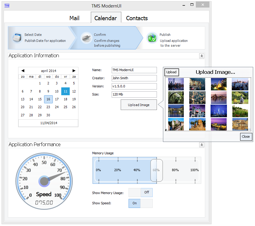
- TAdvSmoothButton: iPhone style button component
- TAdvSmoothCalendar: Calendar control to navigate through days, months and years
- TAdvSmoothCalendarGroup: Multi-calendar view based on the TAdvSmoothCalendar component
- TAdvSmoothCalculator: Calculator with sophisticated opacity and fill
- TAdvSmoothCircularProgress: Sophisticated drawn and smoothly animated circular progress
- TAdvSmoothDatePicker: Calendar control with dropdown button to navigate through days, months and years
- TAdvSmoothLabel: Label to display text with complex gradient and texture fills
- TAdvSmoothListBox: iPhone style animated listbox
- TAdvSmoothImageListBox/ TAdvSmoothImageListBoxPicker: Animated image thumbnail list & picker
- TAdvSmoothPanel / TAdvSmoothExpanderPanel / TAdvSmoothExpanderButtonPanel / TAdvSmoothExpanderGroup: Container for other controls with a smooth fill and the possibility to add HTML text, Buttons
- TAdvSmoothProgressBar: Smoothly animated progress bar
- TAdvSmoothMegaMenu: Rich web-like mega menu component with support to add controls, tear-off, sections, hover items, ...
- TAdvSmoothMenu: Animated navigation control with the possibility to use complex gradient fills
- TAdvSmoothRotaryMenu / TAdvSmoothRotaryMenuDialog: Smoothly animated menu with popup capabilities
- TAdvSmoothSpinner: iPhone style spinner control
- TAdvSmoothTrackBar: Vertically or horizontally oriented trackbar with semi transparent thumb
- TAdvSmoothTabPager: Page control with tabs designed to fit well specifically with TAdvSmoothButton or TAdvSmoothToggleButton
- TAdvSmoothGauge: Instrumentation control to visualize data as a meter with optionally smooth animation
- TAdvSmoothJogWheel: Smoothly animated jogwheel with complex gradients and shadows
- TAdvSmoothLedLabel: 7-segment LEDs with the possibility to add complex gradients and textures
- TAdvSmoothStatusIndicator: Status indicator with sophisticated fill
- TAdvSmoothToggleButton: Smooth toggle button with rounded gradient
- TAdvSmoothComboBox: Dropdown control implementation of the TAdvSmoothListBox
- TAdvSmoothSplashScreen: Rich splash screen to display information while loading large files
- TAdvSmoothMessageDialog: Message dialog with complex and smooth graphics
- TAdvSmoothTimeLine: Time line with complex fills, opacity, sections, indicators and tickmarks
- TAdvSmoothSlider: Animated slider button with on/off state
- TAdvSmoothScrollBar: Scrollbar with scalable pagesize and smooth complex graphics
- TAdvSmoothDock: Apple style dock bar with complex gradients, reflection, animation and different docking modes
- TAdvSmoothSlideShow: Slideshow component with various animation modes, optional thumbnail list and a smooth look and feel
- TAdvSmoothCapacityBar: iTunes style capacity bar with complex fills, opacity, reflection and customizable capacity items
- TAdvSmoothPopup: iPad style popup with opacity, shadow customizable header and footer buttons and support for controls and frames
- TAdvSmoothStepControl: Highly-customizable control for indicating processed, active and inactive steps in wizard-style user interfaces
- TAdvSmoothTouchKeyBoard / TAdvSmoothPopupTouchKeyBoard: Configurable on-screen keyboard for touchscreen applications
- TAdvSmoothTileList: Versatile and extensible tile based gallery style component with tile scrolling, paging, moving, deleting and hierarchical tile structure
- TAdvSmoothPageSlider: Drill down page control that holds and animates multiple pages sliding from left to right and vice versa
- TW7ToolBar: Toolbar that you can see in the top part of the Windows Explorer window
- TW7InformationBar: Panel containing any kind of information
- TW7ToolButton: Button located on TW7ToolBar
- TW7PageSelector: Objects to switch between different pages of your program
- TW7SpeedButton: Button used, for example, in the Windows 7 calculator
- TW7Image: TW7Image is identical to TImage, but contains a number of useful properties. For instance, it's capable of fitting images to the size of the component, has opacity and zoom settings, ...
- TW7ActiveLabel: This object works best if used as a hyperlink or an internal link
- TW7ListViewItem: An empty ListView Item that can be used as a container for other components and can be placed on any object
- TW7TaskItem: Based on TW7ListViewItem, this component should be used for selecting a task that the user must complete
- TW7NavigationButton: Button used for back/forward navigation
- TW7NavigationFrame: Graphic object for framing TW7NavigationButton
- TW7LeftPanel: Panel usually located in the left and containing links to additional actions
- TW7CaptionPanel: Panel that usually contains a title and is located at the top
- TW7Panel: Panel that has a number of styles, including the style of the digits display window in Windows calculator and iPhone style
- TW7ProgressBar: ProgressBar used for displaying the free disk space in Windows Explorer
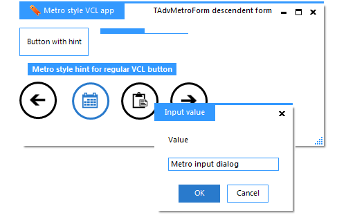
- TAdvMetroFindDialog / TAdvMetroReplaceDialog: Metro style find and replace dialog
- TAdvMetroButton / TAdvMetroToolButton: Metro style button
- TAdvMetroTile: Metro style tile
- TAdvMetroHint: Turns all hints on the form in Metro style flat hints
- TAdvMetroProgressBar: Flat Metro style progress bar
- TAdvMetroScrollBox: Metro style scrollbox
- TAdvInputMetroTaskDialog / TAdvMetroTaskDialog: Metro style task dialog
- TAdvMetroForm: Metro style form