Blog
All Blog Posts | Next Post | Previous Post

 Using the new TAdvShapeButton & TAdvPreviewMenu
Bookmarks:
Wednesday, January 21, 2009
Introduction
An eye-catching feature of the new Office 2007 environment is the round button that sits in the top right corner of the window from where a menu can be shown that resembles the old File menu.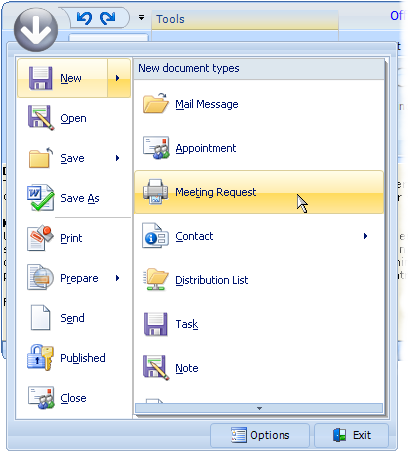 What makes this menu a little
different from a regular menu is that it has a frame with 2 panes. On the left
pane, the menu items are displayed. On the right pane, either submenu items for
left menu items are shown or a fixed set of items to select from. In the new TMS
Advanced ToolBars & Menus v2.5 release, it is now possible to add such typical
round button and menu to a Delphi application with TMS Office 2007 style
toolbars.
What makes this menu a little
different from a regular menu is that it has a frame with 2 panes. On the left
pane, the menu items are displayed. On the right pane, either submenu items for
left menu items are shown or a fixed set of items to select from. In the new TMS
Advanced ToolBars & Menus v2.5 release, it is now possible to add such typical
round button and menu to a Delphi application with TMS Office 2007 style
toolbars.Starting with the round button and menu To have a round button, the TAdvShapeButton component is introduced. This component can display images in PNG format with transparency on the TAdvToolBarPager. Make sure that the pager tabs do not overlap the button. The indent of the first pager tab can be set with the property AdvToolBarPager.TabSettings.StartMargin. In the demo, a round PNG image was used but nothing prevents you from using more irregular shapes. The TAdvShapeButton supports 4 images: Picture, PictureHot, PictureDisabled, PictureDown which set images to display for normal, hot, disabled and down state respectively. The TAdvShapeButton can be used as standalone button but more commonly will be used with a TAdvPreviewMenu and as such, it has a property AdvPreviewMenu with which the TAdvPreviewMenu component can be set that should be displayed when it is clicked.
The anatomy of the TAdvPreviewMenu The TAdvPreviewMenu is a non visual component at design time. It can be displayed at runtime by calling AdvPreviewMenu.ShowMenu(X,Y). When assigned to a TAdvShapeButton, it will be displayed automatically at the correct position by the TAdvShapeButton. The TAdvPreviewMenu has a frame with 2 panes. The left pane is being used to show MenuItems and the right pane is used to show SubMenuItems. The MenuItems are defined through the property TAdvPreviewMenu.MenuItems which is a collection of TAdvPreviewMenuItem instances. This class has following properties:
CanSelect: when true, the item can be selected (clicked) otherwise, it is only used to show SubMenuItems that can be selected.
Caption: sets the caption of the menu item DisabledPicture: sets the picture for the disabled state of the menu item
Enabled: when true, the menuitem is enabled
ImageIndex: sets the picture for a menu item through an ImageList assigned to TAdvPreviewMenu.MenuImages
OfficeHint: sets the Office 2007 style hint that is displayed when the mouse hovers the menu item
Picture: sets the picture for the normal state of the menu item
Separator: when true, the menu item is just a separator, ie. small horizontal line between menu items
ShortCutHint: this sets the shortcut hint text that is shown when the menu is opened through its shortcut on the TAdvToolBarPager.
ShortCutSubItemsHint: this sets the shortcut hint text used to open the subitems
SubItems: this is a collection of subitems that can be displayed for a MenuItem.
When items are available in the SubItems collection, a little arrow on the right side of the menu item indicates this.
SubMenuCaption: this sets the caption text of the submenu, shown at the top of the right pane
SubMenuItemSpacing: this sets the spacing between items in the submenu
When a menuitem is clicked, it triggers the event OnMenuItemClick with ItemIndex parameter indicating the menu item index that was clicked.
The right pane shows submenu items. These submenu items can either be defined globally for the TAdvPreviewMenu (and will be displayed for all MenuItems that have no SubItems defined) or can set per MenuItem. The global defined submenu items are set through TAdvPreviewMenu.SubMenuItems while the subitems per menu are set through TAdvPreviewMenu.MenuItems[index].SubMenuItems. A submenu item has following properties:
DisabledPicture: sets the picture for the disabled state of the submenu item
Enabled: when true, the menuitem is enabled
ImageIndex: sets the picture for a submenu item through an ImageList assigned to TAdvPreviewMenu.SubMenuImages
Notes: this is a stringlist that can hold a description text for a submenu item
OfficeHint: sets the Office 2007 style hint that is displayed when the mouse hovers the submenu item
Picture: sets the picture for the normal state of the submenu item
ShortCutHint: this sets the shortcut hint text that is shown when the submenu is opened through its shortcut of the menu item.
When a submenu item is clicked, it triggers the event OnSubMenuItemClick with ItemIndex parameter indicating the menu item index the submenu belongs to and SubItemIndex the submenu item index.
Finally, the TAdvPreviewMenu also has the capability to have one or more buttons at the bottom of the frame. The properties of the buttons are set through the Buttons collection. Each button is defined by a TButtonCollectionItem class with following properties:
Caption: sets the caption of the button
DisabledPicture: sets the picture for the disabled state of the button
Enabled: when true, the button is enabled
Font: sets the font of the button
ImageIndex: sets the picture for a menu item through an ImageList assigned to TAdvPreviewMenu.ButtonImages
OfficeHint: sets the Office 2007 style hint that is displayed when the mouse hovers the button
Picture: sets the picture for the normal state of the button
Width: sets the width of the button.
When a button is clicked, it triggers the event OnButtonClick. This event returns the parameter ButtonIndex to indicate what button was pressed. Note that the TAdvPreviewMenu will not automatically close when a button is clicked. The menu can be programmatically closed by calling : AdvPreviewMenu.HideMenu
Choosing a style with the TAdvPreviewMenuOfficeStyler
Like a lot of components in this area today, TAdvPreviewMenu has a lot of color settings to customize every aspect of the control. To save the developer time, common sets of colors that emulate the Office 2007 or Office 2003 colors have been embedded in a separate styler component: TAdvPreviewMenuOfficeStyler. The component can be dropped on the form and assigned to TAdvPreviewMenu.Styler. In this styler, appearance for buttons, menuitem and frame can be set or more conveniently, a style can be chosen by setting the Style property. TAdvPreviewMenuOfficeStyler is also TAdvFormStyler, TAdvAppStyler compatible to make it easy to change the style of a complete form or application with a single property.Bruno Fierens
Bookmarks:

This blog post has not received any comments yet.
All Blog Posts | Next Post | Previous Post